the brief
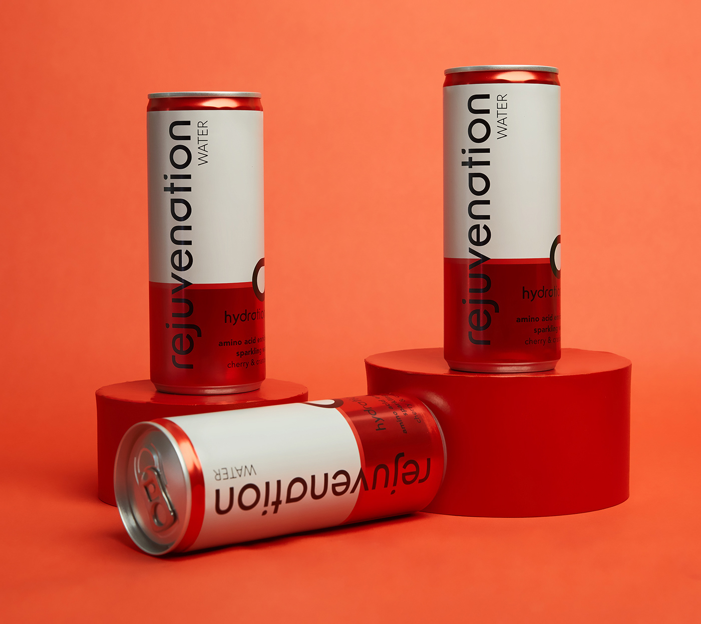
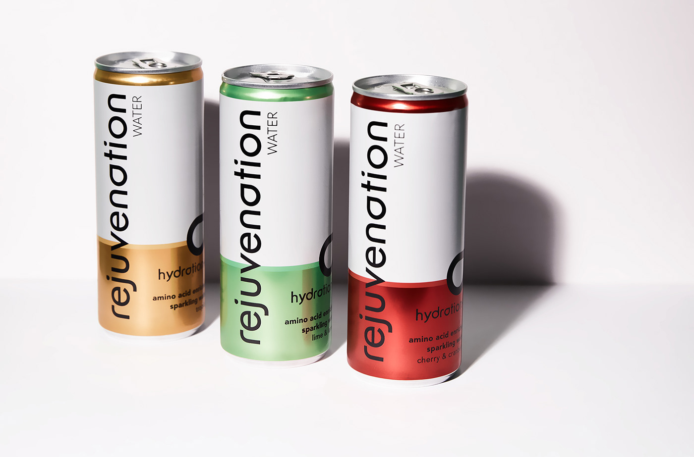
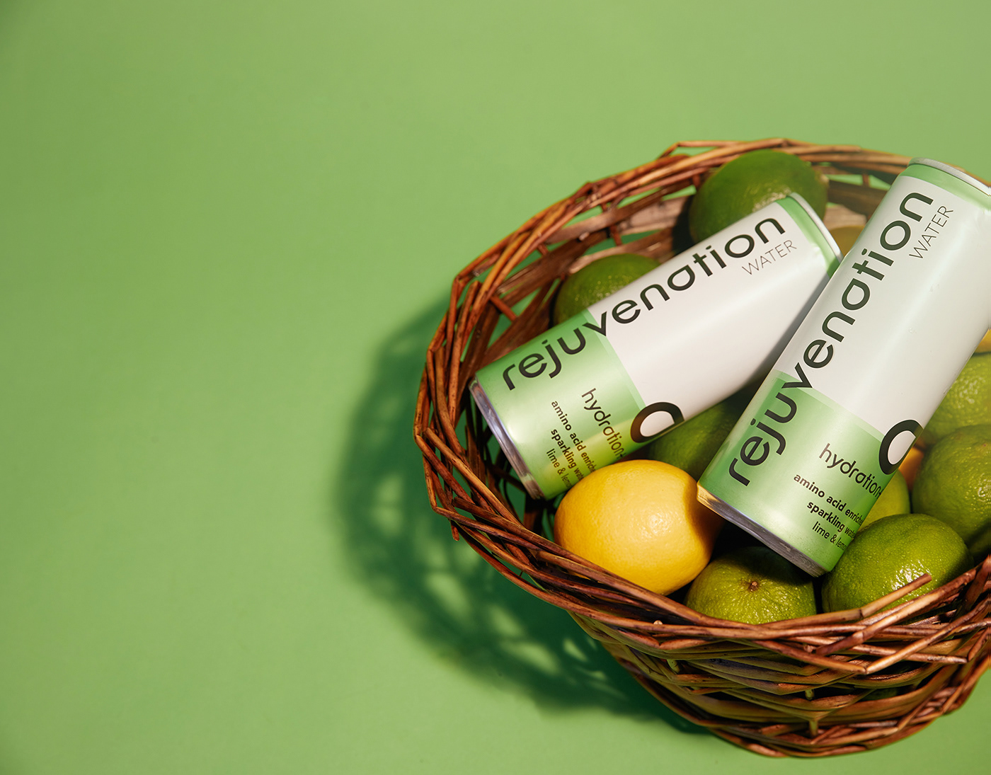
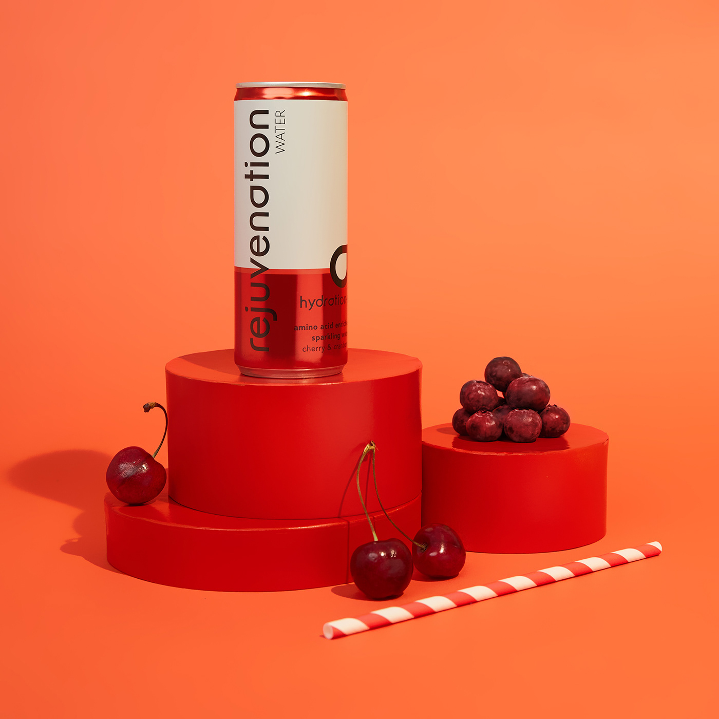
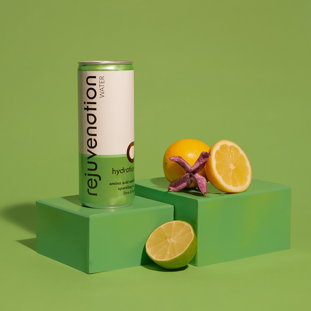
Launched in 2016, London based Rejuvenation Watermarkets themselves as being the World’s first Amino Acidenriched spring water. Stockists include Tesco, Holland and Barrett and Waitrose. Their latest range will be in 250ml slim line cans. These cans were to stand alone from the bottles with their own identity however not being too dissimilar to the bottles.
“I’m are looking for something as disruptive as the concept itself. As the can will go behind bars as well as in café drinks chillers, I want the branding to be instantly recognisable, evenfrom a distance as well as reflecting the ‘premium hydration’through the branding. I’d like the range to look as if it belongs to the Rejuvenation Water but not a copy of the original branding as the original ismore ‘active hydration’. I’d like to develop the droplet withinthe Rejuvenation into an overall brand logo but not sure how we could incorporate this into the new branding without it lookingtoo ‘active hydration’.“