Packing Hormel's Bacon
Hello, my name is Jacob Bowden and I'm a Graphic Designer. This study or project was to experience changing or updating an already existing product's packaging to something that is revamped and marketed towards a millennial demographic.I chose to tackle Hormel's Natural Choice bacon packaging.
Design Choices
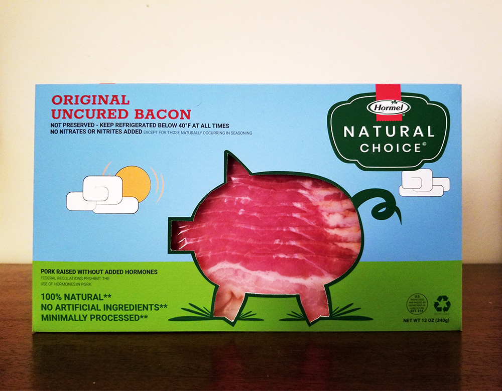
The packaging is very practical and recyclable. Hormel plays the bacon to it's strengths being natural and no nitrates. Also the graphics of foods, the colors used, and recycled paper box help add to this theme of nature. All of this in mind let's you create the image that the product is nature caring and aware.
The design is very solid and tight. I believe making the box more playful and colorful while retaining the emphasis of natural would be the goal in marketing the millennial demographic.
My idea was to use brighter colors to get some attention, use an illustration, and sell the natural in natural choice. I chose a yellow green and lighter tint of blue as my colors.

Back Design
The backside packaging stays similar in a lot of ways to the original's typography and layout. Major changes made were the colors and adding the food illustration as a text divider. A minor logo ribbon bleeding instead of ending at the border of darker green and some sizing of the text to give some space.
The backside packaging stays similar in a lot of ways to the original's typography and layout. Major changes made were the colors and adding the food illustration as a text divider. A minor logo ribbon bleeding instead of ending at the border of darker green and some sizing of the text to give some space.


Logo
The original logo has red type for the word, 'Hormel', but I felt like black was more legible and allowed the ribbon to be more vibrant without matching the ribbon and type color. Another tweak changing the existing typeface to a very similar typeface that was less italicized. The words beneath the Natural Choice seemed tight and felt better without or just placed somewhere else.
The original logo has red type for the word, 'Hormel', but I felt like black was more legible and allowed the ribbon to be more vibrant without matching the ribbon and type color. Another tweak changing the existing typeface to a very similar typeface that was less italicized. The words beneath the Natural Choice seemed tight and felt better without or just placed somewhere else.


