

Another master's project. On this project we had to redesign the label and/or packaging from a jam, and the organic and premium lineups.
I chose Bonne Maman. Being a well know brand internationally, I wasn't allowed to make too many changes on its packaging or brand. And that was a big challenge.
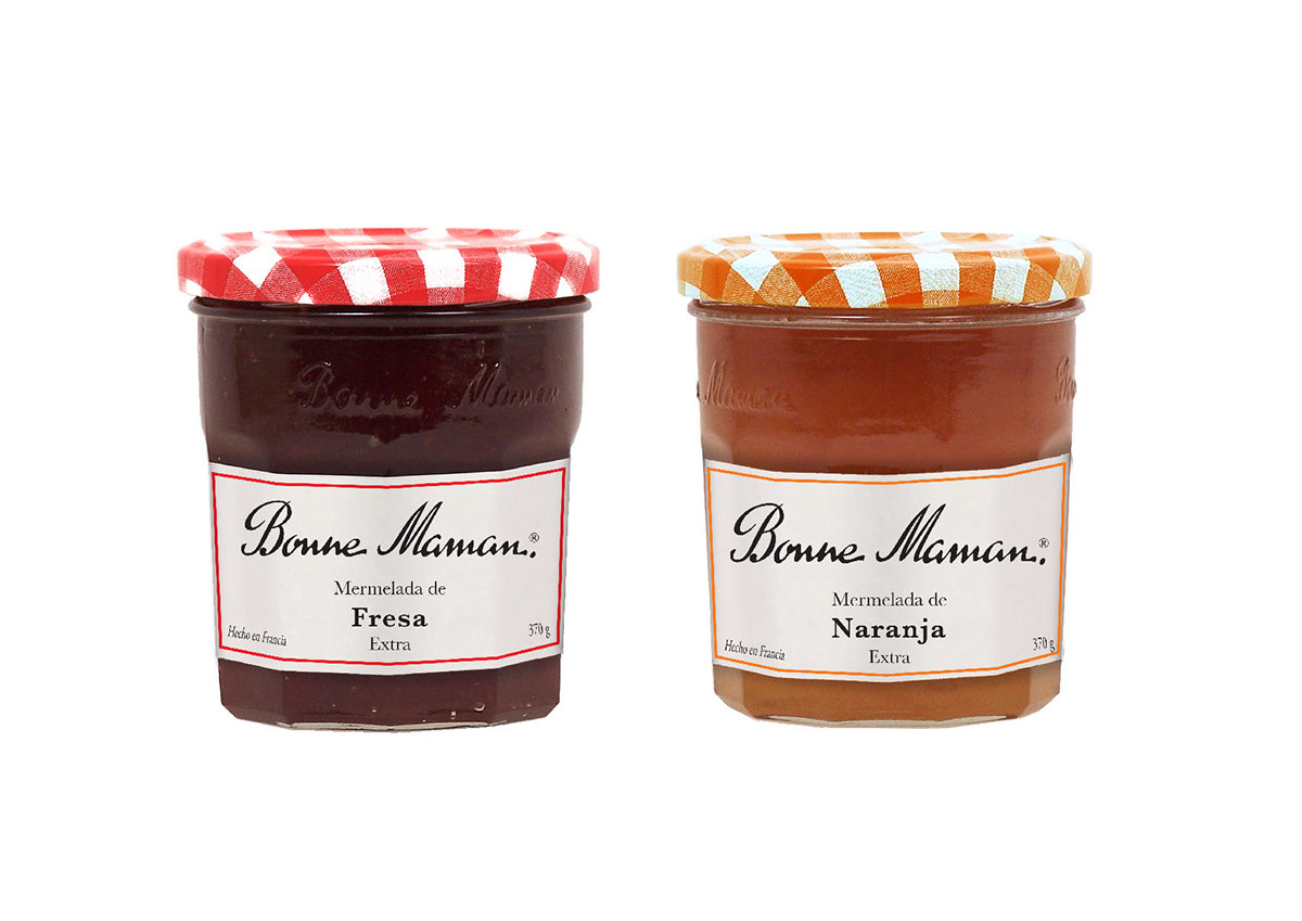
On this challenge I took the label as we know it, added a margin which will change according the flavor, and gave different thickness and order to the rest of the information in order to create some hierarchy to the text that is important to make more visible after the name of the brand, the flavor of the jam.
I chose Bonne Maman. Being a well know brand internationally, I wasn't allowed to make too many changes on its packaging or brand. And that was a big challenge.
On this challenge I took the label as we know it, added a margin which will change according the flavor, and gave different thickness and order to the rest of the information in order to create some hierarchy to the text that is important to make more visible after the name of the brand, the flavor of the jam.

Label Design
Diseño de la etiqueta
Design dell'etichetta
For the organic label and packaging, the text is in negative on a colored label, the cap is darkened a small percentage to make it different from the regular version.
The text hierarchy stays the same as the regular version.
The text hierarchy stays the same as the regular version.

For the Premium version, the label stayed white like the original, the frame was removed but an botanical illustration from the fruit used for each flavor of jam.
The checkered pattern on the cap will remain black, grey and white on all the flavors.


In this project we had the option to change either the brand, the jar and the label, but making a research i found that with this brand ( Bonne Maman ) it would be hard to change the brand and the jar; because both of them have an historic relevance in the company.
En este proyecto teniamos la opción de cambiar tanto la marca, el frasco y la etiqueta, investigando, encontré que en esta marca ( Bonne Maman) sería complicado hacer cambios en la marca y el frasco, ya que ambos tienen una relevancia historia y tradicional dentro de la compañia.
In questo progetto avevamo l'opzione di fare modifiche nella marca, vaso e le etichette, investigando, ho trovato che in questa dita ( Bonne Maman) sarebbe complicato fare modifiche nella marca e nel frasco, poiché tutti due hanno una rilevanza storica e di tradizione.
In questo progetto avevamo l'opzione di fare modifiche nella marca, vaso e le etichette, investigando, ho trovato che in questa dita ( Bonne Maman) sarebbe complicato fare modifiche nella marca e nel frasco, poiché tutti due hanno una rilevanza storica e di tradizione.


