三重県の四日市市に本社工場を中心に、東京・名古屋・大阪・福岡などの都心部や、海外にも拠点を持つヤマダイ食品は、栄養・健康・安全に配慮した惣菜の製造/開発を行う会社です。1921年創業以来、伊勢湾の海産物を使った佃煮作りに始まり、惣菜の業務用製造から冷凍流通まで、時代の変化に伴って事業を進化させながらも、「Creating Happiness(幸せの想像)」を企業理念に、「食が人々のなかに幸せを生むタネであり続ける」ことを追求し続けています。
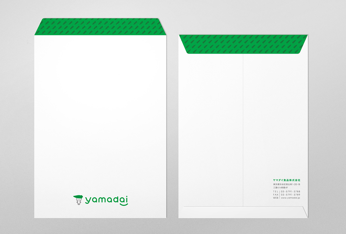
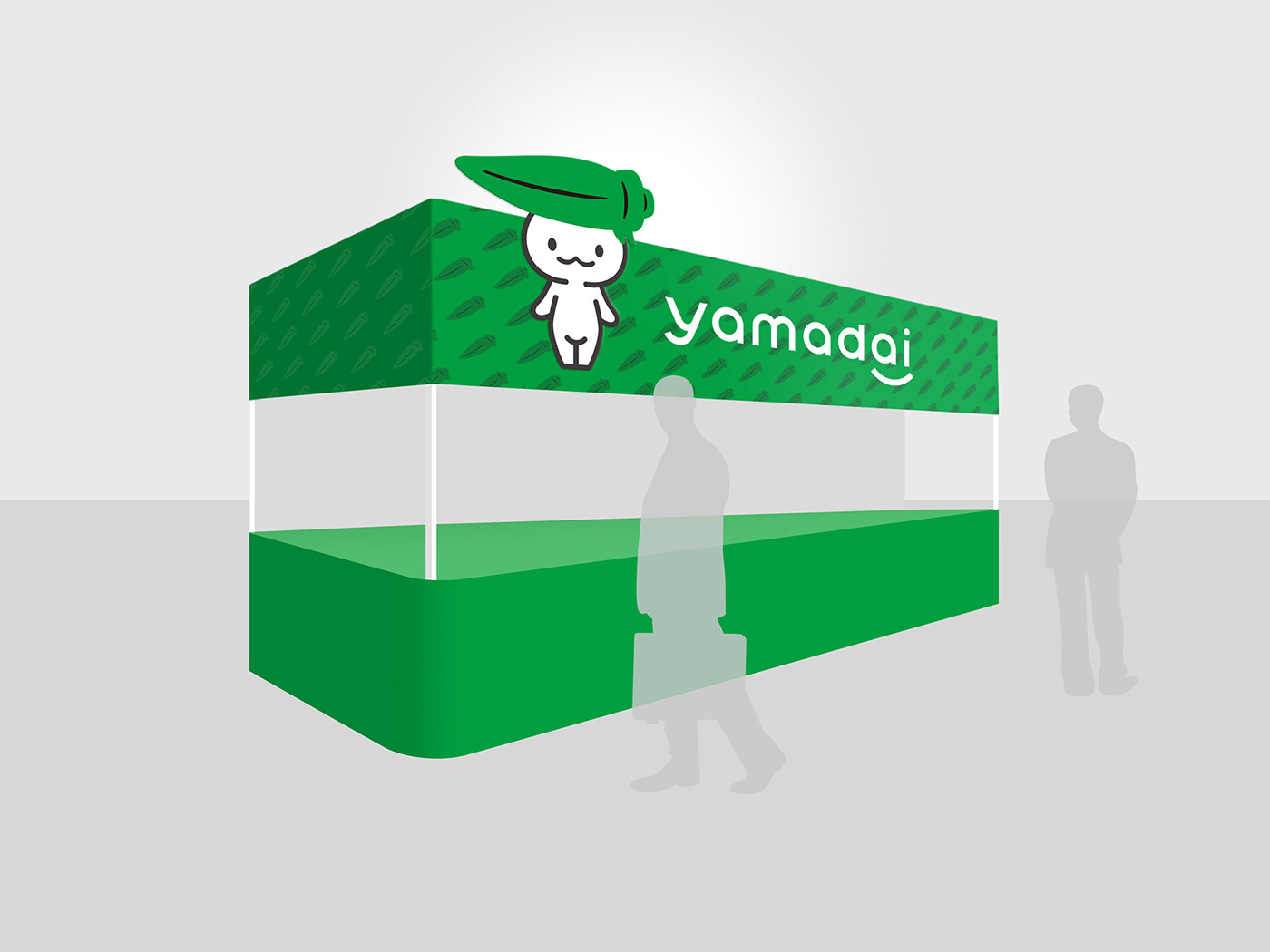
tegusuでは同社のCIリニューアルに伴い、タグライン、ロゴタイプやカラースキームの策定、キャラクターのシンボルロゴへの最適化、ビジネスツールやガイドラインの作成等を担当しました。
YAMADAI FOOD CORPORATION is a company that produce pre-cooked side dishes that are nutritious, healthy, and safe. Holding its head office and factory in Yokkaichi City of Mie Prefecture, the company also has its base in urban cities such as Tokyo, Nagoya, Osaka, Fukuoka, and also overseas. Founded in 1921, they started off by using seafood from Ise Bay to boil in soy sauce to make "Tsukudani", and later went on to commercial production and frozen distribution. As they have revolved according to the change of time, with "Creating Happiness" as their corporate philosophy, they continue to pursue "to be the reason why people find happiness in food".
Due to the company's CI renewal, tegusu has been in charge of deciding the tag line, logo type, and color scheme, optimizing the character symbol logo, and creating business tools and guidelines.

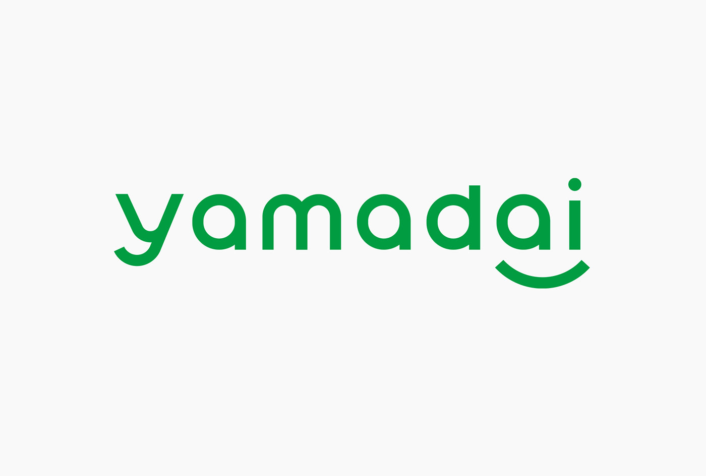
ロゴタイプ:
これまで大文字にしていたロゴタイプを小文字に変更。丸みのある造形によってオリジナルのフォントを作成し、「やさしさ」や「安心・安全」「自然」等のキーワードを連想させるロゴタイプに仕上げています。「ai」のアンダーラインは、食を通して愛と笑顔をもたらす企業であることを表現しています。
これまで大文字にしていたロゴタイプを小文字に変更。丸みのある造形によってオリジナルのフォントを作成し、「やさしさ」や「安心・安全」「自然」等のキーワードを連想させるロゴタイプに仕上げています。「ai」のアンダーラインは、食を通して愛と笑顔をもたらす企業であることを表現しています。
Logo Type:
Changed the logo from capital letters to lower case. Created an original font with curves so that it would be associated with keywords such as "kindness", "safety", and "natural". The underline below "ai" describes that we are a company that brings love and smiles through food.
Changed the logo from capital letters to lower case. Created an original font with curves so that it would be associated with keywords such as "kindness", "safety", and "natural". The underline below "ai" describes that we are a company that brings love and smiles through food.
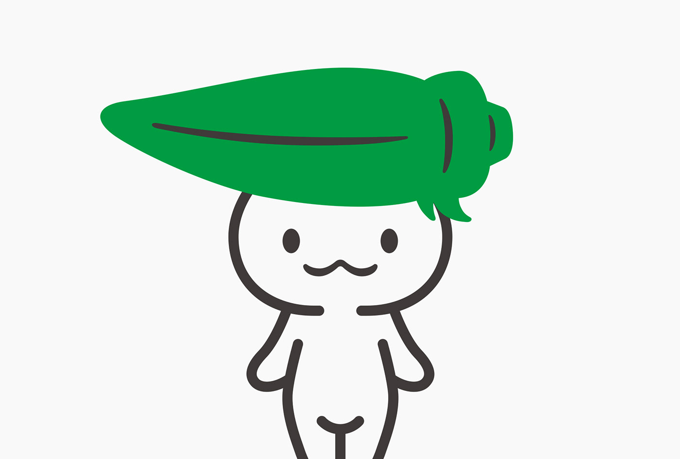
シンボル:
顧客とのコミュニケーションを活性化する方法として、既にヤマダイ食品のキャラクターとして親しまれている「ベジピー」をシンボルロゴとして採用することを提案。縮小時に視認性が確保されるよう、線の太さの調整やアウトラインの省略等の調整を行いました。(※キャラクターデザインは他社によるもの)
顧客とのコミュニケーションを活性化する方法として、既にヤマダイ食品のキャラクターとして親しまれている「ベジピー」をシンボルロゴとして採用することを提案。縮小時に視認性が確保されるよう、線の太さの調整やアウトラインの省略等の調整を行いました。(※キャラクターデザインは他社によるもの)
Symbol:
As a way to activate communication with customers, we proposed to adopt "Vegepy", a beloved character of YAMADAI FOOD CORPORATION, as the symbol logo. We have made adjustments such as adjusting the thickness of the lines and omitting the outline, so that it would still be recognized even when the size was reduced. (*The design of the character was done by another company)
As a way to activate communication with customers, we proposed to adopt "Vegepy", a beloved character of YAMADAI FOOD CORPORATION, as the symbol logo. We have made adjustments such as adjusting the thickness of the lines and omitting the outline, so that it would still be recognized even when the size was reduced. (*The design of the character was done by another company)


多様な使用シーンが想定されるため、欧文のフォルムに合わせた和文ロゴタイプも作成。コンポジションが変わった際に統一したイメージを与えられるよう、複数のロゴタイプ組み合わせパターンを作成しました。カラースキームとしては、植物や野菜など自然を象徴する色であり、「調和」「癒し」の色として人々に親しみを与えるグリーンを、数値も含めメインカラーとして再定義。セカンダリーカラーには、空や海・水を表す「青」と、太陽や光をイメージさせる「黄色」など、野菜が育つのに欠かせない要素を色として抽出している。
As it was assumed that it would be used in various scenes, we created a Japanese logo type that matches the form of the European format. We created several patterns with various logo types so that when the composition changes, we would still be able to give a unified image. As for the color scheme, we have redefined green as the main color, also for numbers, since it is a color that symbolizes plants, vegetables, and nature and gives "harmony" and "relaxation" to the people. As a secondary color, we have chosen "blue" that represents the sky, ocean, water, and also "yellow" that can be associated with the sun and light. We have chosen these elements that are essential when growing vegetables.