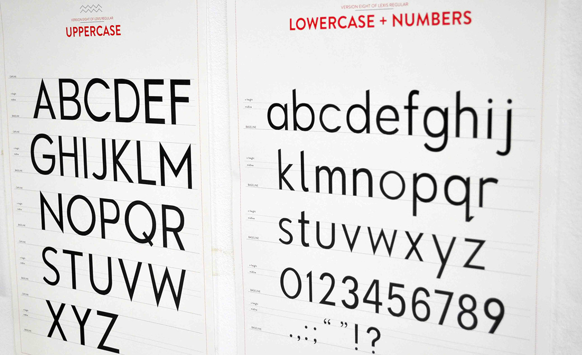
Typeface name: LEXIS REGULAR
Lexis Regular began with pencil sketches and drawings of letters and numbers.
It was inspired by analyzing a dyslexic child's handwriting as well as looking into various
font design that a person sees and encounters on a daily basis.
Lexis Regular is a font specially designed to help dyslexic individuals better see, read and process
words and information. The font aims to be used across all learning and teaching materials such as
exercise books, text books, cue cards, visual aids etc.
As shown on the following images is the Version Eight of Lexis Regular.
The following images show the recent work-in-progress showcase held in LASALLE College of the Arts
from 18 March 2013 - 21 March 2013.

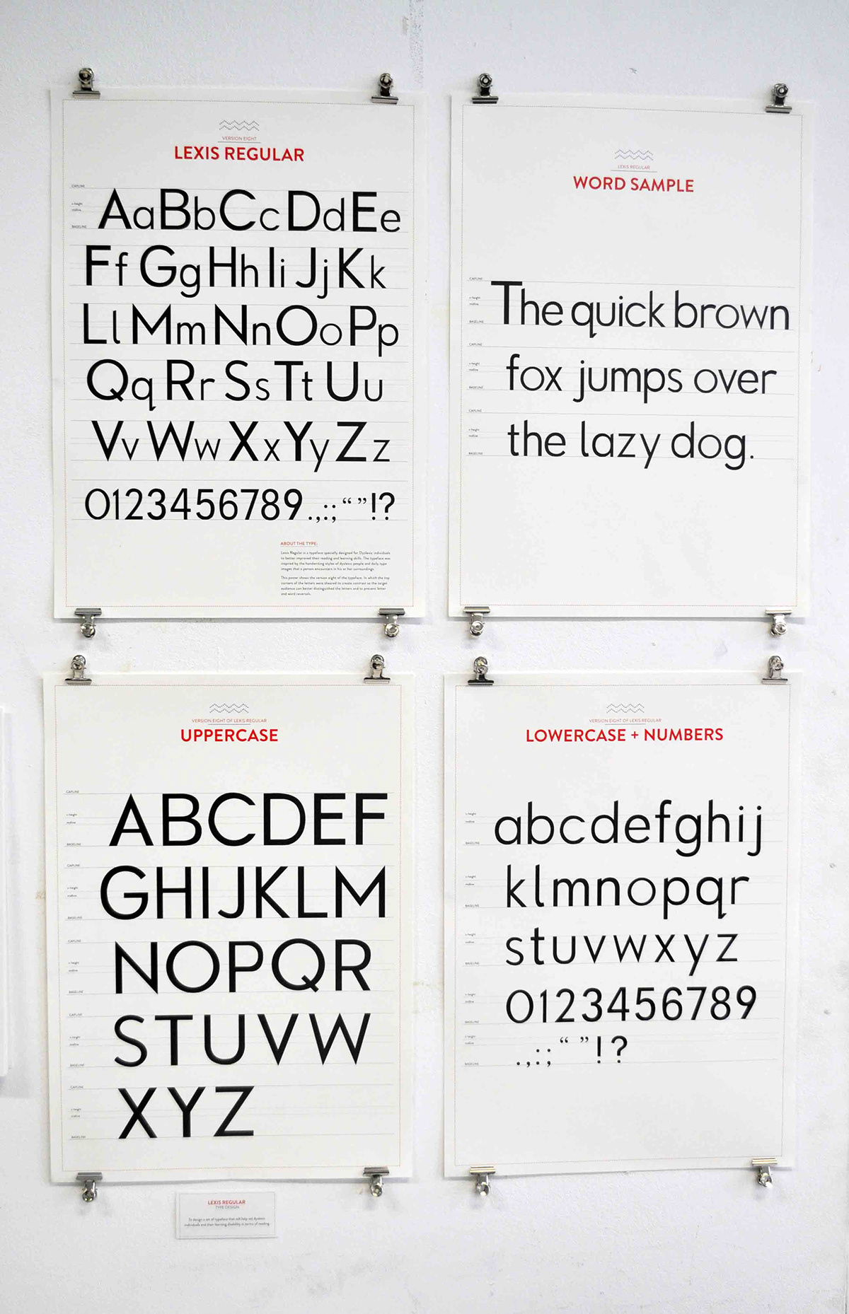
LEXIS REGULAR: VERSION EIGHT + WORD SPECIMEN

SKETCH BOOKS OF LEXIS REGULAR
The book shows the initial sketches and stages of the Lexis Regular typeface. In this book, pencil sketches of individual
letter, numeral and punctuations were drawn and compiled for viewing purposes

WORK-IN-PROGRESS SPACE

WORK-IN-PROGRESS SPACE + USER TESTING VIDEOS
The video shows the user-testings that were conducted for versions three and six of Lexis Regular Typeface among Dyslexic Children to test the type's readability and effectiveness.

