


Canopus Rebranding
When I started at Canopus, they had no on-site designers. The upper management had been doing their own designs and sending them out to a production house. I immediately saw that they had no corporate branding. Each product had it's own look that didn't relate to any of the other products and the company logo was minuscule on the packaging.
My focus for the 9 months I was at Canopus was to make a cohesive look and carry it through all the collateral, packaging and web plus draw more attention to the company name. By drawing consumer attention to the company name it would allow the popular products to bring recognition to the rest of the line.
I was also responsible for the consistent branding for the company internationally. I created all the collateral pieces that were then disseminated to the other countries for translation and any size conversions. These pieces included:
• Software and hardware packaging
• Ads
• Datasheets
• Product catalogs
• Product shots
• Press/Reviewer kit
• Direct mail pieces
• Mouse pad
I was responsible for the floor layout and branding issues surrounding our trade show booth and presence at US trade shows. You will notice two separate branding looks to the projects below. The original look, as seen in the software and hardware boxes, was based on the concept of Canopus providing the tools to release the video editor's creativity—a partnership between technology and creativity. I used the Da Vinci head for it's right-brain/left-brain to illustrate that idea.
The newer look came about after an upper management overhaul and is used for the rest of projects. The new VP of Marketing wanted to focus on Canopus's international presence and customer service. While maintaining a high-tech feel, I replaced the other elements with the globe superimposed with culturally-diverse people in monitors.

The original branding look, as seen in the software and hardware boxes, was based on the concept of Canopus providing the tools to release the video editor's creativity—a partnership between technology and creativity. I used the Da Vinci head for it's right-brain/left-brain to illustrate that idea.

The newer branding look focuses on Canopus's international presence and customer service. While maintaining a high-tech feel, I replaced the other elements with the globe superimposed with culturally-diverse people in monitors.

Software Packaging: I used the Adobe packaging as a model for my software cases. The president of Canopus wanted a very high quality case that our customers would keep. To conserve in costs, the boxes have a generic branding image on them and can be used for any product and manufactured in bulk. There is a specially designed belly wrap for each product.
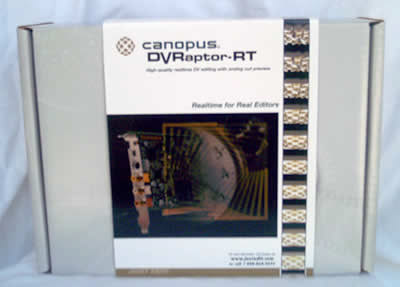
Hardware packaging is simpler than the software packaging but it's the same concept of a generic box with a product-specific belly wrap.
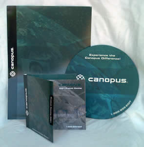
Trade Show Collateral: I proposed that the collateral materials be shrunk down to a handy size for trade shows. This lead to my design of the CD case catalog. It included a small product catalog and a interactive CD. The CD contained all of our collateral materials except the T-shirt!
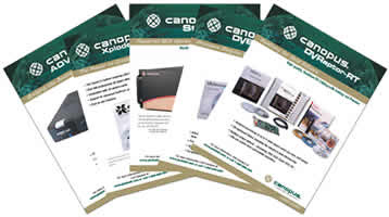
Datasheets
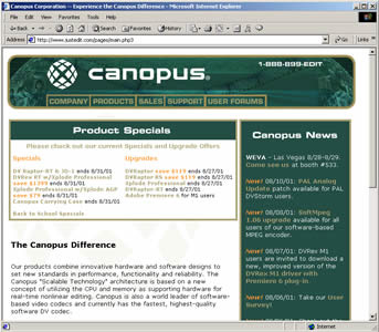
Website: Home Page
I was directly responsible for the overhaul of the company website. It was a joint project between me and the freelance programmer. Highest on the list of priorities was adding white space and a major reorganizing the site hierarchy.

Website: Sample Product Page


