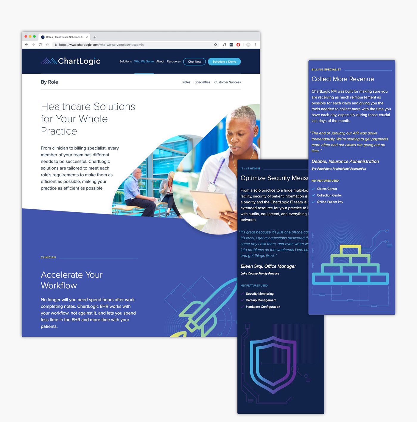
In operation for over 20 years, ChartLogic has made it their goal to positively impact patient care by delivering award-winning healthcare IT solutions for providers of every size and budget.

Problem
ChartLogic’s previous visual identity was a dated and overly-detailed representation of a digital folder. While the logo itself was too clunky to accurately represent the company’s offerings, the brand as a whole also lacked a sleek and modern aesthetic in order to position itself as a high-tech and trustworthy partner.
Solution
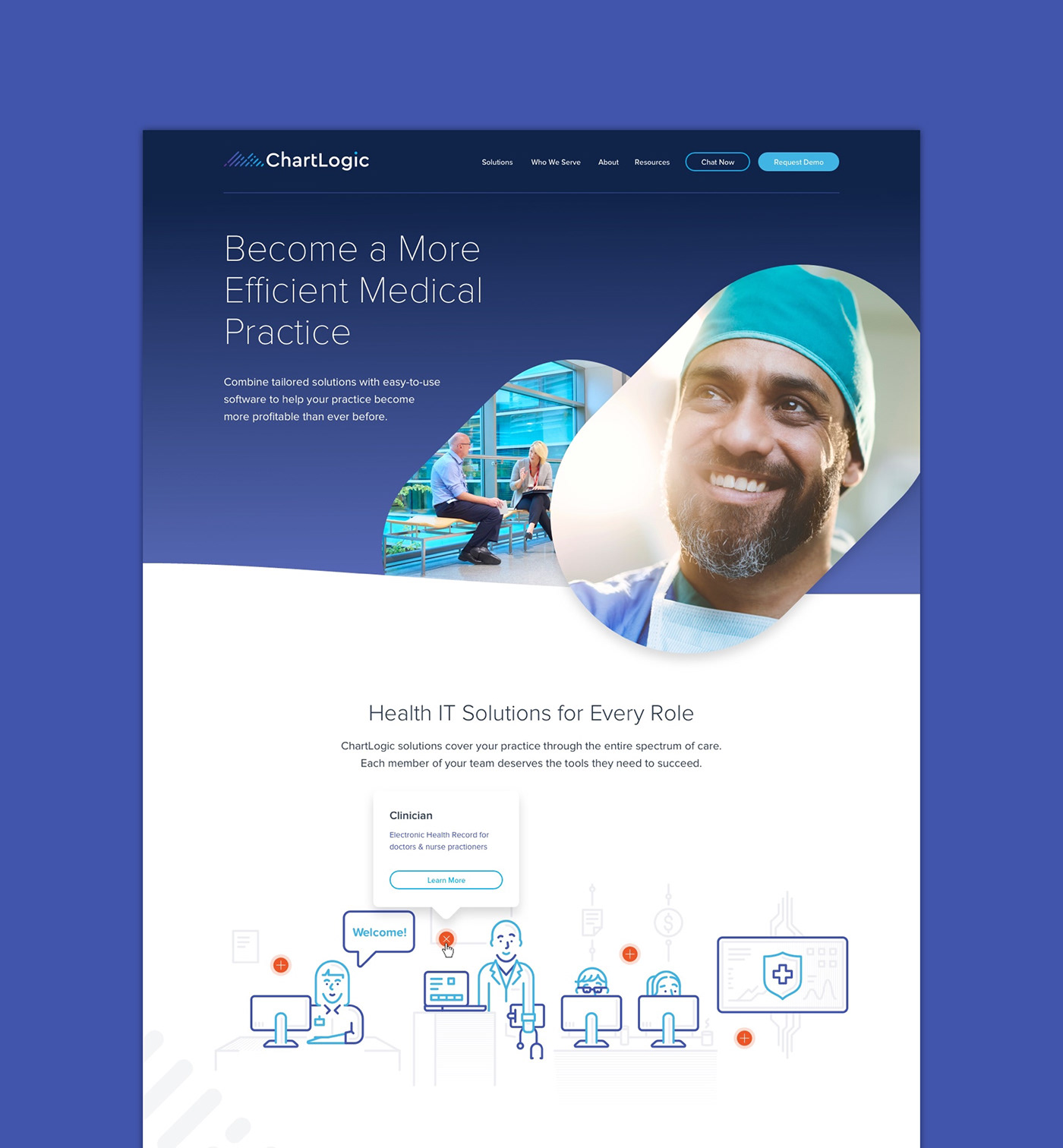
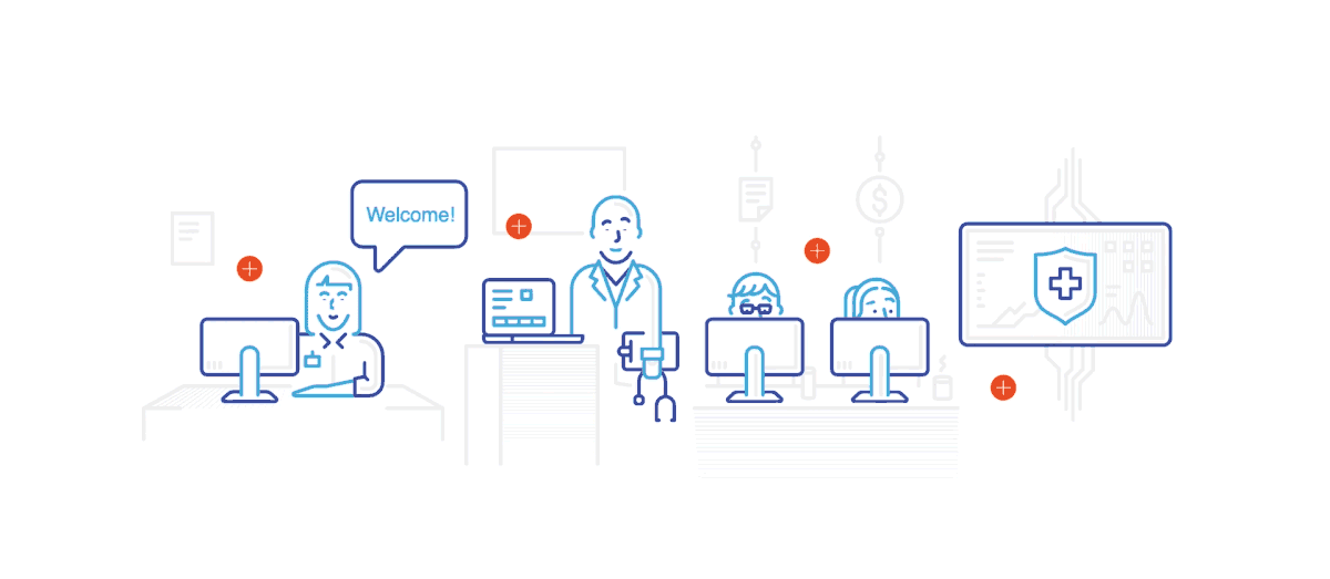
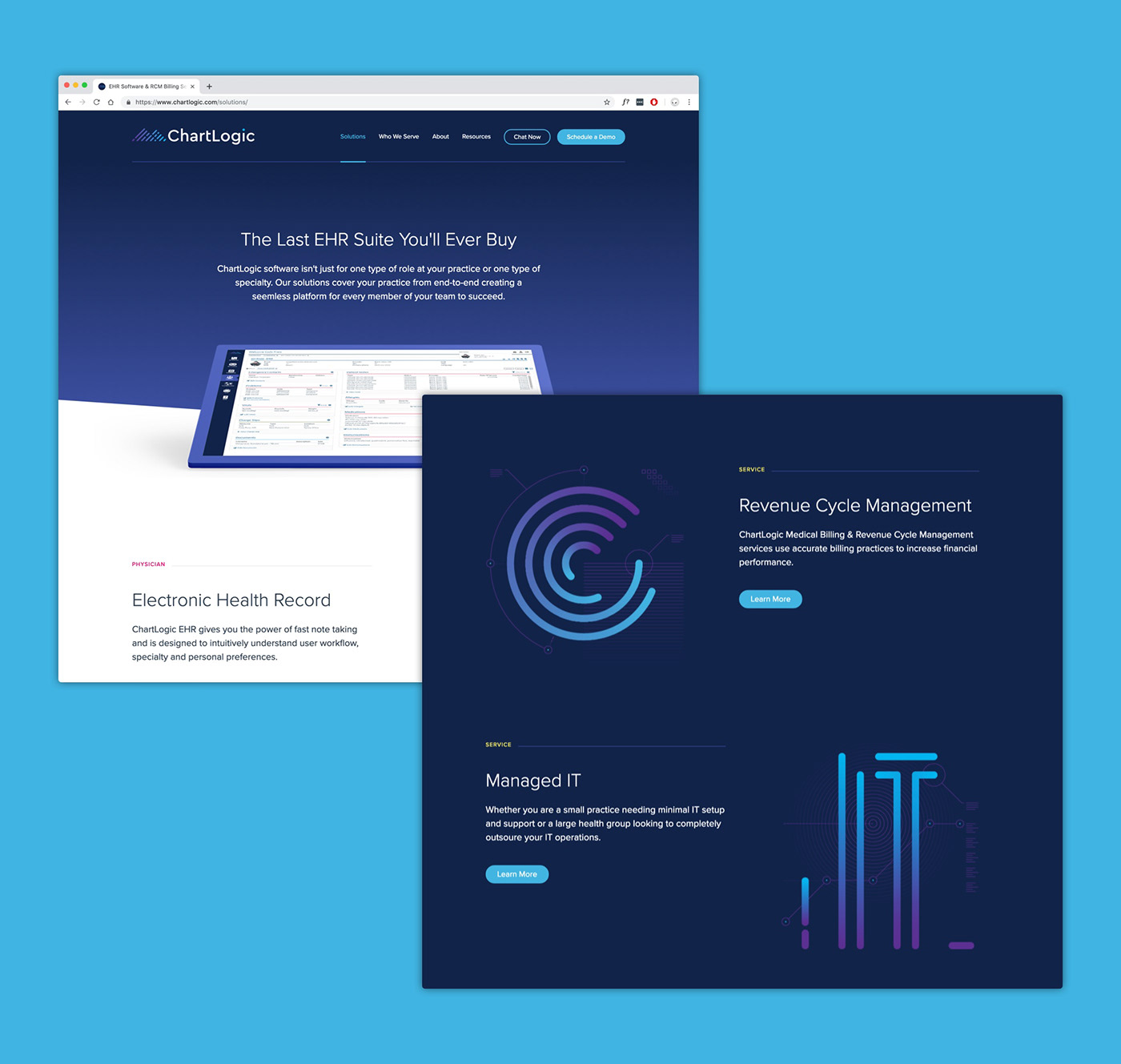
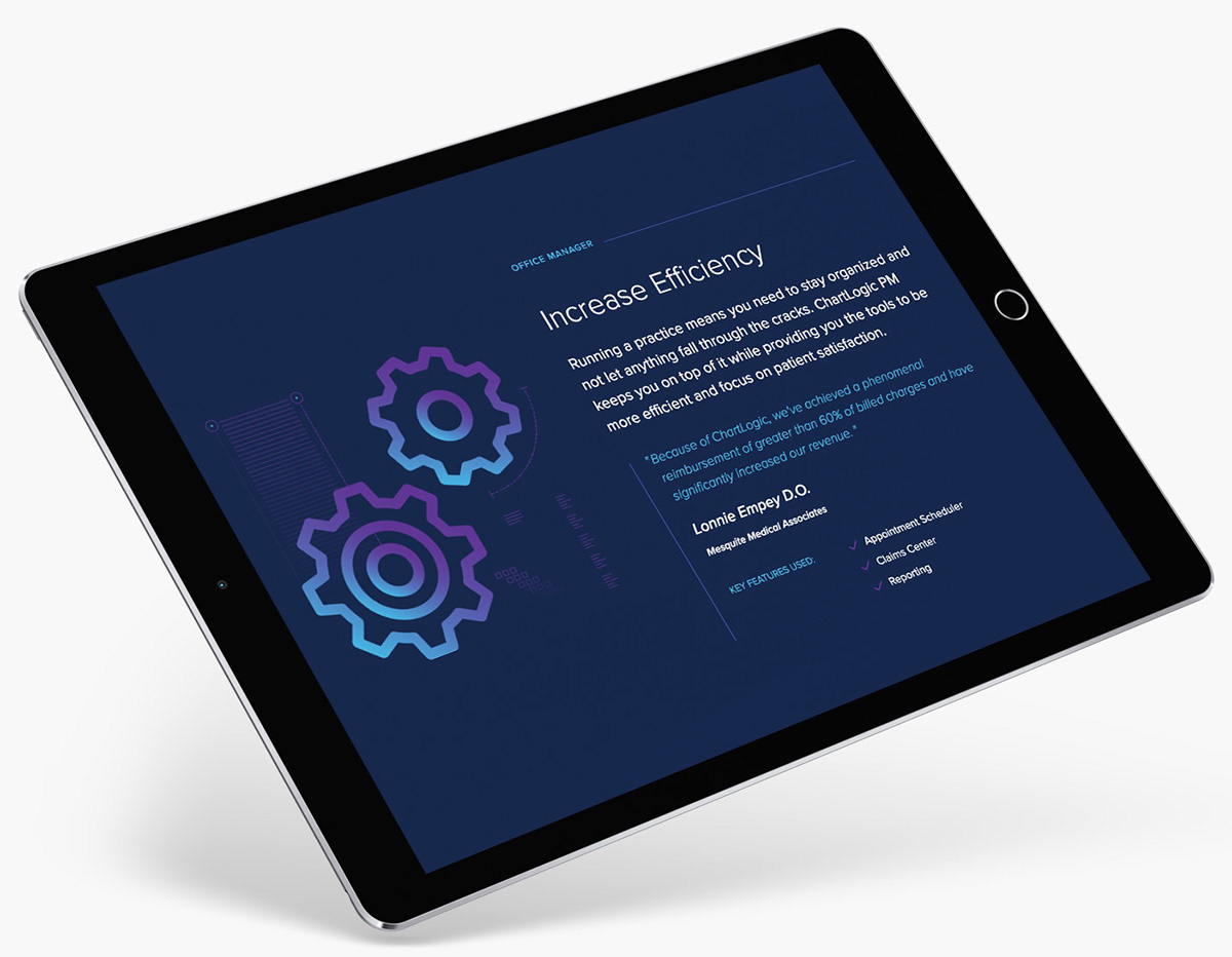
We designed a brand and web experience that was simple, intuitive, and contemporary. Emphasis was placed on color and bold iconography, brought to life using SVG animations and subtle micro interactions.
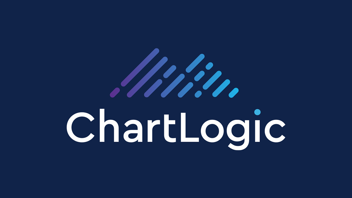
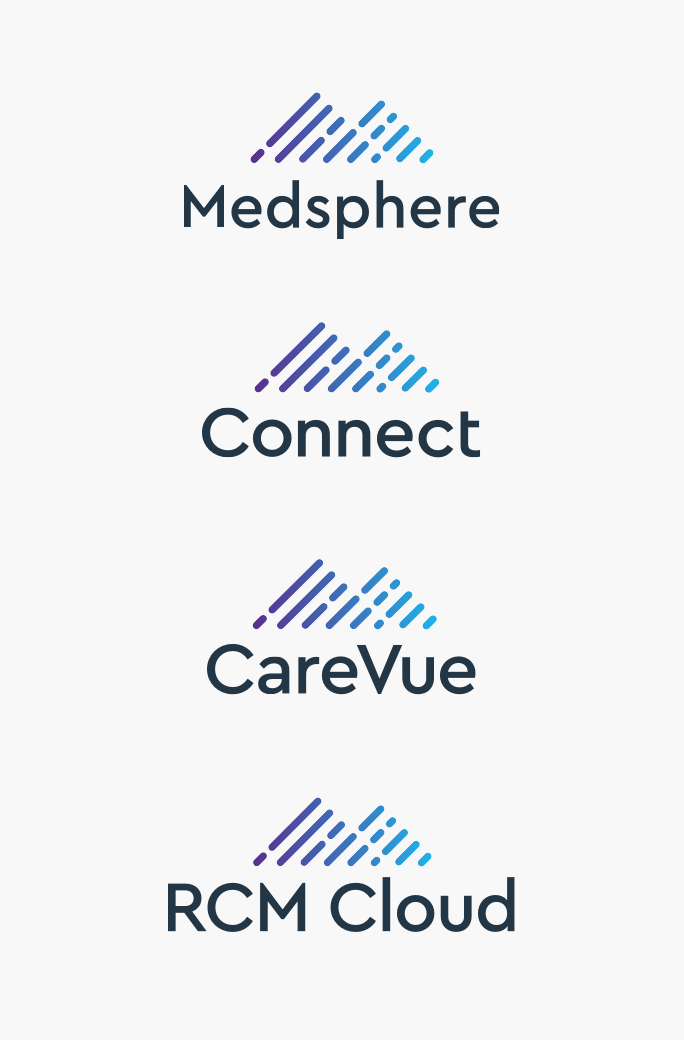
Typeset in Cera Pro—a modern and easy-to-read font—the ChartLogic logo is actually one in a family of five.