NEW CONCEPT AND DESIGN FOR SEDUCCIÓN
Seducción was a semi-premium product of the chocolate family in Nestlé, but the client wanted to renew completely this product by changing the product's shape, packaging design and even it's formula.
They wanted a new more-premiun concept and an attractive product cover, enhancing the new shape of the bar. That was the challenge.
Flavors: Chocolate with Milk, White Chocolate, Chocolate with Hazelnut inclussions and Chocolate with Almond Inclussions.

Old SEDUCCIÓN packaging design. The chocolate bar was more straight and rectangular.
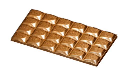
This is the image the client sent to me, to see the new mold of the chocolate bar. With this element I started to work.
START!
So here we are...

At first, I sketched in pencil this individual pices of the bar in order to see in a better way the new shape. The idea was that we could see better the appealing of the new curved shape.
3D Modeling

In order to see a more realistic shape of our bar, I decided to model it in 3D. So I took my time making it in CINEMA 4D, taking care about the shape, trying to keep really close of the actual mold.
Having the 3D modeling would allow me to move or change the perspective with more freedom so I can appreciate in which way the bar look more appealing.
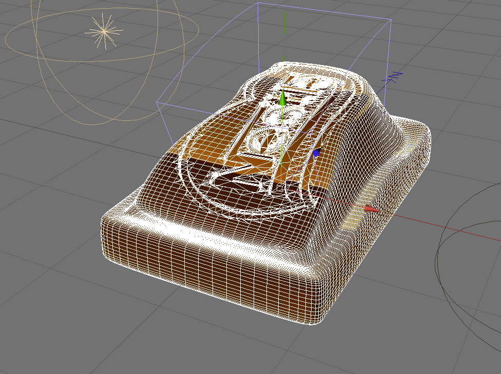

Some renders to see the shape of the chocolate pice of the bar.


FIRST PACKAGING DESIGN OPTIONS
Below we can see my firsts options of packaging design I made for the new SEDUCCIÓN. The idea was to make it simpler, more premium and more appealing to show the new shape.
First Option: Simpler, with a lighter front, and the product with its inclussion. I put two lines of silver-plating direct color to make it look more premium.

Option 2: Following My first Idea, I made a new Simple front but, this time I tried to use more curved lines following the new concept of the mold.

Option 3: This Time I used a simpler geometrical shaped front, using a big rhomboid curved-corners shape to show the bar. The idea was to change the color of the shape to show the different flavors.

Option 4: Following the simplicity of the forms, I tried to stand out the new shape of the bar with this centered stripe with a curved line in the middle. To enhance the chocolate bar I put golden dierct colored lines that could make the cover to look more premium.
OPTIONS 3 AND 4 were approved so I made the adaptation of the 4 flavors in both designs

Hazelnut

Almond

Chocolate with milk

White chocolate

Hazelnut

Almond

Chocolate with Milk

White Chocolate
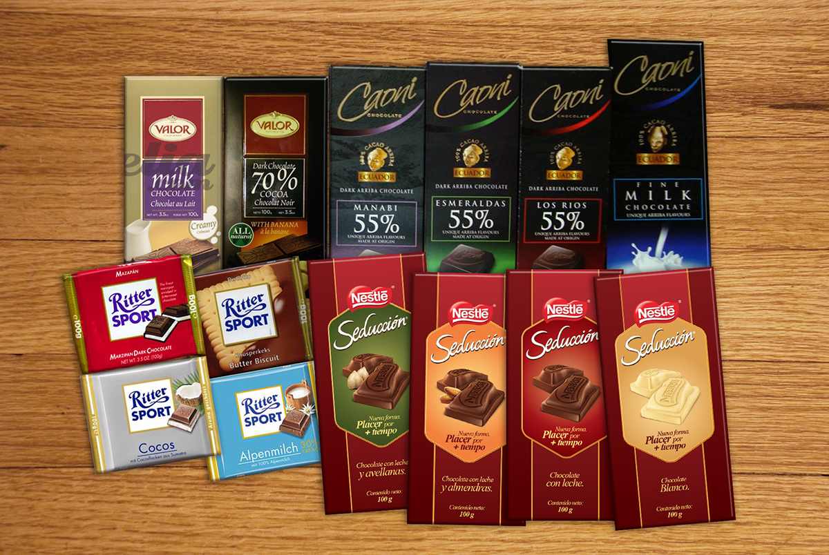
I made this assembly with our designs and the competitors designs in order to see if they make the difference.
First Option.

Second option
NEW REQUEST
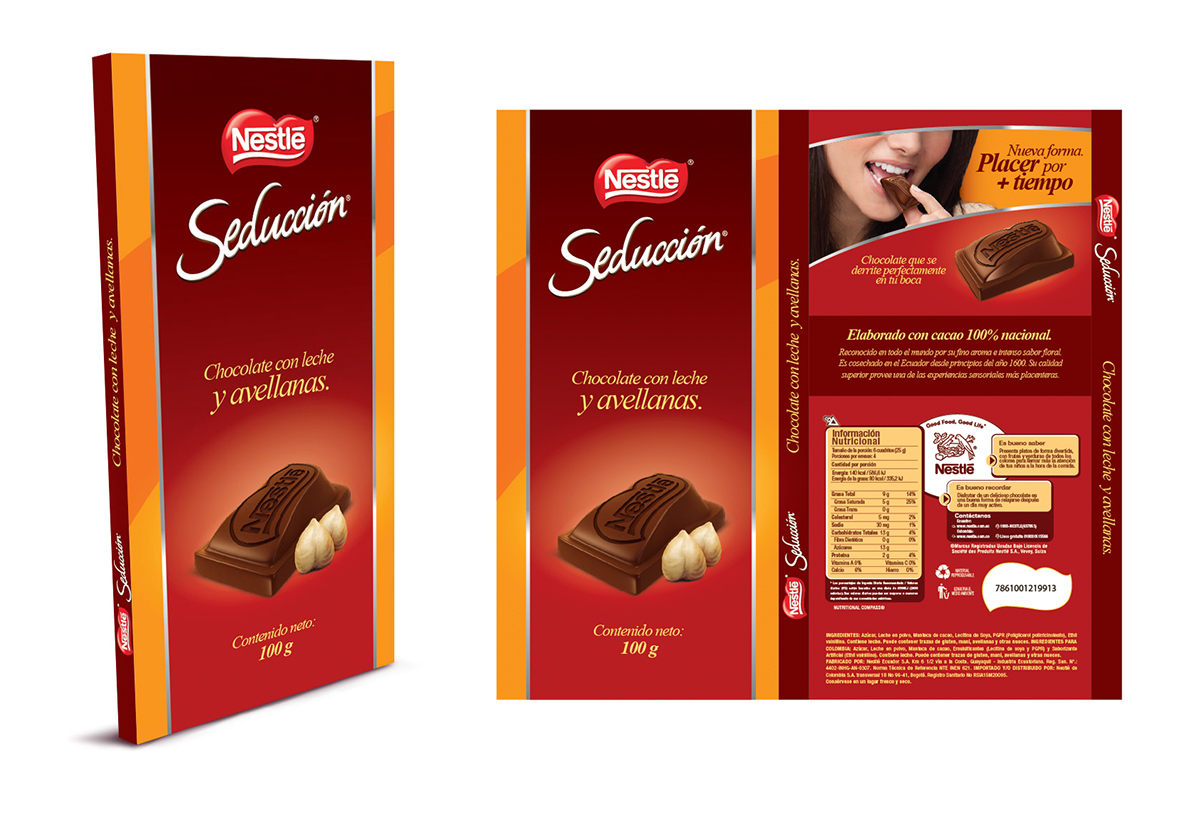
So, the client made a new request in the road to perfection. They needed to show the inclussions inside the chocolate bar, not only outside. Then we decided to make a sliced chocolate behind to show the inclussions in the chocolate bar.


THE APPROVED DESIGN
The Client decided to keep this option as the final design. So I put the new sliced chocolates and make this new assembly. They worked perfectly.

NEW MODELING
The client gave us some samples of the actual shape of the mold. and we could see a more curved shape than the one I model first. So, I took a new modeling time.

The changes I made were to smooth the curves and the brand above the bar. Also, I made a rough edge in the base to simulate they were broke carefully into pieces.
Below we can see the new renders.


In this case I worked in photoshop the inclussions.

Final Assembly.
FINAL STAGE
At the end of the process, we sent my final renders to our illustration supplier to make them more realistic to apply them in the final layout.
Below we have the resulting illustrations by David Chung.


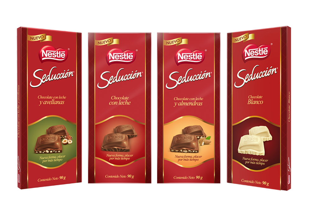
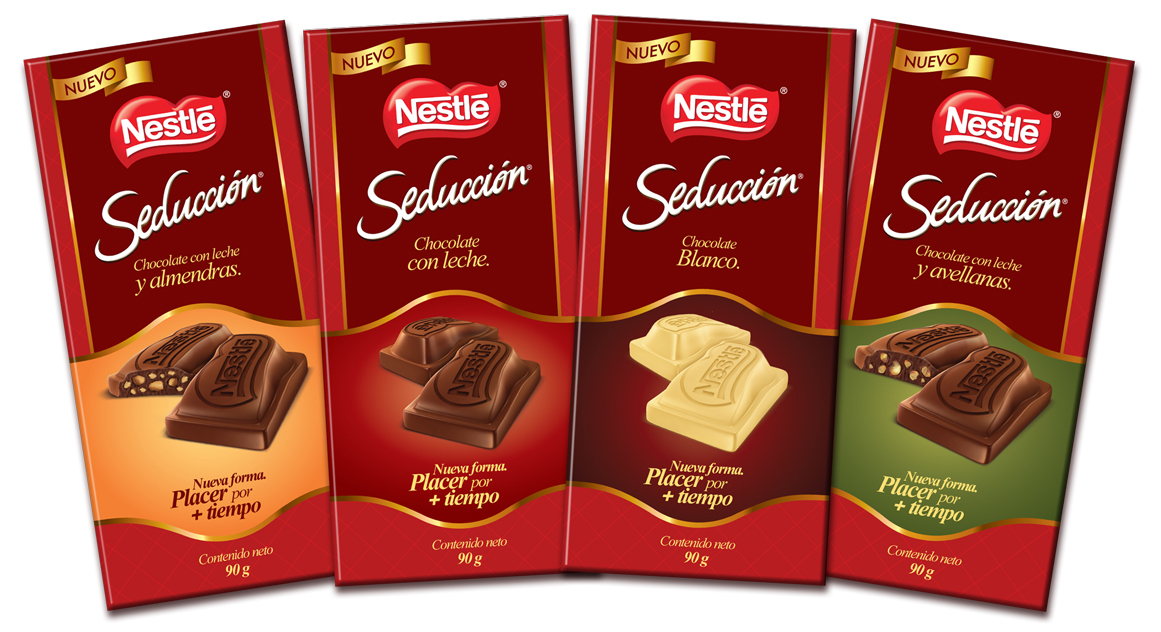
THE FINAL FORM
This is how the design were approved by the client. We put all the design into a single vertical shape in the middle of the cover. It was a very prefectionist but funny project. At the end we were happy by the results.