


EICAS
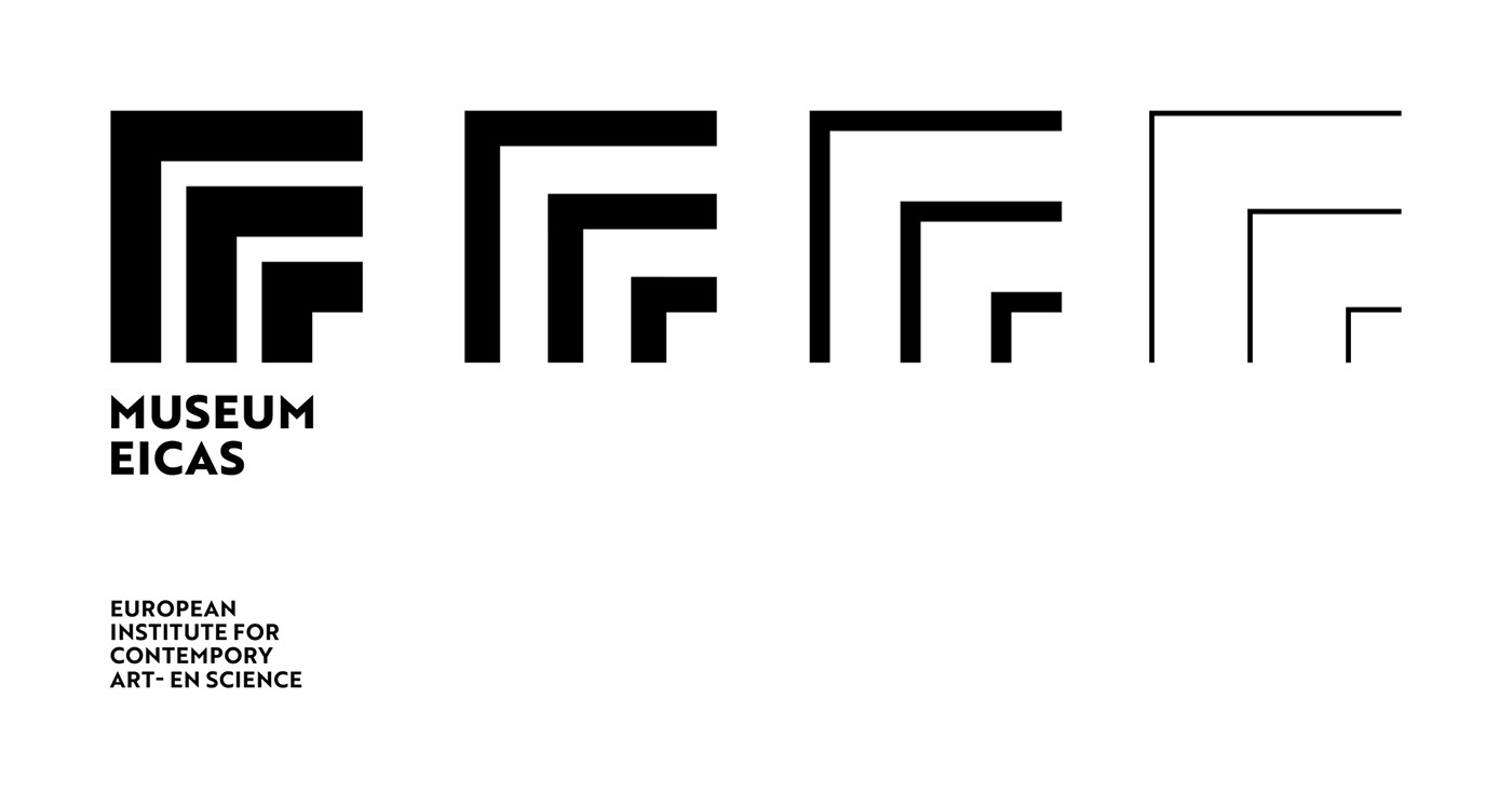
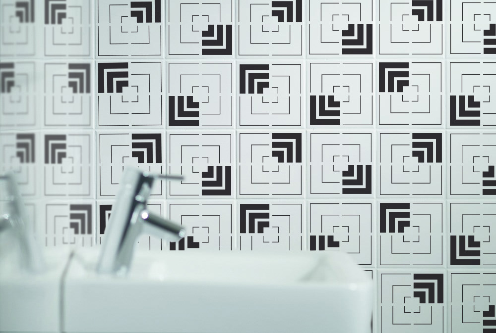
For Museum Eicas we have sketched the brand identity of an iconic and international institution. Matching the museum’s starting point, the Zero movement from the fifties, we developed a visual language that does justice to monochromy, repetition, seriality and directness of the material.
For Museum Eicas we have sketched the brand identity of an iconic and international institution. Matching the museum’s starting point, the Zero movement from the fifties, we developed a visual language that does justice to monochromy, repetition, seriality and directness of the material.
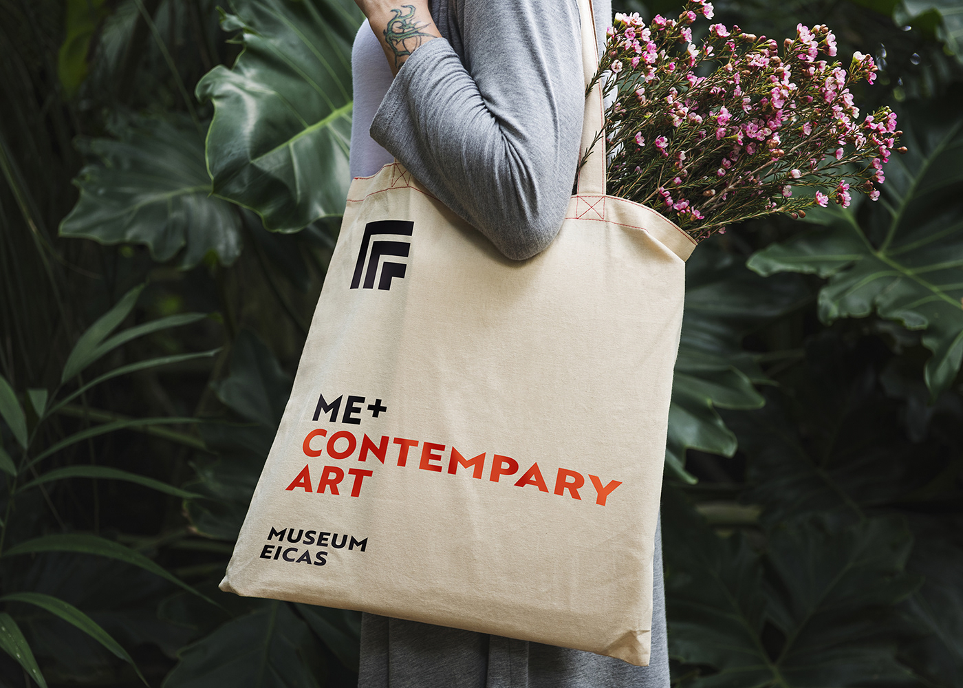
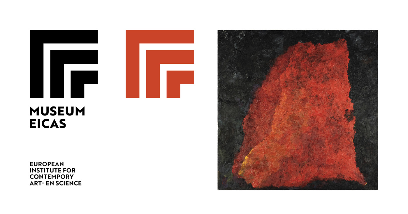
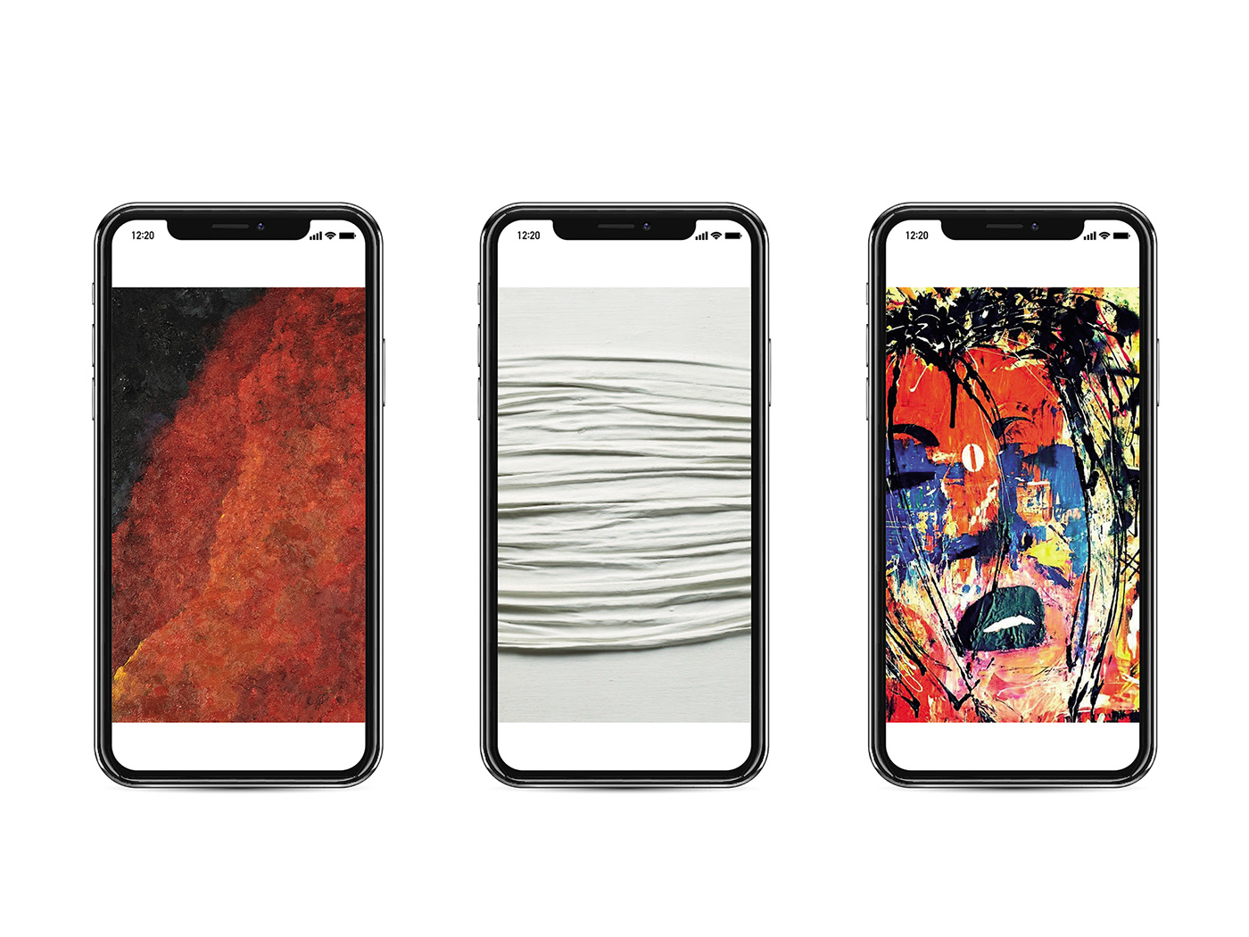
The logo, based on the merging of the characters M and E, gives a powerful, recognizable and minimalist image. The color of the corporate identity has been chosen from one of the works of the Dutch artist Armando who forms the basic collection of the museum. In addition, the merging of the initial letters of Museum Eicas (ME) can be translated into the personal attachement of the museum visitor with contemporary art and science.
Although we are extremely proud of our concept, our spontaneous initiative for the museum came too late to be implemented.


