⟶ Check out the live redesigned homepage on my website
____
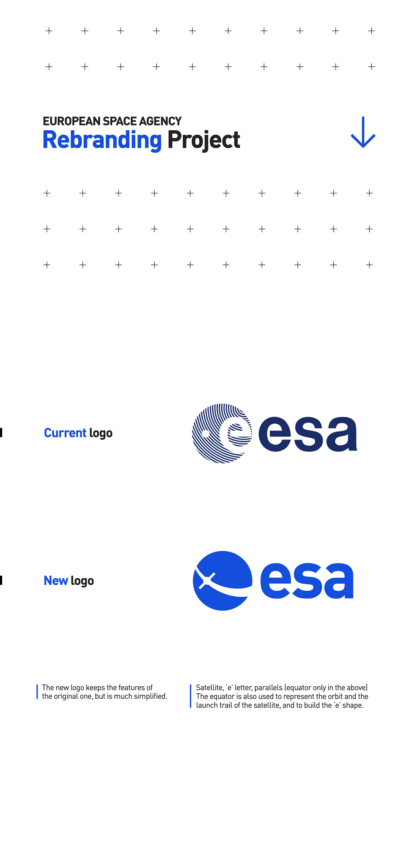
Context
My starting point was that ESA, the European Space Agency, could use a rebranding. NASA is getting there already, becoming sexier every year to attract an audience. ESA shows some signs of wanting the same thing happening, but their logo and main branding looks a bit dull and old compared to nowadays standards.
This project is purely personal, made because I love space and wanted to showcase my skills.


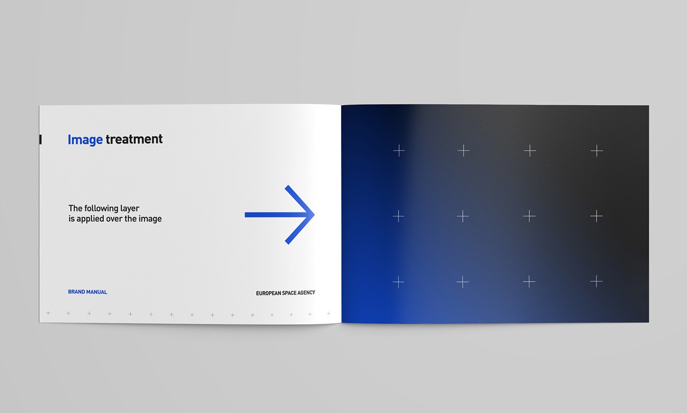
The crosses pattern is a reference to the old school space pictures, when we could see the reticles of the camera appearing on the pictures.
This was kept as a nod to the past, because retro and space is an appealing combo. The goal though is not to go too much into that retro vibe, space agencies are reinventing themselves and I wanted that contrast with a modern brand identity.
Here's how we could apply this pattern as an image treatment, to share on social medias mostly.