


Photography (view) | Self-publishing | Exhibition Design
Background: Images have the potential to tell stories. They have the capacity to speak of our current social and cultural lives, and to create connections with others. Photography is one of the primary means by which we can make sense of the world around us. We can use photography as a method of creatively documenting our surroundings, and as a means of inventing new ways of seeing and understanding.
Brief: Explore the locality, in our case the seaside town of Falmouth, engage with people, find the overlooked stories that you want to tell. Uncover new narratives. Create powerful, beautiful, expressive, unexpected images. Share your work with new audiences. Throughout the project you will be challenged to engage with a range of activities, in varied locations, working directly with co-creators; such as Oliver Udy, Lucienne Roberts, Alec Dudson, ICBQ Team, Nick Raven and Steve House.
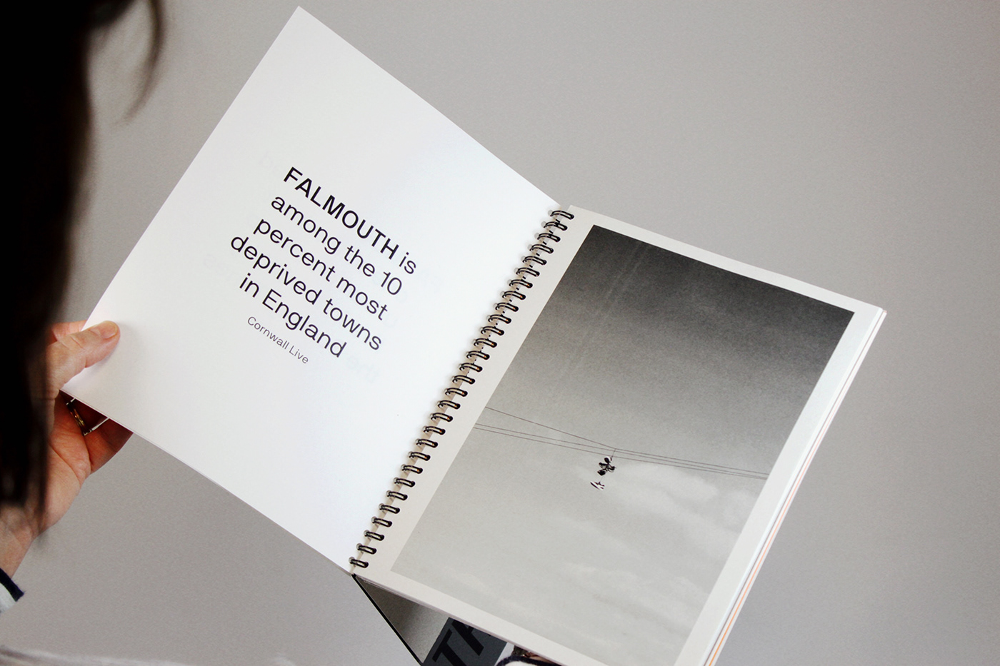
Outcome: Besides the Seaside explores and documents the reality of residential living beyond the postcard ideology of the Cornish seaside town of Falmouth. From an external point of view, Falmouth is commonly identified by beautiful beaches, picturesque cottages with brightly coloured doors and quaint little streets, when realistically, there is a whole other world living behind the facade. This world is one which individuals would not typically classify as Falmouth, being situated amongst the 10 per cent most deprived areas in the country. It is a two sided story. This contrast between the tranquil, desirable Cornwall and its harsh reality is the focus of this photographic essay. What lies behind the unseen?

(above) The surprising juxtaposition and social contrast in Falmouth. On the flip side...
The Photography
Over the past 4 weeks, as a group, we were encouraged to explore locality and the sense of the area in which we live from multiple perspectives. By generating a range of possible subject matters, I uncovered my final focus (the facade of Falmouth) and consequently experimented with different styles of photography to reflect this theme in the best possible way.
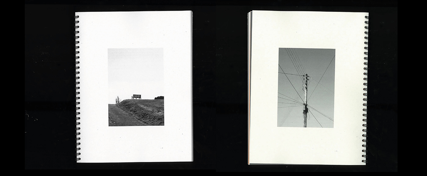
The final series of photographs have been monochromatically edited. The black and white effect evokes a sense of bleakness and emptiness, devoid of colour and therefore creates a particular atmosphere surrounding the images. The photographs focus on details within the areas which may appear unappealing and lack any pleasant attributes, providing the viewer with an honest representation of the area, demise of refinement, adjustments or alterations.
Some of the photographs are abstract, with an increase amount of white space, combined with the use of shadows, shapes and interesting elements, which provide the viewer with details to explore and question.
The work is inspired by local photography Oliver Udy, German photographer Michael Schmidt and British photography Chris Killip.


(above) a selection of final photographs, view full series here
The Publication
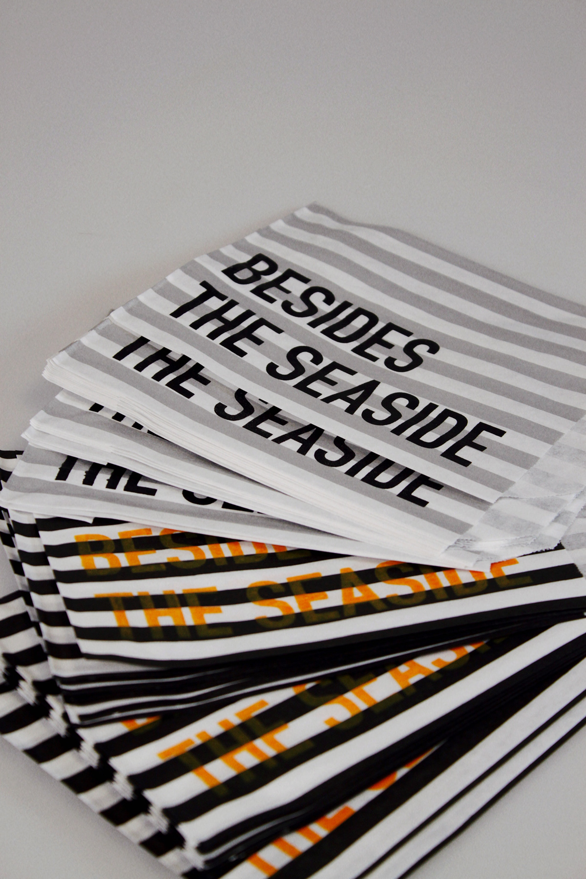
The design involves both screen, risograph and regular printing methods on a range of paper weights and stock; including 80gsm Newsprint, 140gsm and 100gsm Cartridge Paper and a selection of 160gsm Coloured Card. Assisted by the chosen binding method, it evokes a sense of tactility and adds a more industrial nature to the publication, reflecting the subject matter.
The title ‘Besides the Seaside’ mimics the well-known song ‘Beside the Seaside’, however with the adjustment of words, the meaning is altered and aligns with the photographic message, supported by the cover. The grey-board cover attempts to emulate the durable and convincing facade in which Falmouth holds to its external viewers. This strong reputation of picturesque beaches, beautiful cottages and vibrant streets of Cornwall, blocks the undesirable, deprived areas from view. The reader is initially blind of to the full title, however upon the turn of the page, is revealed. The title is fully exposed with 'besides' physically positioned besides 'the seaside' and hidden behind the metaphorical facade, suggesting the individual experiencing the unseen neighbourhoods of Falmouth.
Inside, an abstract line illustrates the journey undergone travelling from the stereotypical depictions of Falmouth (the 'seaside’) to the photographic locations, enhanced by the use of corresponding coordinates. This is filtered throughout the design as a stylistic detail.
Prior to the involvement of imagery, two local headlines sourced from regional newspapers have been incorporated to add context but also highlight the juxtaposition between both social categories.
"on the flip side"
The sequence, sizing, spacing and layout of images has been debated. My goal was to create a narrative and consistent pace throughout the chosen photographs, without becoming tiresome or lacking excitement. Each image holds details which require further investigation and spark intrigue and question.
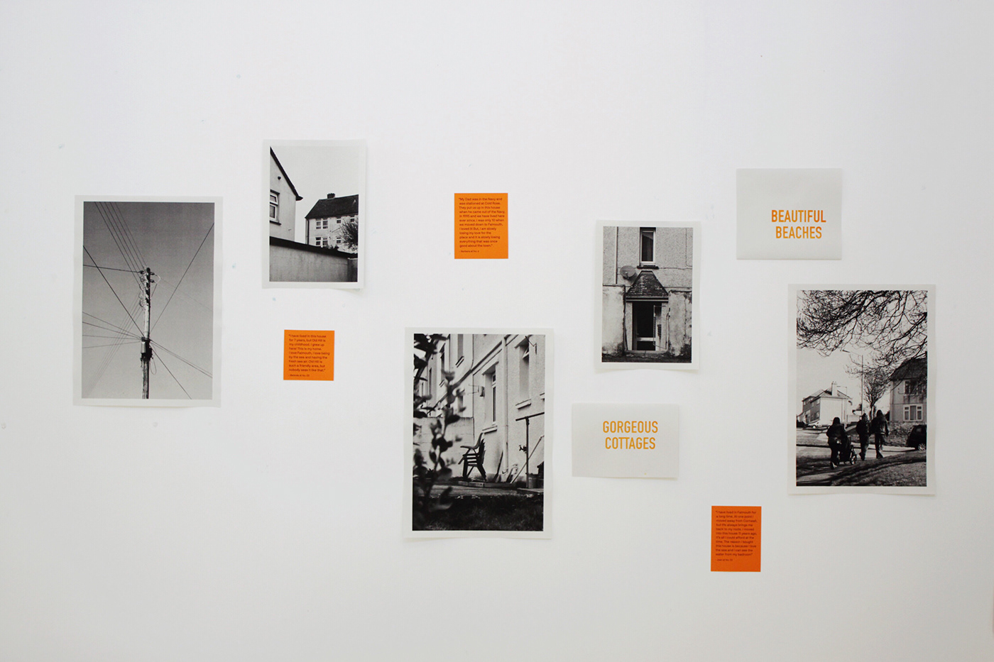
Peppered throughout the publication are a range of quotes personally collated, by me, from handedly interacting with local residents living within Falmouth. This interaction allowed me to ask and individuals responded to the question “How would you describe Falmouth?”. The involvement of these positive statements juxtapose the bleak, pessimistic imagery - framing the focus of the narrative.
Additionally, placed on the striking orange tip-ins, are stories personally collected by myself having spent numerous days in the residential area of Old Hill. Old Hill is the particular neighbourhood positioned in the lower 10 percentile of the most deprived in England. To add a more personal approach to the photographic essay, I spend time connecting to residents, asking about their lives and what brought them to the area. The choice to position these extracts on a visually attractive colour adds life and reality to the publication, that these individuals are the at the Heart of Falmouth.
The black, grey and orange colour scheme compliments the imagery and appeals to the eye - increasing and encouraging curiosity.
Dispersed throughout the publication a selection of images have been printed on a range of paper stocks, which as a result have produced different textures and appearances, in particular on the dark grey and orange card. The dark grey imagery creates a interesting 'light illusion' (as shown below VIDEO).
(above) video providing a full 'flick through' of the publication


____________


(above) example of publication spreads, scanned.


(above) stop motion of a selection of spreads.
Once reading has concluded, individuals are invited to take a postcard, positioned alongside the publication in a perfect-bound ‘pad’. The bound nature of the pad allows for ease of tearing and removal from the remaining bulk.
The act of printing the unappealing imagery onto postcards begins to combat the postcard ideology of Falmouth. The stereotypical picturesque beaches and quaint streets have been replaced by my collection of opposing photography.
The accompanying use of candy-cane paper bags replicates those commonly received in souvenir shops when purchasing postcards and holiday merchandise. The publication title has been screen-printed onto the bags and a selection of postcards showcase screen-printed juxtaposing quotations, linking with those within the publication itself. The simple act of sending and receiving the postcards will highlight the two-sided stories towns and cities can have.
Individuals are finally encouraged to upload and continue this message onto social media under the hashtag #besidestheseaside.
The colour scheme is continued entirely throughout the ‘range’ - from the publication, to the postcards and the paper bags, to the final exhibition space.
Individuals are finally encouraged to upload and continue this message onto social media under the hashtag #besidestheseaside.
The colour scheme is continued entirely throughout the ‘range’ - from the publication, to the postcards and the paper bags, to the final exhibition space.


(above) a selection of scanned postcards, accompanying the main publication.


The Exhibition
To conclude our 4 weeks of photographic exploration, we collaboratively curated an exhibition, entitled ‘Nowhere’, which showcased a culmination of our individual uncovered stories and narratives of Falmouth. We decided upon a consistent use of fleuro-green to act as a navigation system, way-finding and as a strong, impactful identity, capturing the attention of an audience.
Each individuals collection focussed on different perspectives of the area and displayed enhanced skills in photography, self-publishing and curation design. We each showcased a selection of our favourite images, combined with a publication created in response to the work collated over the 4 weeks. We were challenged to display our work in an immersive manner, which would enhance the experience for the audience.


(above) advertising positioned around the University.


(above) fluero-green tape used to typeset 'NowHere' the title of the exhibition (not my best kerning)


Exhibition Space: The Wall
My personally designed exhibition space focusses upon the notion of the unseen and what lies behind the facade. By positioning my work out of the highly trafficked locations, the audience is forced to search for the work as a response to the imagery.
The photographs have been placed lacking any sort of uniformity, alongside the addition of orange quotation captions and screen printed statements, which enhances the message, adding further meaning and reflecting the appearance of the publication.


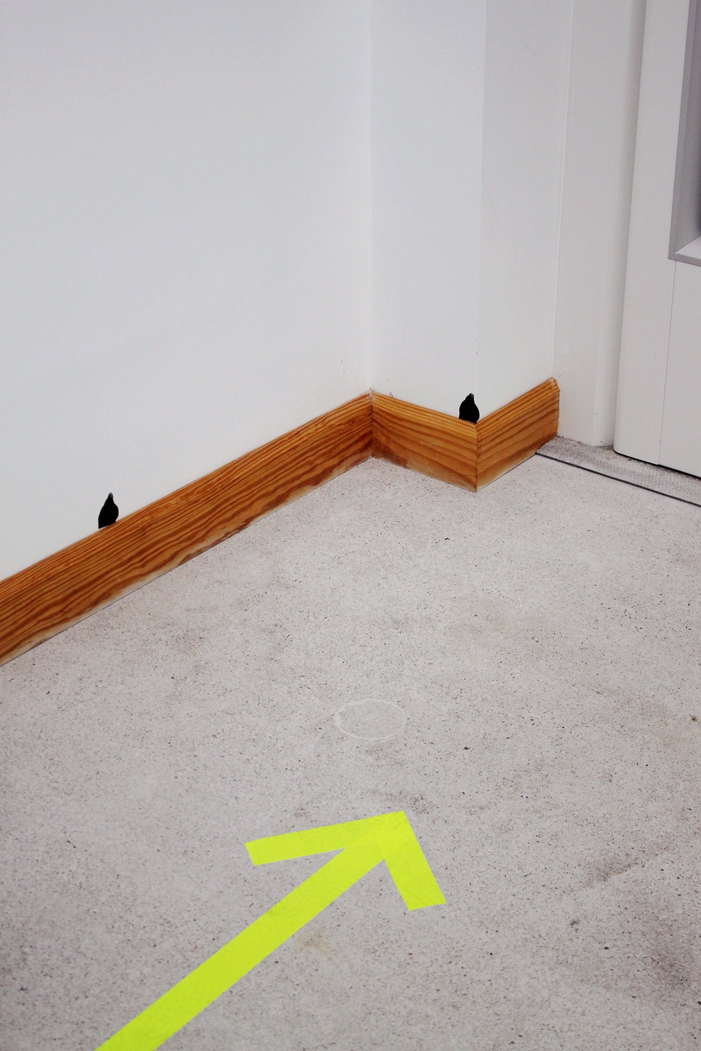
Exhibition Space: The Lift Experience
The audience is naturally lead towards the glass lift, situated to the right of the exhibition wall, assisted by the fluero-green arrow; where my work continues to be displayed.
With the imagery being focused upon going behind the typical postcard ideology and facade of Falmouth, the use of the lift allows for individuals to literally be taken behind the facade of the exhibition, into a normally unused, unseen and unrecognised space. The audience can consequently travel up and down, experiencing the photographs in an alternative way, different to the typical exhibition experience.
(view experience below)


___________
To conclude this project I wanted to say a huge thank you to both Steve House and Nick Raven at Falmouth University for this wonderful experience and project over the past four weeks. Additionally, I want to thank everybody who came to view the exhibition, it was wonderful discussing and networking with students from alternative courses and members of the public!
Finally, thank you for viewing this project!
(be sure to check out the full photographic collection here)
xx


