


The Story
After 2 years of running around the Wairarapa, Ben Bergeron from Mission Farriery decided he finally needed to sit down and put together a website, and part of that meant putting together a logo.
From the get-go, Ben knew exactly what kind of style he wanted for his logo, with the keywords "Traditional" and "Old School" front and centre. As his trade is Blacksmithing and Farriery, he wanted to keep to the traditions usually associated with that, while also wanting to be instantly identifiable with his clients. A simple greyscale colour scheme was all he wanted, and simplicity was key. We decided to play on the symbolism of the horse shoe being easily recognised, and and also being a lucky charm for many.
We sat down over a couple of hours and hashed out a few ideas. From originally only wanting to stay with a text-based logo, we ended up with a clean, simple, adaptable iconic based logo.
Even though he claimed he had no creative bone in him, Ben was great to work with, bringing some awesome ideas to the table in the journey to the final brand design.
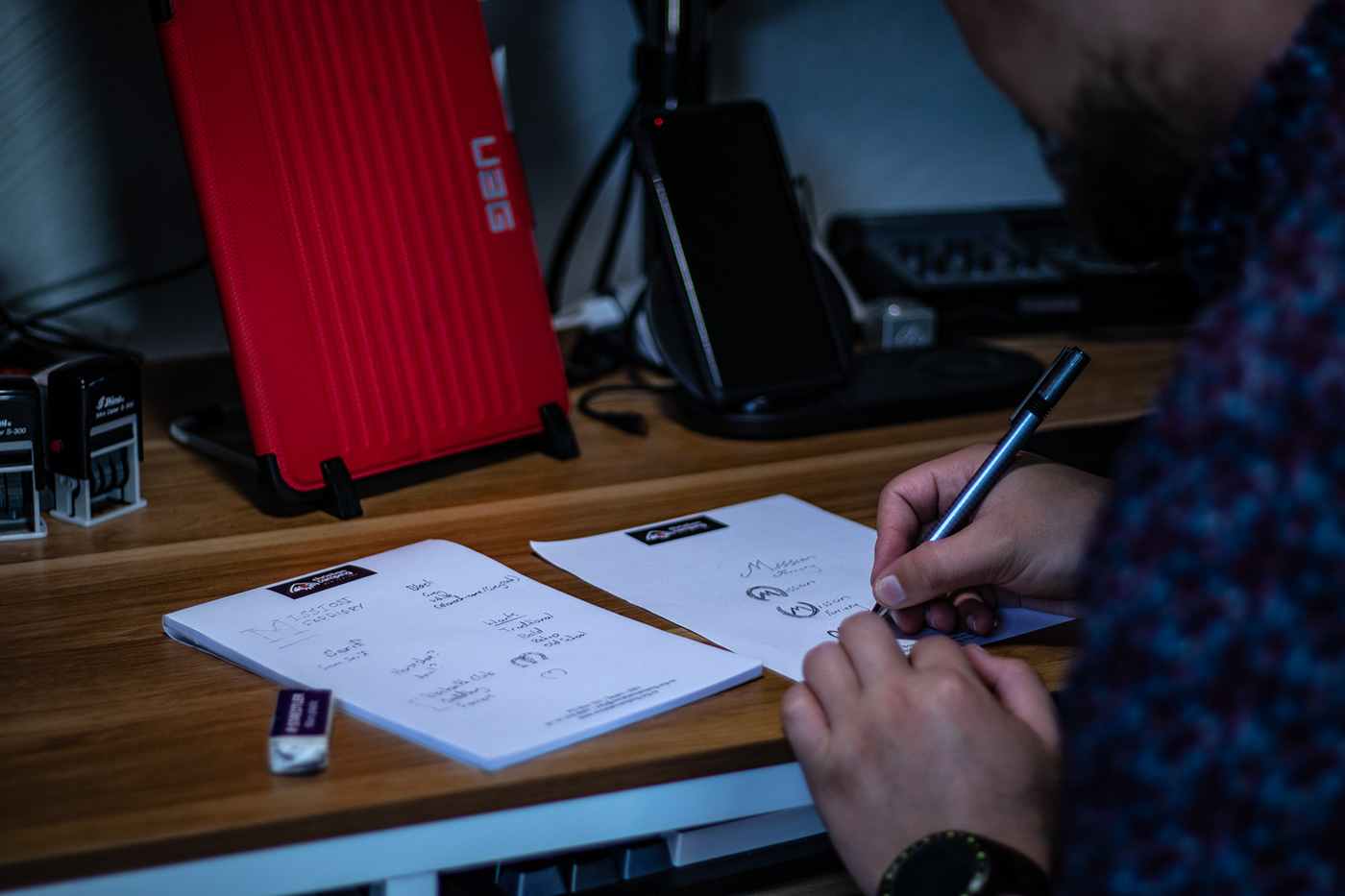
Some of the initial notes and drawings for the logo design

Playing around with some different colour options on Adobe Colour (originally Kuler)

Our final core colour choices. We decided to keep it a simple greyscale scheme, allowing for more colour options where needed in the design.


Choosing a font for the secondary words

Our final font choices

Some of the different logo versions for each division. I try to always have a "colour" version, black version, and white version for all my logos.


If you would like for me to help you design your logo as well, check me out at www.dpdesignz.co.nz and contact me today. I'd love to work with you!
Thanks for reading!


