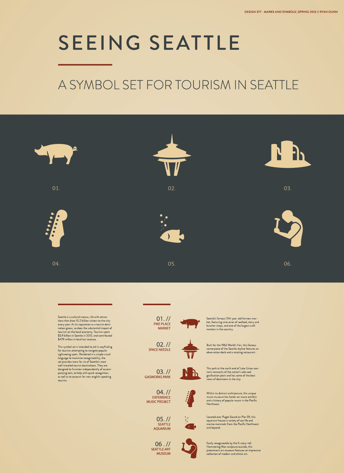
The challenge: develop a set of symbols for a variety of tourist attractions in Seattle, to be used on tourist maps, signage, etc. In order to be successful, the symbols needed to be legible at large and small sizes, and easily recognizable to people who have never been to Seattle.
As a native Seattleite, I quickly encountered difficulty when I realized that my visual perceptions and preconceived notions about Seattle landmarks were based on my familiarity with Seattle culture and lore, and could potentially be meaningless to a tourist. My original renderings of the Hammering Man, Gasworks, and Pike Place were highly abstracted and less tangible, relying on distilling the landmarks into a single element representing the whole (an abstract tangle of pipes for Gasworks, a fish in motion for Pike Place, a hammer for the Hammering Man, etc.). It became clear that to get them to work, I would need to take a slightly more literal approach, and strike a balance between symbolizing the landmarks and accurately portraying them.
After a healthy amount of research and testing on native Seattleites and transplants alike, the solutions became simplified and iconized illustrations that incorporate enough detail to be distinctive and recognizable while still retaining enough simplicity to be visually cohesive and reducible.


