Arvand
Beyond Comfort
Established in 1985, Arvand today is a role model manufacturer which offers energy-efficient heating and cooling solutions. The style of Arvand represents Authenticity and Reliability, combined with Modern and Cutting-Edge capabilities.

Design Basics:
Inspired by their deep roots in state-of-the-art technology, we founded our design approach to represent their authenticity and novelty in a clear and elegant way.
Inspired by their deep roots in state-of-the-art technology, we founded our design approach to represent their authenticity and novelty in a clear and elegant way.

Redesigning the old Logo:
Arvand team asked us to redesign their old logo and give it a new look and sense while keeping its original roots and implications.
Arvand team asked us to redesign their old logo and give it a new look and sense while keeping its original roots and implications.

Structure & Proportions:
The logo is composed of three elements. The icon of air-conditioning, the Ying-Yang symbol and the letter "a" from Arvand name.
It represents the work field of Arvand (air-conditioning) along with the continuous innovative character of the brand alongside its originality and long history (Ying-Yang symbol).
The base structure of the logo is inspired by Fibonacci mathematical proportions (golden ratio).

Tagline:
The tagline is made of two words that each one of them implies the specific elements of the brand to bring to mind certain values and characteristics of the company.
The tagline is made of two words that each one of them implies the specific elements of the brand to bring to mind certain values and characteristics of the company.
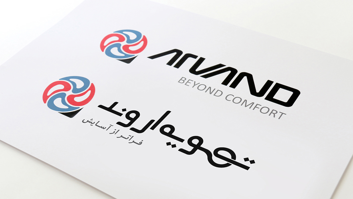
Logotype Family:
We designed both Farsi and English logotypes harmoniously to give them a family.
We designed both Farsi and English logotypes harmoniously to give them a family.

Visual Identity & Style:
Alongside logo, we created a visual system to communicate the core concept and feel of the brand.
Alongside logo, we created a visual system to communicate the core concept and feel of the brand.


Brand Guidelines:
To help the brand consistency, we delivered all the design guidelines through Arvand Brand Bible.
To help the brand consistency, we delivered all the design guidelines through Arvand Brand Bible.

and Arvand continues being & doing great ...


