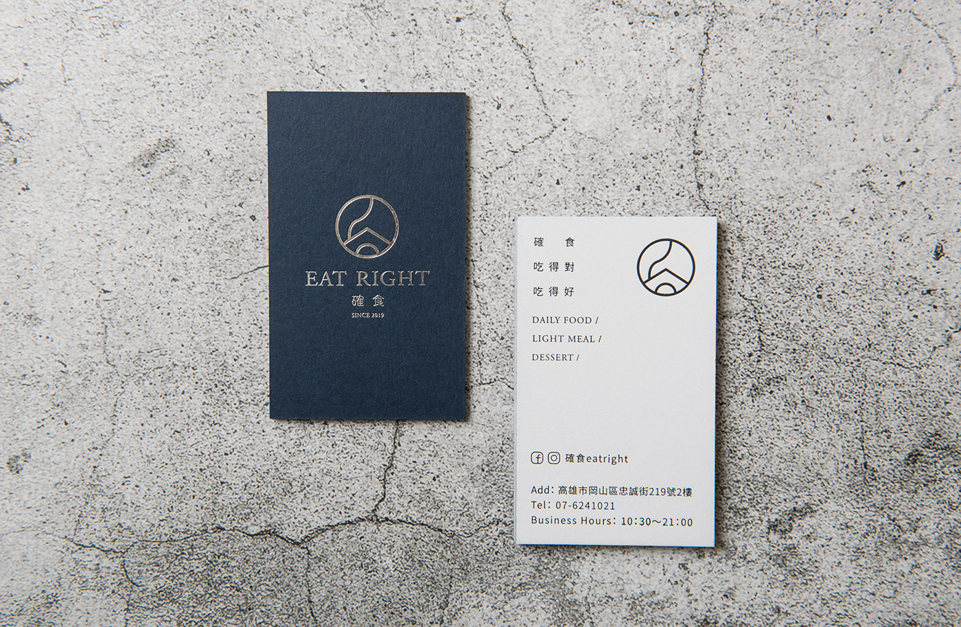
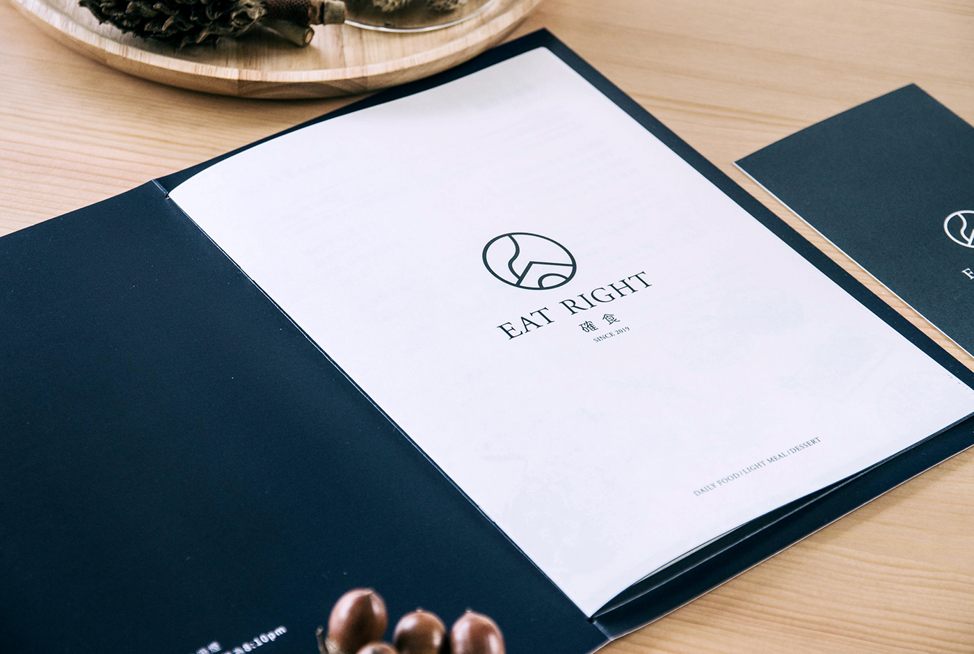
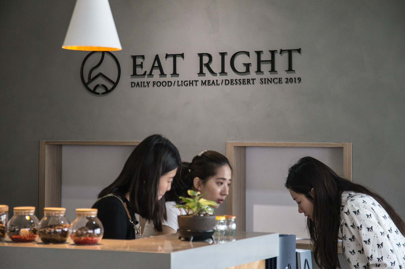
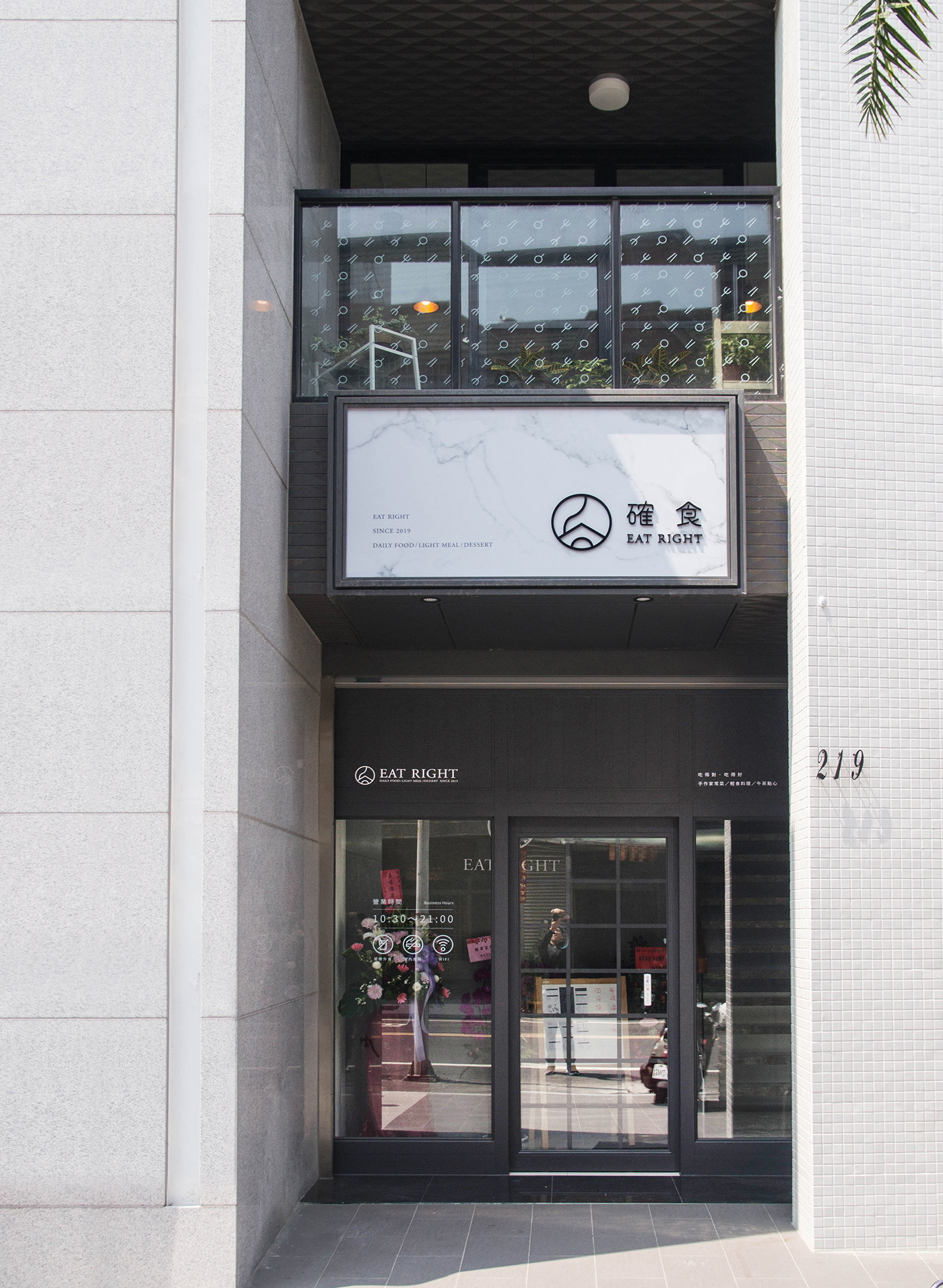
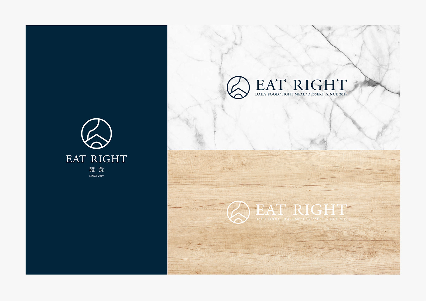
料理的靈魂來自於觸動,是令人讚嘆的認同,更是劃開回憶的漣漪。以餐盤的意象作為圓形輪廓,象徵家的斜頂屋簷和戶的窗口作為元素符號,一絲裊裊屢煙則表示即將開飯的提示。圓,有團聚之意;斜頂不只是屋簷,更是漢字「食」的上蓋。確食,「吃得對、吃得好」,團聚,享用每道入心的料理。
Soul of Cooking is originated from a sense of touch. It is amazing identification, and even the ripples that cleave our memory. The image of a round dining plate is employed as the circular shape and as the signs and elements that symbolizes the eaves with the slanted roof and the windows of the house . Smoke curling upwards signifies it is going to have dinner. As circle carries the meaning of getting together, the slanted roof does not merely mean the eaves, but refers to the upper lid of the Chinese character “食” (eat, food). Certainly, the dining restaurant “Eat Right” upholds the concept of “eating right, eating well” while people getting together to enjoy each dish of man’s heart.
Client:確食
DA:SIANG SINN DESIGN
DA:SIANG SINN DESIGN
Design:王柏偉 Bo-Wei Wang
Date:2019.03

LOGOTYPE


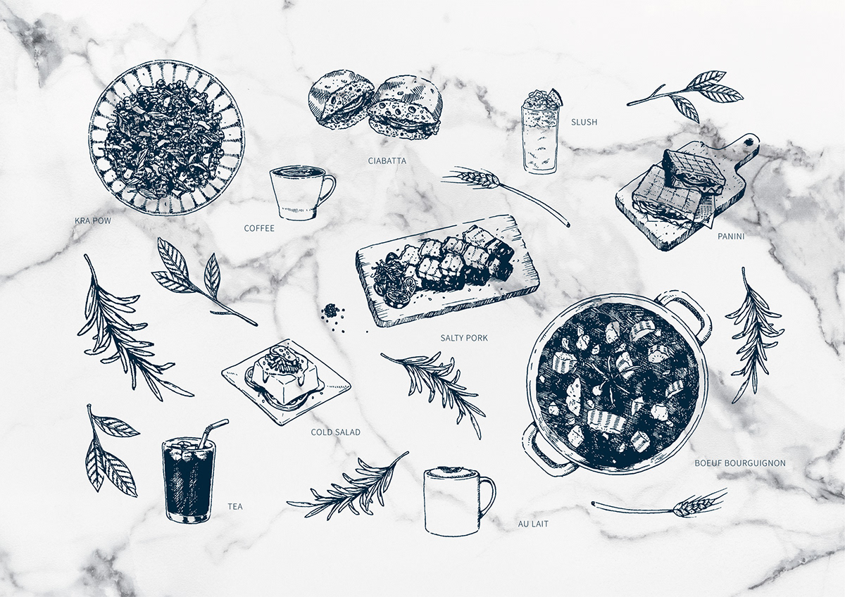
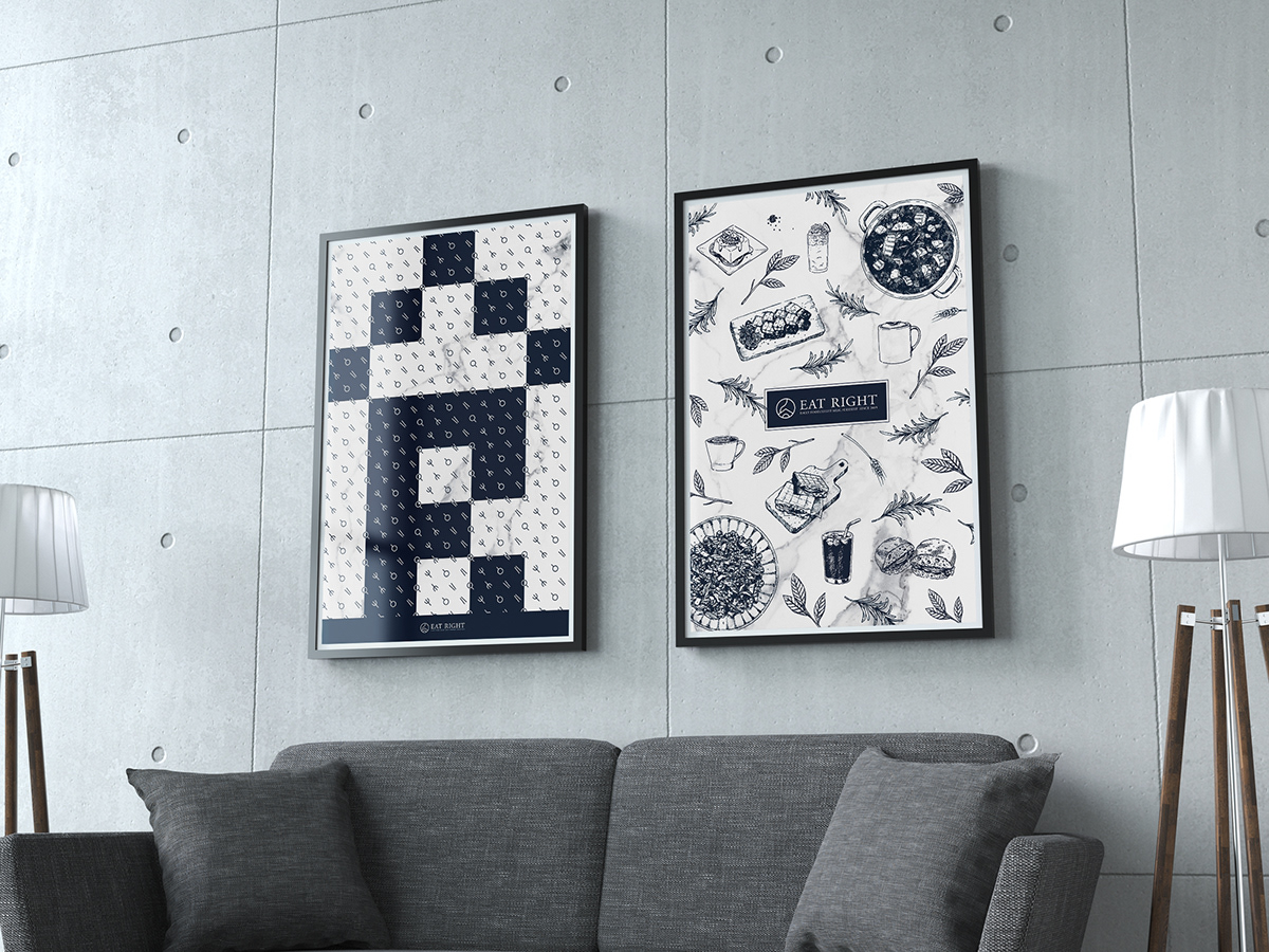
illustration
PATTERN


其他視覺應用
GRAPHICS DESIGN & EXTENDED PRODUCTS