


1. Understand the Problem
2. Research and Investigate
3. Generate Possible Solutions
4. Select AND DEVELOP Best Solution
5. Model and Prototype (Create)
6. Test and Evaluate
7. Produce

1. Understand The Problem
I like how this cover includes the computer windows open in the background which relates to the topic as it's about living in a virtual world. I has different colors for each of the windows and sits on a black background which helps draw the reader. I think that this book is about how things happen in our virtual culture. The multiple windows of each color help draw the reader in and they also give it some 3 dimensional properties in the 2D plane that it exists on.
The purpose of a book cover is to draw the reader in and make the POSSIBLE reader ask a question, for example why something is on the cover and what it means in relation to the story and the title. The reason you are appealing to a possible reader is because your job as a cover designer is to make that possible reader, a reader. The point of a cover is not to tell the reader the story through the cover, or show them a character. This doesn't mean you can't use an important symbol in from the text to help the reader think about what that symbol means.
A good cover will draw the reader in and make them ask themselves something, maybe they ask themselves why something is on the cover or it may help catch the reader in. It also could form some sort of meaning or symbol for the book. A bad cover will tell you what the story is about, or possibly have absolutely nothing to do with the book at all.
I will be creating a front, back, and a spine cover for a book of my choice.
The Book I'm choosing is Lord Of The Ring's: The Two Towers
Requirement's:
1. Title
2. Authors Name
3. Defining Graphic, that can communicate abstractly
4. (On The Back) A summary of the book, callouts for the back, publisher (logo and name), and then an optional ISBN number and UPC
5. Inner flaps, one about the author, and the other is the opposite of the back (ie. back is callouts, then the inner back flap is a summary)**Optional**
2. Research and Investigate
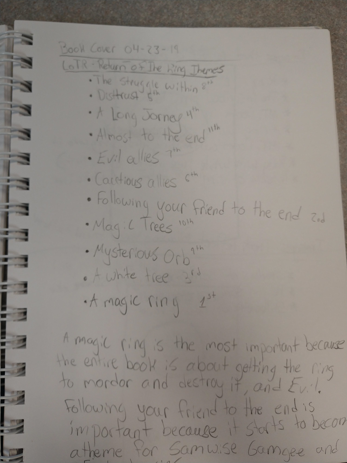
The book the is the Two Towers and it is in the Lord Of The Rings series of book. It is actually books 3 (the treason of Isengard) and 4 (The ring goes east) from JRR Tolkien's original chronology, but due to paper shortages at the time of publishing, as well as cost, Tolkien merged the original books 3 and 4, and made it book 2, of the now 3 lord of the rings books. The two towers, as referred to in the title are Orthanc and Barad-dur. The title symbolizes the alliance between the two towers, or really, Saruman's alliance with Sauron. The book has been translated into 38 different languages and wrote 15 different languages for his books. Tolkien based his books off many different things including his personal experiences from world war one. The biggest symbol in the book is the ring, specifically Sauron's ring, and the text of the ring says "One Ring to rule them all, One Ring to find them, One Ring to bring them all and in the darkness bind them" this could be used as a possible design idea as it has great meaning.
3. Generate Possible Solutions


4. Select and Develop Best Solutions


5.Model and Prototype (Create)

Here at the first screenshot from April 30th, I am using a basic font with the basic color, just to help generate ideas about font and color. Based on my best solution from stage 4, I am going for a simplistic and symbolic look. I'm trying to communicate the war for the ring with Gondor, the good forces, on one side and mordor, the bad, on another. At this point I just have the Tree of Gondor. I created a gold looking, gradient for the ring in Illustrator. Moving forward, I'm going to start on barad dur, the tower from mordor, and look for a font for the title and the authors name. The plan for the authors name is to have it large and in gold at the top and the title, smaller and in silver at the bottom of the cover. The Back is going to include a quote from a character in the book, most likely the one i used in my final draft from part 4.

May 2nd, Spent the day refining the fonts, and gradients, and now i will be moving on to the back cover, and then the spine. The spine will include the title and just 'Tolkien' for the authors name, and possibly the JRR Tolkien symbol.

Decided to go with a navy blue background because I think it compliments the gold and silver really well. I added the Title, in the same gradient to the spine and added the JRR Tolkien logo. Moving on to the back today and tomorrow and the I will start refining and working on small details. As for current thoughts, I'm brainstorming whether to have barad dur to be white or black on the back...

Added some textures to my cover, including a metallic one to my ring to give it a more realistic look, but I may delete it because it took away the shine of the ring. As for the text my next plan is to make it smaller and more proportional. Then I will move onto isbn and upc

added the isbn and the upc. Now im going to give the ring some texture

Gave the ring some solid texture so it isn't as flat and it also helped make the tree and barad dur stand out more. Also took some feedback from Coulson on the Front title and font as well as the spine title


