

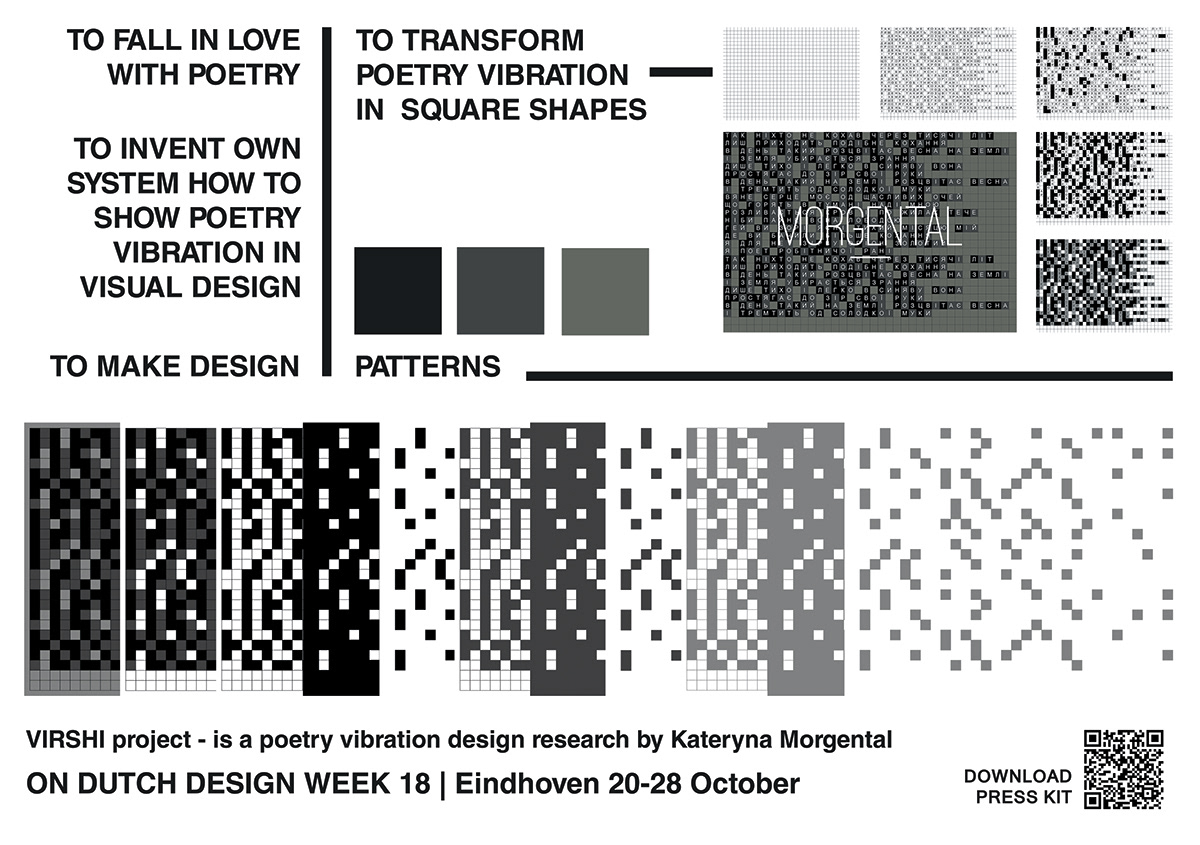
VIRSHI - research project inspired by poetry
This project shows unseen poetry (phonetics) vibration in graphic patterns. I"ll try to explain how it works in few steps.


So, all vowels, consonants and intervals were painted in own color


I made such vibrative gif-invitations for mail sending HTML letters to my subscribers, designers and press to visit our Ukrainian Stand during DDW18.


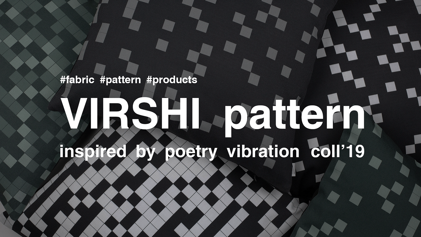
All colors in project represent different kind of feelings in 3 shades of color intense
That is about more than only poetry, it's about that things which are inside and outside us.
For example, monochrome black-gray is basic and neutral pattern
red is more about inside feelings, like love and heart beat
green is about outside things, that surround us, its color of nature
So, you can mix all them or choose only one color


Variety of my searching processes of stand concept in collage sketches. Main idea was to show VIRSHI pattern project printed on different surfaces and materials as fabrics, wallcoverings, rugs and paper postcards... And the hardest was to combine them all.


and every pattern it's a poetry vibrations...


digital printing process at VICOSELI printing company


few photoes from Dutch Design Week18...


Ukrainian designers and curators at MODERN_ISM
Dutch Design Week 2018, Eindhoven, Netherlands


publications in media about VIRSHI pattern project

VIRSHI COLLECTION 2019


VIRSHI COLLECTION at Contemporary Art Centre / Lutsk, Ukraine


____________________________________________
Product design and Art-direction by Kate Morgental
Graphic design by Kate Morgental
Video by REDFISH PRODUCTION ( Anton Ryzhich )
Thank you for your time!
Follow MORGENTAL on :


