
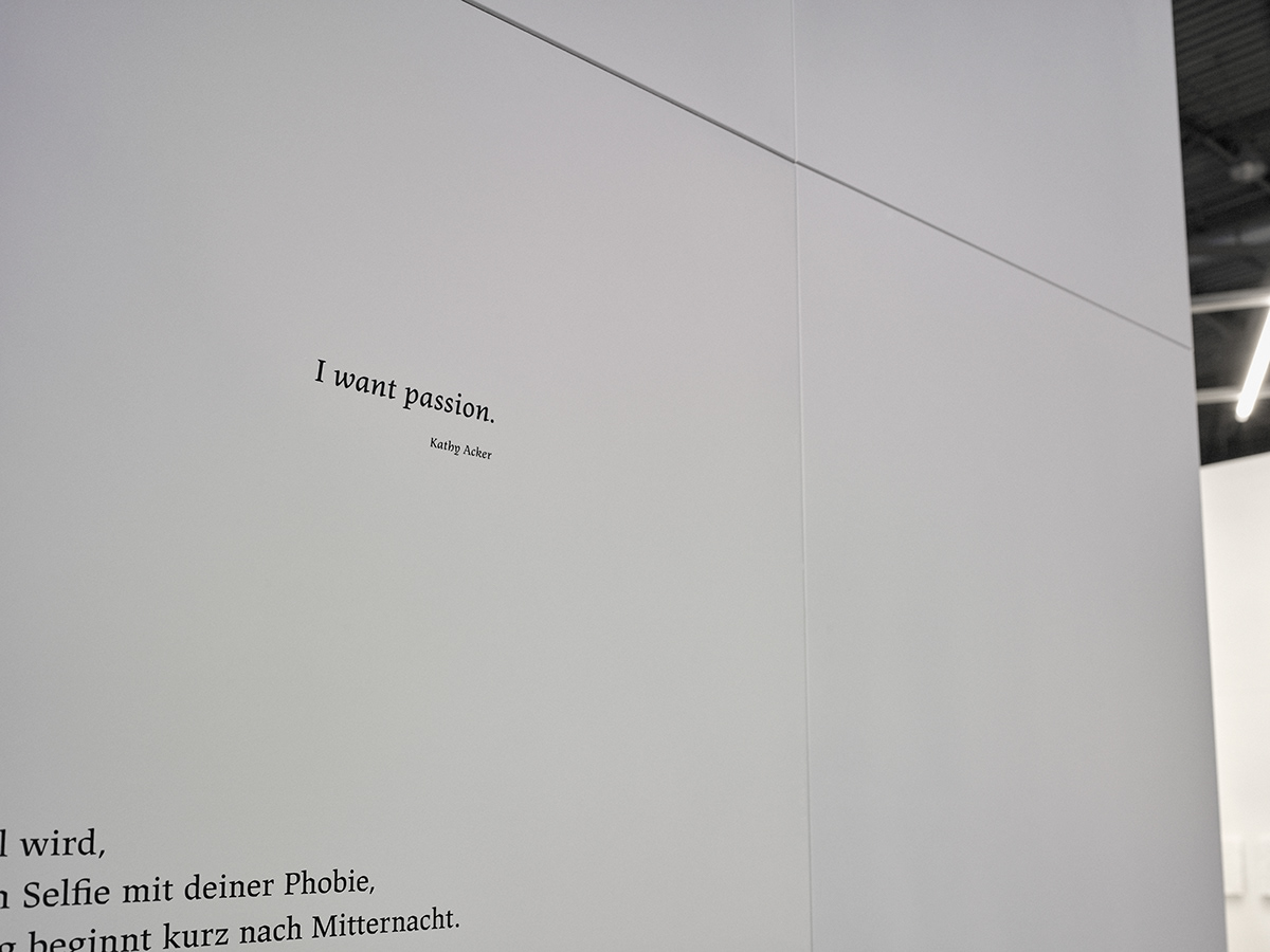
Silence Inside
The labyrinth of spaces that have become visible
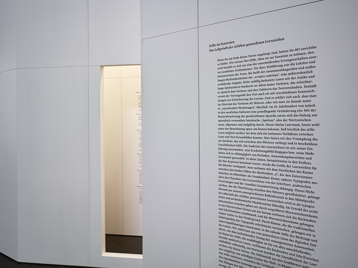
Stille im Innersten
Das Labyrinth der sichtbar gewordenen Leerzeichen
Leipzig Book Fair
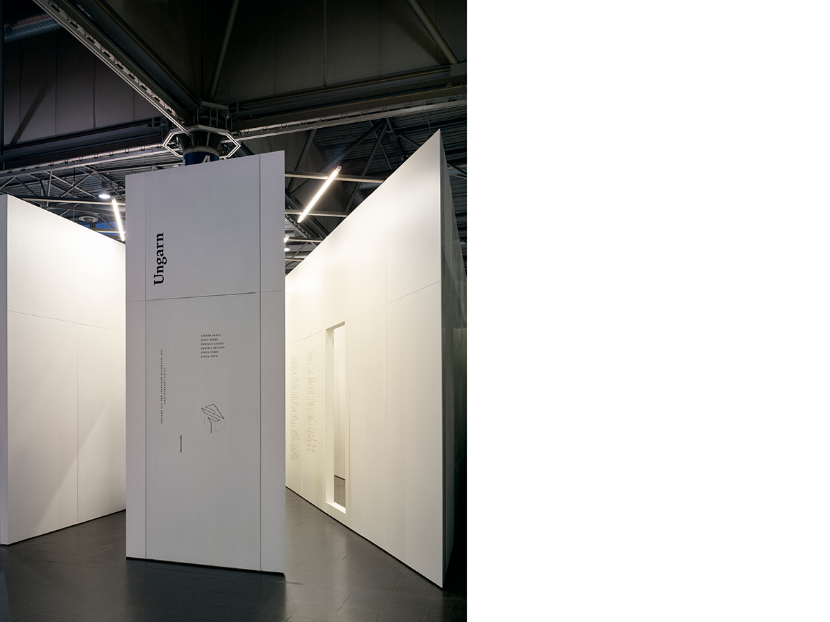
Hungarian Pavilion
Collegium Hungaricum Berlin
2017
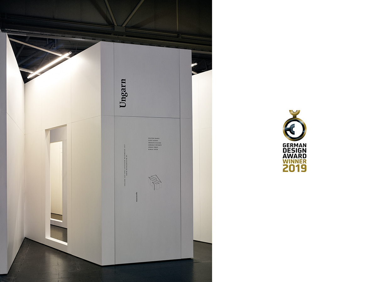
German Design Award 2019
8 February 2019, Frankfurt
Excellent Communications Design – Fair and Exhibition
Winner
Statement of the jury
The labyrinth of fragmentary texts and scribbled blank spaces creates a mysterious atmosphere that interprets the theme of literature per se at a high intellectual and artistic level.
Jurybegründung
Das Labyrinth aus fragmentarischen Texten und gekrickelten Leerzeichen schafft eine geheimnisvolle Atmosphäre, die das Thema Literatur als solches auf hohem intellektuellen und künstlerischem Niveau interpretiert.
By the time you get to the end of this initial text, you will have had 509 invisible helpers. We use this help without noticing it, although it is a significant achievement of Western civilisation. Before its introduction, to read and interpret texts, namely the 'scriptio continua', continuous, endlessly long chains of letters proved an extremely tiring task. It’s no wonder reading was undertaken by reading aloud from texts of ancient times and remained thus for many centuries. That was how text comprehension was made easier for the reader and the listeners, and that was the reason why the reader added all kinds of markings to help reading. It explains the fact that for the sake of convenience in ancient times slaves – or as they were then referred to, ‘talking tools’ – were entrusted to read aloud. However, by the 11th century a radical change had occurred in western culture: with the reorganisation of written language, space, ‘spatium’ in Latin, became generally widespread and eventually ubiquitous, in contrast with its earlier, sporadic use. ‘Space’, as it is called today, facilitated silent reading and a more intimate relationship with the text. The thousand-year-old triumphant progress of the rather hidden, modest character shrouding itself in invisibility is now being celebrated. The function of space has remained unchanged since its introduction, yet its appearance, namely its size, has changed in different periods, as well as depending on the field of application and general taste. In its heroic age, for example in the case of codices to be copied, the size of a space was doubled for the sake of monks. Medieval Cistercian monks calculated with double the distance between the two legs of the letter ‘n’, which served as a fundamental unit. Their successors in typography are putting the space in the service of the typeface, practical requirements and total visual effect. Now the non-character ensuring the transition between words emerges from its subordinated role: it comes to life as a typographical and architectural manifestation in the labyrinth of spaces that have become visible. We proceed through enlarged spaces in the vast architectural fabric, while letters and punctuation marks are decreasing in the literary texts surrounding us and spaces are coming increasingly to the fore. From areas that transpose the traditional emphases of typography we arrive at a chapel-like enclosure, in the sacral silence of retreat and reading. We withdraw from the constant noise of the digital world, from the overwhelming compulsion of continuous presence. In the end, the letters and punctuation marks fade away almost to invisibility and the space-infinity shines like tiny stars on the horizon in the space of silence excluding everything, which is vital for contemplative reading. The music of silence heard in the headphones isolates us from the constant rumble once and for all. In the rooms imitating silence the specific and mystical mixture of the human body’s swelling sounds, heartbeat, murmurs of breathing, as well as the sounds of void creates silence, encouraging further absorption – inner silence.
Eszter Szablyár
The curator’s text on the external wall of the pavilion


Motto
“There is undoubtedly some aesthetic quality in our feeling of nothing:
when we experience nothing we have some kind of aesthetic feeling.
Something is concealed in the structure of experiencing nothing, which at the same time is an accessory to the structure of aesthetic experience.”
Otto Schiller, aesthetician, 1913
Motivation
A written text using the Latin alphabet has a character which is hardly ever mentioned, which is not taken notice of, which does not exist physically, which has no tonality, while it is impossible to read without it and interpret the content of a written text clearly, whether the written words are in a book or on a computer, tablet or mobile. Typographers and book designers often talk about the chubby belly of the letter ‘a’, the beautiful eye of the letter ‘e’ or the hanging tail of the letter ‘y’, and so on. Typographers, who are regarded as eccentrics, have created several thousands of forms for each typographical sign intended for each sound, but the one in question does not gain attention and they do not imagine a shape for it. However, the keyboards of typewriters, computers and smart phones have a key with what is clearly the largest size to ‘present’ it on paper or on the screen. The key for creating this character is ten times bigger than all other keys on an old Mercedes typewriter, six times the size on an Apple keyboard and five times the size on an iPhone screen. This character is counted by the character count like all the others, yet it does not have a body.
This is our character:
spacium,
a blank,
a space,
Leerzeichen.
Spacium in writing ( ) is a gap between two written sections. Spacium which is used to separate words, or a word and a punctuation mark, is commonly referred to as a blank. The key for a blank (and thus the spacium) is often called the space bar, borrowed from the English. Traditions relating to the size of spaces between words and sentences can be different in different languages and in some cases constitute a rather complicated system. Many different keys for space are available on computer keyboards to express different sizes and meanings.
Hungarian uses a standard space for separating words. Latin writing did not use spaces until the 7th-9th centuries. Yet Old Hebrew and Arabic used spaces partly to compensate in meaning for the absence of marking vowels. Traditionally, spaces are not used in CJK languages – modern Chinese and Japanese still do not use them, although modern Korean does.
Spacium is the nothing without which the something cannot exist
We would like to research the typographical and architectural approaches and connections of absence, space, air, immobility and silence in our work.
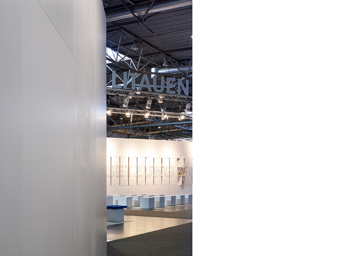
The Hungarian Pavilion at the Leipzig Book Fair erects a memorial to Nothing, which plays a vital part in interpreting a written text.
What is invisible becomes visible, and what is visible gets eliminated in the background. The realized concept connects the most innovative proposition of the organisers of the Hungarian Pavilion at the Leipzig Book Fair, Collegium Hungaricum Berlin – the Hungarian pavilion should be the space from among the thousands of stands full of shelves and books where, as an absence, a work, a book should not be represented as an object to be displayed. The organisers who invited the tenders themselves stipulated the need for space and interspace at the Leipzig Book Fair.
“Every stand at the Fair offers visitors the same: a selection of the publications of recent years from a specific aspect. Yet, due to the stipulations of the organisers, it is impossible to make purchases. In order that the Hungarian stand would leave a lasting impression with visitors and become an attractive target, excelling from among the several hundred other stands, we must use different tools: instead of a stand with books, we would like to offer an experience for the participants of the Fair.
The fundamental point is that the Hungarian stand is not an ‘exhibition of books’, but an experience responding to the situation, genre, literature and the object, an experience that gains distinction from the chaos of the Fair. It attracts visitors due to its position, appearance and features. It promises something different in its visuality and presents something different in its content. The stand can extend the Fair’s basic character and key words of content such as book publication, literature, science and the Hungarian nation with new befitting but innovative meanings, such as innovation, digitization, interdisciplinarism, experience, audiovisuality, etc.”
Extract from the brief call for tender by Collegium Hungaricum Berlin
The absorption of books and literary works with truly immersed content requires silence, positive solitude and a certain introspection. Stille im Innersten (Silence Inside) is a structure ending with an architectural enclosure where the rumble of the exhibition hall fades and dies away. It becomes suitable for perceiving silence, where the spaces in the selected Hungarian literary works placed on the external shell and internal layers appear and shine in the interior.


A series of spaces – interspaces: a labyrinth
How can we describe the invisible, something between things? First of all, the necessary tools must be clarified. The German word Hülle (cover, shell) primarily expressing the creation of space helps interpretation. Hülle, umhüllen mean a kind of covering and concealing. The etymological meaning is attributed to headscarf, consequently its character does not express volume but something that is two-dimensional. The interpretation of space, including the surrounding shell in modern architecture (Raumkunst), has become widespread, in contrast with the 19th-century notion (Baukunst).
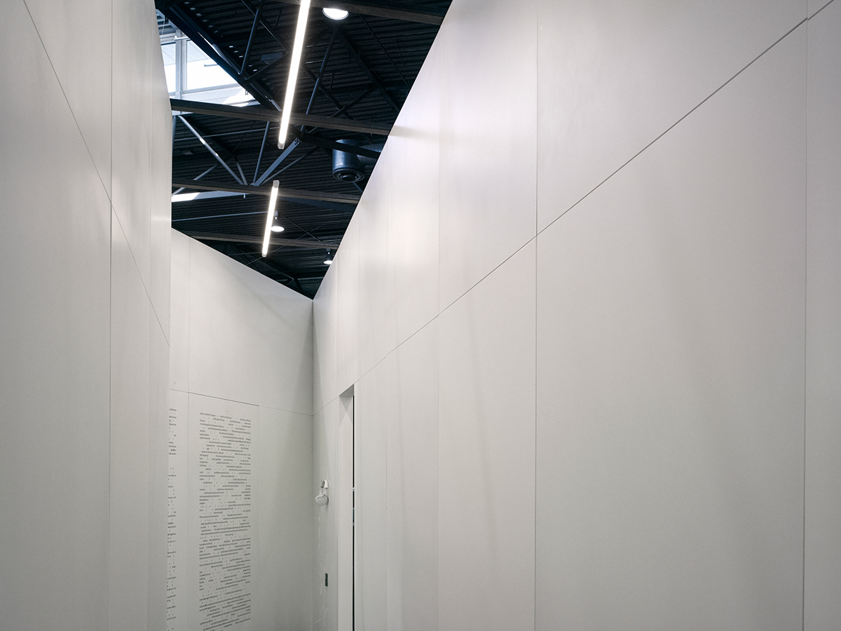
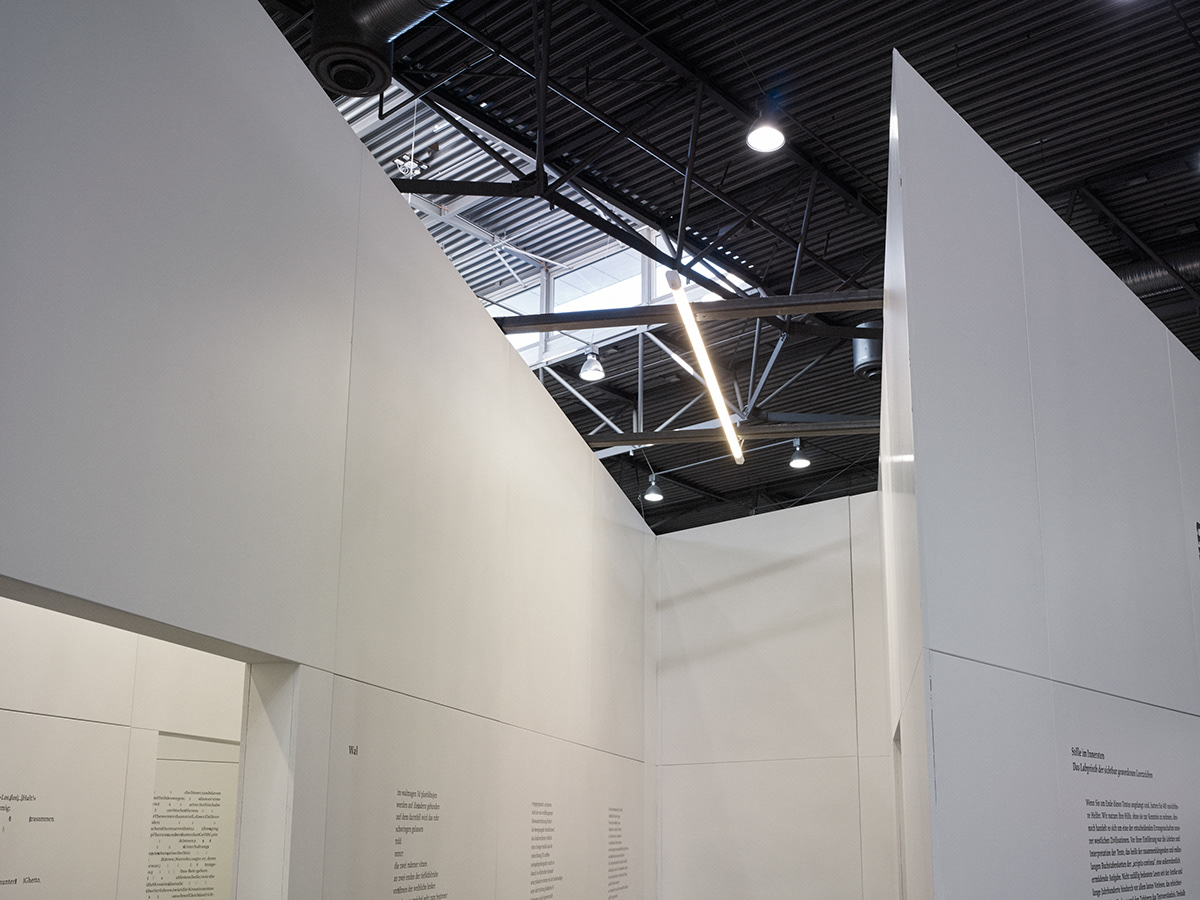
Thus the invisible can be expressed by its opposite, the visible, the tangible. Its dimensions can be regulated by the arrangement of its shell. In order to make the ‘in-between things’ expressive, a simple shell is most suitable, for example a simple linear wall of identical thickness, which does not divert attention from the ‘in-between’ and does not attract the eye more than necessary. It does not become emphasised. At the same time, walls together produce an effect of volume. When walking among them they function rather as boundaries to space, as a counterpoint to volume.
According to what principle should the walls be arranged in order to express architecturally the complexity which is represented by space in printed texts so that it would provide a multilayered – tactile, kinaesthetic, acoustic, visual and, last but not least, intellectual – experience for visitors to the Hungarian pavilion at the Leipzig Book Fair?
Our answer can be deduced from a system of a five-thousand-year old space, a symbol which is present in every culture, often with different (varying over time) meaning; it is
the labyrinth.
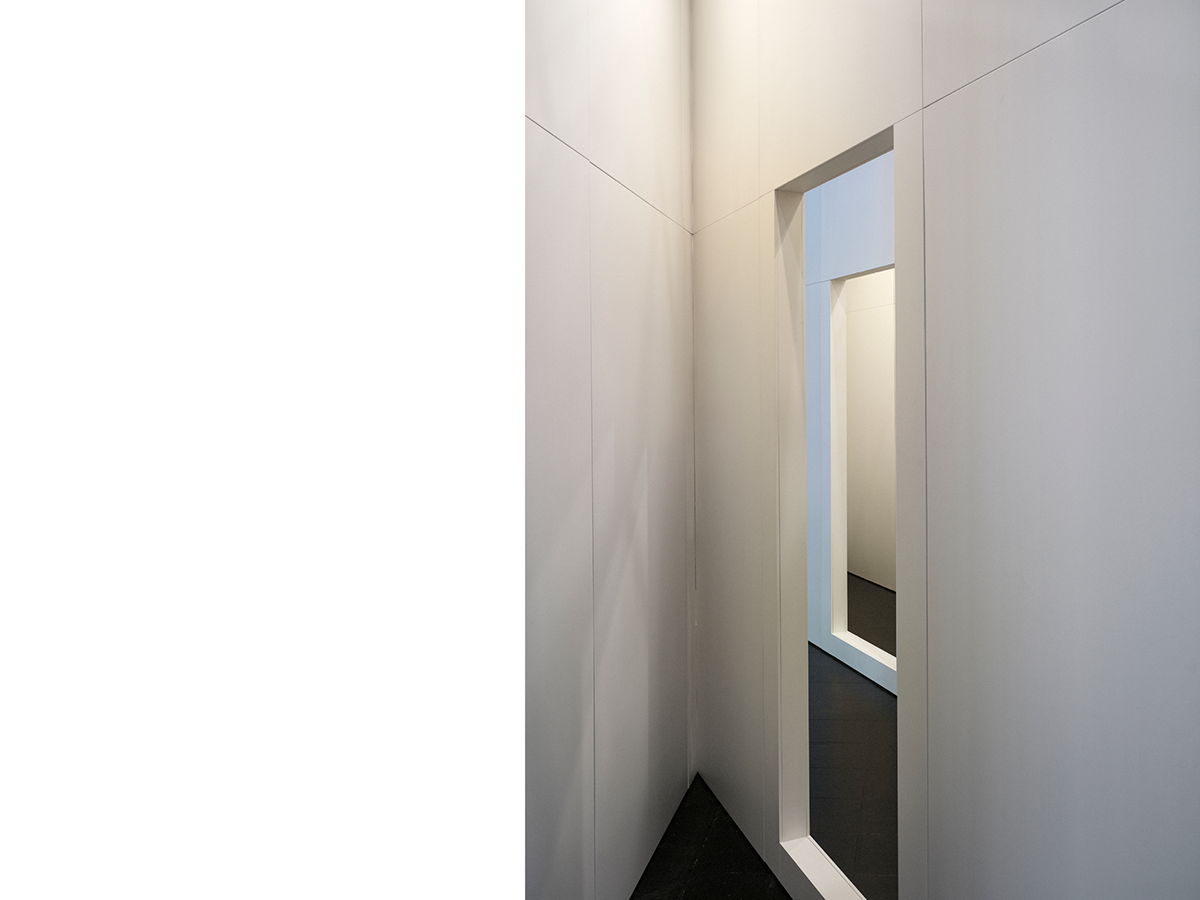
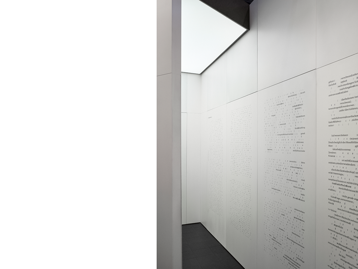
A space does not present a halt between characters, rather a transition, a division facilitating understanding. The architectural translation of the aforementioned principle points in the direction of the labyrinth, where the specific dynamics of connected spaces leads the observer. That is how a labyrinth, as a series of continuous spaces and interspaces, becomes an appropriate approach. We have examined geometrical systems which are able to result in the desired complexity in a space of 7 x 4 metres.
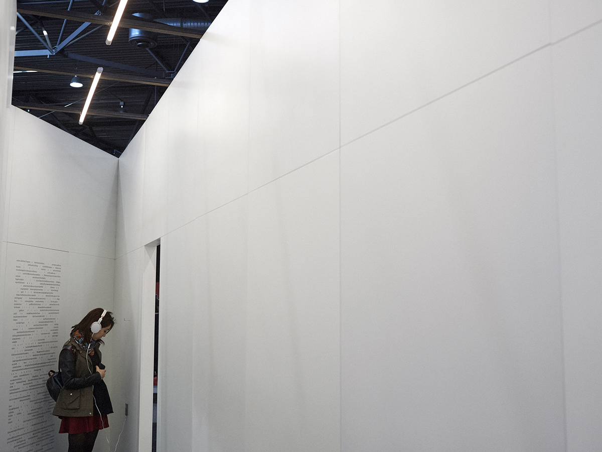
A labyrinth is like a set of steps; it has a pulling force. In the case of steps, human curiosity urges us to ascend, look around and see from another angle. Although differently, a labyrinth entices, we are curious about what the deeper layers conceal. Our desire to learn something new drives us. Labyrinths were traditionally created on powerful geometric lines. Our principle of construction was based on a right-angled grid of triple division, which was fused with a diagonal grid due to the corner situation. Finally we created five segments of space with different qualities, which we connected with door-like openings in the walls in such a way that lucidity was reduced to a minimum.
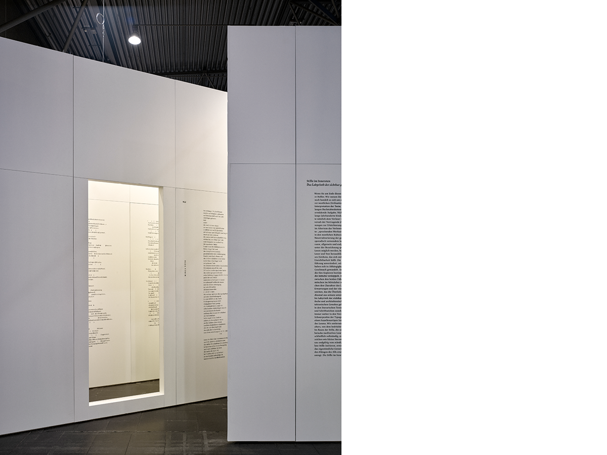
The four labyrinth-like corridors, which are open from above, operate as a kind of buffer zone, unlike the fifth, deepest covered space. On entering the latter the rumble of the exhibition hall fades and dies away. The wall is constructed from sawn and trimmed timber frames (5 x 10 cm cross section) covered with natural chipboard and painted white. It is about 10 cm thick with a height of 3.30 metres. Since it basically has a cavernulous structure, anything which can be held in a ten-centimetre space can be built in.
The space of experience
The labyrinth, a well-known space of experience, expresses the aforementioned qualities. The ribbon-like construction stands tall over the exhibition stands but does not try to show off its monumental power. It cannot do that since
Nothing is invisible,
Nothing is hiding,
Nothing is unnoticed,
Nothing is soft,
Nothing is white.
We, who created the pavilion, consciously leave questions open. The conscious use of the public’s imagination is one of the strongest structural elements of our concept about design. Visitors can have many different associations about the ensemble of spaces. The angles created by the continuous walls may remind them of the relationship of pages when turning the leaves of a book. A walk in the labyrinth may provide the experience of wandering between the lines on a page when jumping some spaces (interspaces) and taking a peep at the next line. Visitors will walk around one another to some extent, although two people have enough room, one of them still has to turn sideways. There is something exhilarating about it, as people have to get close to each other, and play games with one another. We think it is an experience-like relationship.
In the pavilion’s next layer the space-gap-line has an area of tranquillity where filtered noise, almost complete silence, can be reached amidst the cacophony of the fair. We compare isolation, which is vital for reading, with sacral perception. We have employed the word ‘chapel’ for the architectural enclosure.
The analogy of the emphatic central space
Raising the problem is what we experience today: the time has come when everyone must create his/her own empty sign, empty space, which an individual, a reader, enters and escapes to from time to time from the terrible cacophony, the digital noise, the pressure of continuous presence, the compulsion of information and reception into which we have become entangled in the excessively accelerated and smart digitized evolution. A book, a literary work, tangible and smellable paper as a static object in the present time can be companions when we tear away from the compulsion of active communal participation, which continuously expects beeping, buzzing and vibrating reactions.
A book is an arbitrary mechanism – silent reading, comprehension and entering a literary work demand solitude, exclusivity, one-way attention and isolation. “Book and go” is no option here. It is impossible to receive the direction of positive and negative sentiments and emotions connected with the relations of absorbing literary works via social media.
The lasting effect of a work, which becomes built in the personality, succeeds in complete silence.
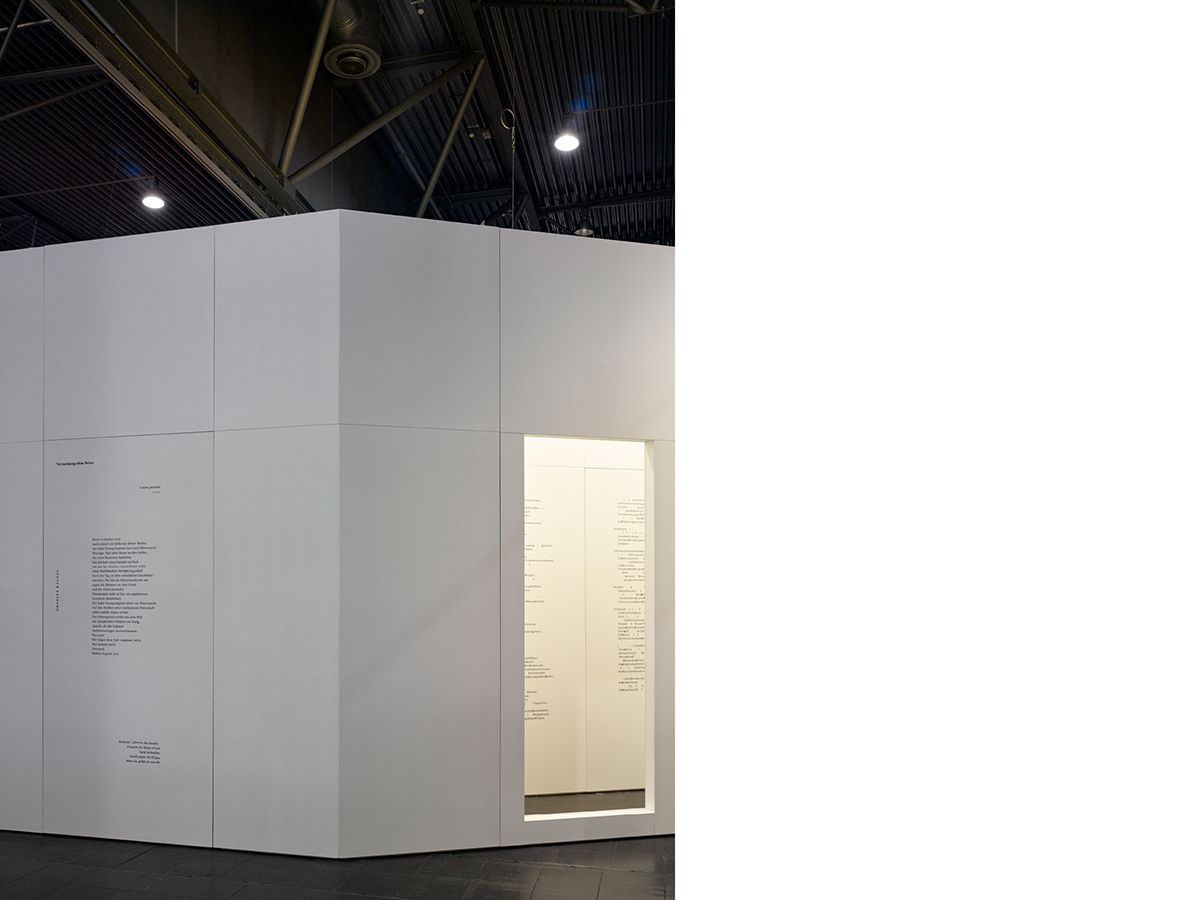
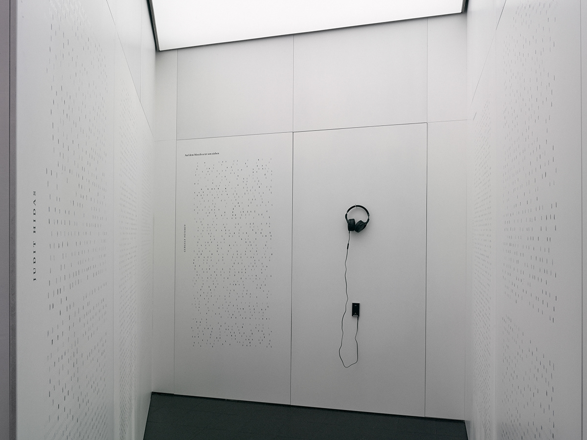
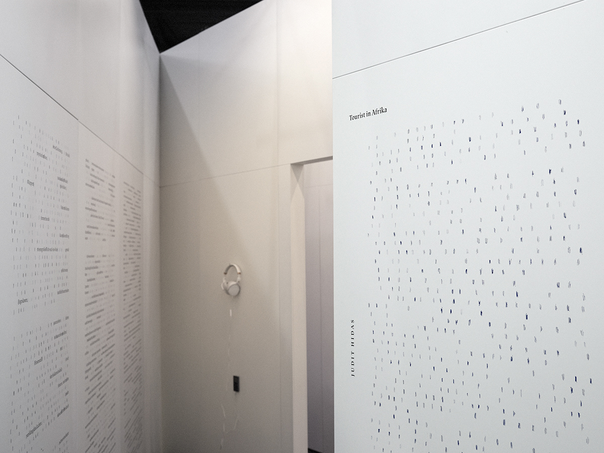
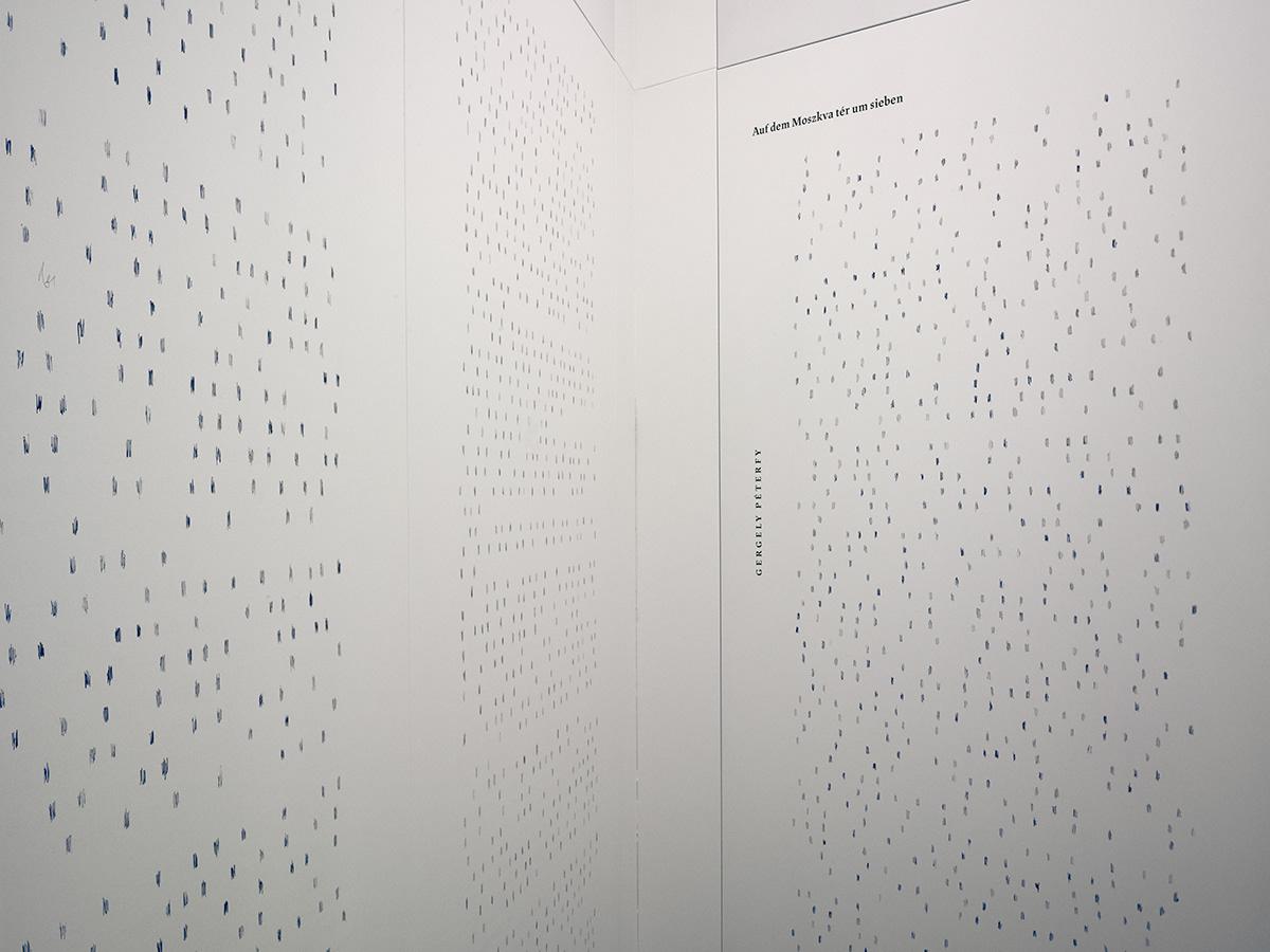
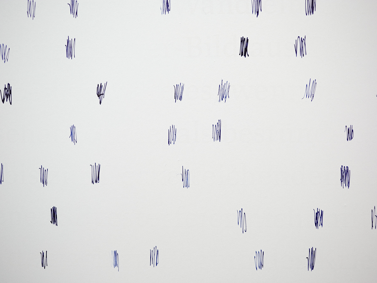
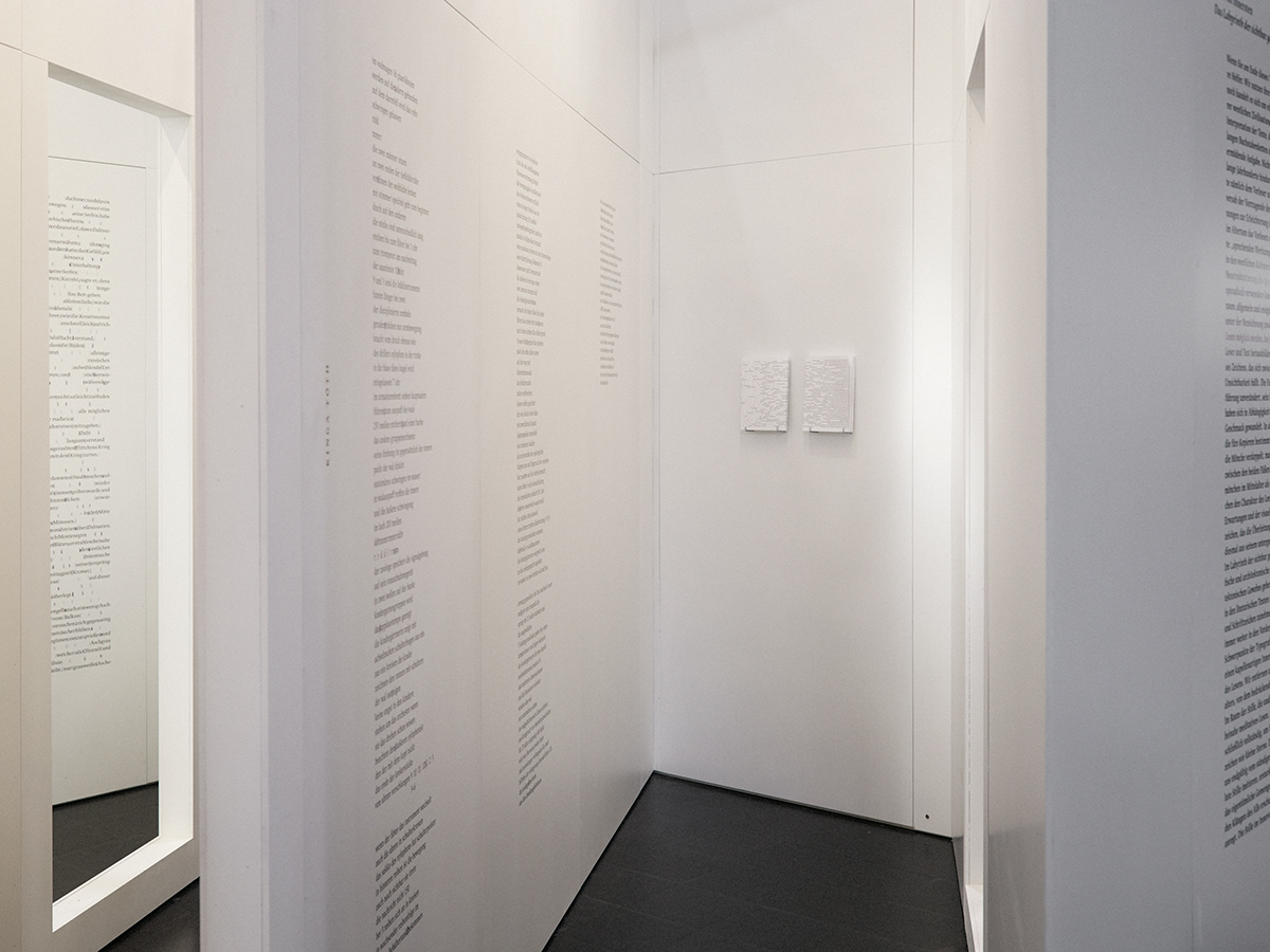
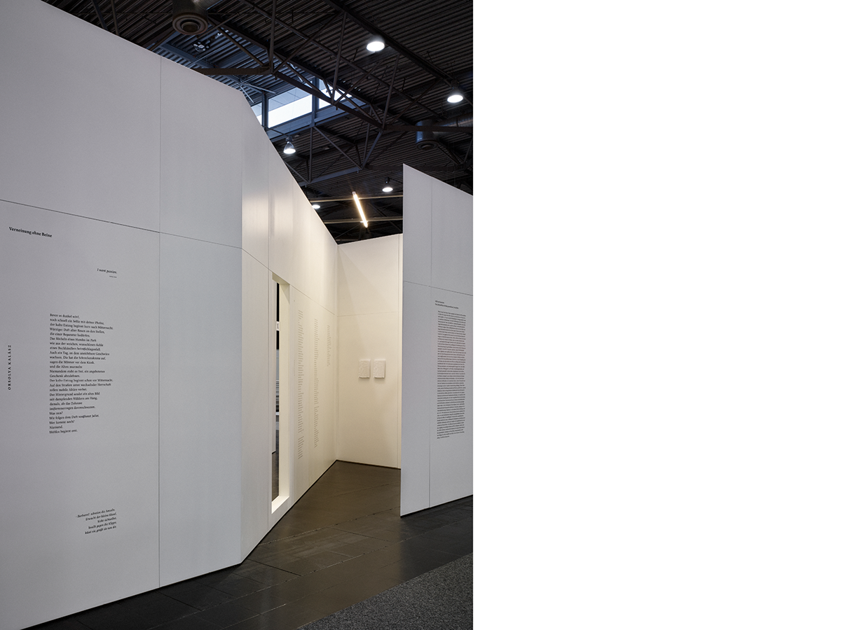
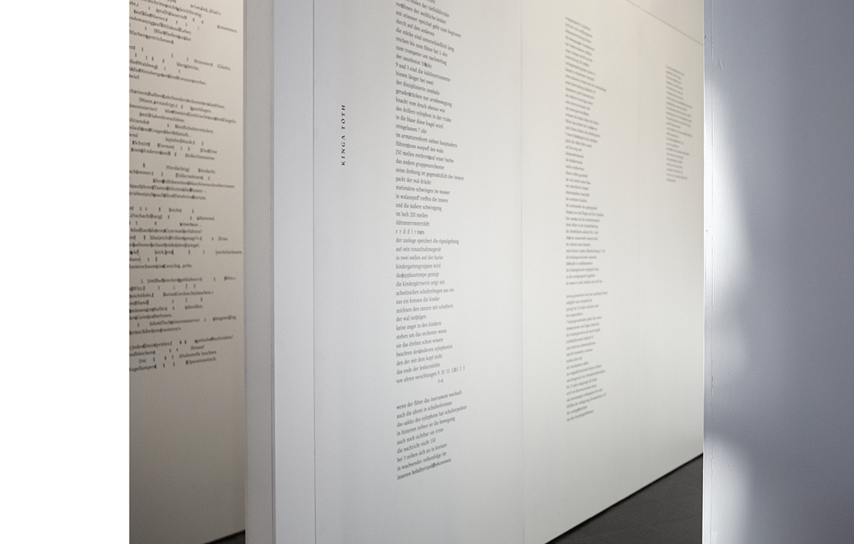
It is a relatively deep and hidden space that can be accessed via corridors and doors. It is the location of silence inside. It is a wedge suitable for meditation in the centre of the labyrinth as a continuous interspace, where visitors are received by data visualisation of an artistic value created by visible spaces, a sophisticated lyrical world of typeface. On the walls several tens of thousands of tiny drawn up spaces from contemporary literary works shine as stars in the sky. The reader enters space and can experience perceptions similar to the Little Prince.
Memory signs of immortal writers, poets and literary scholars can be discovered in the typographical “celestial bodies”.
It is a soft, minimalist and rhythmic wall pattern. A consciously static visual world is fixed; the reader takes a rest in the space of the chapel.
The technique of the works on the walls is screen printing of 1.5 x 2 metres with the use of black paint and varnish. The “space” motifs were made with dip pen using ultramarine ink.
Inner Silence (Breaks I and II)
Kata Tesch
The sacral space in the depth of the corridors of Stille im Innersten (Silence Inside) pulls visitors out of the Fair’s bustle and invites them to contemplate and observe what is inside. The primary role of sound effects from the earphones found here is to support creative solitude and absorption. Just like a completely soundproof anechoic chamber, the sounds of the outside world become silent and gradually get into the background besides the direct environment and the sounds of one’s body. The experience of reading similarly lifts us out of the neighbouring reality and our body and sense organs involuntarily react to each word and idea. Our breathing and the rhythm of our heartbeat, our blood pressure and hormone production are forming continuously and they are accompanied by sound effects, which are sometimes hardly audible, sometimes very noticeable.
The phrases of the compositions are provided by the sounds and tones of our inside world. The tiny murmurs of our digestion, the current of our blood flow have an organic rhythm similarly to the written word. The discreet manipulation of these presents a kind of response to the emphatic rhythm of spaces in literary works printed on the walls. The impulses streaming via several channels supplement one another and intensify the experience of visitors who come to rest in the middle of the space.
The idea originates from the fact that while we are alive we cannot find absolute silence. So-called anechoic chambers exist, which are specially constructed not to allow any noise to enter from the outside world. They are very interesting spaces because those who enter them experience that silence does not exist, the sounds of their own body intensify and transform into a symphony. Besides breathing and heart beat, they also perceive several unidentifiable sounds, of which they cannot necessarily tell whether they represent hallucination. For example, they ‘hear’ the bones and tendons move while they move their heads.
When we leave the earth and enter space we can hear ‘the silence’ of space. Audio artist Katalin Tesch worked with atmospheres constructed from sound patterns suggestive of these in her acoustic installation Inner Silence (Breaks I and II).
Positive turning inside, inner silence meets the silence of the universe.
‘Does silence connect or separate?
Silence connects or separates.’


The typography of Silence Inside
Every character which is not a letter, a number or special symbol can be regarded as punctuation. Such are spaces, punctuation marks at the end of sentences, colons, dashes, hyphens, quotation marks and indents. Their aim is to make the communicator’s original intent established. In addition, they also have a condensing and grammatical function, they help the comprehension of the text. The sentence structure, the sound value and intonation of the text, thus the modality of a sentence can be stated with the help of punctuation. Punctuation marks are not always fixed, their absence can be a literary tool. The choice of a suitable typeface is a central issue in the process of book design. The measurement system of letters changes according to fonts, so it is not surprising that we cannot talk about uniform sizes of space. Designers have to deal with defining the size of spaces. Their task is to research the connections between the size of a given publication, the margins, line spacing and letter sizes in the interest of a harmonious textual image and optimal readability. The rhythmic alterations of spaces and interspaces represent a fundamental pillar of our installation; therefore, we considered it important to perform these tasks in the case of texts included but not visible in the labyrinth. There are generally well applicable proprieties. According to university professor Albert Kapr, “the size of a normal space is one third of a square. In the case of narrow letters the space can be tighter, while with wider letters it can be larger.” What does typography call a square? “Exclusive material without pressure whose width is identical with the height of the body of a letter.”
Albert Kapr (1918–1995) was a specialist professor of the internationally renowned Hochschule für Grafik und Buchkunst in Leipzig where he headed the Department of Book Design. He was the rector of the college between 1966 and 1973, as well as the founder and senior lecturer of the Institute of Typography. Initially he was an assistant as Ernst Schneidler’s pupil, then he taught applied graphic design, calligraphy and typography in Weimar, the home of the former Bauhaus.
Due to the location being in Leipzig, we decided for a font called JAF Lapture, a design by Albert Kapr, to emphasise Silence Inside being presented in Leipzig.
The basis of the typeface is Leipziger Antiqua, which was designed by Kapr in 1971 and modernised by the founder of the Just Another Foundry, Tim Ahrens, in 2005. That was how the JAF Lapture font was created.
The classicist antiqua is characterised by its dual nature. On the one hand, it includes definite, straight angles and, on the other, a certain softness. Rounded forms expressing lyricism can also be discovered in them, just as harder architectural structures and sensitivity represented by typography and content are present in our construction. The fundamental typographical work, The Elements of Typographic Style by Robert Bringhurst, was typeset using this font.
Last but not least, our choice pays respect to professor Albert Kapr and the work of German typographers.
The colours of Silence Inside
The colour of Nothing is white in the designers’ fantasy.
Following traditions, the written text is in black and the spaces which become visible are identified with the colour of indigo blue ink.
The prominent colour experience of the pavilion is presented by these three colours. The dominant colour of the external shells, the walls leading to the labyrinth is white; indigo blue prevails on the printed and drawn walls of the chapel space, while the eliminating letters and characters are painted on thinly, with varnish glittering in a translucent light. This provides people approaching the depth of the pavilion with a feeling of ‘non-presence’.
The key words of the application for the tender associate with Space/Raum and space/universe/Weltraum/sky, which continue with the ideas Nothing/empty void.
Indigo blue mixed with white is really hip.
Book design for Silence Inside
The installation includes thirty conceptual books of 112 pages, in a handbook format with a soft cardboard cover, on finely tactile creative paper and made with high quality. It interprets, explains and makes the visualisation seen on the wall portable.
The book as an object of art is a vital tool for identifying the theme of the pavilion.
Chapters 10 and 11 of Gergely Péterfy’s novel The Stuffed Barbarian was used in the book to the author’s pleasure.
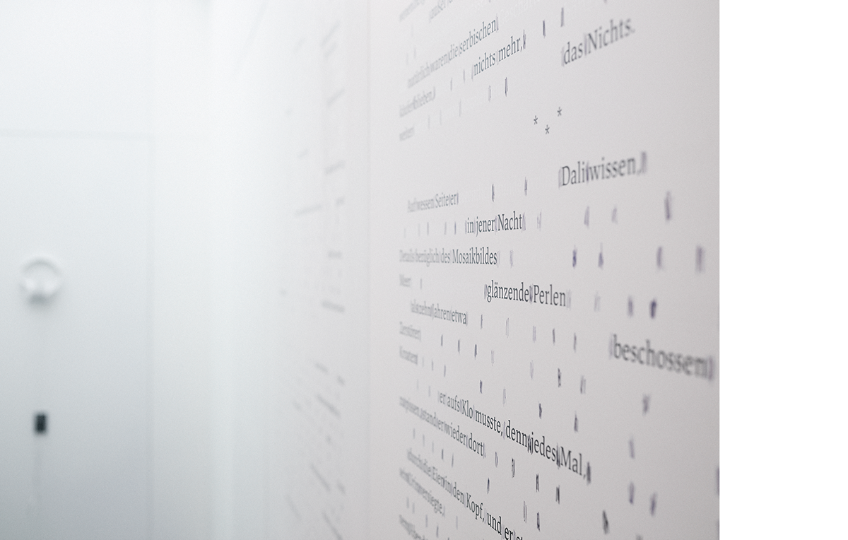
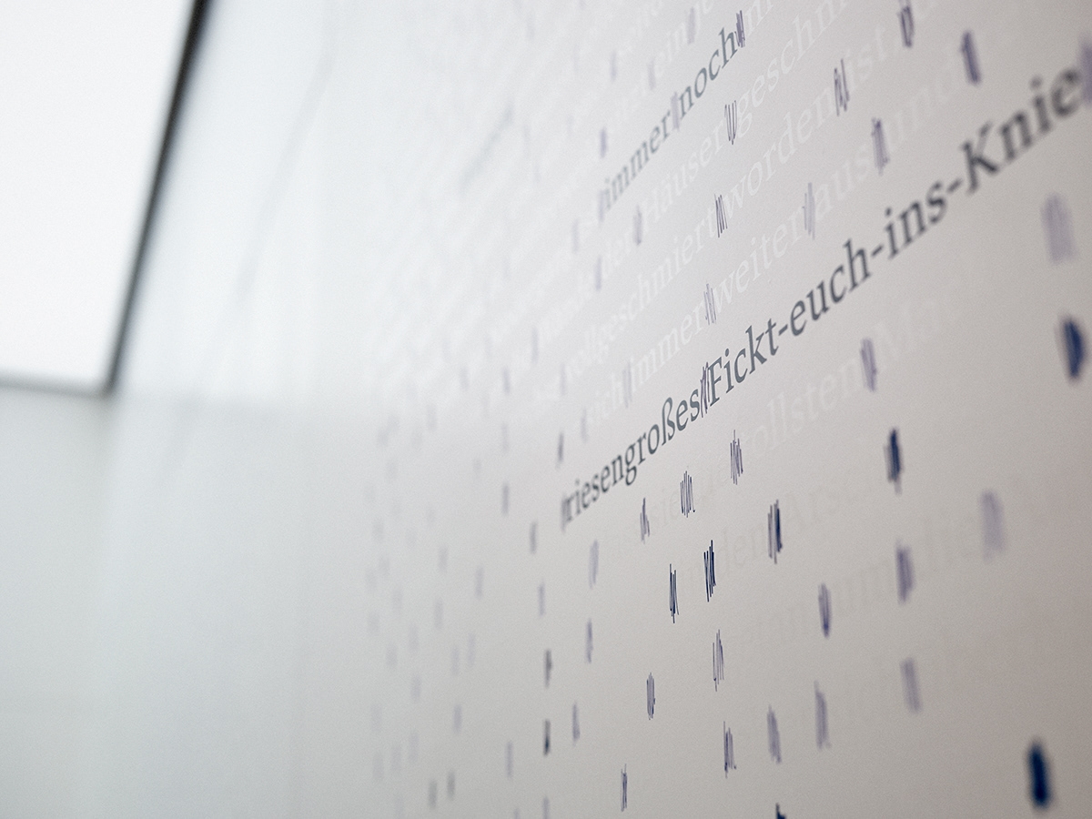
The volume begins with a visible and readable text set in black letters in dense lines. From page 8 spaces hatched in indigo blue, which gradually become more compact, create a medley until every written word and space can be seen in the first half of the book.
Then the number of visible letters diminishes slowly from page to page, they change into a transparent layer of varnish and words appear less frequently. In the end, the spaces and their rhythm are left so that then they peter out and the novel becoming a work of graphic art turns into total void.
The finish of the text represented with offset printing on whitened matt paper with white cover paint is a printing technical bravura.
About Literary Digestion
The basis of the visualized text is provided by the extract from Gergely Péterfy’s novel The Stuffed Barbarian through which the deeper operations and connections of the Leipzig Book Fair’s Hungarian Pavilion are demonstrated. The spaces and the different rhythm of the texts that can be observed in the space and the book and their quality embraces visitors and readers as a fine net. Not only does the literary canon open up for us but it, unnoticed, crawls under our skin so that finally this soft varnish network and the precise outlines of the ink would be dissolved in the silence inside.
(blurb)
The copies are placed on the routes of the labyrinth. The books have played a part at events and programmes at outside venues held by the organisers of the Leipzig Book Fair’s Hungarian Pavilion. Besides the pavilion, the Hungarian programme included three external locations in the city presenting events fusing genres. In the GRASSI Museum of Ethnography Gergely Péterfy read from his novel The Stuffed Barbarian, which was published in German, while an evening of literature was held with music and video recordings with the participation of Zoltán Danyi, Judit Hidas, Gergely Péterfy and János Térey in the popular cafe naTo. Recipient of the prominent Peter-Huchel-Prize 2017 Orsolya Kalász and Kinga Tóth read from their latest volumes of poetry in one of Germany’s oldest cinemas, UT Connewitz, which operates in its original 1912 condition.


The visual affect elements of the walls
With all the walls of the labyrinth there is basically nothing more than an extended exhibition surface set up according to a special constructional principle. The corridors leading to the chapel space and the dividing turning walls, which appear as columns from the routes of the hall, serve the purpose of presentation. All this is closely connected with the aesthetics of the book, which operates as a clue.
Artists and their works displayed on the walls:
Kinga Tóth: Wal
Orsolya Kalász: Verneinung ohne Beine
János Térey: Wer lebt, hinterlässt Geräusche
Zoltán Danyi: Der Kadaverräumer
Judit Hidas: Tourist in Afrika
Gergely Péterfy: Auf dem Moszkva tér um sieben
The columns imitate book pages constructed with regular margins with extracts from the defined literary works by contemporary Hungarian writers and poets. Proceeding towards the interior spaces, these works first have visible black letters, then a transparent layer of their loose density appears, which may flash accidentally due to the light on the entire surface of the ceiling of the chapel space. Perception of nothing depends on the individual and fantasy. It is very interesting how different people perceive and what shape they give to Nothing. We made spaces between words visible with repeated fast hatching movement up and down, and again up. The accordion system is justified, the extension and narrowing of the spaces with different width can change according to the operational principle of the musical instrument. The calligraphic sign that is produced in this way is parallel with the labyrinth’s view from above. The logo of Silence Inside expresses this technique.
However, someone would perhaps draw a dot, others would dip their fingers in ink and make a smudged patch, while yet others would construct regular squares. Nevertheless, readers become aware that anyone can shape spaces, but words and sentences can be formulated only by writers, poets and literary scholars.


Imprint
Silence Inside
The labyrinth of spaces that have become visible
Leipzig Book Fair, 2017
Hungarian Pavilion
Creative conception and realization:
Under the umbrella of Lead82 commissioned to perform the work submitted for the competition
Art director Zalán Péter Salát,
architect Gergely Sztranyák,
graphic designer, artist Zsófia Sztranyák
and architect Péter Zilahi
Sound by Katalin Tesch
Technique
The textures/writings on the walls were made with screen printing and with the use of black paint and varnish. Size: 1.5 × 2 metres
‘Spaces’ were painted with dip pen using ultramarine ink.
Text by Eszter Szablyár
Screen printing: Kontur-Press Ltd., Üllő
Screen prints were made by József Bozsóki
Coordination of wall painting and printing by Ágnes Horváth
Glossing the walls with airbrush gun by István Plavec
Used material: Milesi furniture primer
Letters on the walls: JAF Lapture Regular 48/68 pt
JAF Lapture Display Bold 60/78 pt
The typeface is a contemporary adaptation of Leipziger Antiqua, which was designed by Albert Kapr in 1971 and modernised by the founder of the Just Another Foundry, Tim Ahrens, in 2004. With this choice the designers pay their respect to typographer Albert Kapr, former rector of the Hochschule für Grafik und Buchkunst in Leipzig, founder and professor of the Department of the Book Design Institute, as well as to German typographers.
Joiner’s work by Péter Pausz, Tamás Herr
Wood provided by JAF Holz Ungarn Ltd., Pécs
Lighting technique: Arteria Industrial Goods
Execution of the ceiling light source in the chapel space:
Rio Lámpastúdó Ltd.
*
The designers express their gratitude:
to Ágnes Horváth, manager of Kontur-Press Ltd., Üllő, for organising execution processes and her care for the designers in the Üllő workshop;
to József Bozsóki, screen print master demonstrating and using the meticulosity of the ancient printing technique;
to Eszter Szablyár for the text on the artistic concept;
to Balázs Kiss, manager of the Pécs Unit of JAF Holz Ungarn for his help with selecting and procuring wood materials;
to Tamás Bunkóczi, trade manager of Flexo-matic Ltd., for his expert advice concerning paint used in the pavilion;
to László Mészáros and Attila Szigeti, managers of the Budaörs EPC Printers, who made the printing of the conceptual book of 30 copies possible with offset technology;
to Katalin Varga, staff member at the office of the Swedish paper factory Arctic Paper in Hungary, for her support in procuring the paper used for the book and leaflets;
to Bianka Horváth, Alajos Hepke and all the other volunteers who helped with the design and execution of the pavilion with their advice and in its realisation.
*
Book design: Zalán Péter Salát, Zsófia Sztranyák, Dániel L. Németh – Lead82
Font: JAF Lapture Regular 9/12 pt, JAF Lapture Display Bold 16 pt
Paper: Munken Kristall Rough, 150 g/m2 – Arctic Paper S. A.
Cover: Munken Polar Rough, 300 g/m2 – Arctic Paper S. A.
Size: 175 × 242 mm
The book is printed with the use of FM halftone screening
Printed by EPC Nyomda, Budaörs
Print director: László Mészáros
Printing coordination: Tamás Szalai, Attila Szigeti
Printing machine operator: Péter Pozsga
Binding: Előzék Kft.
Binding director: Ádám Szöllősi
Published in a volume of 7 printer’s sheets, 112 pages, 30 copies, offset printing, with the use of FM screening and CMYK black, Pantone Reflex Blue U and Pantone Bright White colour
More about the designers
Creative concept
Zalán Péter Salát book designer and graphic artist, independent art director recipient of the German Design Award Gold twice and Red Dot Best of the Best twice, founder of Lead82. He lives in Budapest.
lead82.com
lead82.com
Zsófia Sztranyák, graphic designer, artist. Graduated from the Budapest Metropolitan University in 2016 and lives in Budapest.
Gergely Sztranyák, architect, winner of the Junior Prima Award, senior lecturer. Graduated from the University of Pécs in 2008 and obtained his Ph.D. in 2011. He lives in Pécs.
Péter Zilahi, architect, member of the P8 Studio. Graduated in architecture at the University of Pécs in 2011 where her gained his Ph.D. in 2015. He lives in Pécs.
Sound Installation
Katalin Tesch, media artist. After the Moholy-Nagy University of Art and Design, Budapest, she was a post-graduate student in Switzerland. She currently lives and works in London.
Collegium Hungaricum Berlin
The design for the competition of the Hungarian Pavilion in Leipzig was initiated and organised by Collegium Hungaricum Berlin. Director Gábor Kopek, curator and project manager of the Leipzig pavilion Ágnes Gelencsér, strategic director György Demjén and programme manager Dániel Kovács took part in the consultation during the design process on behalf of Collegium Hungaricum Berlin.
Publishing Hungary Program
Publishing Hungary Program guarantees the financial and professional background of the Leipzig project with the support of the Ministry of Foreign Affairs and Trade and the National Cultural Fund. The manager of the project is Zsuzsanna Szabó.
Photography
Csaba Villányi & Zalán Péter Salát
Retouch
Sándor Rácz
Pécs – Budapest – Üllő – Leipzig
March 2017


