Mono no aware jap. 物の哀れ
en
This is the type of Japanese aesthetics. The meaning is not fully translatable. It is a form of reflection (melancholy) on small, seemingly insignificant matters (refers to the topic of transience). Literally "mono" means "thing", while "aware" is a kind of delight.
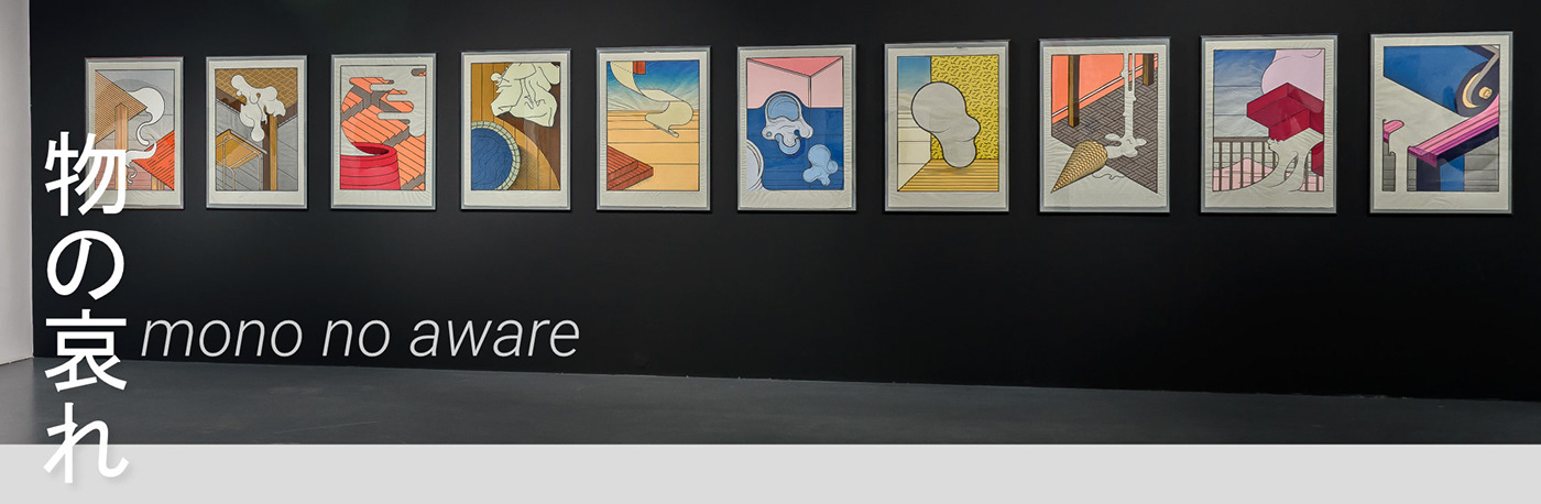
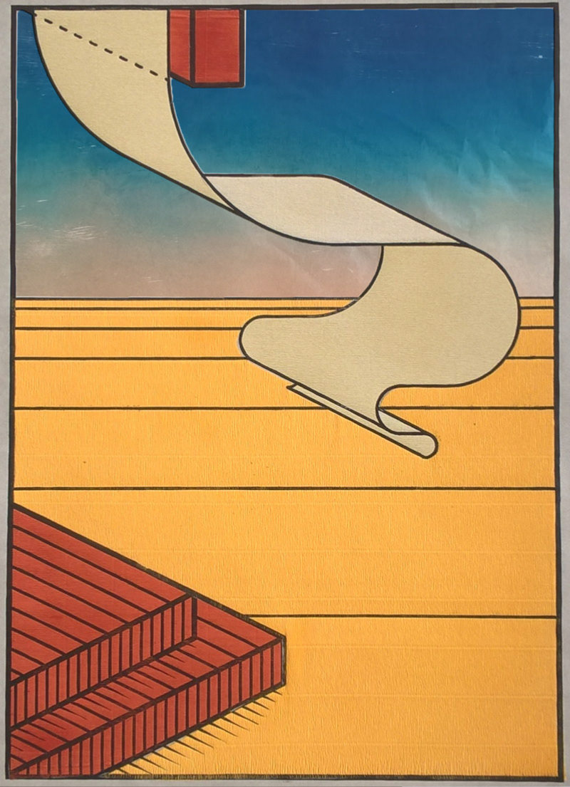
To create a series of traditionally performed graphic works, I was inspired by broadly understood Japanese culture, in particular Ukiyo-e, manifesting itself primarily in traditional Japanese woodcuts. However, I did not do work in this style. I analyzed, processed, the achievements of the local masters and combined this knowledge with my own perception of the world. The effect of such actions are graphics creating a bridge between cultures (Japanese and European). In these works you can find elements of surrealism, haiku, Ukiyo-e mentioned earlier, but also descriptive graphics and mathematical principles.
pl
Mono no aware jap. 物の哀れ
Jest to określenie rodzaju estetyki japońskiej. Samo znaczenie nie jest do końca przetłumaczalne. Jest to forma zadumy (melancholii) nad sprawami małymi, pozornie nieistotnymi (odnosi się do tematu przemijania). Dosłownie mono oznacza rzecz, natomiast aware to rodzaj zachwytu.
Do stworzenia cyklu tradycyjnie wykonywanych prac graficznych, zainspirowała mnie szeroko pojęta kultura japońska, a w szczególności Ukiyo-e, przejawiające się przede wszystkim w tradycyjnych drzeworytach japońskich. Jednak nie realizowałem prac w tym stylu. Przeanalizowałem, przetworzyłem, osiągnięcia tamtejszych mistrzów i połączyłem tę wiedzę z własnym sposobem postrzegania świata. Efektem takiego działania są grafiki tworzące pomost pomiędzy kulturami (japońską i europejską). W pracach tych można znaleźć elementy surrealizmu, haiku, wspomnianego wcześniej Ukiyo-e, ale również grafiki wykreślnej oraz zasad matematycznych.


Composition design
en
A very important part of these practices was my passion for mathematical division and for applying theory to creative work. Searching in connections related to art, with references to scientifically broad issues, are a characteristic feature in my work.
During the time of creating the cycle I became interested in the universality of the principles of the golden ratio and its "ubiquity" in nature and civilization — that it is still current and used since ancient times. That's why I decided to apply this principle to my graphics. The layouts presented on this basis are naturally balanced. Paradoxically, the golden ratio combines abstraction and mathematical complication, then freely available and harmonized.
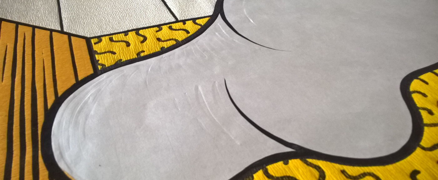
I took the subject of the work as "undefined" (overflowing, flowing, etc.), the feature of which is that they do not occur in nature for too long — they are fleeting, chaotic — at first they are not associated with mathematical divisions or geometry. Works compositions adapted to mathematical division (golden ratio, Fibonacci sequence, prime numbers, Ulam spiral, etc.), while maintaining aesthetic values.
pl
Projektowanie kompozycji
Bardzo ważną częścią tych prac było moje zamiłowanie do podziałów matematycznych i do stosowania teorii naukowych w pracy twórczej. Poszukiwania w obrębie powiązania sztuki, z odniesieniami do zagadnień szeroko pojętych nauk ścisłych, są pewną cecha charakterystyczną w mojej twórczości.
Przy tworzeniu prezentowanego cyklu zainteresowałem się uniwersalnością zasady złotego podziału i jej „wszechobecnością” w przyrodzie i cywilizacji — to, że jest ona ciągle aktualna i wykorzystywana od czasów starożytnych. Dlatego odwołuję się do tej estetycznej zależności, będącej wynikiem zastosowania ścisłych matematycznych podziałów. Zastanawia mnie fakt, że często jest ona używana intuicyjnie. Układy oparte na takiej kompozycji, wydają się naturalnie zrównoważone. Paradoksalnie złoty podział łączy w sobie abstrakcję i komplikację matematyczną, będąc jednocześnie swobodnym i zharmonizowanym układem.
Za temat prac przyjąłem formy „niedookreślone” (przelewające, spływające itp.), których cechą jest to, że nie występują w naturze zbyt długo — są ulotne, chaotyczne — początkowo nie kojarzą się z matematycznymi podziałami czy geometrią. Kompozycje prac dostosowywałem do podziałów matematycznych (złoty podział, ciąg Fibonacciego, liczby pierwsze, spirala Ulama itp.), przy tym zachowując wartości estetyczne.


Matrix creation
en
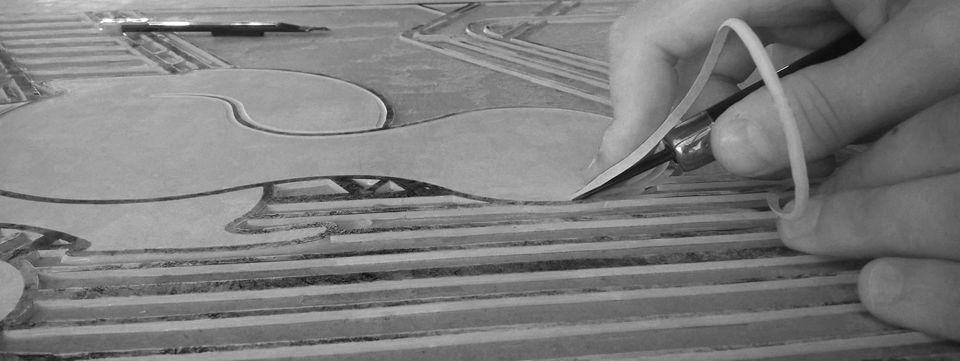
The graphic technique that I decided to use in this cycle was linocut (contour lines). This technique is very similar to the traditional Japanese woodcut technique (it also belongs to the convex printing technique). The linocut matrix compared to the Japanese woodcut is easier to develop, and above all, it does not contain the restrictions of boards for creating large works without the need for gluing and developing boards. To improve the cutting of a large surface of the linoleum matrix, I glued it to the HDF board, which enabled the background to be selected with patches (due to which the work remained very sterile). By using this solution, I also prevented the matrix from deforming during printing.
pl
Opracowywanie matrycy
Technikę graficzną, którą postanowiłem wykorzystać do tego cyklu był linoryt (linie konturowe). Jest to technika bardzo zbliżona do tradycyjnej techniki drzeworytu japońskiego (również należy do technik druku wypukłego). Matryca linorytowa w porównaniu do drzeworytu japońskiego jest łatwiejsza w opracowaniu i przede wszystkim nie posiada ograniczenia formatu deski co umożliwia tworzenie dużych prac bez potrzeby klejenia i opracowywania desek. Aby usprawnić wycinanie dużych powierzchni matrycy Linoleum podlepiłem na płytę HDF co umożliwiło wybieranie tła płatami (dzięki temu praca zachowała dużą sterylność). Stosując takie rozwiązanie zapobiegłem również odkształcaniu się matrycy podczas druku.


Printing
en
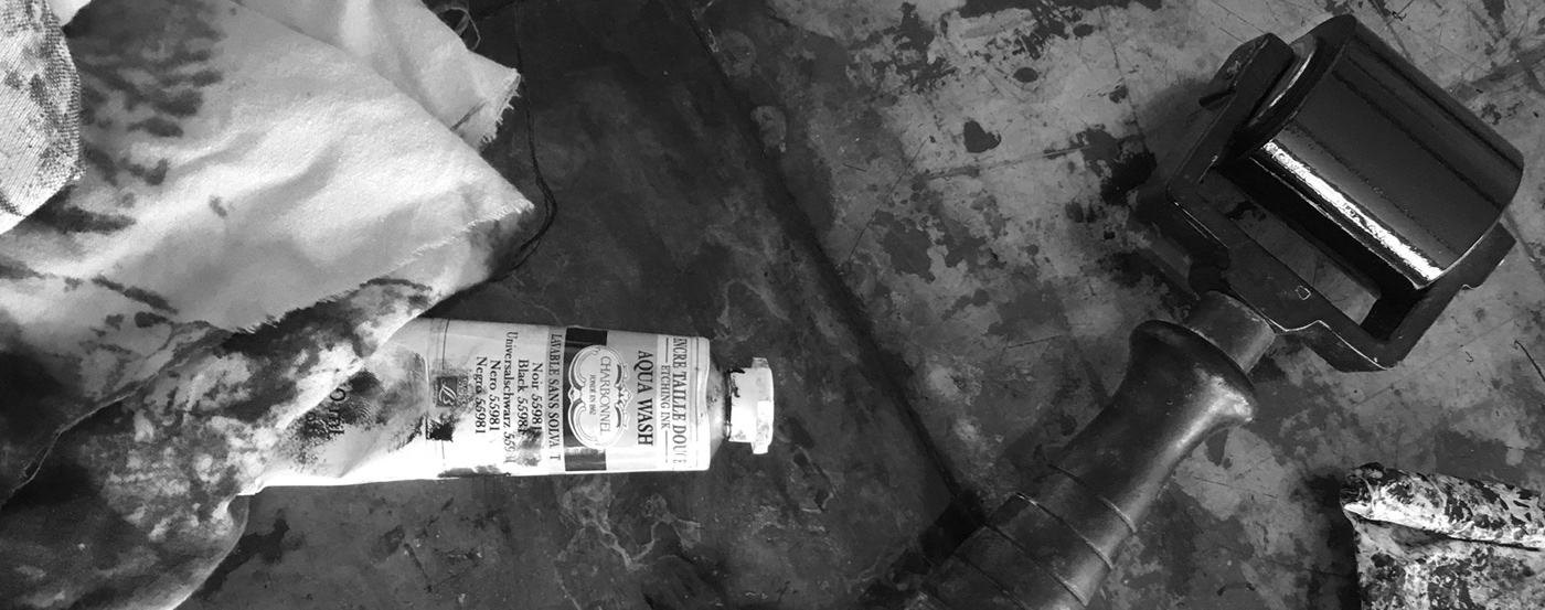
In the reflection process I added color spots with previously prepared (properly cut out using a template) wrinkled paper. Wrinkled paper is very similar to traditional Japanese paper and additionally has a strong texture that enlivens the performance. The graphic technique enabling such a combination of several lamination modules is a collage technique used during printing (between the matrix and the copy paper of the insert there is colored paper with glue applied - thanks to that you can use print on two papers bonded together). Works printed by hand with traditional methods on Japanese Kawashi paper.
pl
Odbijanie
W procesie odbijania dodawałem plamy barwne z wcześniej przygotowanych (odpowiednio wyciętych za pomocą szablonu) krepin. Krepina w swojej budowie bardzo przypomina tradycyjny papier japoński a dodatkowo posiada mocną fakturę, która ożywia przedstawienie. Technika graficzna umożliwiająca takie łączenie kilku papierów to kaszerunek, jest to technika kolażu zastosowanego podczas druku (miedzy matrycę a papier odbitkowy wkłada się kolorowy papier z naniesionym klejem – dzięki temu jednocześnie posiadamy zadruk na dwóch papierach zespojonych ze sobą). Prace drukowałem ręcznie tradycyjnymi metodami na papierze japońskim kawashi.


Thank you for watching
and sorry for my english :P
____
Great thanks to Przemysław Sroka
for sharing great photos from the exhibition :D
for sharing great photos from the exhibition :D


