UNiCORN!
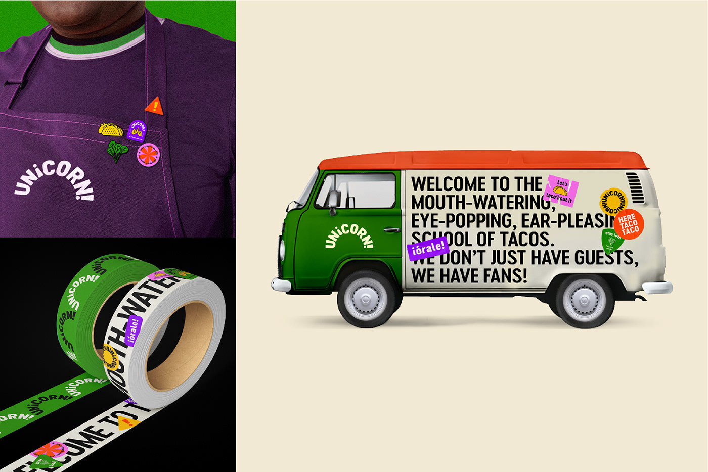
This is an experimental project. Unicorn is a taco brand that has an identity with lively, unique and full of unexpected surprises based on school life. The project featured on naming, logo design, color palette, illustrations, packaging and menu designs, and other various applications including loyalty card, balloon, badges, stickers, taco truck graphic, apron and tape designs.
The identity comprises of two unique characters which take centre stage on the shape of patches, and a brand language featuring bold typography and vibrant colors. I took the simple semi circle shape to represent a taco. I then separated the name into two parts. "Uni" implies universities which means the truck is always parking in front of the university; "Corn" refers to the contents of the taco. I came up with an idea to use an inverted exclamation mark for the "I" in unicorn, which brings to mind Spanish punctuation, and then links the idea of the name to the product, which is of Spanish origin. Note the inclusion of the following imagery to encompass and highlight the university environment, which was the target audience for this promotion: the appearance of numerous badges everywhere; the style of the menu looks like a timetable; the names of the menu items, such as "All Nighters", are all terms associated with school life.