Visual Identity | Orin
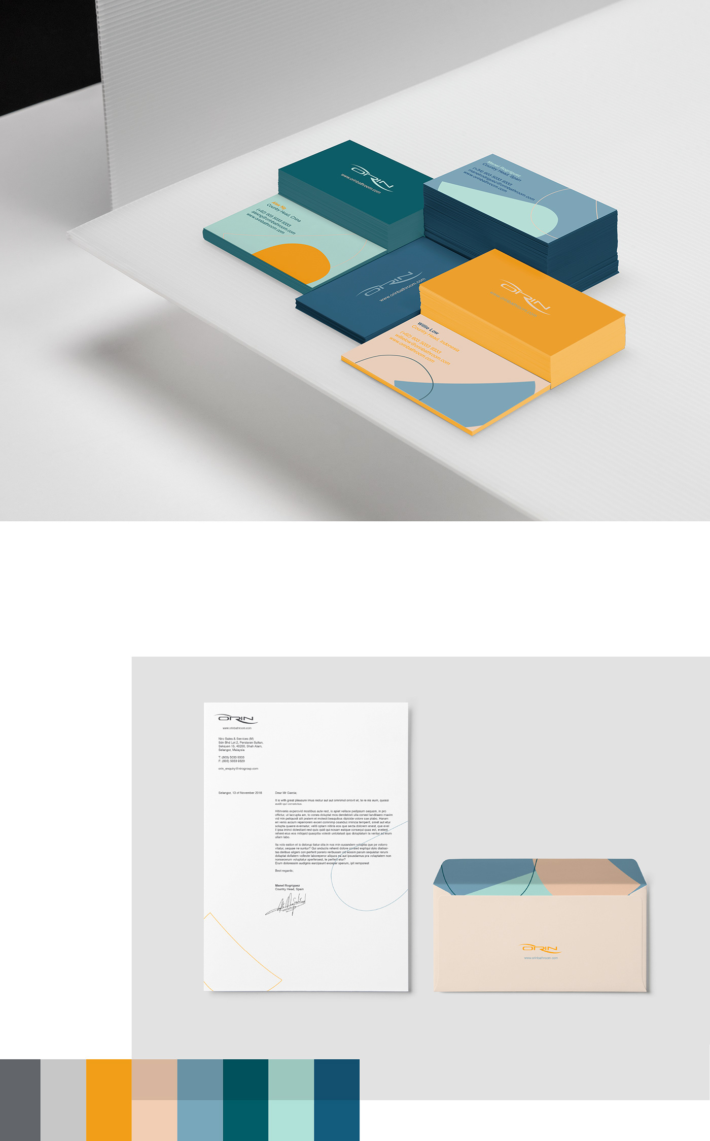
Orin, the producer company of bathroom equipment , approach us to work on their new brand identity. Our design was inspired by the natural movements of water, we created the concept "From solid to organic" that convey dynamism and modernity to the brand.
The graphic environment was built through customized geometric shapes. Inspired by specific words related to the bathroom equipment (basin, bathtub and sanitary ware) we choose one letter of each word and created Orin's abstract geometric shapes. Followed by a renewed colour palette (yellow, blue and green) we added more character to the brand.
We decided to stand out Orin's product as the main element of the catalogue design. For that reason we divided the general catalogue by Orin's new colours (yellow, blue and green), where each one was aimed to separate their three different product typologies. This proposal resulted in a bold graphic design were Orin's product is framed by the geometric shapes designed for the brand and gives to it a consistent and refreshed character.
Category:
branding
promotion