
P E R S O N A L C A R E p a c k a g i n g
Hue Cosmetics
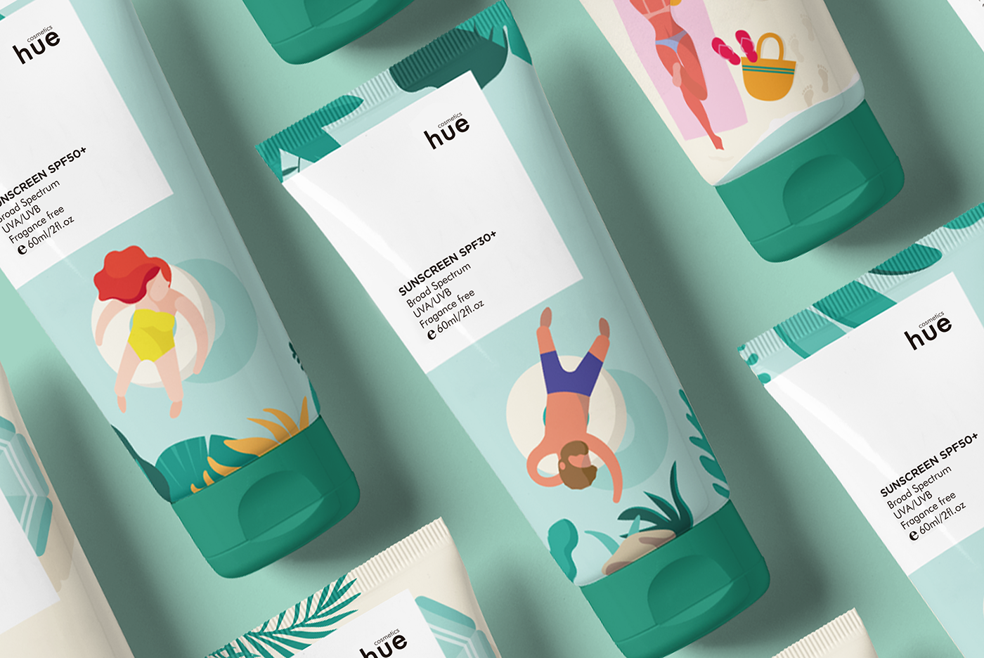
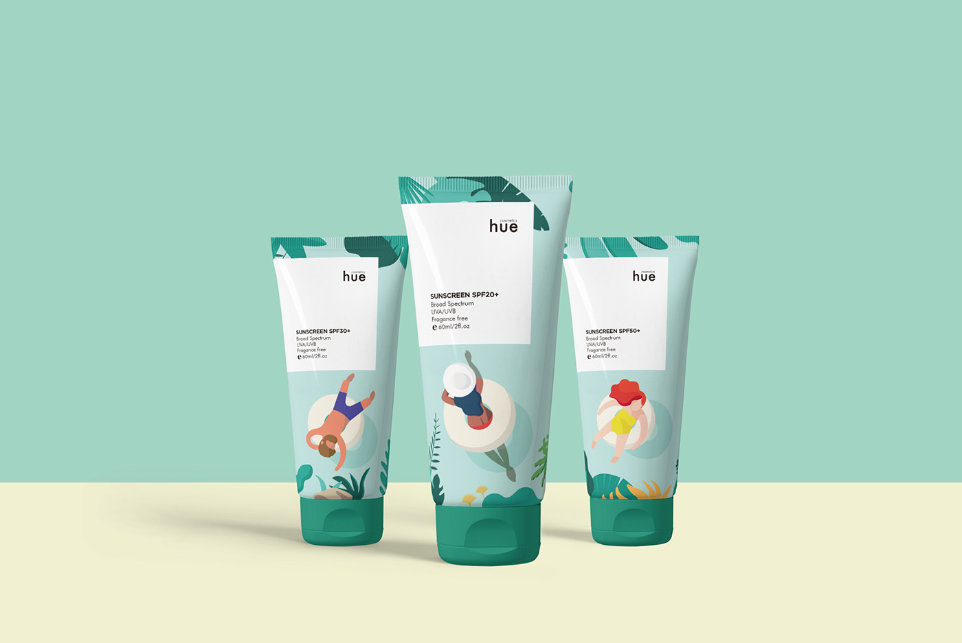
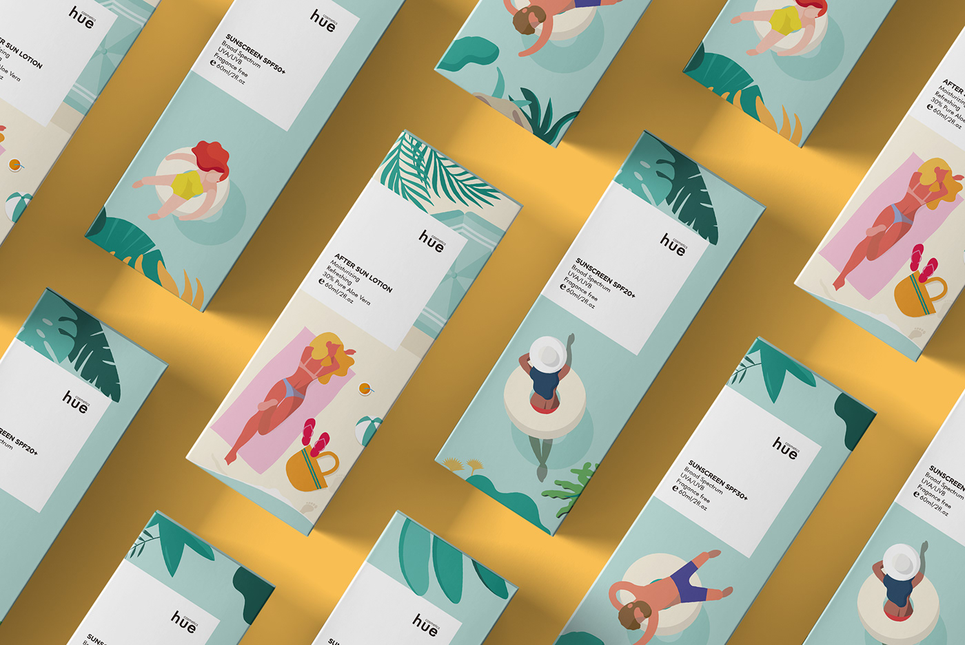
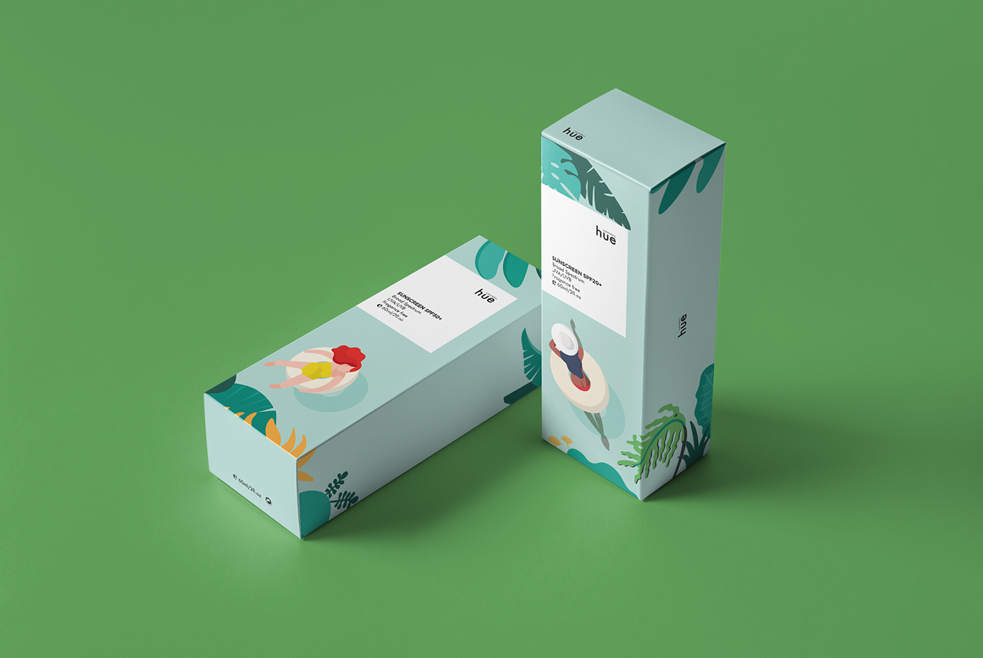
The sunscreens' category is a distant sector, poorly differentiated and stagnant within the market. The briefing consists in creating a packaging for cosmetics that is unique, recognizable and generates graphic impact. The proposal is to bring the product closer to the client, create a link and connect with the audience to get them to feel more identified. We wanted to link the product with the brand through the naming "hue", which means tonality. Creating a range of sunscreens with character, without leaving the standards of formats, materials and current budget of the market.
If the product is launched on the market, it will be distributed internationally, printed in CMYK offset, on chlorine-free matte paper. The manual closure would avoid the use of any type of glue.


C R E D I T S
BAU Centre Universitari de Disseny de Barcelona. / Andrés Salvarezza
Art Direction, Graphic Design, Illustration and Creative Direction: Adriana Bertolin


