
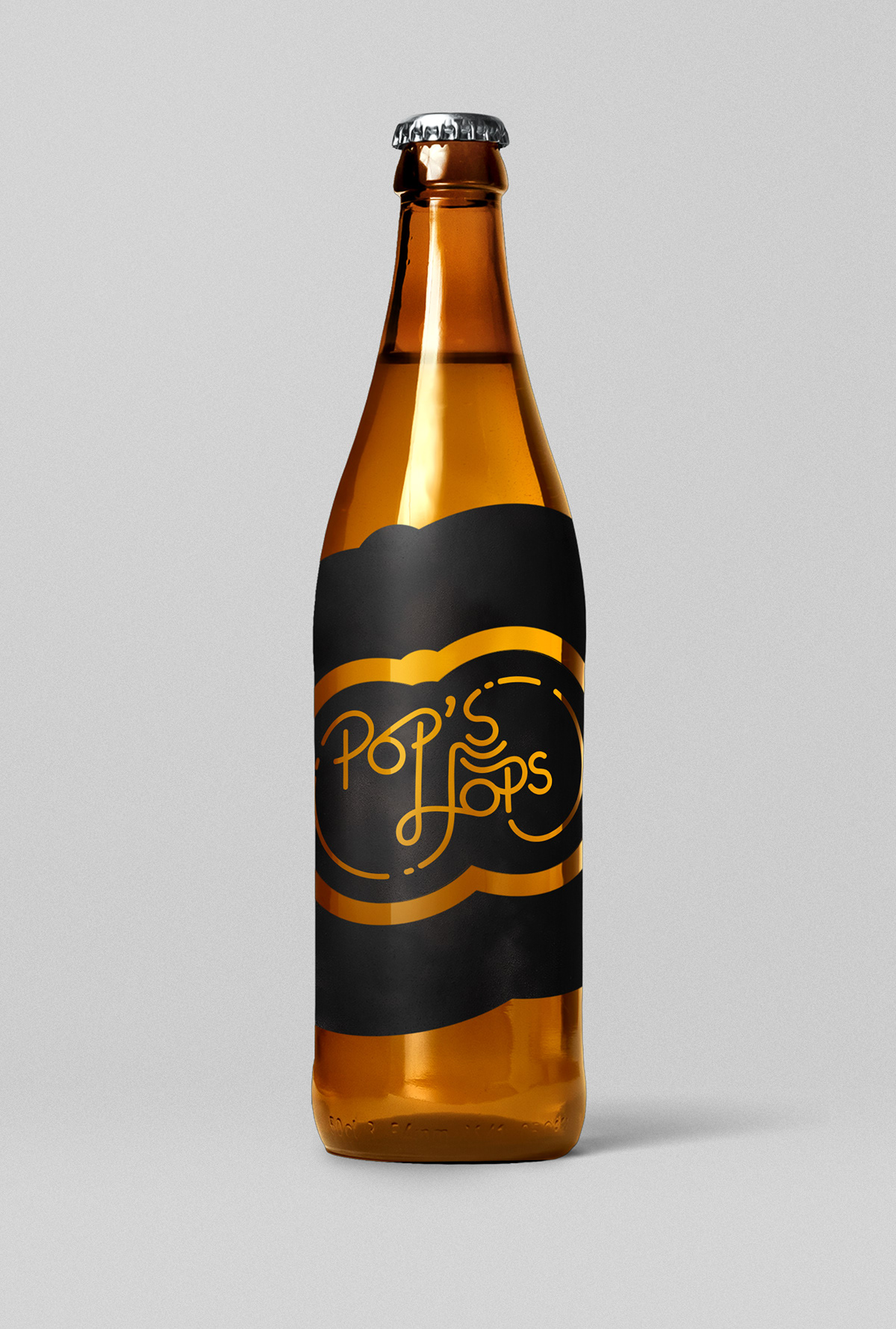

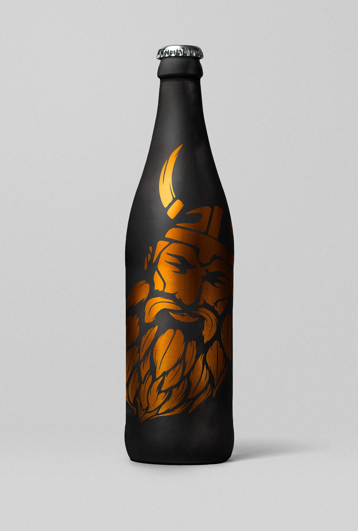


I was asked to create a logo for a new brewing company and i was only told the name. so it was my job to create the look and feel of the brand. I know that the owner and his sons would like the brand to be masculine and clean but i wanted to add earth tones to make it feel more relaxed and add a seance of the locally sourced beer. and i wanted to do that as i cover the bases of the beer industry, in my research there were four types of beer brands the first is the classic design that prompts a seance of signification a beer that you would drink at the gold club, then on the other side of the spectrum there is the funny brand beer that inst scared to take rises and have a laugh the the third is the clean cut brand that is in the middle of professional and fun, after that is the Manly Man Beer the prompts stereotypical masculinity. I created these designs that covered one or more of the different types of beer brands.