


stndrd® creative company
corporate identity design
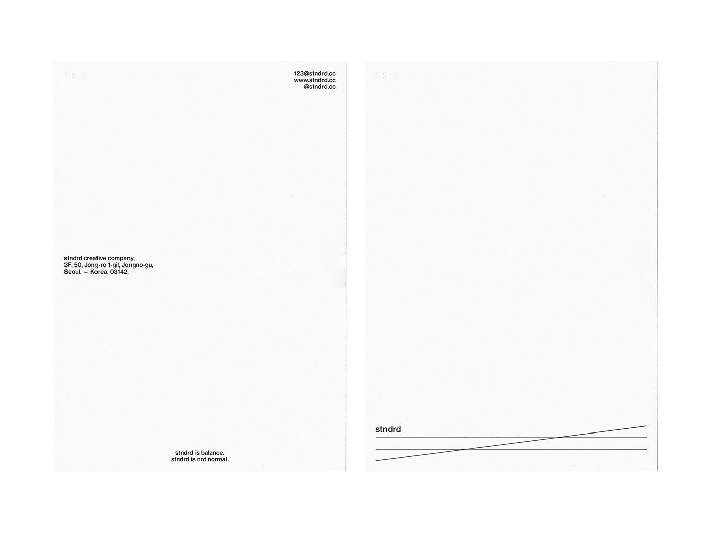
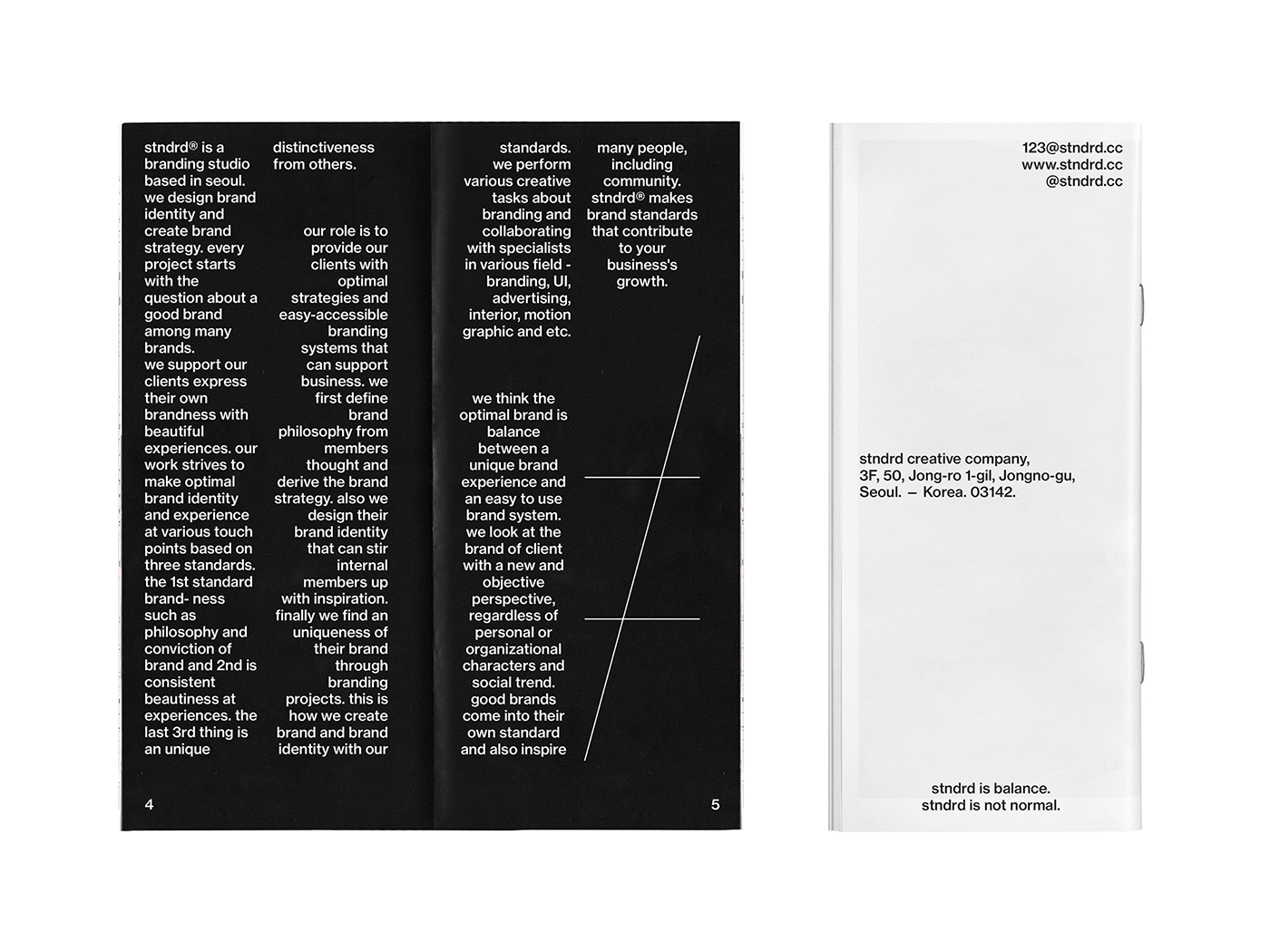
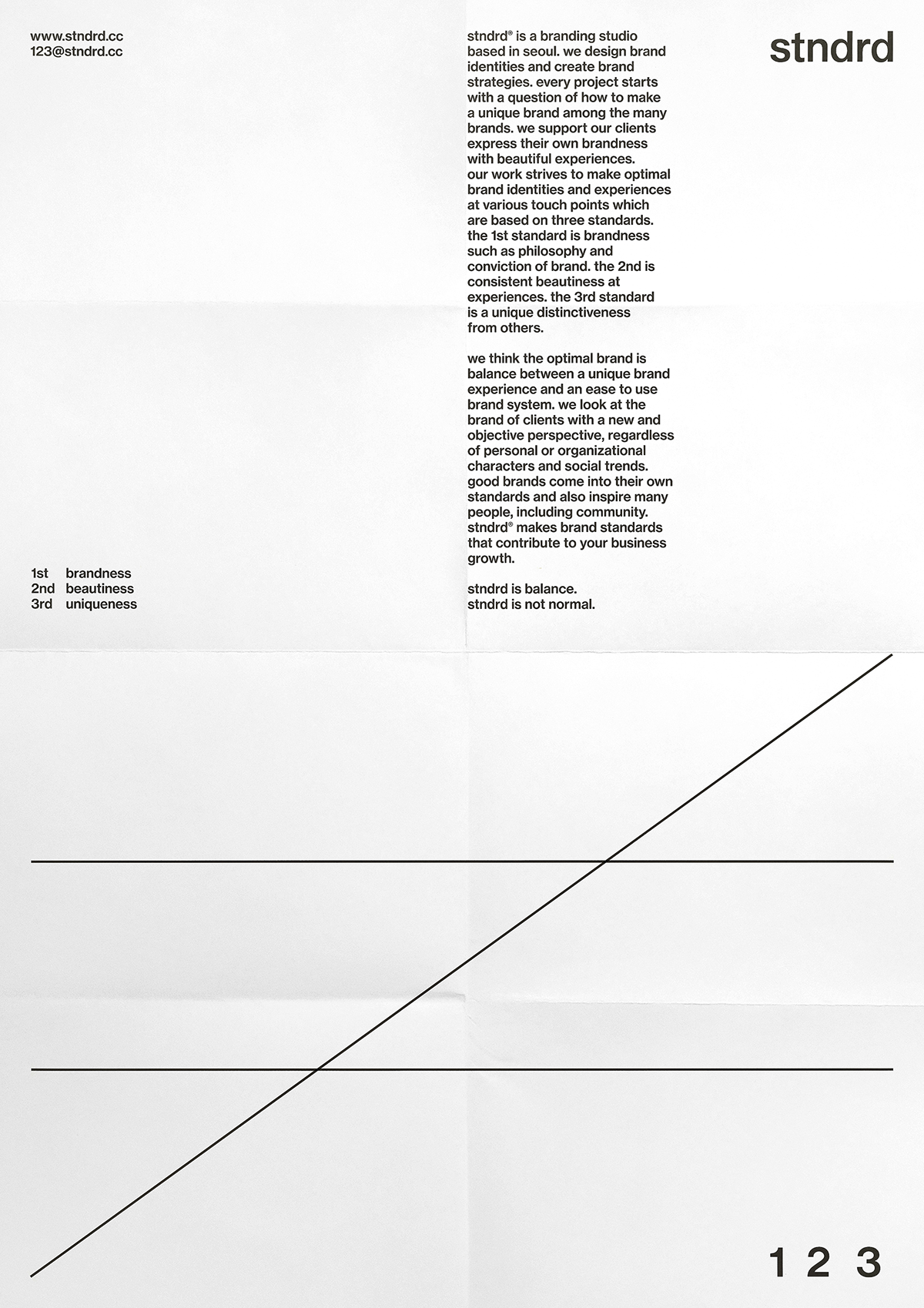
stndrd® is a branding studio based in seoul. we design brand identities and create brand strategies. every project begins with a question of how to make a unique brand among the many brands. we support our clients express their own brandness with beautiful experiences. stndrd is balance. stndrd is not normal.


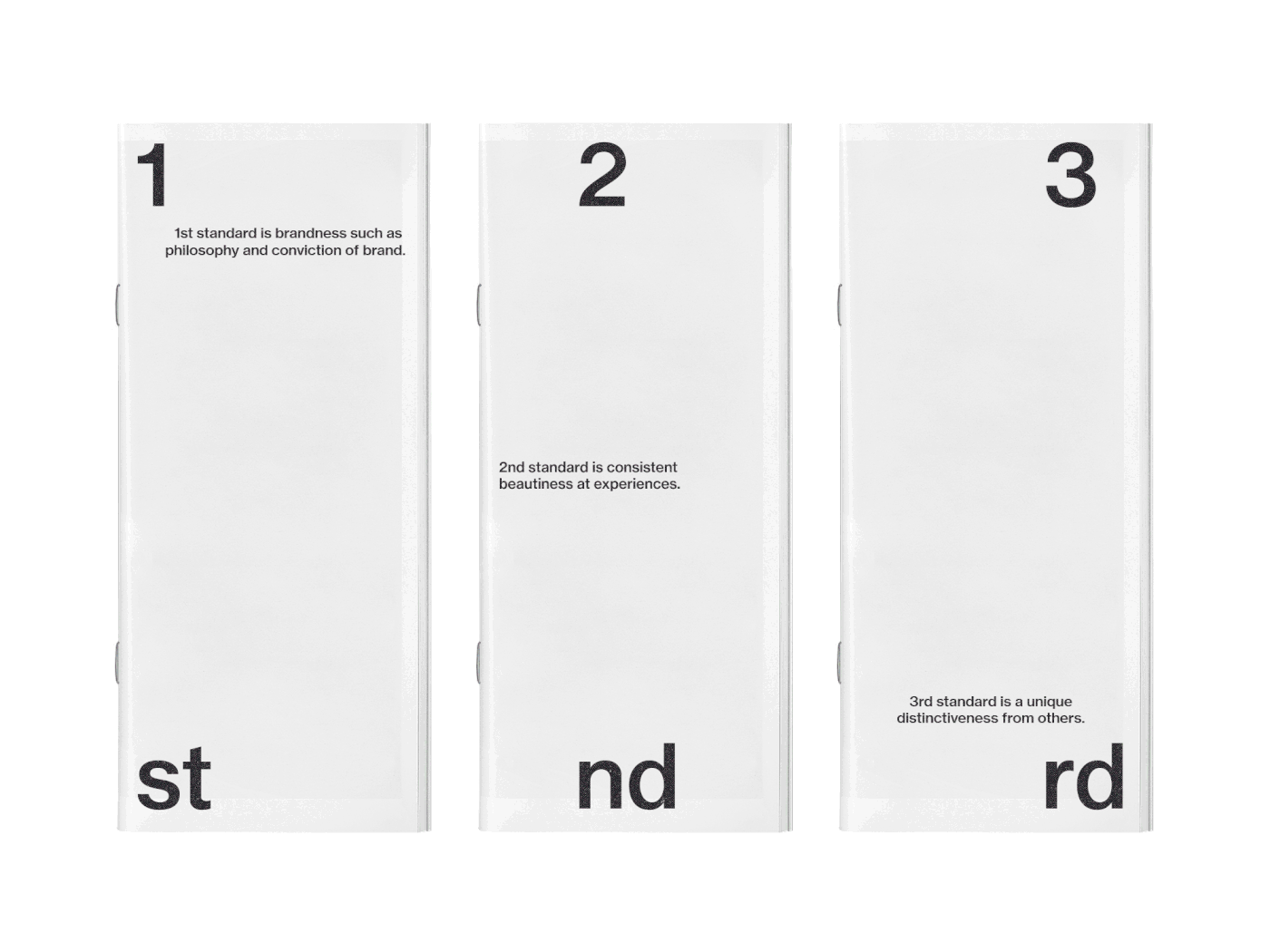
our work strives to make optimal brand identities and experiences at various communication touch-points which are based on three branding standards. the 1st standard is brandness such as philosophy and conviction about brand of members. the 2nd is consistent beautiness at experiences. the 3rd standard is a unique distinctiveness from others. we create the brand by maximizing the benefit of product or service. good brands come into their own standard and also inspire many people, including community. stndrd® makes brand standards that contribute to client business growth.

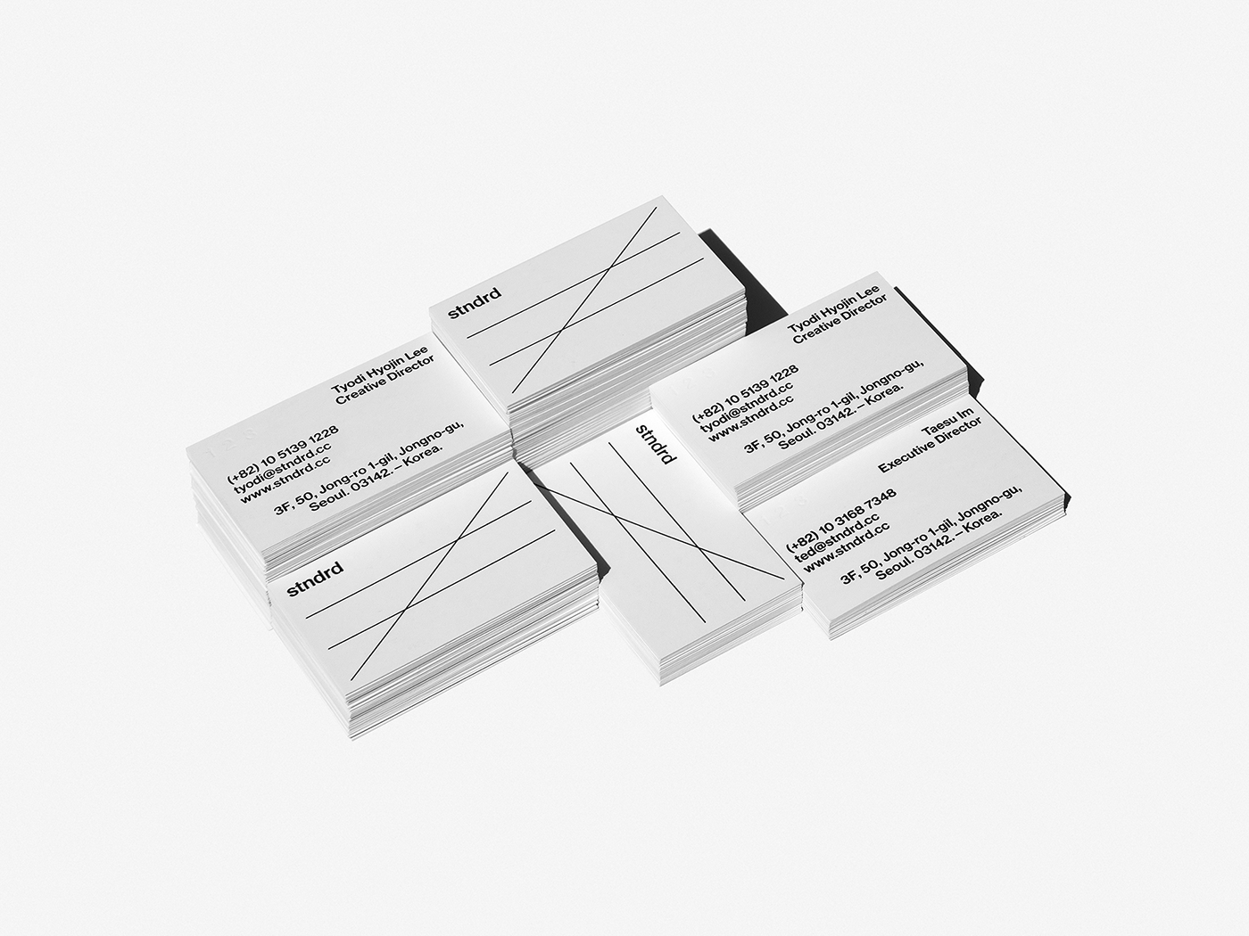
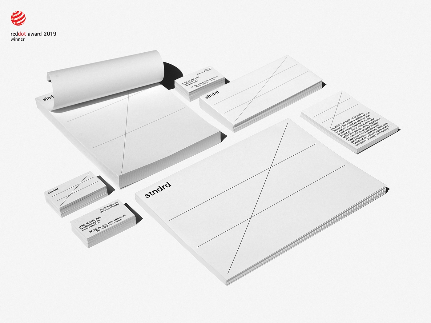
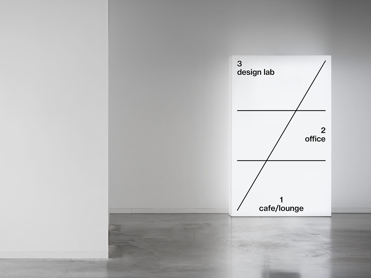
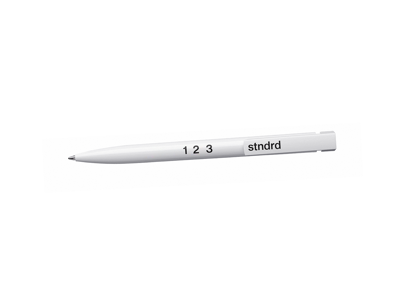
stndrd® is a coined name of three words - the 1st, 2nd and 3rd. this name represents us and also means three brand standards for creating authentic and attractive brand. extracted numbers 1, 2 and 3 act as a key visual at various touch-points. these numbers, which are scattered throughout various communication channels, stimulate people’s curiosity. also these numbers perform as a hint of our brand name ‘stndrd’.


the optimal brand standard we think means a brand system that is easy to use by internal members while providing a unique brand experience to customers. stndrd® seeks an optimal balance, but at the same time this does not mean normal.
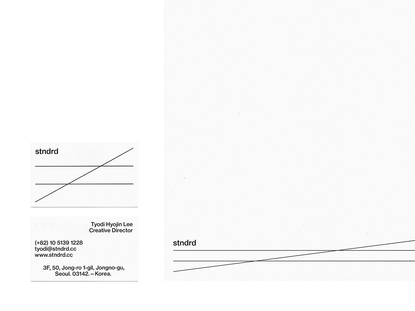
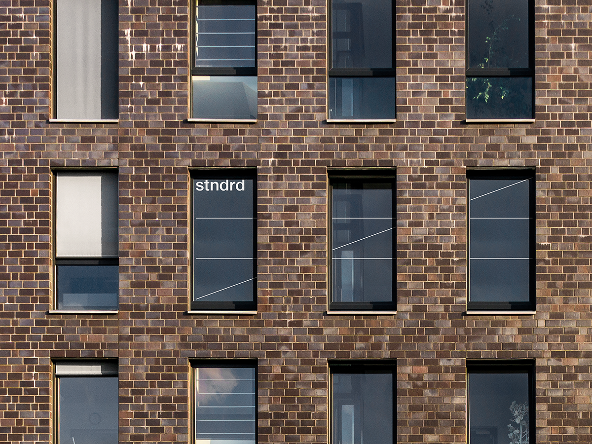
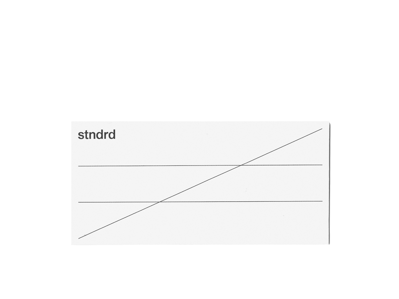
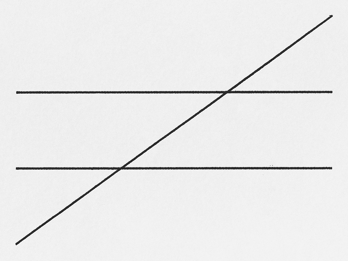
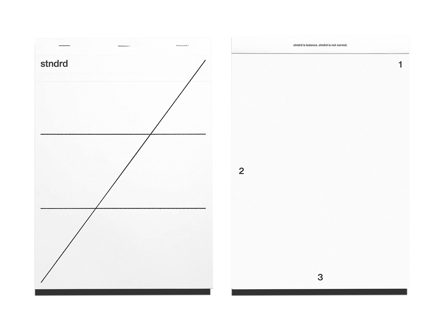
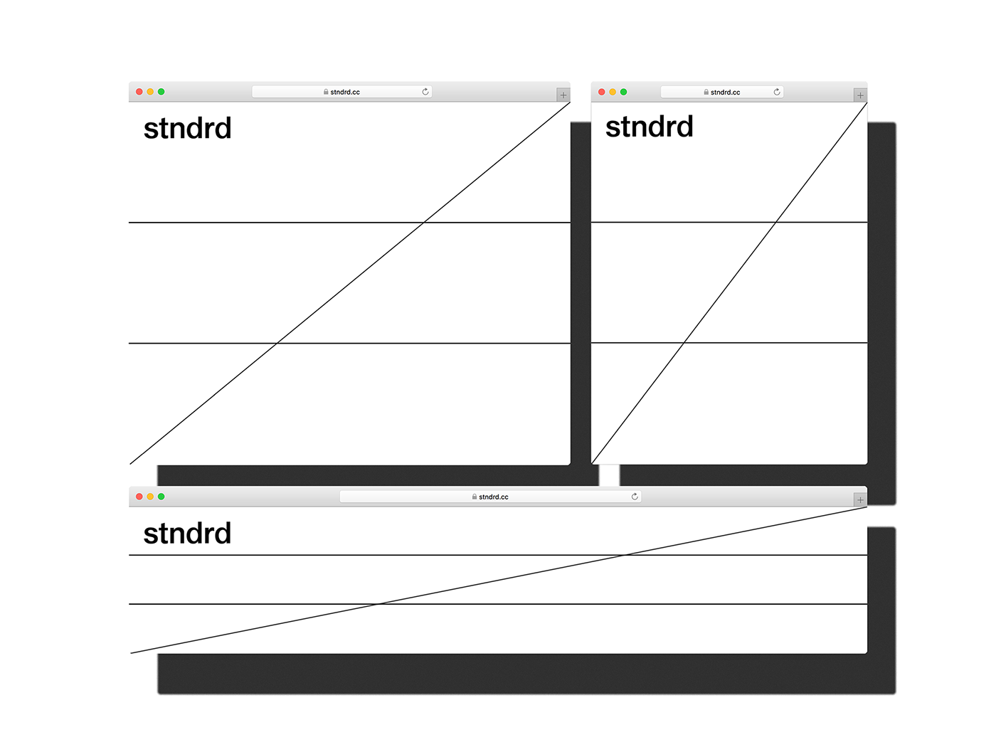
our key visual consisting of three lines symbolizes 'not equal’ in that sense. we complete typography in an uncommon layout utilizing three common alignments and this is our standard we intend to pursue.
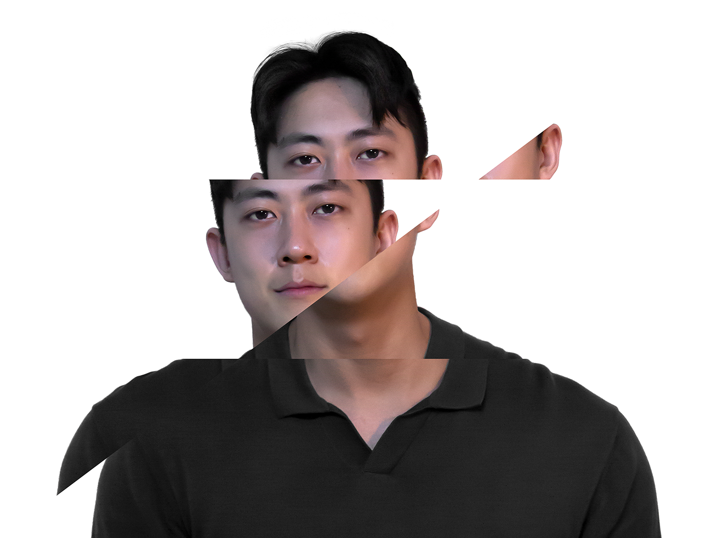


key visual of stndrd® is made by three simple lines. the 1st line means brandness of each brand that exists around us and the 2nd line represents the comprehensive beautiness of brand. there are many beautiful brands around us in the world. and appearances can be deceiving sometimes but it cannot be distinguished from other similar brands. the last 3rd line refers to the uniqueness. we think that when brandness, beautiness and functional / emotional benefits of product come together, finally a unique brand is made that differentiates itself from others.

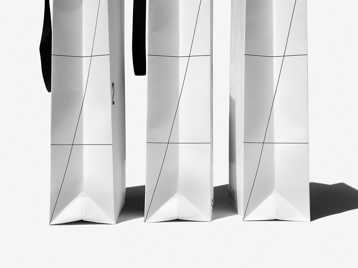

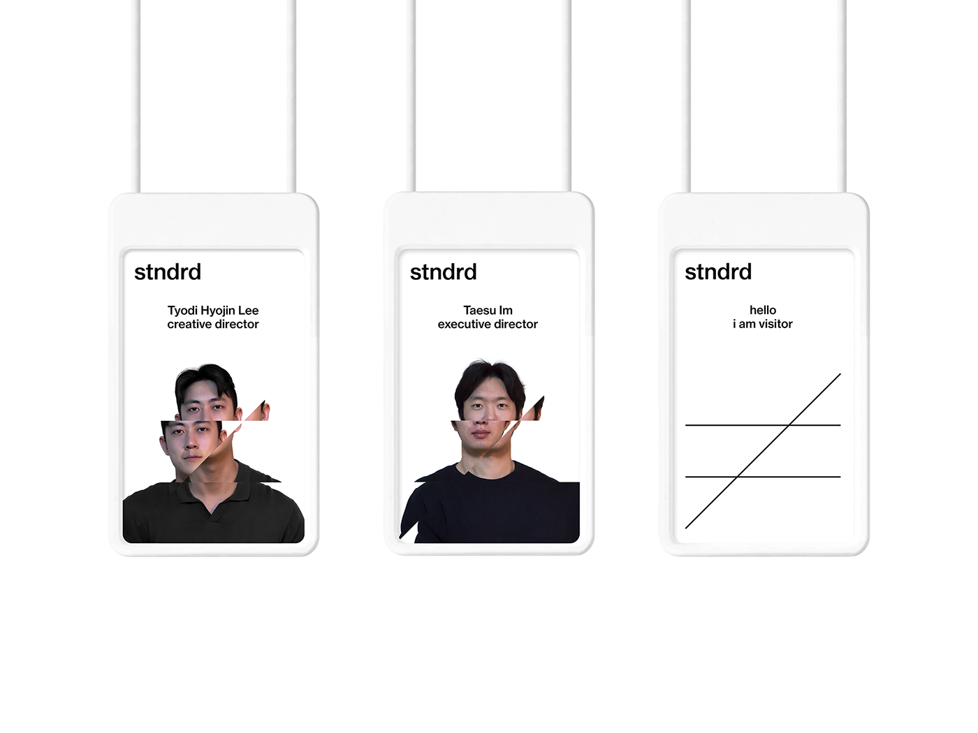
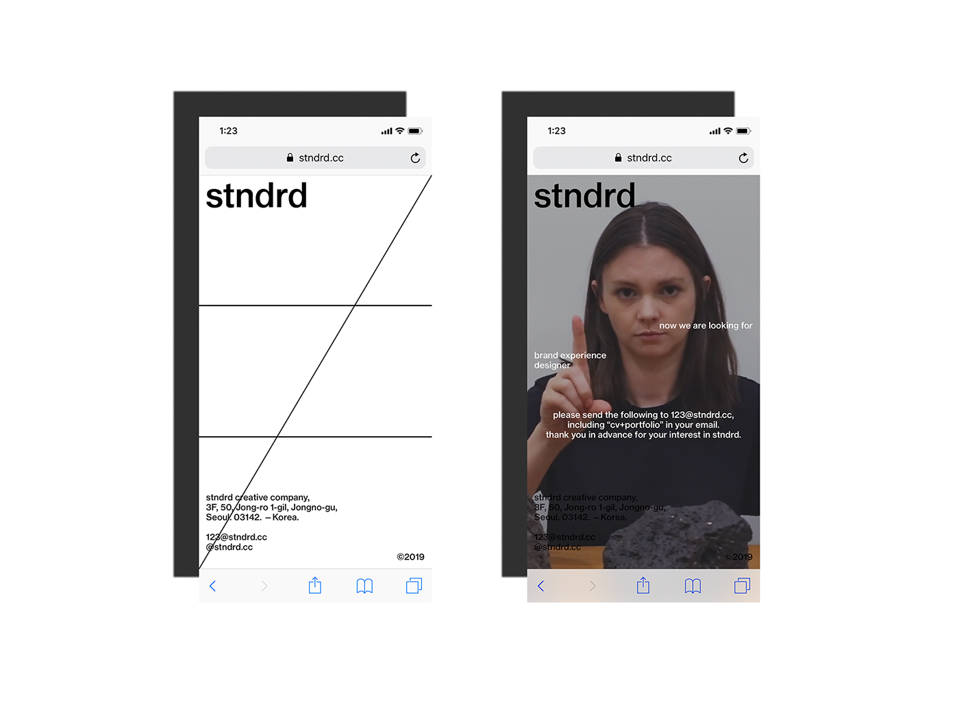
key visuals can be used in a variety of situations. it can be transformed according to the layout and it also can give more unique personality with the split face when using the background picture. the most common alignment methods when we create a document are left-aligned, right-aligned and center-aligned. by using three sorting methods in a frame at a time, we design a typography that is standard but not standard at the same time.


stndrd® creative company
stndrd is balance.
stndrd is not normal.
ⓒ2019


