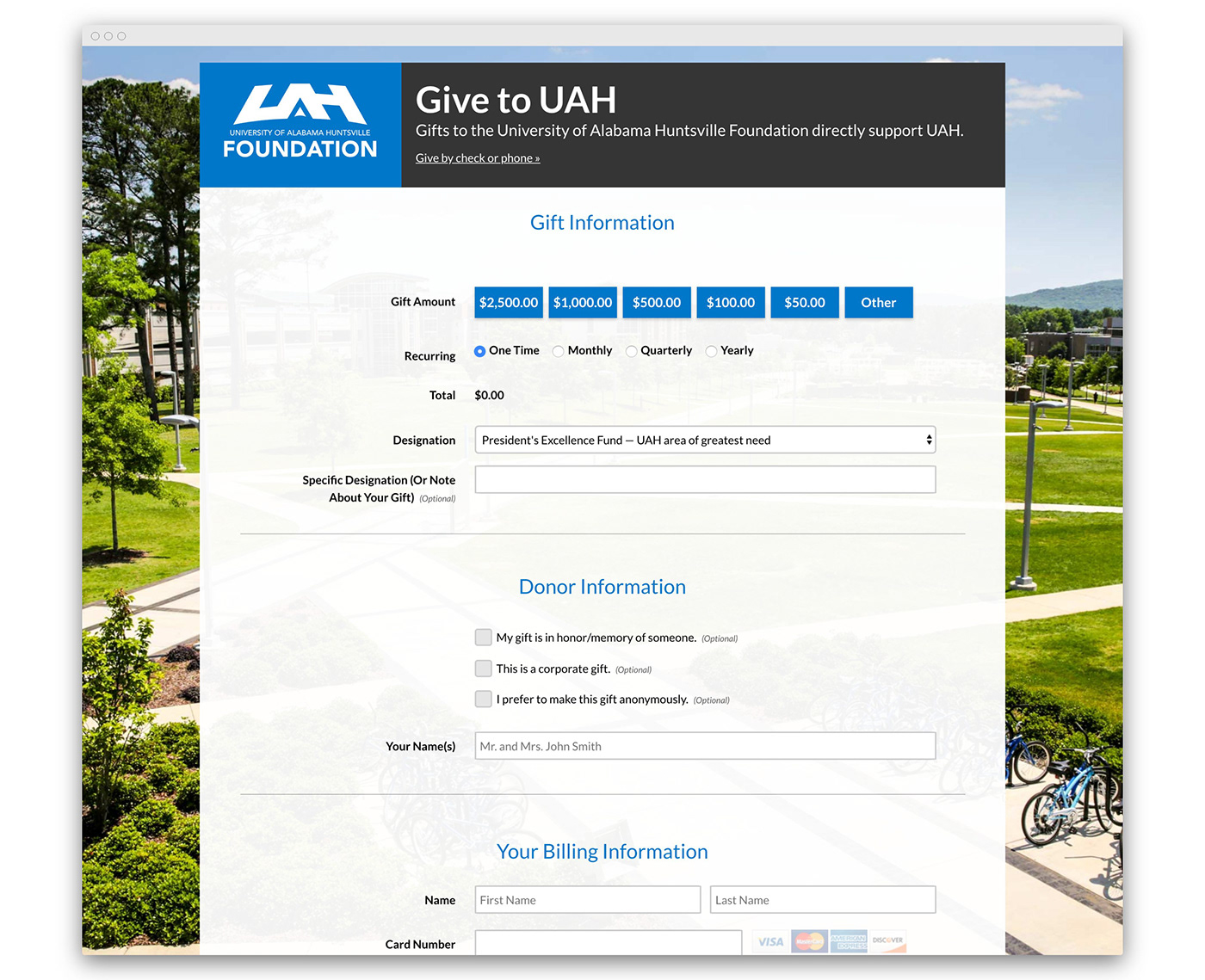
UAH Online Giving Form
In 2017, as Web UI Designer for UAH, I made it my mission to redesign UAH's primary online donation form. The resulting website saw an increase in online donations, was cost-neutral, and won the Grand Award in CASE District III's Fundraising Website or Microsite category.
The Before
I say I "made it my mission" because this wasn't a job assigned to me. But it needed to be done. Why, you ask? Well... take a look at the original page.

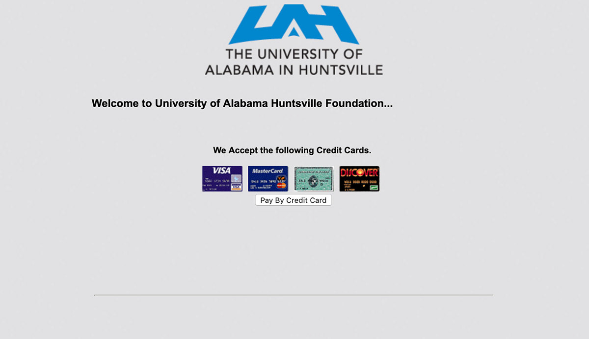
Let's get this out of the way: it was ugly. I mean, those credit card logos look straight out of the 90's. That doesn't really inspire a lot of trust, and trust is critical for a page that's asking for your credit card number.
Other specific problems that I'd look to address:
- splash page required extra click
- # of fields was overwhelming
- order of fields was unintuitive
- site was not mobile-friendly
These problems had been evident to everyone involved with the page, but it remained this way for so long because credit card processing is complicated and no one knew what to do solve it.

Enter: Drew McDowell
Getting Started
The first step to a redesign was figuring out the back-end, since solving these problems wasn't possible with the current payment portal provider. After a considerable amount of research (Google-fu) I came upon an online donation software called GivingFuel which seemed to be a good fit for our needs.
It was important that this solution at least pay for itself with increased donations. With the help of my manager and some of his patented spreadsheet magic, we were able to show that, even if donations were unaffected, this solution would be cost-neutral for us. Now I had everyone's attention.
Contextual Inquiry

Actor portrayal of my furious note-taking
Much of the contextual inquiry had been done before this project even started. The problems I mentioned above came from – well – my eyeballs, but also from casual conversation with co-workers and stakeholders in the years preceding this redesign.
However, meetings with stakeholders revealed a number of pain points not initially evident.
One such pain point was cross-campus coordination. UAH is made up of many different departments, all vying for funding. While the Development office was eager to assist in those efforts, there was concern that those campaigns weren't always coordinated and that money wasn't always flowing through the Development office. Anything that could be done to better funnel energy and dollars through the central Development office would be a step in the right direction.
Also problematic was overly complex and verbose giving instructions on each departments giving page. Departments often had different campaigns or funds to promote. So explaining to people precisely how to fill out the form or write a check so that their money went to the proper fund was difficult. Streamlining the designation process was important.
Design Process
I consulted online resources on form UX and donation psychology, learning a lot about things like anchoring (you list suggested amounts from greatest to least to subconsciously reframe donors' baseline donation amount).
I organized sections into logical chunks for easier comprehension and ordered primary tasks like amount selection first.
I used conditional field logic to hide irrelevant questions and reduce cognitive load.
I used browser testing and CSS magic to ensure the site was responsive and mobile-friendly.
I linked to a new streamlined "Give by check or phone" page to provide clear instructions for offline giving and ensure that money was properly directed through the UAH Foundation (the donation-solicitation arm of UAH).
I implemented the ability to create links to pre-filled forms by passing parameters through the URL. This was a game changer as it completely eliminated the need for departmental pages to include long-winded instructions for properly documenting designations. It let them focus on convincing potential donors to support their programs. I even created a URL generator so that staff in the Development office could easily create links used to market new campaigns.
Launch Strategy
Stakeholders in University Advancement were very excited with the results. After a couple rounds of meetings and relatively minor revisions, the page was sent up the chain. I presented the new site (while giving background on the project and the problem) to the deans of each college, the faculty senate, and the board of trustees, incorporating feedback and eventually securing buy-in.
The Final Product
The page launched in September of 2017 and, in addition to solving numerous internal pain points, has led to a steady rise in online donations.
In February of 2019, UAH was presented with CASE District III's Grad Award in the Fundraising Website or Microsite category for this redesign.