This project is my contribution to my favorite Alien movie's 40th anniversary. I decided to represent and remake one of the works of the great American film designer Ron Cobb's symbols (icons) for the spaceship Nostromo.
He named them the “Semiotic Standard For All Commercial Trans-Stellar Utility Lifter And Heavy Element Transport Spacecraft”.
You might have noticed that these icons bear a striking resemblance to the rounded rectangles used for modern app iconography.
I really like them, these small details help to believe and fill the atmosphere of a retro-futuristic space mining ship which is created for people (space miners, workers) who worked and traveled through space and galaxies.
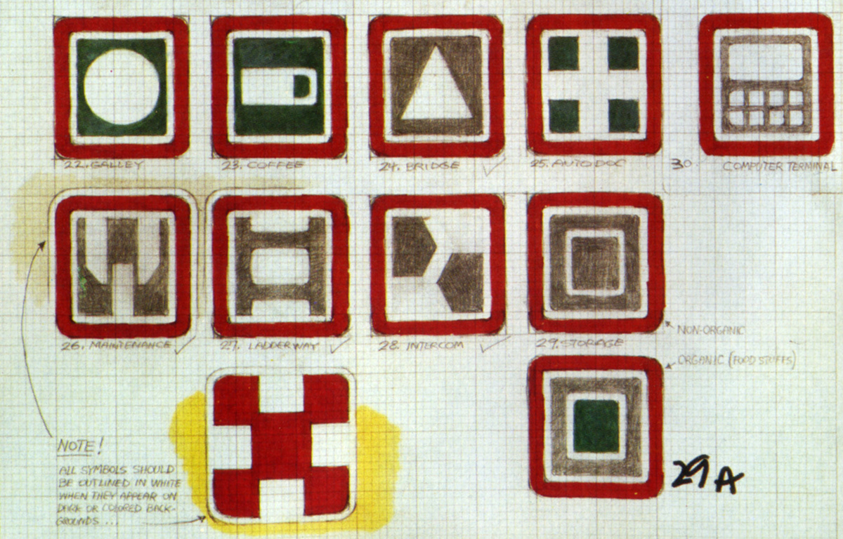
The sketches below are from Cobb’s 1981 collected works,
Colorvision book: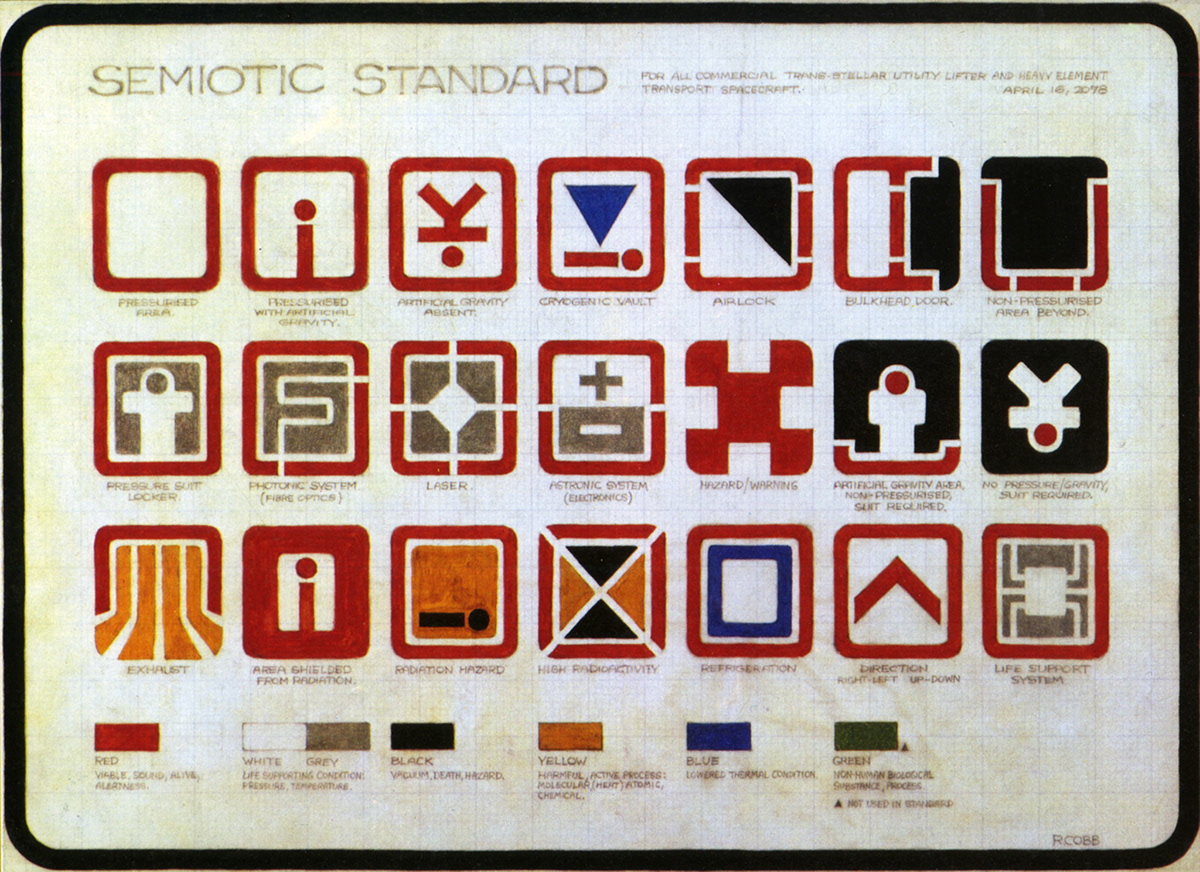
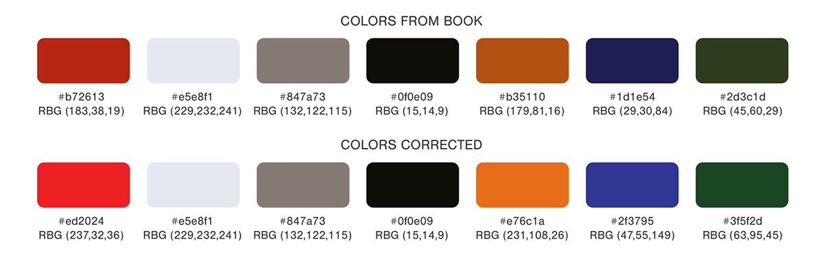
Icons shape analysis:
Ron Cobb designed these icons on graph paper which is a common way to make design sketches in 70-80.
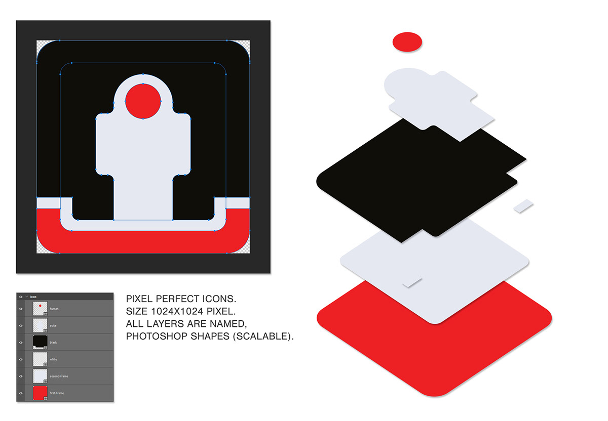
Icons size is 19 x 18 units.
First, all icons have a main frame, then a separator line and area for the different types of content. The main frame is sometimes interrupted and in rare cases, there is no frame. The main frame is mainly colored red which is in terms of color theory related to danger, the wrong way, do not enter, and alertness explanations. Let’s leave colors after the shape and symbols analysis.
Important note from Cobb’s sketches:
All symbols (icons) should be outlined in white when they appear in dark or colored backgrounds...
( I think he means that in spaceship walls or surfaces where they will be placed, these icons are mainly made from metal and have dark grey or grey colors, so the white outline will popup the icon and make more visible. Another example medical compartment or in Mother’s* room where are the walls and surfaces are white and a white outline not needed anymore).
* Mother is the name of the leading computer (brain) of Nostromo.
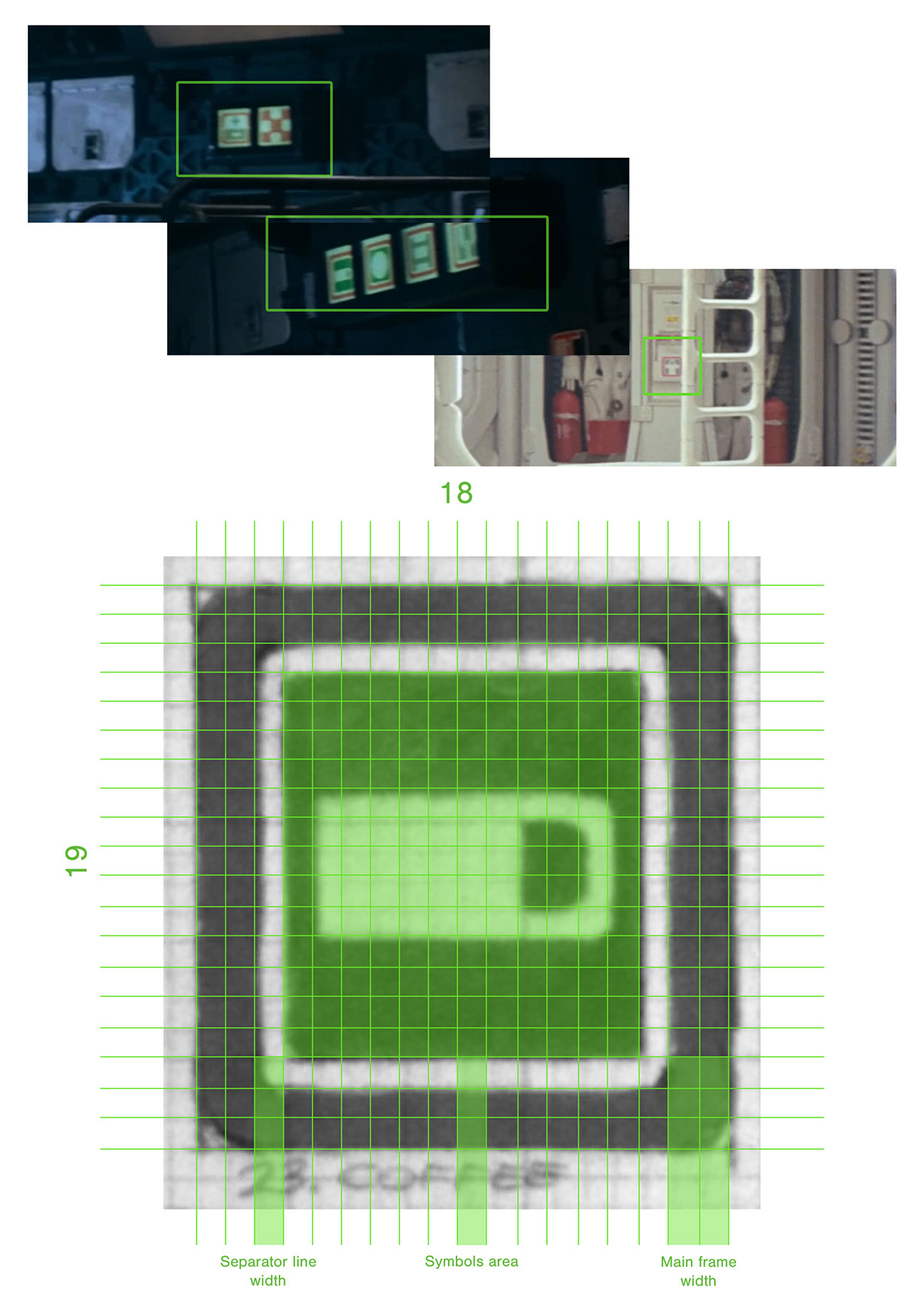
See screens from the film.
Grid and sizes.

Colors.
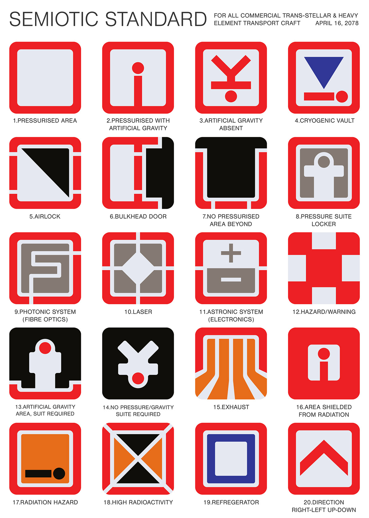
In the first image, we can see the colors chosen by Ron, of course, they are in paper and the colors were faded. I have just copied the image and cut it to place it here.

Red - viable, alive, sound, alert.
White and Grey - Life-supporting condition: Pressure, temperature.
Black - Vacuum, death, hazard.
Yellow - Harmful active process: Molecular (heat) atomic, chemical.
Blue - Lowered thermal condition.
Green - Non-human biological substance, process (Not used in standard)
Recreated.
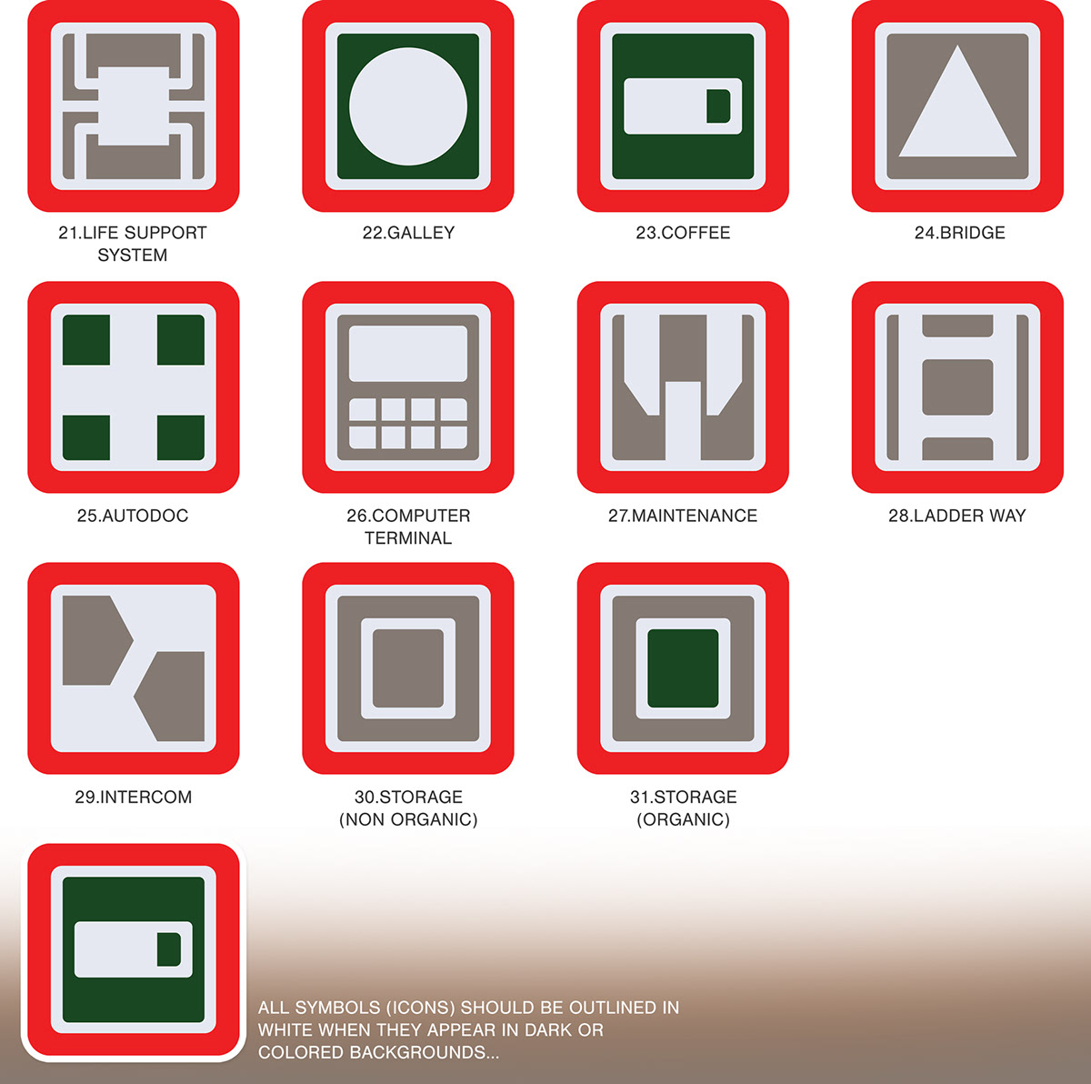
Specifications.