Philippine Studies
An academic journal gets a younger, more graphics-rich look
An academic journal gets a younger, more graphics-rich look
Client
Philippine Studies
Ateneo de Manila University
Format
Journal
Year
2007
Dimensions
6 x 9 in
Philippine Studies
Ateneo de Manila University
Format
Journal
Year
2007
Dimensions
6 x 9 in
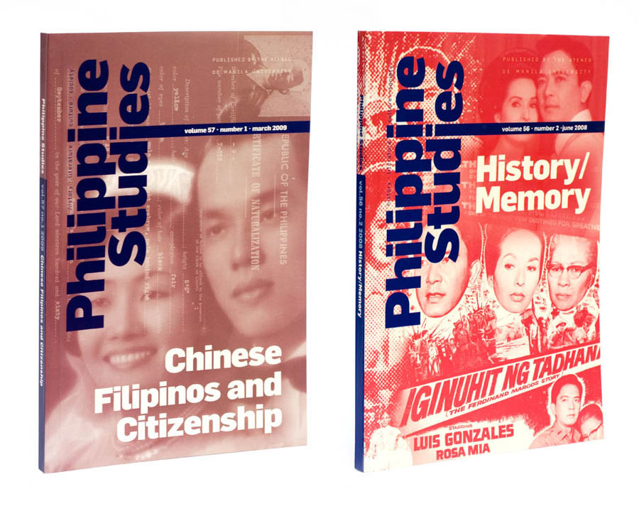
The new front cover design features a prominent monotone image from the lead article (left) or for themed issues, the main topic (right).
Philippine Studies is a quarterly journal on Philippine history, literature, culture, and society. Though it is a scholarly publication, it emphasizes readability as among its main criteria for considering articles, consciously veering away from the difficult and jargon-filled text-heaviness normally associated with academia.
A redesign was commissioned in order to make the journal more appealing to a younger generation of scholars and academics. Contributing authors are encouraged to include images whenever necessary; not only does this make for more interesting reading, but it also adds to the "younger" and more sophisticated feel--being articulate both literally and visually--that the journal was going for.
A redesign was commissioned in order to make the journal more appealing to a younger generation of scholars and academics. Contributing authors are encouraged to include images whenever necessary; not only does this make for more interesting reading, but it also adds to the "younger" and more sophisticated feel--being articulate both literally and visually--that the journal was going for.
Before

Philippine Studies prior to the redesign. All covers were blue and gray, with the issue theme on the lower right. The navy blue portion of the identity, which referred both to the journal and the university, was retained in the redesign.
After

The spine retains the navy blue color of the previous design, but injects a pop of color which is especially eye-catching when issues are stored in shelves--which is probably how they are usually stored. Pertinent information like volume and issue number, year, and main article/theme are uniform and clearly legible.

The journal's new look. The front image has a distinctive color which varies per issue. The back cover features the lineup of main articles clearly, and supplementary features (ie book reviews, research notes, interviews, etc) at the bottom. The back is always a signature navy blue, while the issue's color is reiterated in a box beside the barcode.
The overall typography was streamlined from four (Optima, Arial, Garamond, Book Antiqua) to just two distinctive but still academic-friendly typefaces. The navy blue main color of the publication was retained. A bold monotone cover with an image from the lead article was introduced; this stemmed from an earlier incarnation of the journal featuring a different cover color for every issue.

The table of contents was revised in order to make the journal name more prominent. White space was utilized to make it easier on the eyes, and more flexible to accommodate instances when there is a theme (placed under the journal name) or if there are more main articles than usual.
The inside covers are printed in the journal's signature shade of blue, to give a pop of color to the otherwise monotone contents. A two-column layout highlights the verticality of the journal's size.
The inside covers are printed in the journal's signature shade of blue, to give a pop of color to the otherwise monotone contents. A two-column layout highlights the verticality of the journal's size.

The main articles' title and key info now occupy a whole page. This allots more attention to the article, and doubles as a divider of sorts. A more contemporary type treatment was used for the titles--colons were eschewed so that subtitles are now distinguished by color.

A large drop cap signals the start of the article.

Notes and references, which used to take up a lot of space, were reformatted in a smaller but more readable sans serif. Unlike the previous design where one had to go through a lot of pages for articles with extensive notes, it is now easier to follow endnotes and flip through references at a glance.
About the journal
Philippine Studies is an internationally refereed journal that publishes scholarly and original articles from a range of disciplines that provide historical and ethnographic viewpoints on the Philippines and its peoples. It welcomes works that are theoretically informed but not encumbered by jargon; studies that describe their subject well but also offer fine-grained interpretation and astute analysis; papers that look in-depth into a topic but also pursue comparative thinking. It prefers contributions not confined by the nation-state but take on transnational and global perspectives, even as it seeks to engage scholars who may not be specialists on the Philippines. Founded in1953, Philippine Studies is published quarterly by the Ateneo de Manila University.
From the website

The new layout is more sensitive to the inclusion of graphics. To break the monotony of text, full bleeds (top) are employed whenever appropriate. Others include full-page images (film newspaper ad, below left), full-spread photos (panoramic view of Quiapo Church, bottom left) and half-page bleeds (view of Barasoain Church, bottom right).


The new design merges the pre-redesign look with another older incarnation ca. 1980s, where each issue had a different, bright color for the cover. The window of color on the spine also serves as a mnemonic device of sorts (ie, "I'm looking for the pink one") which makes for easier browsing even if only the spines are visible.
Philippine Studies is available at the Ateneo de Manila University Press. It is also available internationally on its website, where one can purchase annual subscriptions or individual issues and articles.
