

I like having delight in my projects. For me, when I look at design (or food, or art, or even a street!) that I like, sometimes I stop to just admire the view. This project centered on the creation of a typeface, and my final type specimen is this video. I wanted to convey fun and simplicity, as the typeface is very round and constructed from simple geometric shapes.
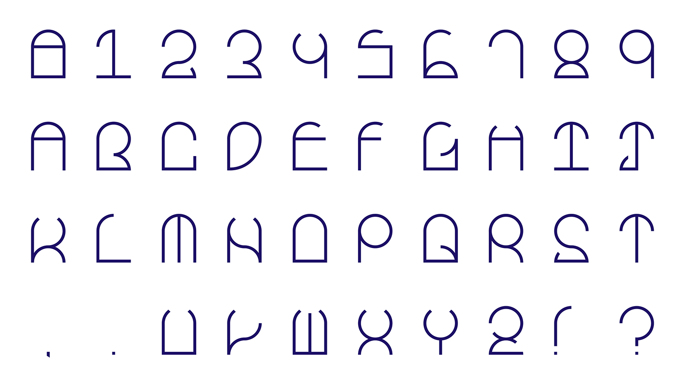
Frame Typeface


My summer study abroad in Italy and trip in France inspired me when I started to make this typeface. A lot of the historical buildings in Europe have beautiful windows. Even within these buildings, a lot of the decorations and architecture were suggestive of windows and frames. The mosaic inside San Miniato al Monte particularly influenced me in the creation of the "key shape" for Frame.
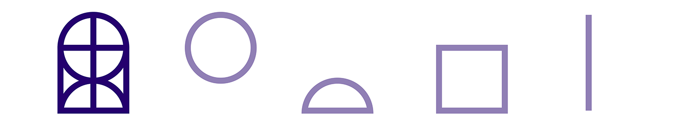
Base key for Frame. Made of a simple geometric shapes
The original key did not have the half circle at the bottom, but I added it in because I needed more options for the strokes of the typeface.

Red letters represent glyphs that needed to be edited.

For the first iteration, the typeface turned out pretty cohesive because of the key shape. Some of the letters still needed a bit of work, though. In particular, the B and the K were a little out of place because of their filled-in counters, and the and were in lowercase. For the F and J, they had similar forms like E and I, respectively; however, they weren't formed in the same fashion, so I standardized that as well in the next iteration.

Final Typeface
After creating the typeface, I worked on different ideas for a type specimen. I worked with the idea of foreground and background, and I also considered focusing more on the strokes of the letters themselves. Both of these paths, however, that would have turned the focus to the final specimen over the typeface itself.


At this point, I asked myself two questions: What's the point of the typeface? How was it made? I realized that whatever final specimen I made should respond to these questions. As a result, I started to create a motion graphics piece as the final product. I had worked a bit in Adobe AfterEffects a few years ago, but I had to go back and re-learn how to use the program. I felt that motion would fit the typeface, with its curving, geometry-based lines.
On another note, I brought geometric shapes to the forefront of the specimen, as it was important for viewers to see that the typeface framesthese shapes to create the letters. I introduced textures to the video, as I wanted the video to evoke children's playing blocks, or at least something physical, over slick color fields on a screen.


In reflection, basing my typeface on a "key shape" helped me to standardize my typeface early on. In terms of the final specimen, the storyboard sketches turned out to be a lot more important than I had first thought, as going back and fixing parts of the video were difficult. I had only a week to make the video, but I used it as a means to explore AfterEffects and get used to the program. If I were to do this again, I would make my storyboard more detailed, and I would change the presentation of the words at the end to emphasize that this typeface works well with motion.


