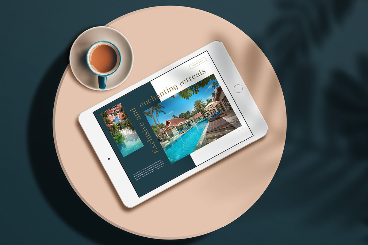
A full rebrand commissioned to give Hermes Retreats the luxurious look and feel worthy of its premium escapes, we elevated this high-end family-owned business to new heights. The brand was led by an Outhink™ process, where we defined their brand compass to inform the visual identity.
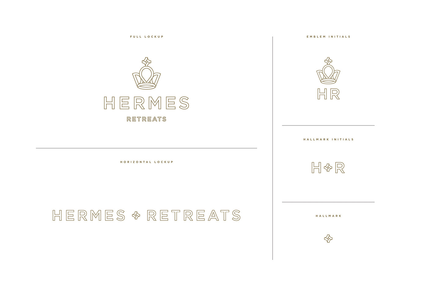
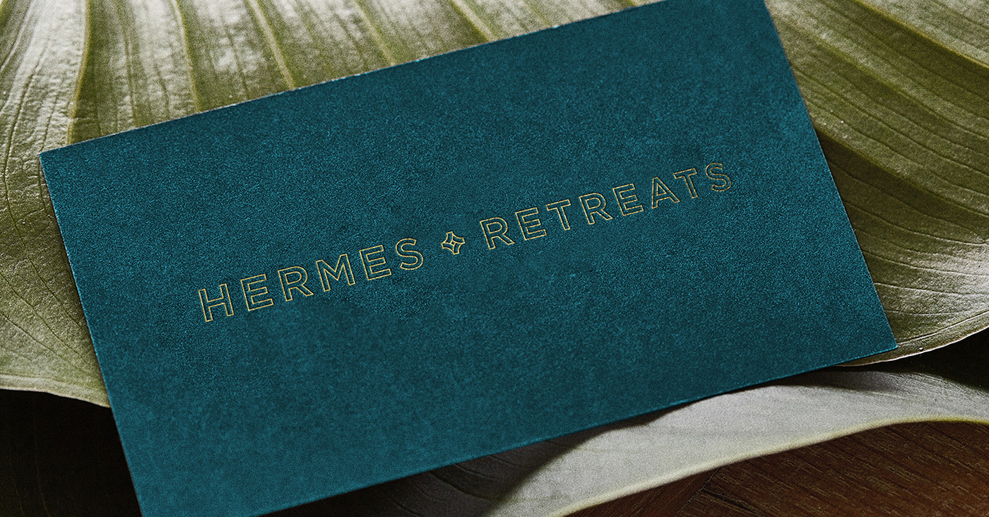

Building the brand from its key point of difference, we positioned the retreats as about more than just indulgence - it’s the wealth of meaningful, moving and otherworldly experiences they provide that set them apart. This permeated the creation of each design element, including the the logo which was comprised of four key symbols crafted into one unique crown-like form - each representing destination, travel, divinity and luxury.


Positioning Hermes Retreats as the ultimate destination for enriching travel,
we also crafted sumptuous brand patterns, colour palettes, photography and collateral.
we also crafted sumptuous brand patterns, colour palettes, photography and collateral.
