


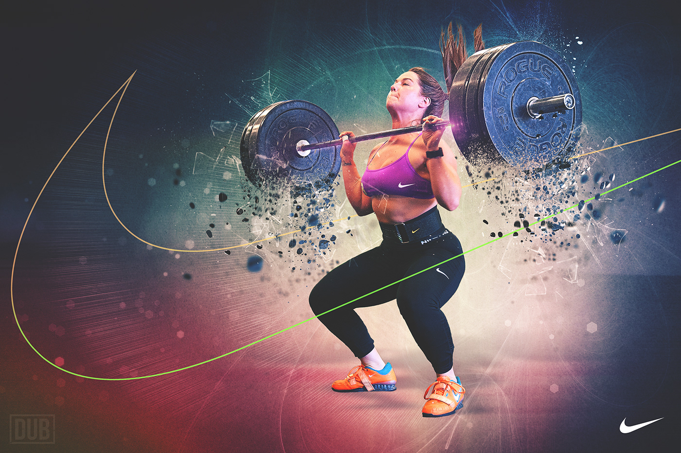
I have lately come to enjoy going back through older photos to see if how I view them has changed. Would I still process them the same? Do I see something now that I might not have when I took them? These are some of the questions I asked when I was going through weightlifting photos taken of my coach. I had processed one image out of several in a clean & jerk sequence, but this time around, I thought I might take it a little further.

After going through the sequence I shot, I tried to find the best one. I look for just about everything. What is the most dynamic movement shown? What about facial expressions? Is the position of the lift correct? Would she think the photo was cool if she was tagged in it on social media?
These are just a few of the things that I consider when going through images. Initially I landed on the one circled above and that is the same one that I came back to this time. I love where she is in this lift, her hair, etc.

Immediately I wanted to isolate her from the gym, most likely, entirely off the image all together. So that is where I started. From there it was a matter of enhancing the dynamic motion even further.

And then a little time spent in Photoshop, and I have the final image:
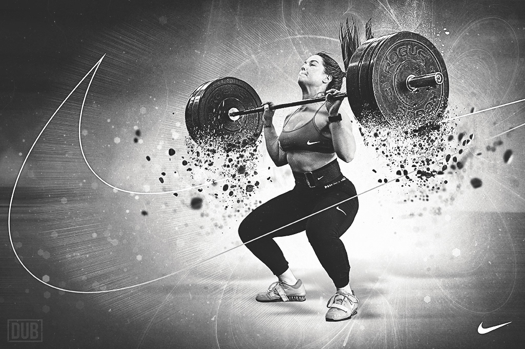
I also thought it would be fun to experiment with a few different layouts and colorways for this.


With that image, I really liked the movement and patterns in the background. Every time I attempted to add copy to it, the layout felt too crowded. The motion of the weights, the background, and large Nike swoosh outline always said enough for me. Yet, I still wanted a version with some text on it.
Again, this is always volumes easier when just about everything is compartmentalized within Photoshop so that I can easily move and adjust as needed. Here are a few poster variations I came up with. I wanted to reduce the noise of the background, focus on vivid colors, and bold text.


