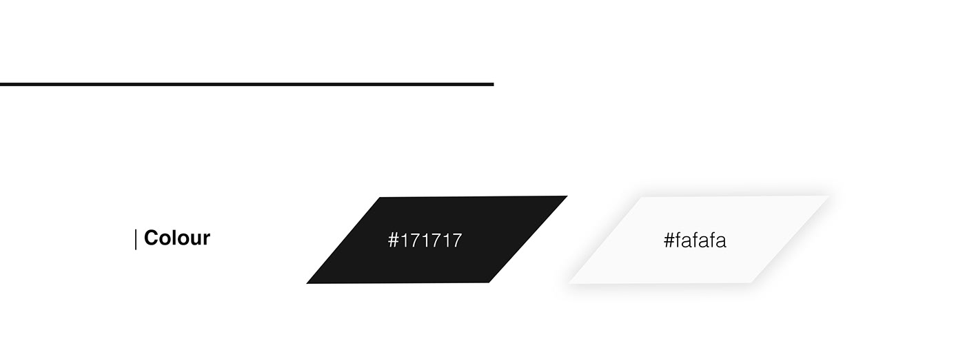
| The client expressed interest in a play on the word invert. Other criteria's included the use of bold text, and a colour scheme of black and white with the option to add colour if needed.
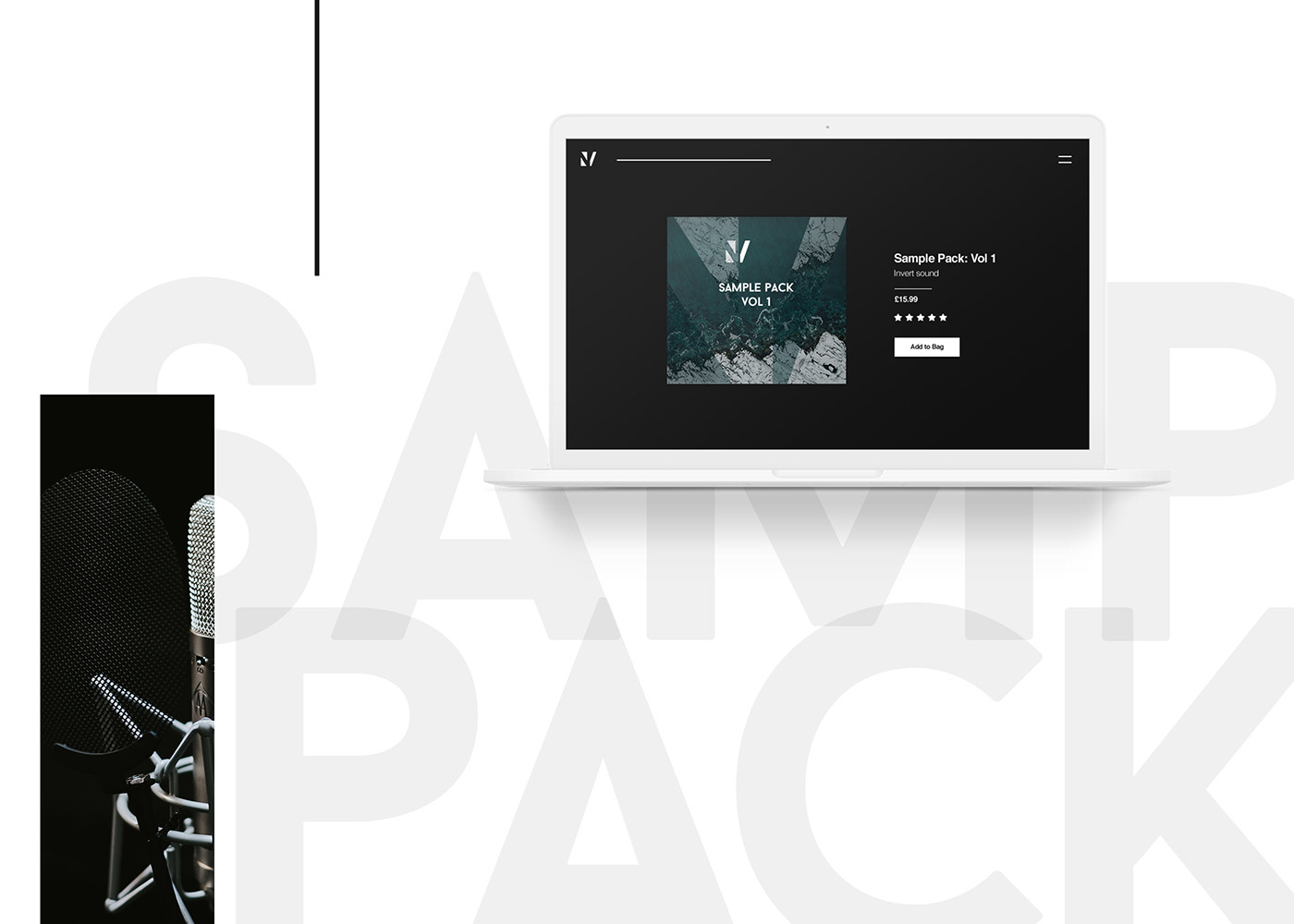
| The design utilised the angles of the N and V to create the desired inverted effect. These letters could also be used on their own to create an appealing icon.