


Pierri Imóveis
PT/BR
Pierri imóveis é uma imobiliária da cidade de São Paulo. A empresa tem como grande foco a experiência jurídica e facilidade com a burocracia e simplicidade na execução de compras e vendas dos seus imóveis.
Ao identificar a necessidade de se atualizar no mercado, a empresa buscou por uma agência com o objetivo de renovar sua imagem no mercado, transmitindo maior seriedade e melhorar a identificação com os imóveis de alto-padrão que ela comercializa, assim a marca deveria ser sóbria e transmitir o senso de experiência de mercado.
Objetivo do projeto:
Realizar o redesign da marca Pierri Imóveis com as características citadas, buscando trazer um novo padrão de comunicação para a empresa, dando a ideia de sofisticação, sobriedade e experiência, além de mostrar a grande expertise da marca com o setor jurídico.
Tags da marca:
Confiança
Jurídico
Elegância
Sofisticação
Seriedade
Sobriedade
Experiência
Jurídico
Elegância
Sofisticação
Seriedade
Sobriedade
Experiência
Tags visuais:
Elegante
Limpo
Minimalista
Sofisticada
Limpo
Minimalista
Sofisticada
EN
Pierri Imóveis is a real estate company in the city of São Paulo.
The company has as great focus the legal experience and facility with the bureaucracy and simplicity in the execution of purchases and sales of its real estate.
When identifying the need to update in the market, the company searched an brand agency with the objective of renewing it's image in the market, transmit more seriousness and greater identification with the high-quality properties that it commercializes, so the brand should be sober and serious beyond to convey the sense of market experience.
Project's goal:
Carry out the redesign of the Pierri Imóveis brand with the characteristics mentioned, seeking to bring a new standard of communication to the company, giving the idea of sophistication, sobriety and experience, as well as showing the great expertise of the brand with the legal sector.
Carry out the redesign of the Pierri Imóveis brand with the characteristics mentioned, seeking to bring a new standard of communication to the company, giving the idea of sophistication, sobriety and experience, as well as showing the great expertise of the brand with the legal sector.
Tags of the brand:
Confidence
Legal
Elegance
Sophistication
Seriousness
Sobriety
Experience
Confidence
Legal
Elegance
Sophistication
Seriousness
Sobriety
Experience
Visual Tags:
Elegant
Clean
Minimalist
Sophisticated
Elegant
Clean
Minimalist
Sophisticated


PT/BR
Tipografia
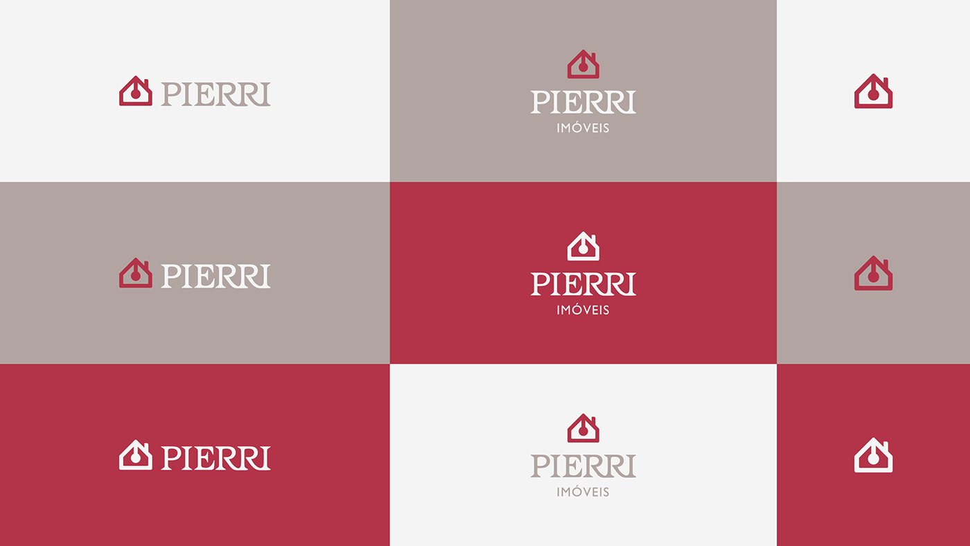
A tipografia escolhida para o logotipo foi a “Barcelona Expert” em sua versão Book SG. Para uma melhor leitura e singularidade, foi feito um espaçamento manual bem como a junção de alguns caracteres da palavra.
EN
Type
The Type chosen to the logotype was the "Barcelona Expert" in Book SG version. To reach a better reading and singularity, was made a manual spacing as the joint of some letters of the word.

PT/BR
Cores
As cores selecionadas foram cores sóbrias em complemento ao bordô, que gera uma sensação de sofisticação e transmite a percepção de uma marca jovem e mais afetuosa.
EN
Colors
The selected colors were sober ones in addition to the burgundy, which creates a sense of sophistication and conveys the perception of a young and more affectionate brand.


Obrigado pela visita!
Thanks for watching!


