

Redesigning SPLT
For a project at school, I was required to choose a company from a list of start-ups to rebrand. I chose the company SPLT, a start-up in the ride-sharing industry. The company intrigued me because of their unique take on how to compete in the ride-sharing space. After carefully looking at the SPLT brand via their website and online marketing, I decided that a rebrand could put the company in a better position to reach their target market. This case study will take an in-depth look at the process I took to create a rebrand of SPLT.


The Current Brand
SPLT uses a trendy colour palette of teal green and pink for their website and app. My guess is that this choice was an attempt to match the company’s fresh and innovative business plan. I feel, however, that this choice lacks a certain professionally that is found in the rest of their company. I decided that a more traditional colour scheme would give the company a more refined and professional feel and therefore appeal to the corporations and universities that SPLT is targeting.


The Final Logo (B&W)

Marketing Materials

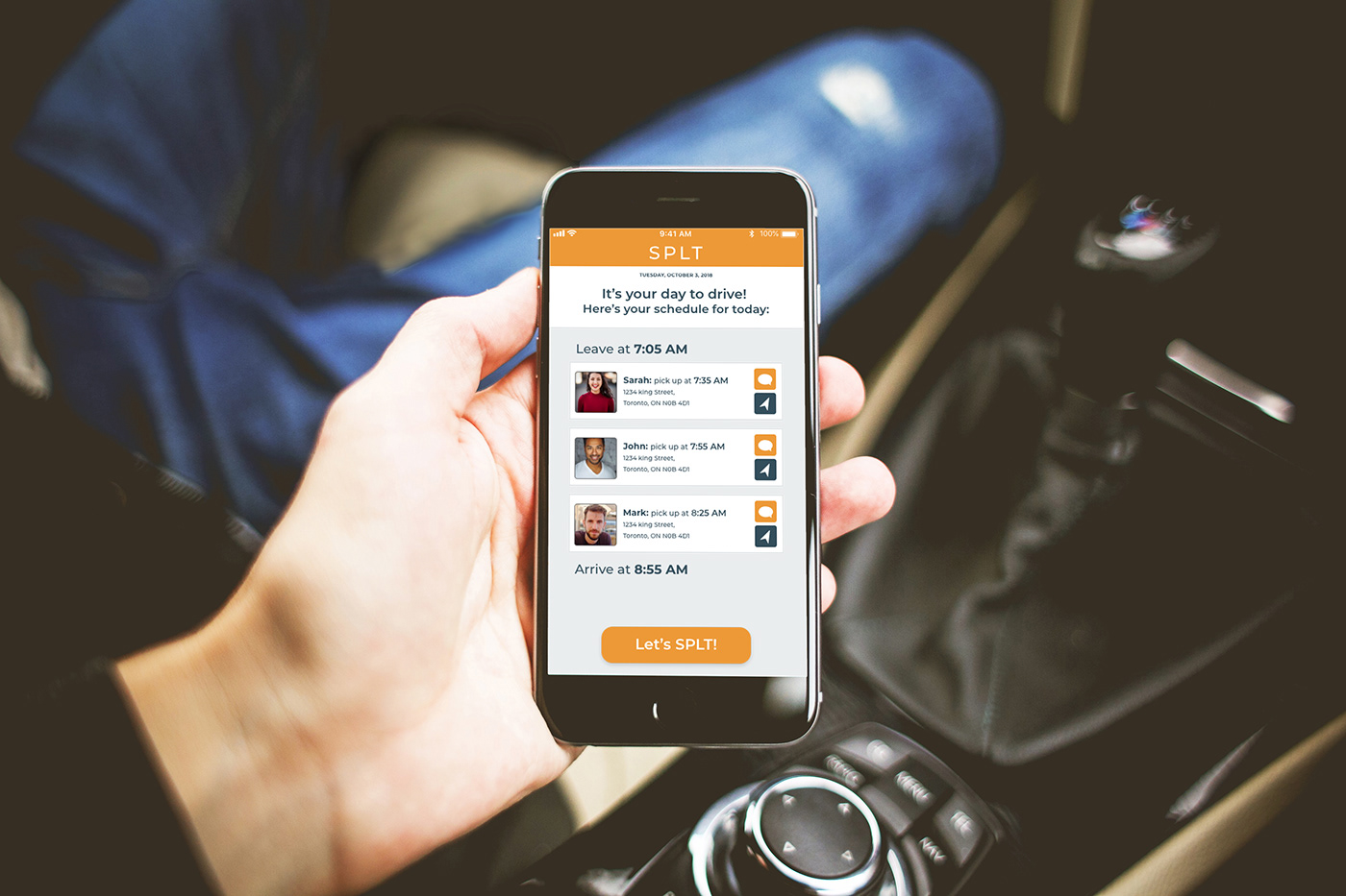
App Interface Redesign


