


Indorse
Branding, Visual Identity
The aim of Indorse is to empower people to learn and give access to sharing both professional and social skillsets. It is a revolutionary blockchain-based online platform, which is secure, non-biased and free of charge. For data security, it uses the new model of tokenization and unlike other traditional platforms, Indorse has built a network where users have full control over their data.
Encouraging personal growth
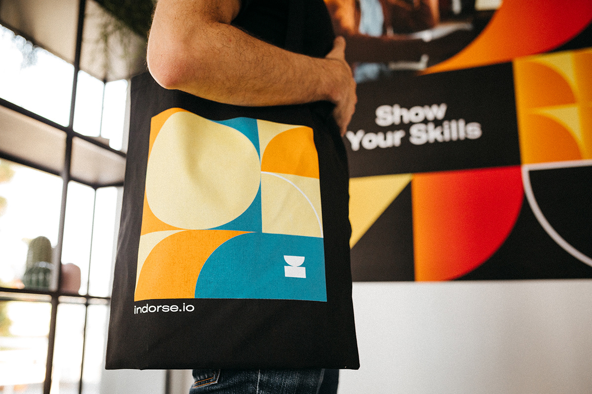
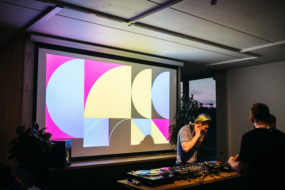
By continuing the idea of personal growth and combining it with the will to embrace individuality, we have created a branding system constructed from basic shapes, which not only visualizes an abstraction of the abbreviated IND, but also states that ‘each of us is unique, colorful and different’ in an unique way.
Symbolizing skill
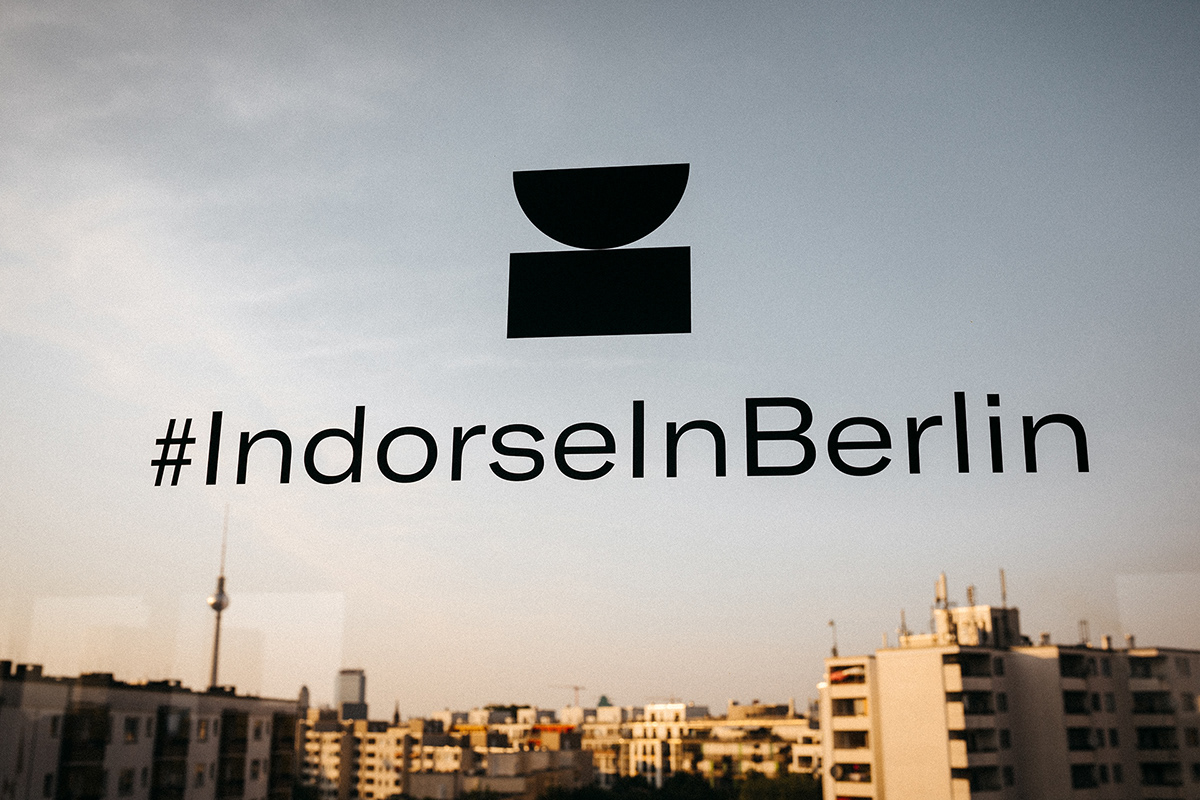
Our logo embodies the different factors needed on the journey towards success. It's shaped liked a trophy to show the importance of skill validation. It also makes up the Indorse “I” and underlines the balance that is essential to the skill mastery process.


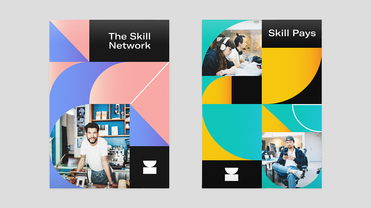

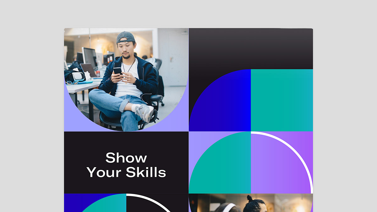
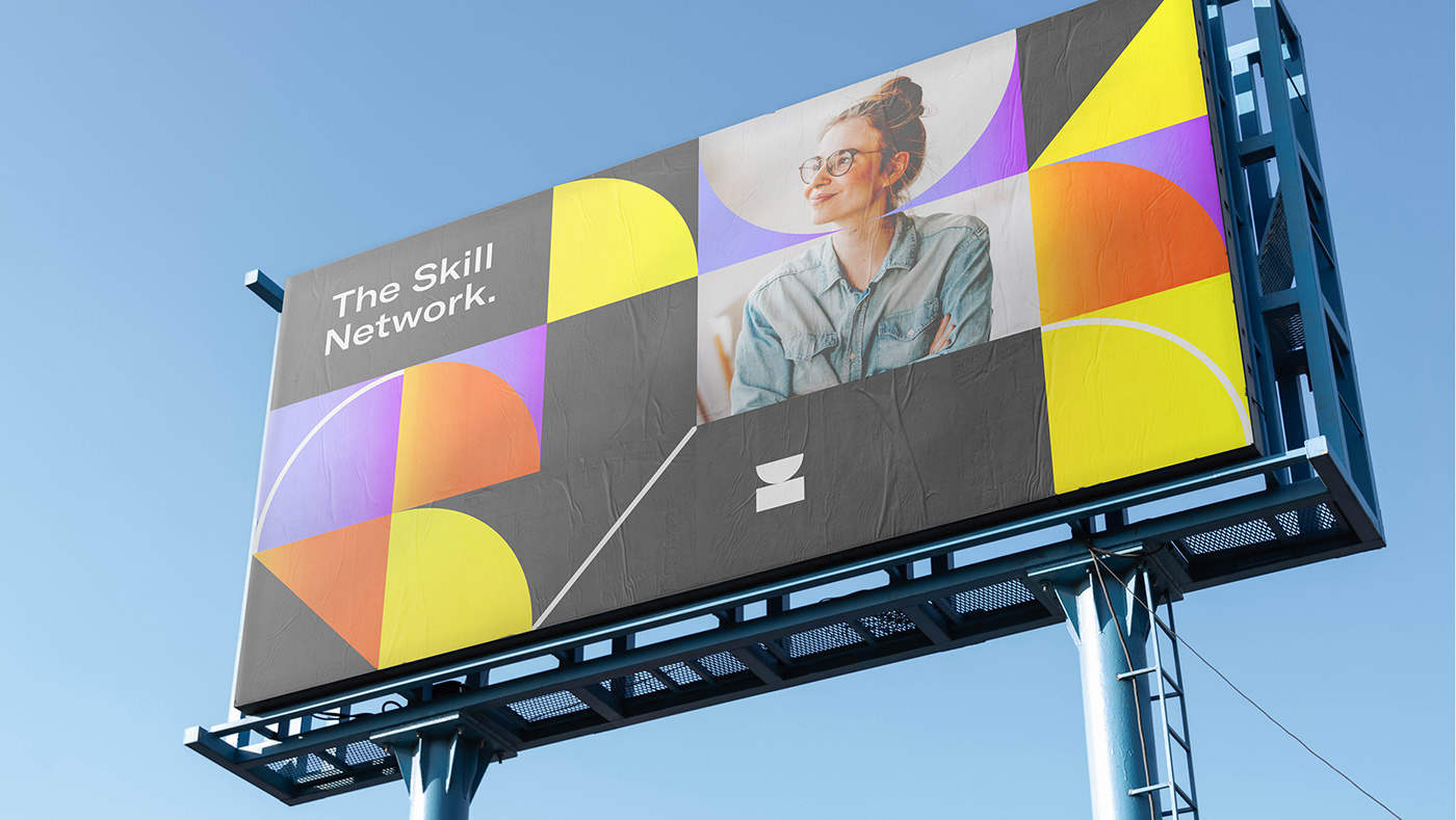
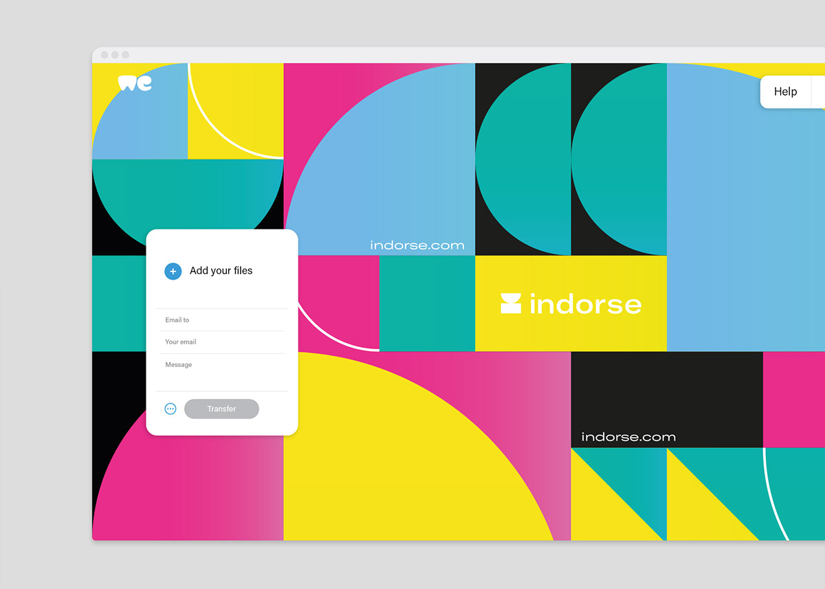
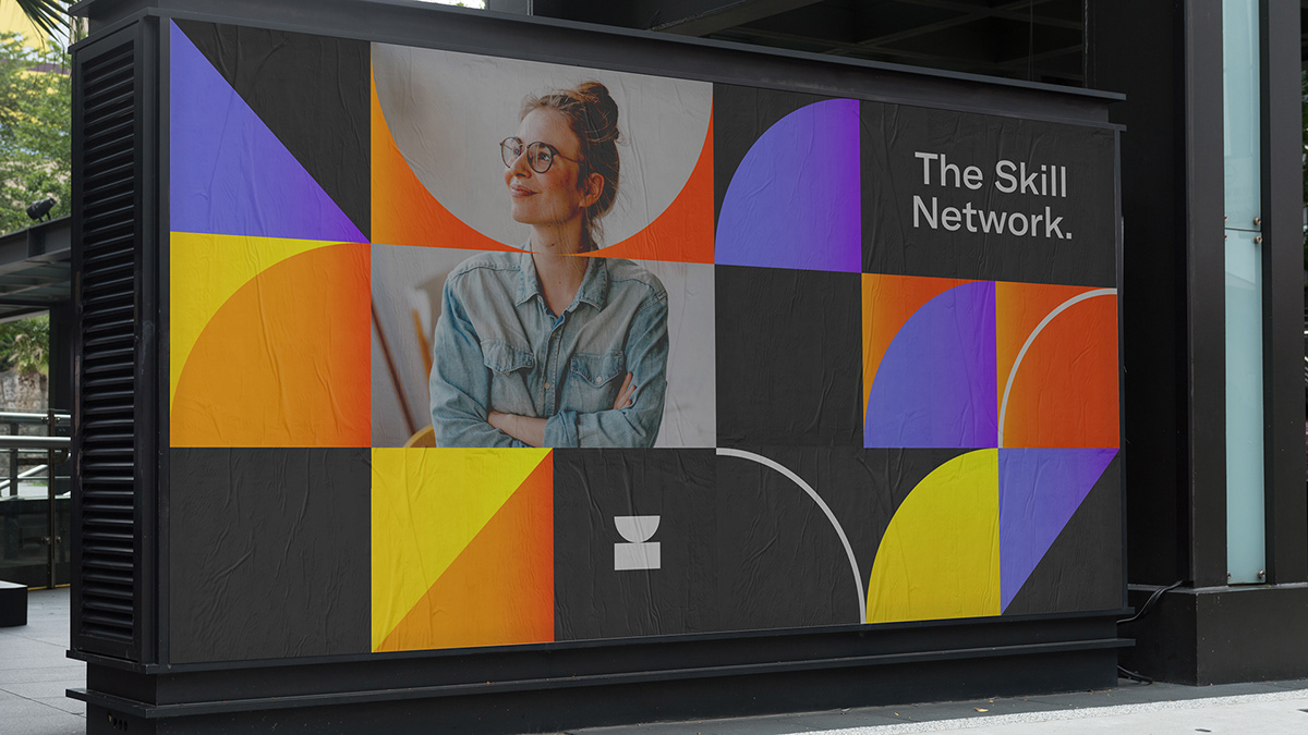
Promotional materials are covered up to 80% by the identity’s visual elements, where logo and other shapes are used as a mask for photos of people. This approach connects geometric patterns with human elements and brings people into focus. By doing so we underline, that behind each skill stands a real person and Indorse is a platform for various individuals, where skills are their online representation.


Rewriting the rules
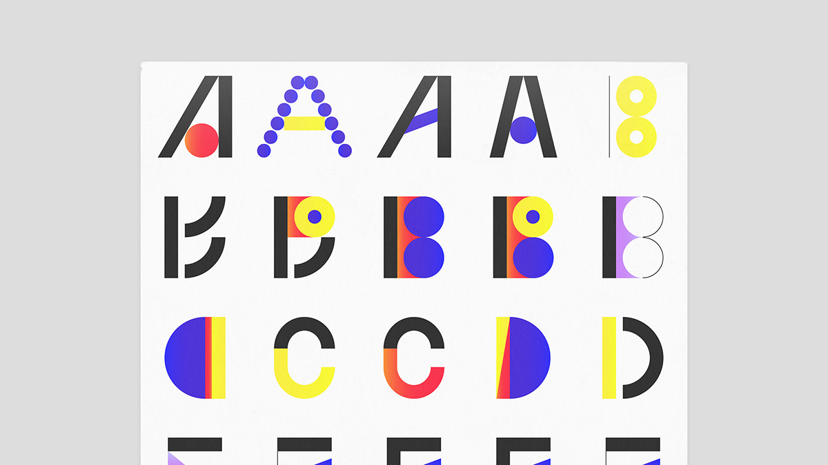
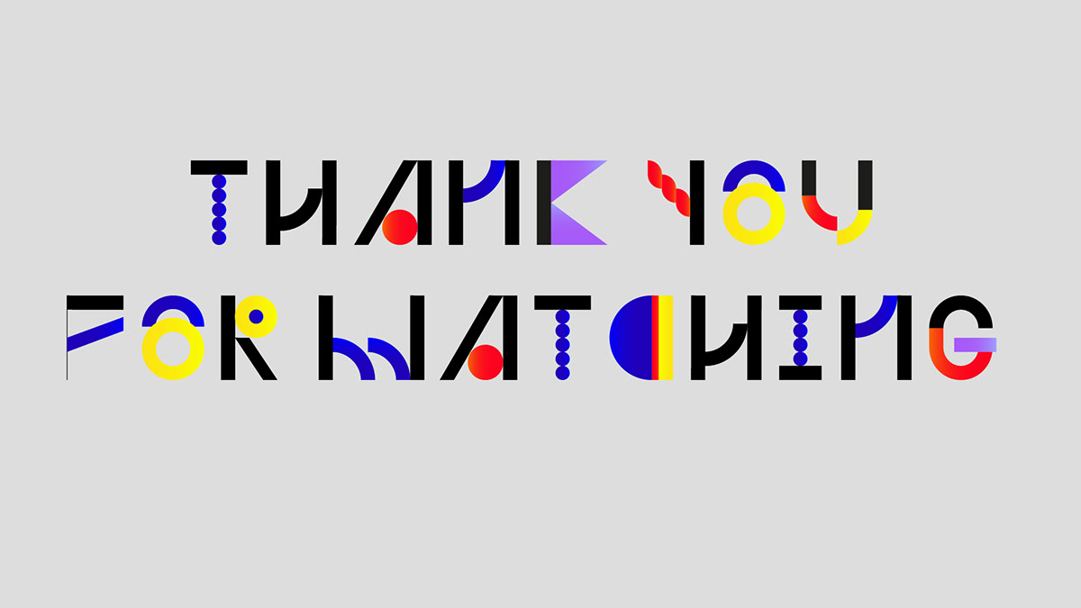
Indorse specially tailored typography brings the playful Indorse essence to each one of our key messages. It breaks free from the norm and encourages our users to think out of the box and try something new.


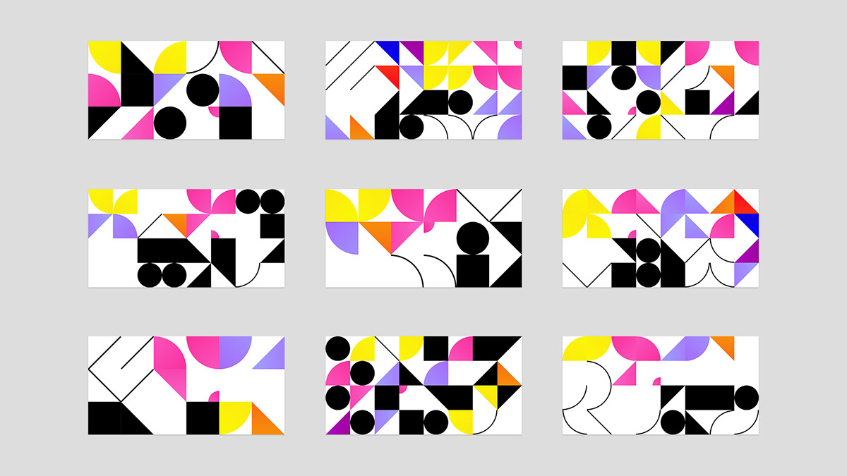

Mapping out individuality
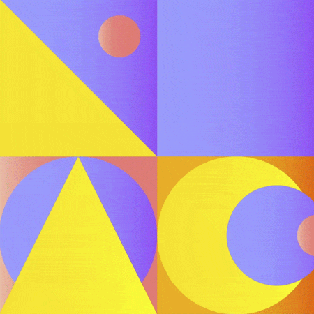
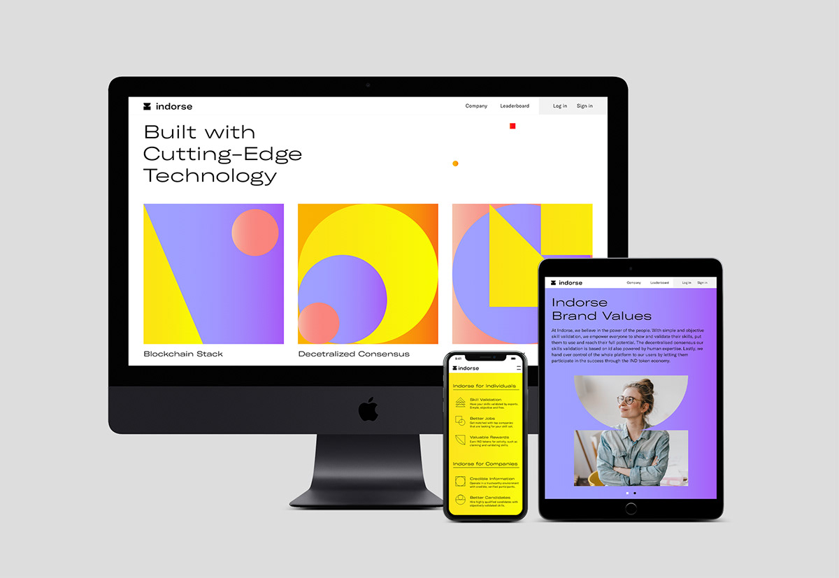
The visual system is designed to display user data. By keeping the visuals abstract, we gave the brand a distinctive look, while particular graphics can be used to illustrate more complex data. By using the custom developed generative tool, users can access individual patterns that reflect the skills they have. As users add more skills and validate them, their patterns transform.
Connecting through clarity
Custom icons stay consistent with the rest of our identity system. Their geometric shapes make them easy to understand, which allows us to communicate with users in the most quick, concise manner.

Together with Serviceplan and Freunde von Freunden we developed three brand videos, telling individual authentic stories of skillable people:
We couldn’t have done this without the help of these three companies: Serviceplan, the largest independent communications group in Europe, and Freunde von Freunden, a Berlin-based production studio and content platform and Odd Bleat, an animation studio from Greece.
Visit www.indorse.design for more information about the Indorse visual identity.
Follow us: Facebook | Twitter | Instagram | Behance | Our Website


