Summer Olympic Bid design for Seattle in 2044 for Branding and Identity at Edinboro University with Scott Gladd as the overseeing professor.
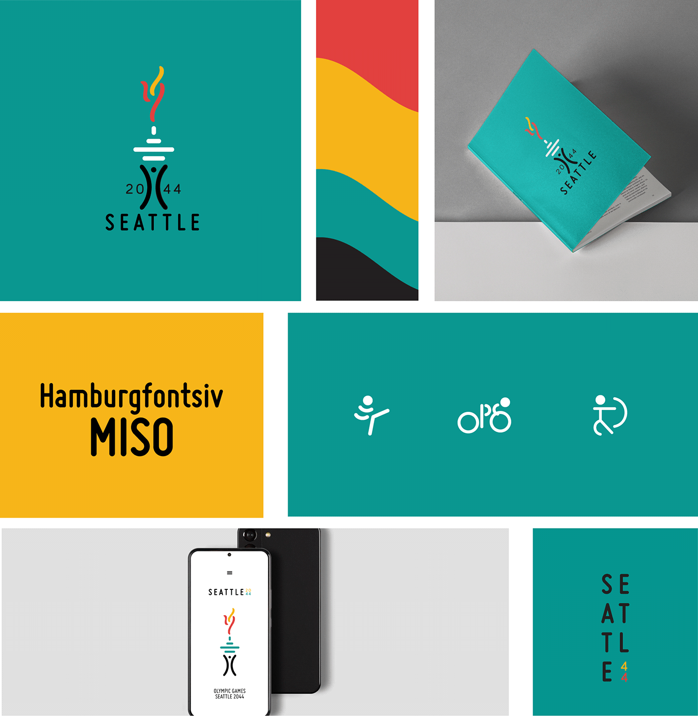
For this logo design, after researching, I understood that sticking with the space needle would be my best bet in representing Seattle. The design itself is a study of lines and line work.
I selected the colors for several reasons:
1) The flower of Seattle is the dalhia, and when the flower has different colors, it means separate things; red conveys power while green and blue represent a fresh start and big changes.
2) I wanted to represent the fire that had harmed Seattle from its beginning, but allowed it to grow to become the Seattle we know today.
3) The fire represents both the Olympic torch and the spirit of the competitors.
4) I wanted to relate the design back to Seattle's nickname "Emerald city".
You can find my process work here.