In today’s world of fast moving consumer goods, honey is often mass produced in bulk to meet demand, blended with varieties from numerous regions which dilutes the true provenance, character and flavour of the core ingredient. Manuka Emporium is a new honey brand challenging this mentality.
Working with a select group of today's apiarists in New Zealand, Manuka Emporium were inspired by the attitude, persistence and honey making philosophies of those who have come before and focused on delivering a product that is truly special in the market. The beekeepers from yesteryear harvested and sold pure single source honey to their local general stores which was then bottled and labelled by the shopkeeper. Simple, honest and true.
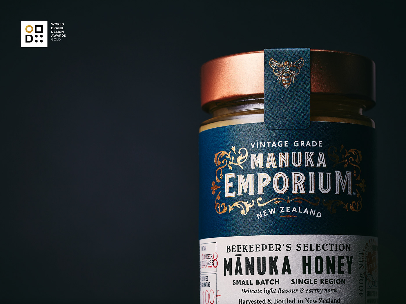
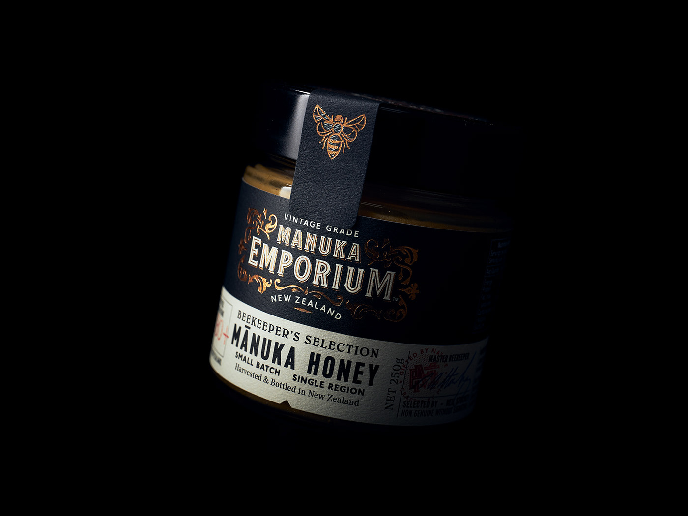
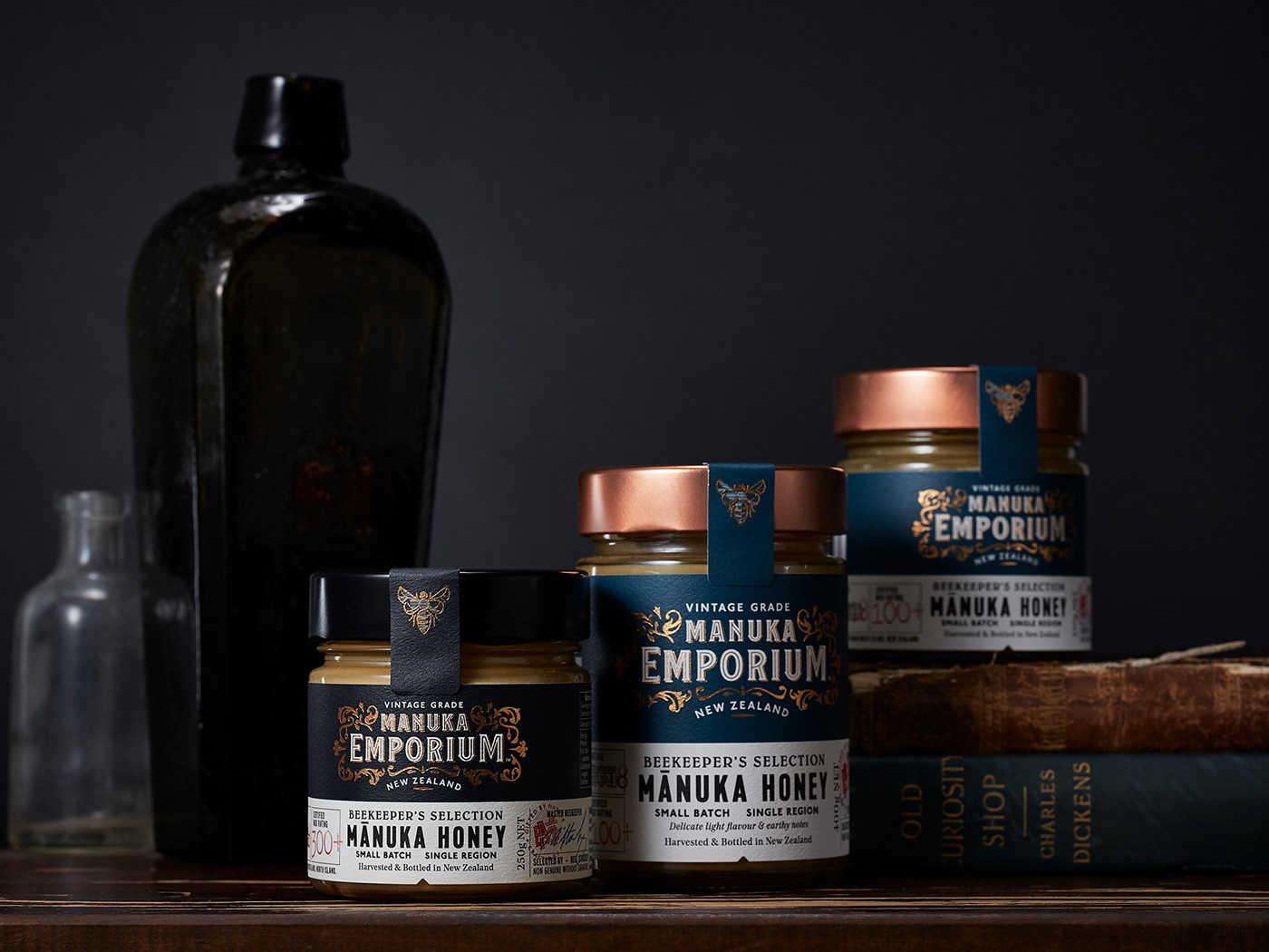
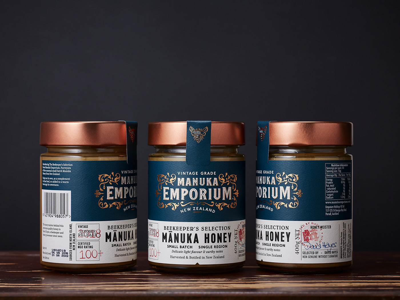
The brief was to create a superior brand that echoed the values of these skills and create an compelling visual language that would appeal to the discerning consumer looking for that special item for a social occasion or gifting. Inspired by the authenticity, opulent decoration and typographic crafting of premium liquor brands that can be discovered in old whisky lounges and bars, the brand exudes the charm and character of a Victorian era shop. Product details were added with the Beekeepers Selection label, proudly displaying vintage, season, style, flavour notes and the apiarists signature.
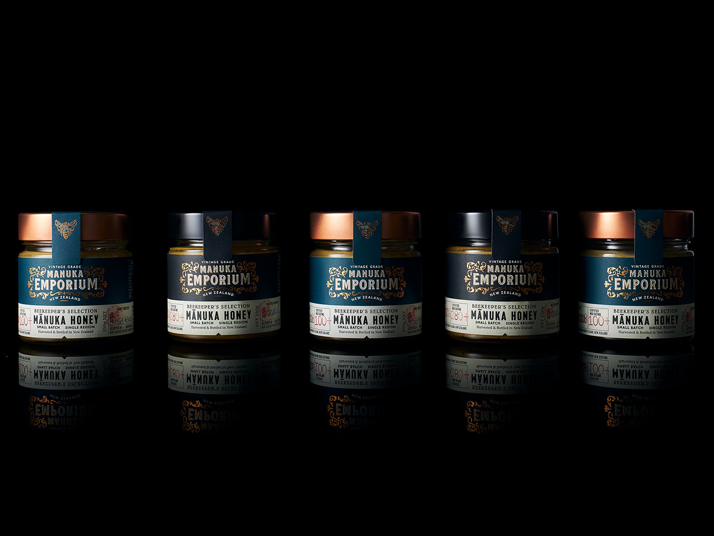
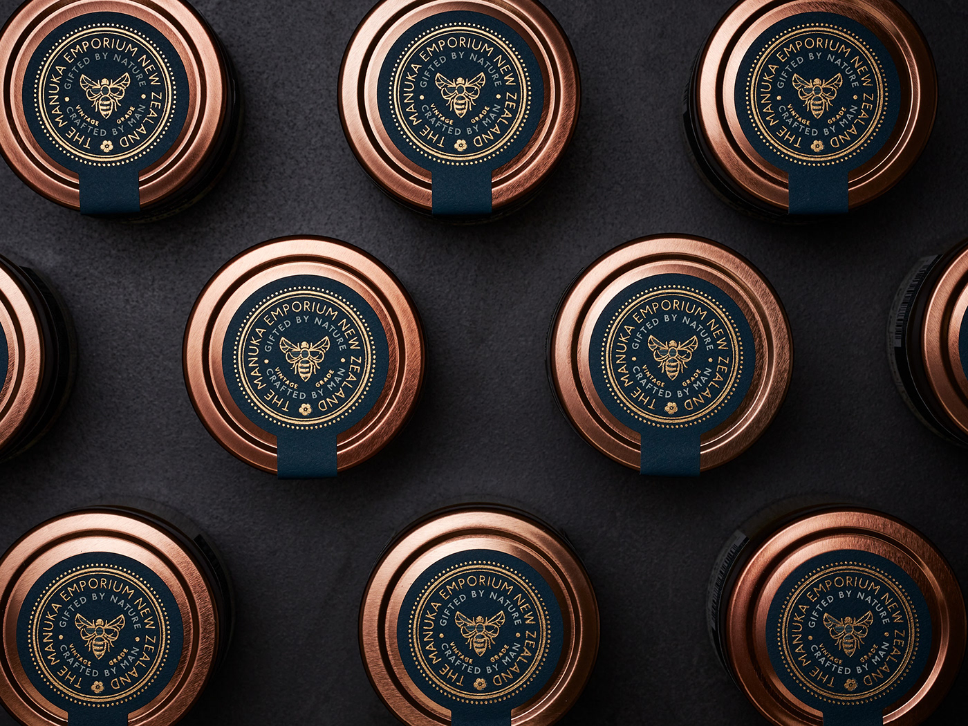
Copper foiling, red stamps, different colour labels denoting MGO strength and a unique bee motif add premium cues to the quality of the product.
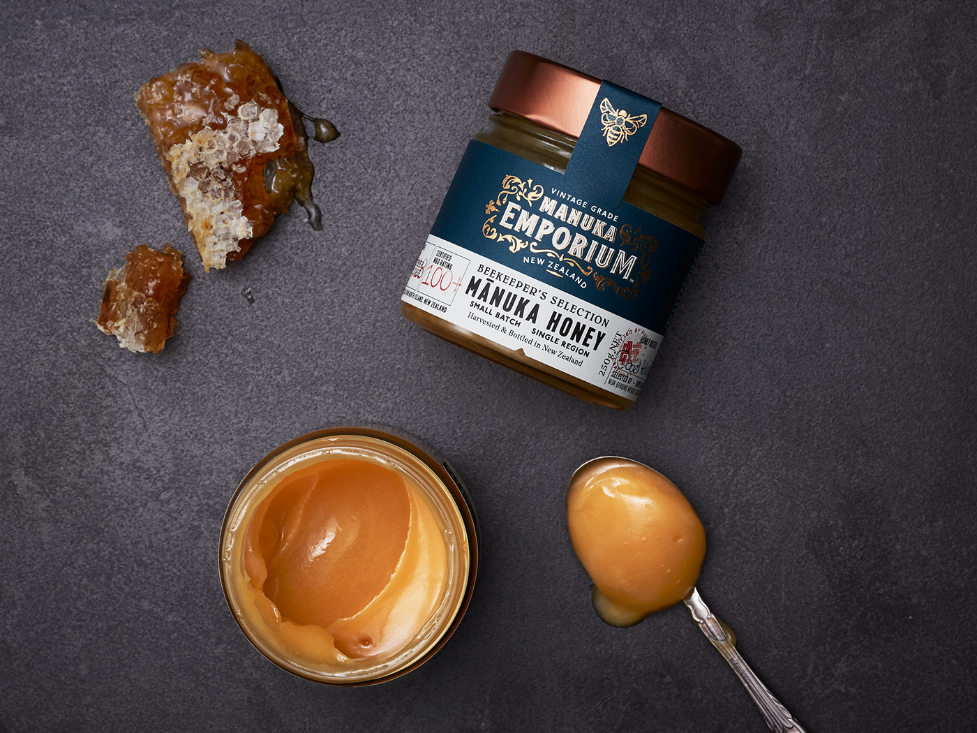
The Beekeepers Selection is the purest of foods, gifted by nature.
Working with a select group of today's apiarists in New Zealand, Manuka Emporium were inspired by the attitude, persistence and honey making philosophies of those who have come before and focused on delivering a product that is truly special in the market. The beekeepers from yesteryear harvested and sold pure single source honey to their local general stores which was then bottled and labelled by the shopkeeper. Simple, honest and true.
The brief was to create a superior brand that echoed the values of these skills and create an compelling visual language that would appeal to the discerning consumer looking for that special item for a social occasion or gifting. Inspired by the authenticity, opulent decoration and typographic crafting of premium liquor brands that can be discovered in old whisky lounges and bars, the brand exudes the charm and character of a Victorian era shop. Product details were added with the Beekeepers Selection label, proudly displaying vintage, season, style, flavour notes and the apiarists signature.
Copper foiling, red stamps, different colour labels denoting MGO strength and a unique bee motif add premium cues to the quality of the product.
The Beekeepers Selection is the purest of foods, gifted by nature.
Range of work: Identity, Packaging
For more about this project visit: www.weareonfire.co.nz/work