


Penguin Coffee ®
Logotype and Packaging Design
In Buenos Aires, Argentina the only way to get your coffee is by buying a bag from a grocery store or going to a coffee shop.
Either way, you end up with a coffee roasted weeks ago...
The important about this is that the power of the coffee bean lies in two factors:
Either way, you end up with a coffee roasted weeks ago...
The important about this is that the power of the coffee bean lies in two factors:
The time in which it was roasted and the time when it was grounded. After two days, that power starts to vanish... and after a few weeks, the coffee loose the scent and flavor that makes it unique.
This service aims to give the decision back to the customer. How? By allowing the client to pick the date of delivery, type of beans and the amount of each. The mission is to get fresh coffee delivered directly to the customer's house.
This service aims to give the decision back to the customer. How? By allowing the client to pick the date of delivery, type of beans and the amount of each. The mission is to get fresh coffee delivered directly to the customer's house.

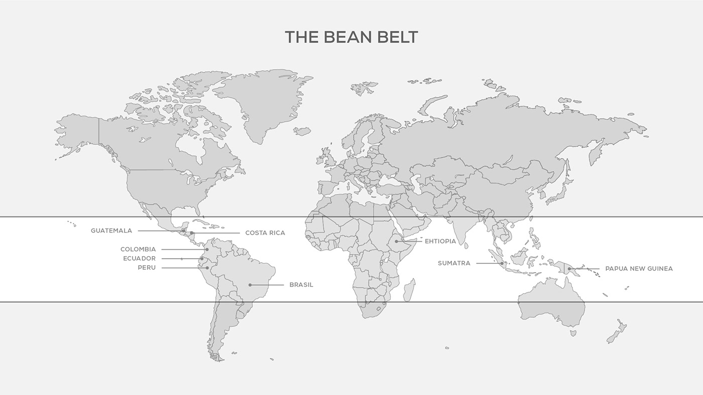
To provide a high-quality product, the beans are imported from different countries of the Bean Belt.
The Bean Belt is a band around the middle of the world, bounded by the Tropics of Capricorn and Cancer. The rich soil and mild temperatures, with lots of rain and shaded sun, make it ideal for coffee production.
The Bean Belt is a band around the middle of the world, bounded by the Tropics of Capricorn and Cancer. The rich soil and mild temperatures, with lots of rain and shaded sun, make it ideal for coffee production.
The Target: Coffee Hipsters
The target was narrowed down to those people who actually love the experience of drinking coffee, and therefore, take their time to make it. The keywords to define this user persona is "coffee hipsters".
They are between 25-35 years old, have an average salary, a passion in their lives and they care about what they eat and drink. Especially when it comes to coffee.
They share their lives through Instagram and want to let people know what they think about the world. They try to limit themselves to only premium and outstanding services. In other words, they don't settle with the average product.
They share their lives through Instagram and want to let people know what they think about the world. They try to limit themselves to only premium and outstanding services. In other words, they don't settle with the average product.

Photos from Unsplash by: Tyler Nix, Nousnou Iwasaki, Najib-Kalil, Freg Raines

Symbol Development
The concept for the logotype is simple. The owner's nickname is Penguin and he likes coffee. To incorporate the coffee bean in the Penguin's belly I use the negative space. This gave the symbol a unique look and stood out from the rest of the already made penguin logotypes.

Grid Systems
It took me several steps of refining, to get the final version. The step that makes every logotype stand strong is the construction by using grid systems. After the main symbol is crafted, I play around with perfect geometry to achieve a solid and balanced outcome.

As you can see, the only element used in the construction of the symbol were circles.


The Lock-ups
Different lock-ups allow the logotype to maintain the aesthetic while being flexible when being applied in real-world situations.
They must have a "clear area" and nothing should be inside of it.


Label Design
Since the brand is going to launch limited editions from time to time, I design a set of guidelines to keep the order and hierarchy in place. Overytime a new label is designed, it must maintain this structure.
This allows the brand to be flexible with the elements and the color scheme, while being part of a cohesive system.
This allows the brand to be flexible with the elements and the color scheme, while being part of a cohesive system.

As you can see below, since every label has different aesthetics and resources applied, maintaining the structure is very important. By doing it, all the designs have the same hierarchy and are still recognized as from the same brand.
In some cases I downloaded resources from Freepik. Although I made a lot of tweaking to them, I can't take full credit for that. For each one, an Instagram feed post and highlighted stories were designed topromote the product.


THAT WAS A LONG CASE STUDY, RIGHT?!
Hope you have learned about coffee as much as I did!
Thanks for the scrolling!
Feel free to drop your feedback and love in the comments.
I am also posting in Instagram, let's get in touch there!


