HATCH:
Sanguine Property Advisory
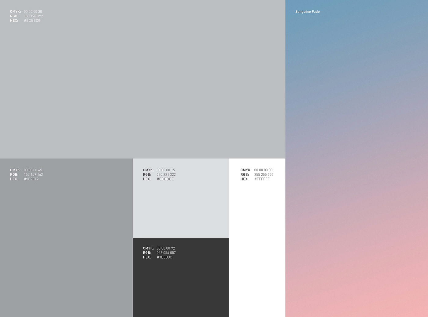
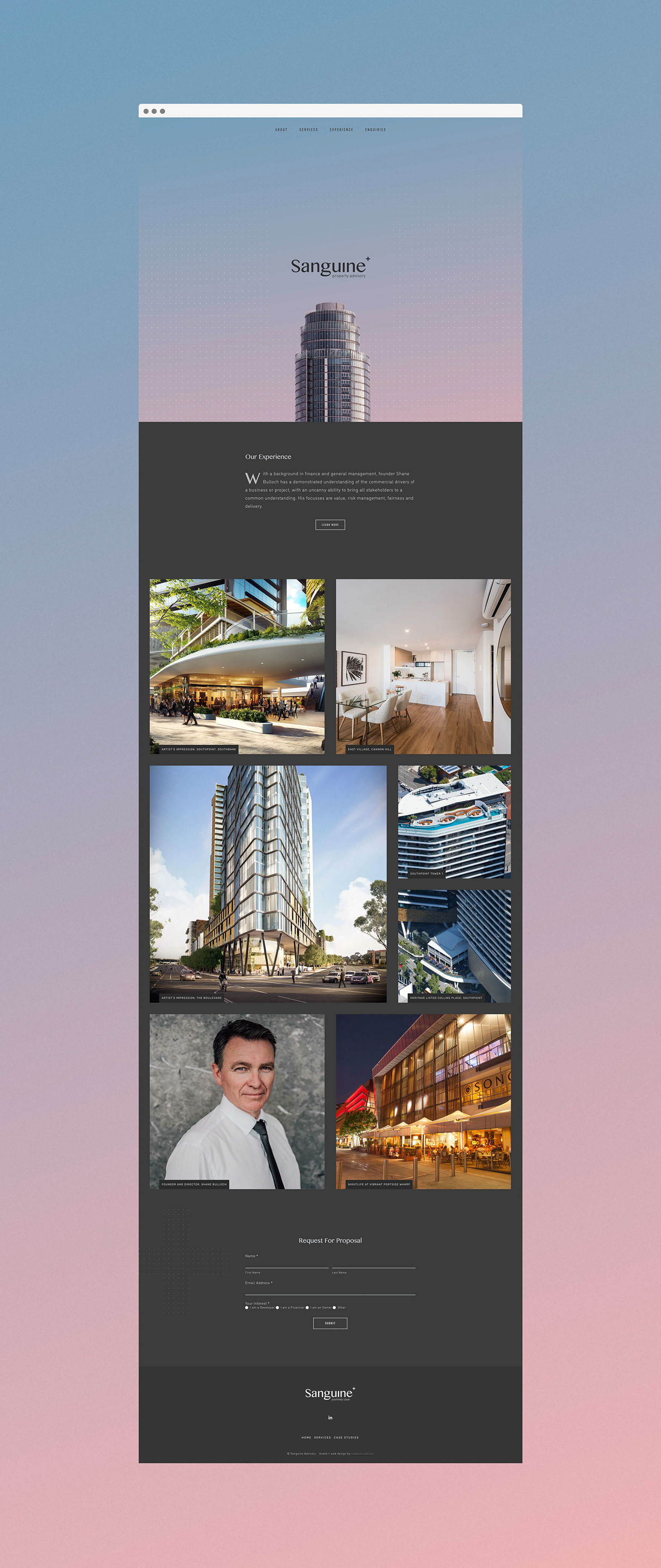
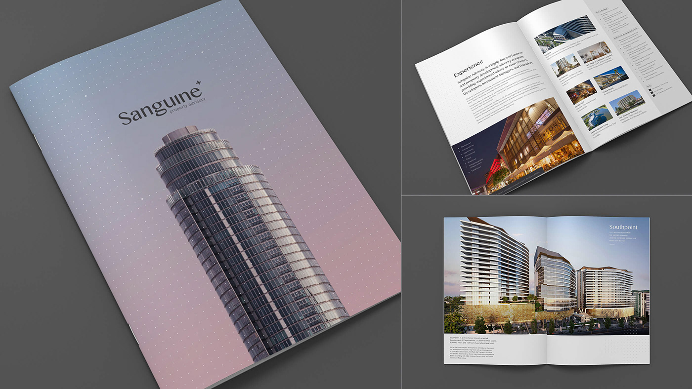
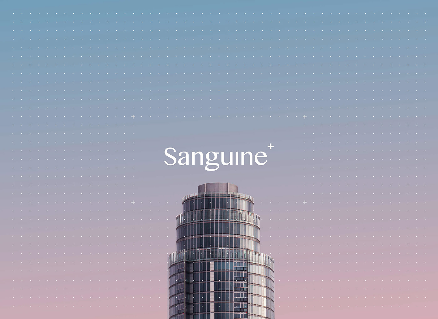
When we were approached to hatch a new identity with the name 'Sanguine' we had to dust off the old dictionary. Aside from describing a certain shade of blood red, its primary meaning is to be "optimistic or positive, especially in an apparently bad or difficult situation." This would make sense with context of the current property market, its tendency to boom and bust, and the fact Sanguine's advice can make or break a project. Yet still, the name sounded quite melancholy to us... and not everybody will go to the trouble of pulling a dictionary out in a meeting. With this in mind, we set about spelling it out for people. The sleek letterforms of the logotype were complemented by an overtly positive "+" symbol as well as a simplified proposition – "positively clear." That's about as literal as we could stomach, so we avoided the temptation use blood red, instead pursuing an understated palette of warm greys that, in combination with the broader elements and principles, evoke a sense of sleek professionalism and instil confidence.
logo / broader visual language / website / brochure
