


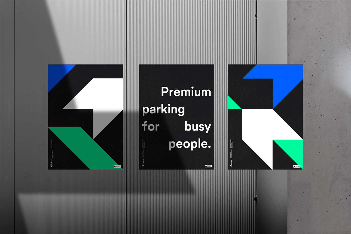

Parkron® — Premium parking for busy people
ES — Parkron® es una nueva app que nace con la finalidad de ofrecer soluciones de aparcamiento a un público particular y profesional que se mueve por ciudad, busca optimizar su tiempo y valora por encima de todo el servicio.
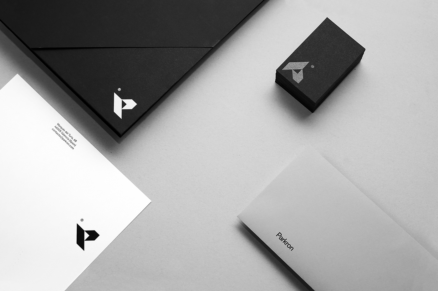
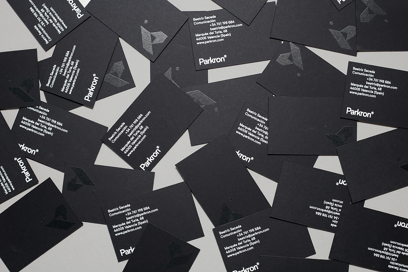
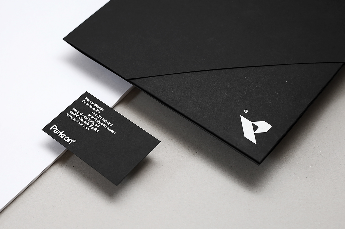
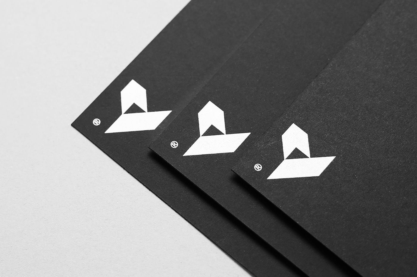
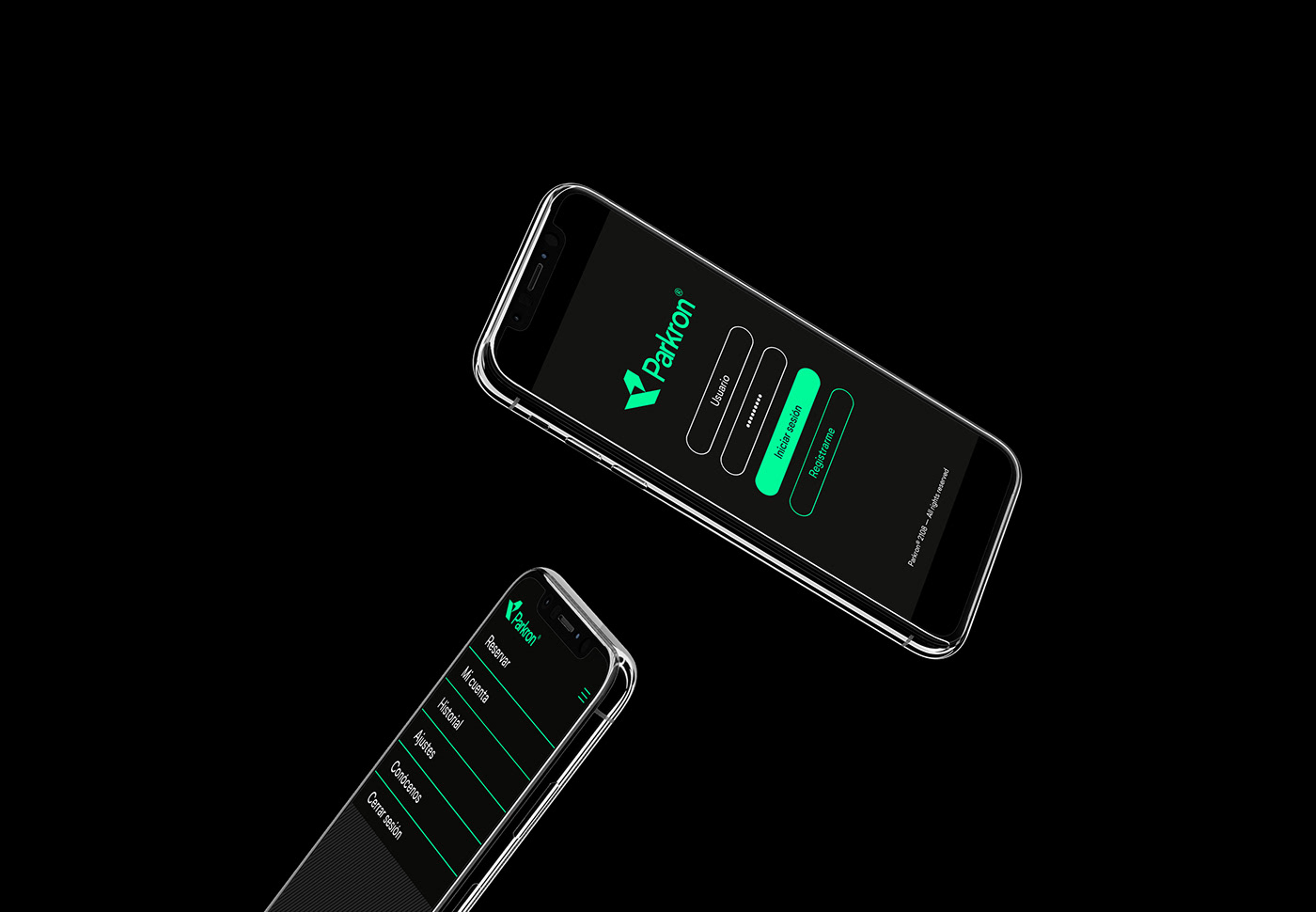
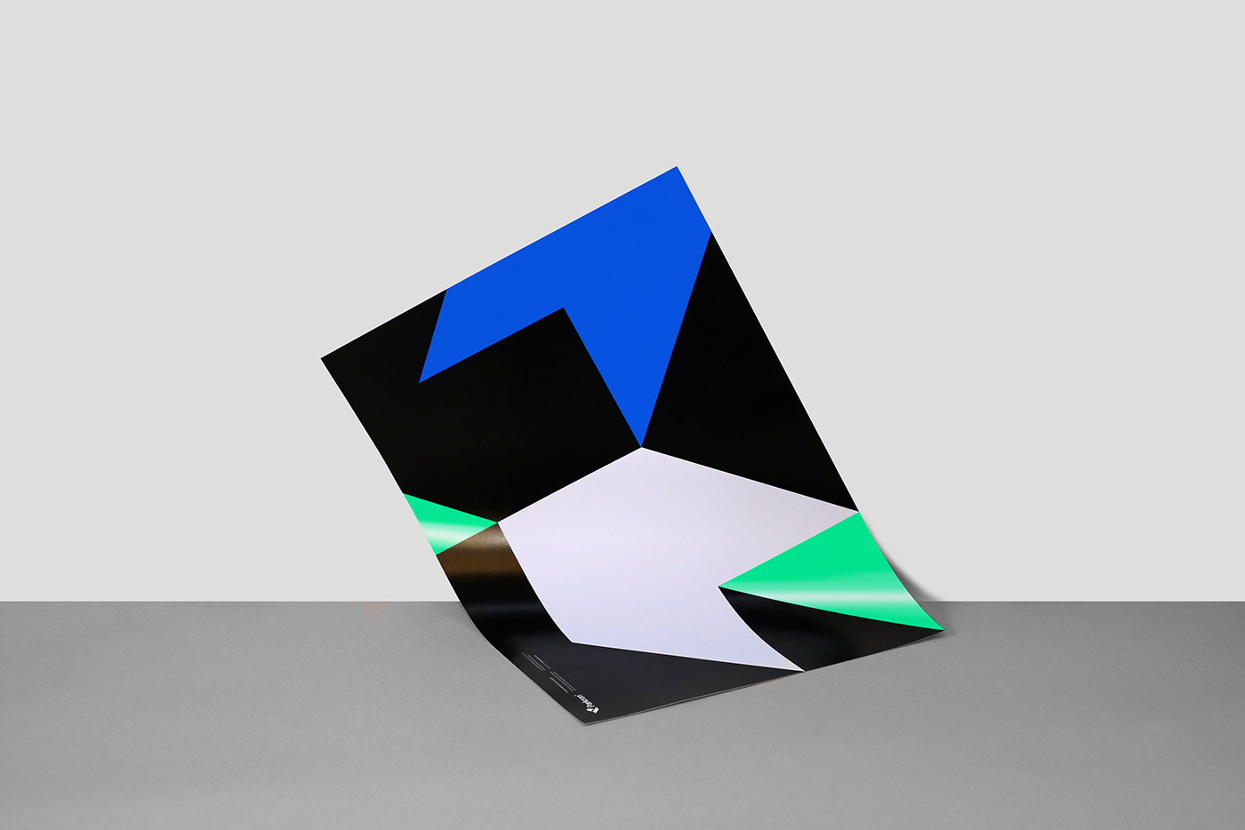
Para este proyecto nos encargamos de definir la identidad visual y los soportes de comunicación de la marca, así como también las líneas maestras para el diseño de la interfaz. Con la intención de expresar el aire exclusivo y la naturaleza digital de la compañía, definimos una identidad sobria pero dinámica y un símbolo geométrico que se aplica en blanco y negro en soportes impresos, mientras que en soportes digitales varía a tonos azul y verde de inspiración RGB.
EN — Parkron® is a new app aiming to offer parking solutions for a particular and professional target that gets around in the city, seeks to optimise their time and values a fine service.
We were commissioned to define the visual identity and communication assets of the brand, and also the visual guidelines for the app interface. Meaning to convey the premium air and the digital nature of the company, we created a sober yet dynamic identity and a geometric symbol in black and white intended to print media, whereas it changes to RGB-inspired green and blue when applied in digital media.
Identidad visual / Visual identity
Visit www.idearideas.com
Follow @idearideas