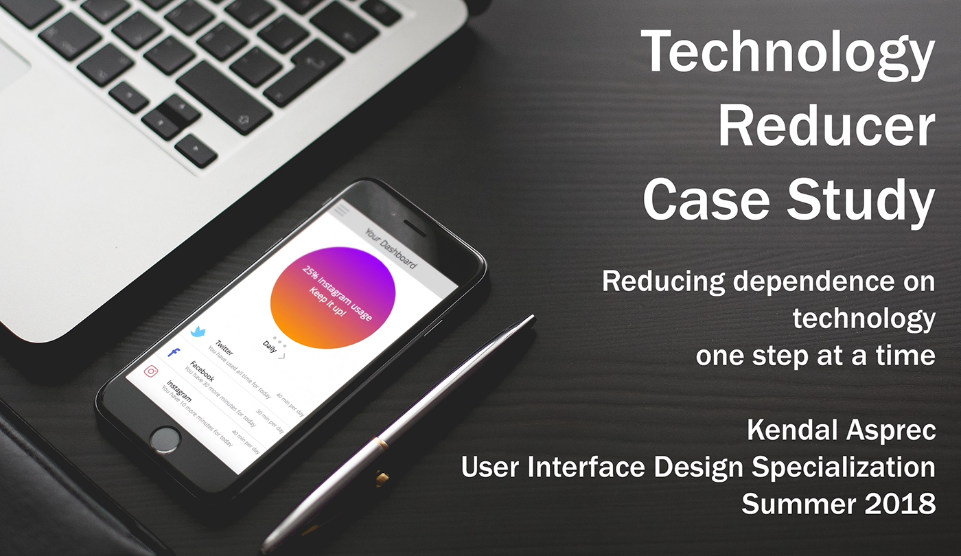
Timeline: August 2018 - September 2018
Tools: Justinmind Prototyper
Table of Contents
1. Context
2. The Problem
3. Research Methodology
4. Research Synthesis
5. Ideation
6. User Roadmap
7. Low Fidelity
8. Medium Fidelity
9. Usability Testing
10. Reflections
1. Context
When I was in my second year of college, I took a student-led class on campus called "Web Design DeCal." After learning how to create some basic websites in that class, I became interested in design. I soon learned about the field of UI/UX, and how people actually make it into a career. So, once the academic year ended, I decided to enroll in a summer class in order for me to learn the intricacies and increase my knowledge of UI/UX. I found a User Interface Design Specialization that was offered on Coursera in the Summer of 2018. This is my final project for that class.
2. The Problem
There are a wide variety of situations where someone would want to collect their personal information. Maybe an individual wants to track their eating habits. Maybe an individual wants to want to monitor how many times they have visited a certain restaurant. Maybe an individual wants to know how much they spent in the past month. Maybe an individual needs to track their blood sugar so they know the right amount of insulin to administer. Whatever the reason, there are many reasons for an individual to gather their own personal metrics. For our capstone project for the class, my team and I were given the very general topic of:
"personal informatics app"
We were told to narrow the topic down into a specific purpose. We could involve a large variety of personal information recording functions. The design is also open ended, meaning that we could make the product basically anything we want. We only had to make sure the product provided a way for the user to specify a set of information they want to keep track of, provided a way to enter data, and provided a way to visualize the data. So, keeping these guidelines in mind, we moved on to conduct user research.
Research
3. Research Methodology
Because of the vagueness of the topic, our team knew that we needed to narrow the topic into something more specific. So, our research methodology was focused on finding the right focus for our personal informatics application.
For the user research and ideation phase of the project, we were given one week to complete all the tasks. Because of strict time limits and physical distance, we were unable to do user interviews. Instead, we relied on a survey to conduct our research. The survey was very convenient, Additionally, by using the survey, the data would be complied instantly, giving us more time to analyze the data.
Once the group decided on this method, we each contributed questions for the survey. Some of the questions I wrote include questions such as “Why is it important for you to keep track of this information?” and “How do you usually use the information that you capture?” and “How frequently do you record this information?” In order to widen the scope of our research, the survey gathered both quantitative and qualitative data. Each member of the team was responsible for sending out the survey to at least five individuals, with the goal being to get as many survey responses as possible. Each individual primarily reached out within their social circles. Additionally, I wrote an email template to send out the survey to others for everyone’s convenience.
4. Research Synthesis
After we received 30 survey responses, we began our analysis on the data. Each team member was responsible for making at least one observation about the data. These are the observations that I wrote:
1) Observation 1: the types of data that individuals tend to track
a) A large majority of the survey participants state that they track data involving their physical health, primarily focused around fitness. Types of personal information that participants track include “exercise” (54.5%), “weight” (40.9%), and “eating” (27.3%).
b) The responses to other questions in the survey reflect this data. We asked survey participants a free response question on what type of information that they specifically capture. We received answers such as weight loss, exercise time, calories consumed, steps, and distance spent walking, biking, and running.
c) However, what is more interesting is how the participants track this information. While the large majority of our participants track their personal information for fitness, and the specific types of information they track are very similar, their methods of tracking this information largely differ. Examples of technologies used to track this information include FitBit, iOS Health, MapMyWalk, Strava, Google Maps, and a regular journal.
d) As it can be seen, there are a wide variety of technologies used to track information of similar origin. Therefore, when making our application, one of our focuses should be on making a unified application that tracks similar information effectively. This is very related to our second observation, ease of use.
2) Observation 2: the importance of ease of use
a) When we asked our survey participants how they currently track their information, the participants were almost split evenly between mobile/web applications and manual methods, such as “journal” (44.4%), “calendar” (5.6%), or “memory” (5.6%).
b) We also asked participants on what stopped them from keeping track of their information. 53.8% of the participants said that “It’s time consuming” and 38.5% of the participants said that “I forget to use them.”
c) Based on the data gathered, we can conclude that people find tracking their personal information as a hassle. If they do track their personal information, some people will forget to log their info, making their data effectively useless. And, even though applications are designed to be more effective and useful than manual tracking, we find that half or almost half of all the participants use manual methods. Applications are designed to be much more effective and much easier to use than manual tracking; yet, many participants still do not use it. In conclusion, when making our application, one of our focuses should be on ease of use.
These are the observations that my teammates wrote:
3) When we asked the participants the fill in the blank question of “what type of personal information would you like to keep track of but don’t currently”, we received interesting results. Out of the seventeen responses, we saw many answers that other participants tracked frequently including sleep, stress, and exercise. Yet the most common answers included “Eating”, “Exercise”, “Sleep”, and “None”.
4) Another aspect that was interesting was the amount of caution people had to capturing their data. When asked about what sort of negatives could be found in capturing their personal data, eight people stated “no” and nine people said “yes”. Out of the nine people, three people stated that keeping track of their personal information can lead to self criticism and two people had data privacy concerns. Other reasons included competition with others, it can lead to unhealthy habits, time spent, and that it is stressful. Therefore, we can assume that privacy is a major concern as well as how they interact with others/ criticize themselves with the product that we create.
5) Furthermore, we noticed that of the concerns respondents had about using these kinds of applications or tracking methods, three described the possibility of developing unhealthy habits. This is a key concern, as our application should ideally lead to better habits rather than obsessive and/or detrimental behaviors. Thus, our last design requirement involves creating some way to limit this kind of behavior, whether through caps on the frequency of tracking, disguising the tracked information through more general labeling instead of absolute numbers, or avoiding describing data in “bad” or “good” terms.
5. Ideation
Based on our research synthesis, we came up with four design requirements that we concluded must be present in our application.
1) Unified tracking across different tracking devices or wearables
2) Ease and expediency of use
3) Protects the privacy of the users
4) Promote healthy behaviors when tracking information
For the ideation phase, the whole team had a large brainstorming session. Whenever the team member was available, they would sit down, come up with an idea, write it down, then repeat until they came up with 25 different, but relevant ideas. After everyone in our group came up with their 25 ideas, we all joined one big group call together using Skype. Here, we curated through our list of 100 ideas, trimming the fat and combining similar ideas. In the end, we combined it all into five main ideas, where at least one team member had to choose an idea from their own list and write more details about the functionality of their idea.
Here are my ideas:
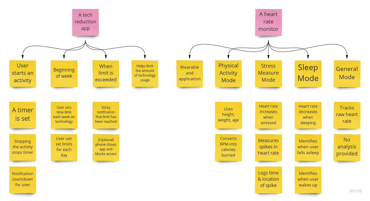
Here are my teammates' ideas:
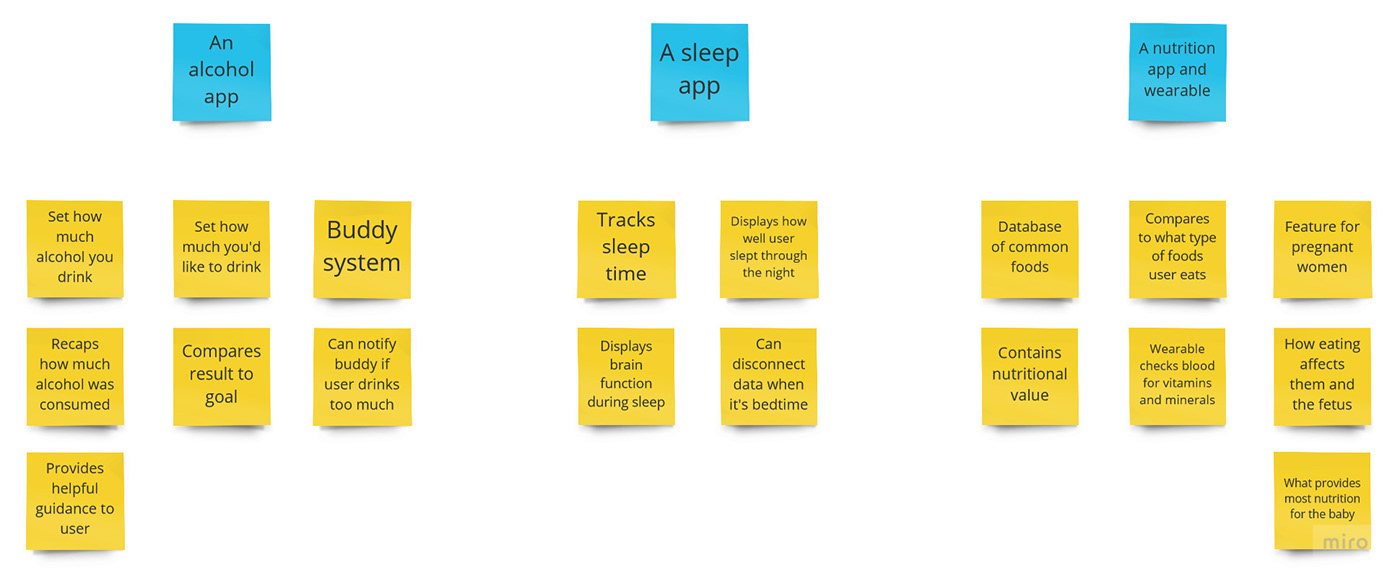
Eventually, after a long discussion, we decided to proceed with the technology reduction application idea. Now, with our idea in mind, we continued to the design of the project.
Design
6. User Roadmap
Before we began creating our prototypes, we first needed to settle on the design of the application. In order to do this, we created a user roadmap of the application's sequence of events. Additionally, it shows the user's possible choices in the application.

7. Low Fidelity Prototype
Just as during the research phase of the project, we were only given one week to come up with the prototype. On top of this, every member of the group had a lot of obligations that week. As a result, our low fidelity prototype was not that great. However, we would proceed with fitting the prototype to the user roadmap.
I no longer have access to the file that was used to create the screens, so I am unable to share the raw images of the screens. However, for this part of the capstone project, we were required to turn in a video of the walkthrough of the assignment. So, as filmed by one of my group members, here is a link to the video walkthrough of the low fidelity prototype.
8. Medium Fidelity Prototype
We then moved on to create the medium fidelity prototype. Like the last prototype, I no longer have access to the file that was used to create the screens. And, like the last prototype, we were required to turn in a video of the walkthrough of the assignment. So, as filmed by one of my group members, here is a link to the video walkthrough of the medium fidelity prototype.
9. Usability Testing
After the completion of the medium fidelity prototype, we continued on with usability testing of the product. In order to properly conduct our tests and get sufficient feedback on our design, my whole group created an extensive user testing plan.
During this phase of the project, each group member personally had a little more time in their schedules than in previous parts of the project. Therefore, we were able to dedicate additional resources to our usability test.
In the usability test, each group member would perform the test with a user live. The prototype is displayed to the user using Justinmind, a prototyping tool that one of my teammates worked for. It functioned similarly to prototyping tools such as Invision, which made it easy to use. Each user was given a specific set of tasks by the interviewer, and these tasks allowed the user to explore the full functionality of the prototype.
The user test itself was very structured. Each test began with introductions and orientation for the users to the program that is being used. Then, each interviewer gathered the consent of the user to proceed with the usability test and acquired permission for the test itself to be recorded for analysis purposes. After that began the testing period, where every interviewer asked their user to complete a specific set of tasks on the Justinmind simulation. Once the user completes the five tasks, there are specific questions about the user experience that each interviewer has prepared. Additionally, there is time for each interviewer to ask follow-up questions based on the behavior of the user and the results of the test. Finally, after everything else is completed, the interviewer says the closing remarks and the test ends.
Tasks:
- Task 1: Use the app to explore the different ways to gather the data.
- Average time = 69.75 seconds
- Task 2: Using the application, find a way to limit your application usage to a maximum of 1 hour a day per application.
- Average time = 93.25 seconds
- Task 3: Set your notification preferences on when you want to be warned.
- Average time = 22.25 seconds
- Task 4: View the simulated phone usage and the notifications.
- Average time = 19.25 seconds
- Task 5: View your application usage statistics in the Dashboard.
- Average time = 51.25 seconds
1) List features of your design that worked well, and explain why they worked well.
a) Features that worked well included setting up the amount of time that the user wanted to monitor their applications. Although a rearrangement of the screen components could be beneficial, users found this tasks to be fairly straightforward and easy to complete. In conjunction, the notification of the user being almost out of time and then the user being out of time for that app was well received and easy to understand.
b) Another feature that worked well was the transition from when the user stopped using the monitored applications to the dashboard. Users enjoyed the dashboard and were excited to see more in regards to “their” data.
2) List features of your design that did not work well, and explain why they did not work well.
a) The first screen the user sees when the app is launched is a screen which asks the user which device(s) they’d like to see their usage on. This was confusing for several testers and was not intuitive.
b) Users also struggled when filling in text fields for how much time they would want to spend on the apps they chose to have monitored, the keyboard would come up on the screen and it would block the text fields. Users mentioned how it would be better to have the keyboard display numbers instead of letters since they were being asked to input time preferences
3) List any ideas for additional features and design improvements resulting from the user tests.
a) An additional feature that was requested by a test subject that I think would be helpful for users is a “compare view”. That way users can see how their screen time varies from each different app that they choose to have monitored, a “compare view” screen in the dashboard would list the apps that are being monitored by our application and allow the users to pick which apps they want to compare side by side and look at their statistics.
b) Based on the feedback that we gathered from the user tests, some users would want to have a more obtrusive option that would stop an individual from using an application overtime. For the next iteration of the app, we might add an option that allows the application to shut down other applications that have gone overtime. There would be settings to customize this feature, and this feature would be off by default so people have to opt-in.
10. Reflections
The user testing phase of this product was the final requirement that I had to complete for the capstone project for this class. After my team and I analyzed the data gathered during the user testing phase, we submitted our work for this assignment, and our work on Technology Reducer ended.
Being my first foray into Product Design, every part of the whole design process was exploring a completely new field for me. Throughout the span of the User Interface Design Specialization on Coursera, we would learn about all of these techniques and gain all of this knowledge about the design process and its specific components. This would be the first time that anyone in the online class was able to actually follow the steps of the design process for themselves.
However, looking back at this project after finishing my second case study, I can spot many potential areas of improvement for Technology Reducer. First and foremost, if my team and I are designing a product from the beginning to the end, we should allocate a good majority of our time to the product. For this one specifically, it was a secondary thought to my teammates and I, as we have obligations such as work or summer school to concern ourselves with. Second, my team and I should dedicate more resources to the research phase of the process. Simply having a survey as the primary method of research is not enough. We need to take advantage of other methods such as individual interviews. And finally, my team and I should create a third iteration of the prototype, the high fidelity prototype. My team and I did not create one for this project because it was not required. However, because the high fidelity prototype is the final step in creating the final design of the product, it is a necessary step that I must take in my future product designs.
