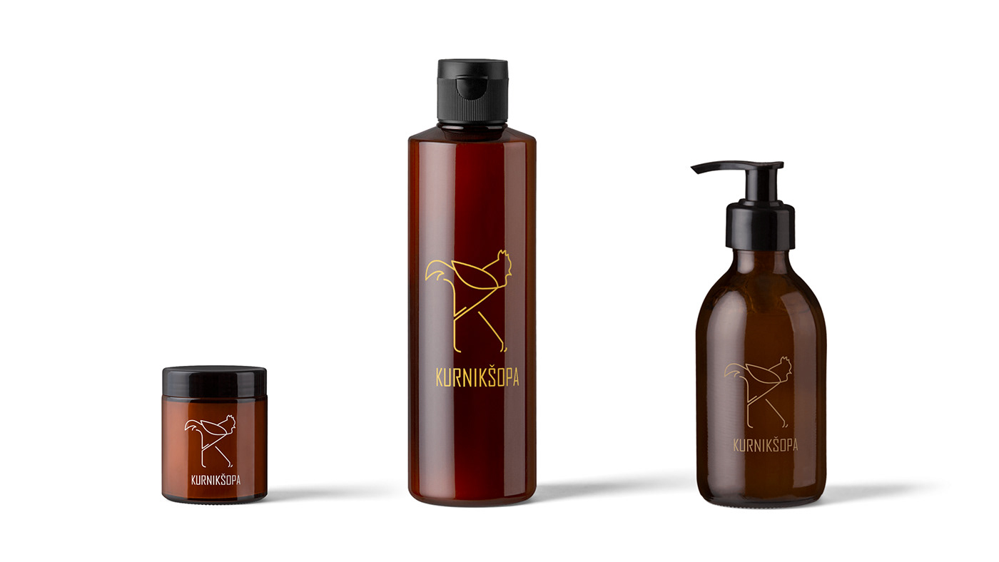
The logo Kurnikšopa is made for Slovak band which is making accessories from wood and leather. Products are mainly man bow ties, wallets and belts. The name "kurniksopa" means something in Slovak that is not that easy to translate into English. From start it should be brand which don´t take themselves too seriously but client liked the first concepts of the logo which were more conservative. So the design was going this way right after first sketches. First version of the logo was made from one line silouette of the hen which body was also shaped into shape of the letter "K". This variant was later changed to rooster which stayed as a final version of the logo. Logo was also made in two versions of the font for the text " Kurnikšopa". One more conservative and the other more funny looking for a little bit from the first plans of the brand. I designed also concepts of the packaging which some of them are looking forward for it´s realisation. I added some mockups for possible future use for the logo. Feel free to comment or like the project if you want.
Few from the first sketches.

Structure of the logo.

Main colors for the logo.

Rough 3D visualisations of the concept packaging.


Few photos from the design process.


Example of the blueprint for the concept packaging.

Custom icons for packaging and website.

Paper prototypes for the concept of the packaging.


Mockups for aditional use of the logo.


