Meinert Wines - Brand repositioning and label design
A development in ownership meant that Meinert Wines needed not only a new wine label design, but a brand positioning that would simultaneously announce the new business partner and refresh the brand's identity.
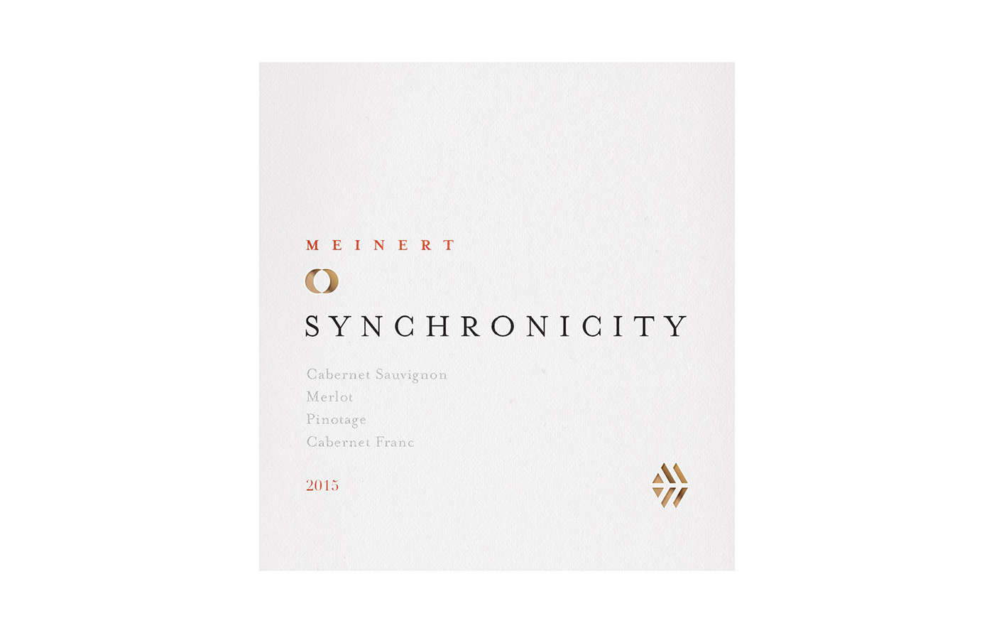
"Our logo of an eagle with a printers’ stick in one claw and a tastevin in the other is entirely fictitious. This logo and other symbols as well as labels and even wine names have been creatively borrowed from the Meinert family’s short but rich printing history in Namibia. The family had used the German Master Guild of Printers’ eagle as a symbol for the sports teams of their printing company.
This crest shows the two-headed eagle (originally used by the Holy Roman Empire) holding a printer’s stick in one claw and an ink roller in the other. Circling birds of prey are also a feature of the Devon Crest vineyard and we set about simplifying and adapting the rather fierce martial style eagle to suit our vinous ends."
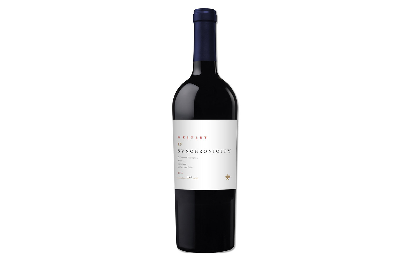
Like most wineries, Meinert Wines had a story that needed to remain part of the brand. The goal of the label redesign was not to lose the old brand, logo, and history, but rather to combine this with elements true to the new owner while creating a brand that appealed to the new collective of wine drinkers in South Africa.
The eagle was preserved as a key element of the design. Because the new owner's name means Oryx or Gemsbok, this was represented throughout. The concept of Synchronicity, a meaningful coincidence and the name of the flagship red, was a creative starter for the brand as a whole.
Label Design 1


Label Design 2


Label Design 3


Label Design 4


Label Design 5


Label Design 6


Design Variations