I started out with re-imagining of an old logo. The original logo included a cowboy style pig drinking a stein of beer. I held on to the cowboy and pig idea by intergrating them into the name of the brewery.

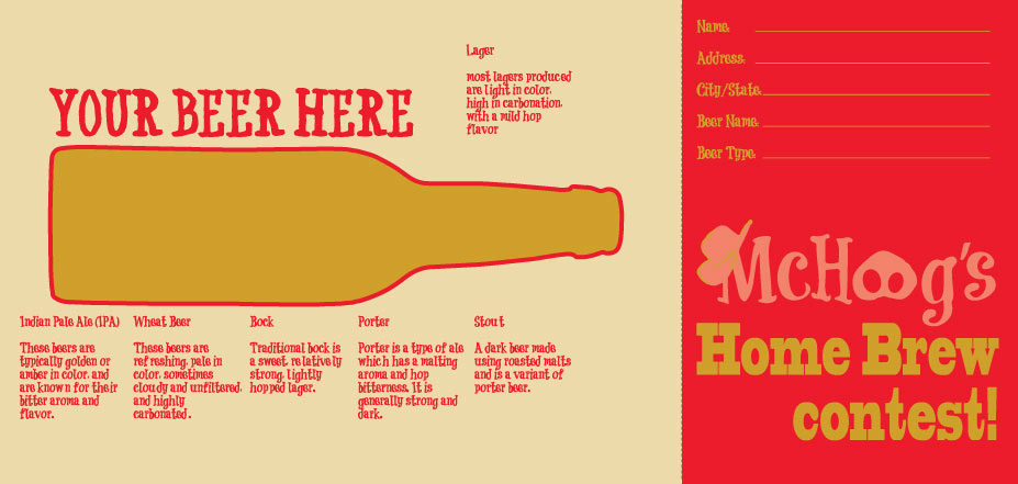
As a project we had to create a direct mail piece. I chose to do one for a fictional brewery called McHog's. The mailer is for a home brew contest. It's a letter fold with space left for mail information, stamp, address, that sort of stuff.

This is the inside of the mailer. The outside is verticle then the reader turns it after opening and the inside is horizontal.

A working photo of the printed piece.

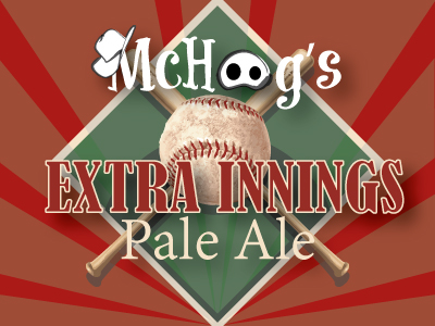
I then created a new label, and a working sixpack for one of the types of beer brewed by McHog's. The beer was called Extra Innings so I ran with a baseball theme. The label has sort of a coat of arms feel to it. And the six pack uses the athestics of old baseball scoreboards.


