


The brief (by Penguin Random House)
You are invited to design a cover look for Wonder to bring this original and unforgettable book to new readers. The design should ensure that this important book remains a must-read for every child.
Your cover design needs to include all the cover copy supplied and be designed to the specified design template (B format, 198mm high x 129mm wide, spine width 19.5mm), incorporating the PUFFIN branding and all additional elements such as the barcode. Please refer to the Submissions Details page for full details of the spec and how to submit your entry.
Copyright must be cleared for all images used in your cover design and you must include a credit line on the back cover of your design for any third party images used. For example: ‘Cover photograph by Joe Bloggs’.
The approach
This time I wanted to do things differently. I didn't want to come up with a design I would usually go for. This would probably be a digital illustration, just like my other ones. This time I wanted to come up with something new. It was not my challenge to win this contest, it was my challenge to challenge myself. I really want to expand my portfolio and really want to cross my boundaries and I hope doing things like this and keep crossing those boundaries will bring me further in my creative career.
The process
The first thing I did after reading the book was writing down what came up in my head. I really liked the brainstorm process, but it was quite difficult because I had this feeling that I immediately had to change it all up. I had this urge to do it differently this time, which made the start of this project a little though. When I was working on it I started to enjoy the process and started to accept the way it went. The thing was, that I just had to put the worrying aside and write down everything I thought of and everything I felt. Doing that would cause coming up with the coolest ideas. I had to put the fact that I was a perfectionist aside.
I really liked the experimenting. It was new to me. Most of the time I go for the things I'm familiar with, the things I know I can do. But now I know that I have to stop doing that. I want to improve my work and want to go beyond my limits. I want to create my own view. Conclusion: I really liked the progress of creating this book cover and will continue doing things like this to broaden up my creative view. Great lesson learned!
The bookcover and the story
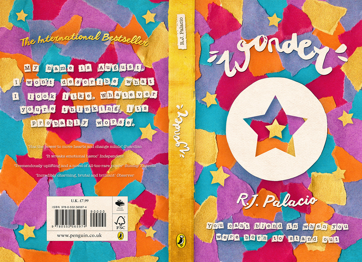


About the patterns
The colorful (and chosen!) one:
Because it was a childrensbook I wanted to 'go inside the creative brain of a child'. I thought of patterns and I thought of what children would like to make. It had to catch the (children)eye, so I thought it was a good idea to make it colorful and fun. I decided to tear apart pieces of colorful paper and glue them all down on paper. This gave a cool effect and was, for sure, eyecatching! I also added a circle in the middle of the cover. I did that because I thought of a storyline. I wanted to create a space with a star in it. I wanted to tell a story without showing too much and without giving a lot of information, I didn't want to make obvious decisions. The star stood for August, the main character of the book. In my opinion he is a star. Next to that, a star is my favorite symbol, so I loved to work with that. The space around the star was supposed to become a 3d (half) circle. With the circle I wanted to show that people didn't immediately see that August was this star. He was different and people found that weird, they had to want to cross or break that circle to get to the real August; this amazing star, this amazing star that was pretty much the same as the people that thought he was different and weird. The circle also stood for how August felt. He probably felt alone all the time and didn't have the feeling he was part of the group. He couldn't speak out and couldn't do anything about it, then people immediately had a prejudice.
The frozen, purple one:
This also stood for this captivity. The purple looks like ice and I thought of the feeling you would have when you swam beneath it. You wouldn't be able to do anything, you wouldn't belong to the rest, you were held captive, you were lonely, you were prisoned.
The crystal one:
I thought this one looked like a crystal. Crystal.. diamond.. I find August a diamond.
I thought this one looked like a crystal. Crystal.. diamond.. I find August a diamond.
The one with the words:
In this design you can see clouds and rainbows. This meant "after rain, there's sunshine". In the design you can also spot the words "unique" and "special". In the middle of the cover you can also spot the word "ok", I think that's an amazing story to be told.


Thanks for looking at my project!


