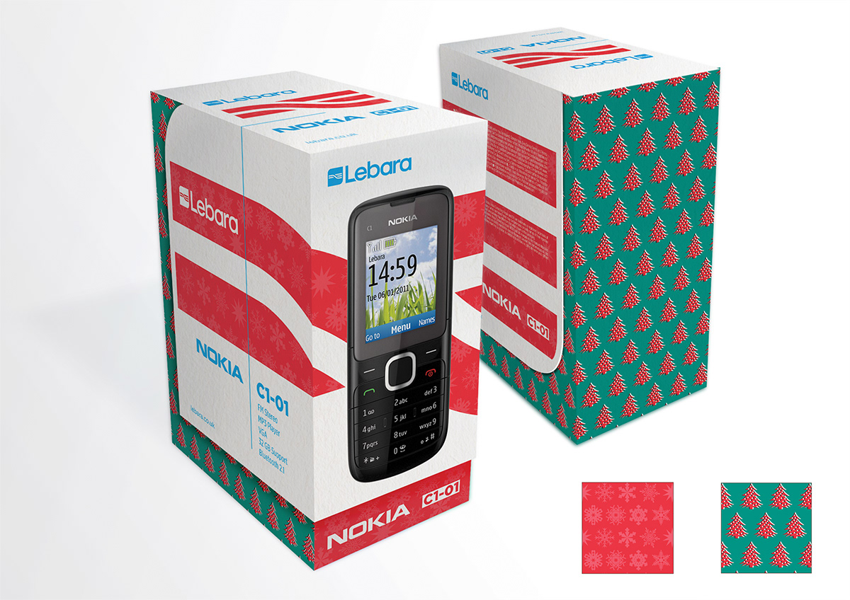

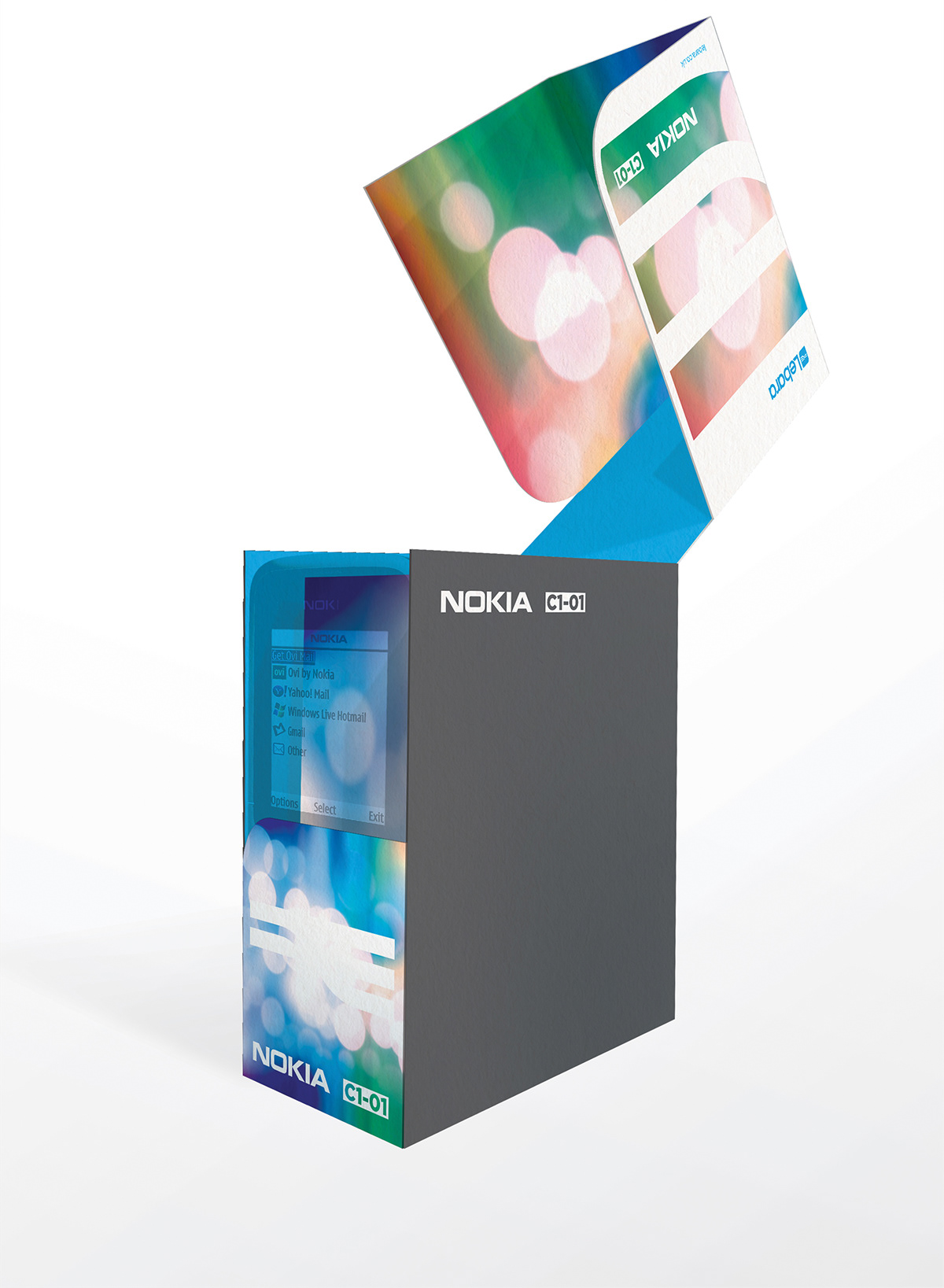
‘Think Outside The Box’ was a ‘blank canvas’ project, with the goal of designing new mobile phone packaging. The only stipulations were that the basics of the brand guidelines remained: the logo, the Gotham font family and using the colours cyan and 70% black.

As a nod to Lebara’s founding aim to provide affordable yet high quality service, I used the original brand colour of yellow in the ‘Value’ range packaging.

The adaptability gives a great opportunity for tailoring for special editions, national and religious holidays or other themed packaging. This is hugely beneficial for a company such as Lebara who target particular ethic markets in many different countries.