PonteAponte (pAp) is a company that aims at a fairer, more integrated and sustainable society. It is in the construction of bridges that we potentiate social innovations and we are the link between who makes the social investment and who receives it. The name is a wordplay with the Portuguese words for "bridge" and "to point", but they consider that bridges go beyond the middle or the crossing, constituting a place of its own, of dialogue and collaboration. They promote bridges, meetings, and transforming connections as an end in itself, for the society we all seek. Their goal is to connect the best in each world to an ever better world by strategically strengthening the social and environmental field.
Their greatest vocation is to qualify social investment by identifying, evaluating and leveraging initiatives of collective social impact, as well as promoting bridges between financiers, financiers and society in general. After seven years of openness to experimentation, critical reflection and hand in the mass, in a context in which it is fundamental to focus primarily on publics of high social vulnerability, ponteAponte perceives that there is an inefficient distribution of resources in the socio-environmental field, as well as gaps in terms of capacities, be they of investors / financiers, or financed, in this field of social innovation.

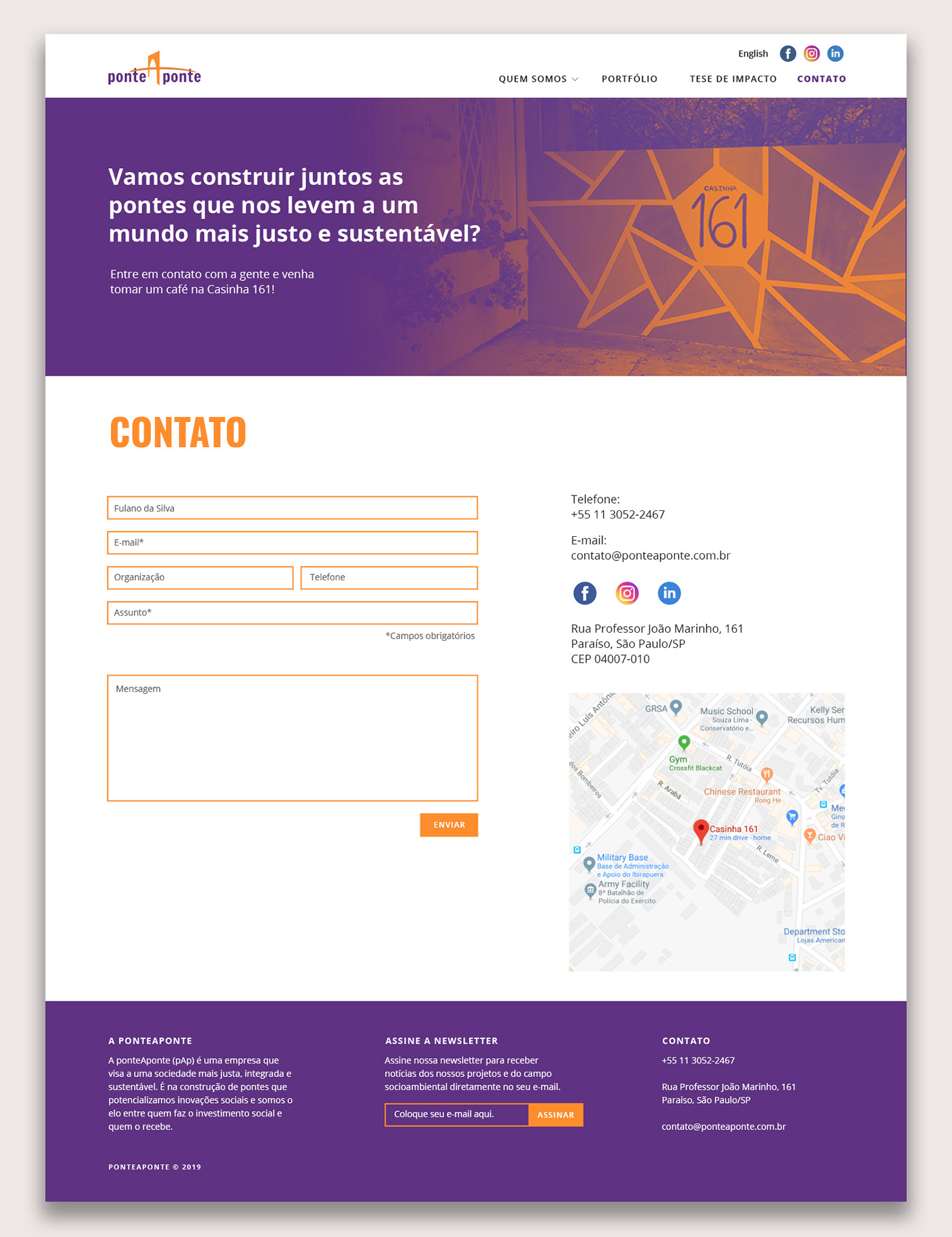
After seven years of experience, it was about time that pAp could engage with a differente profile of prospects, partners and clients, leaving behind its journalistic vein (but not forgetting about it) and diving into its strong soul of business development and social investment expertise. Their goal was to be extremely clear about the services they provide and show that the brand has grown wise, but still dynamic and energetic. Their journalistic past is still alive throughout the long and human-centered copywriting spread all over the website, but just enough to make it clear that Communication is a very important way of unveiling and resolving all kinds of problems a business can have, as well as a vast field for rooting opportunities.


There was no need for a complete rebranding, but it was about time that all the extensive material that has been created along the last years could generate a new brand book. The logotype was reviewed for a better legibility and the colors were smoothly changed and organized so to deliver a stronger sense of innovation. The business presentation was also remade as part of the process of understanding how new elements of visual language would behave in different contexts.


