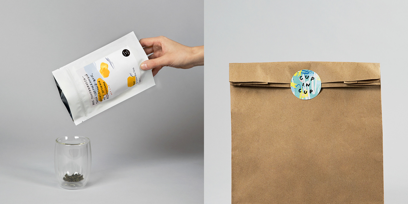
Cup in cup
Упаковка чая
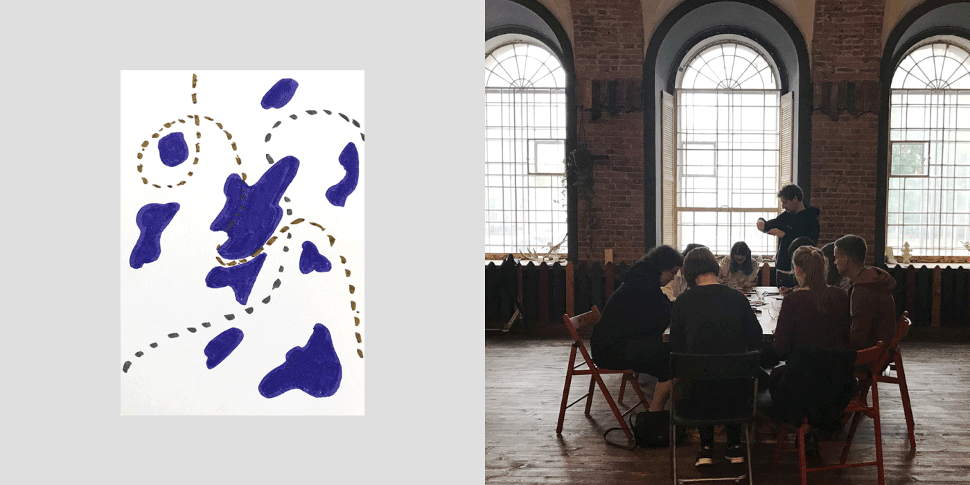
Cup in cup is a teahouse in Saint Petersburg. Its tea assortment mainly comes from China and India in the same way as the general offer on the Russian tea market. The unusual oriental names and the wide variety of types of tea result in a complex product comprehension for consumers. Customers cannot quickly decide which type of tea they want, so they only purchase it from time to time. Our goal was to make the product understandable for the consumer. We decided that consumers themselves would best help us in resolving this matter. The idea was to organise a tasting session with a group of tea lovers. Then, we would ask them to describe the tastes with words and their feelings with abstract drawings. We invited 10 people and gave them six types of tea to try. The drawings that we collected at the tea tasting session were the basis of the packaging.
Cup in cup — магазин чая в Санкт-Петербурге. Как и в целом в российском чайном ритейле, ассортимент Cup in cup — это в основном китайские и индийские чаи. Непривычные восточные названия и большое разнообразие видов делают продукт сложным для потребителя. Покупатели
не могут быстро разобраться, какой чай им выбрать — а потому реже совершают покупки. Нашей задачей было сделать продукт понятным для потребителя. Мы решили, что здесь лучше всего нам помогут сами потребители. Идея заключалась в том, чтобы провести дегустацию с группой любителей чая. И попросить их описать вкусы с помощью слов и свои ощущения — с помощью абстрактных рисунков. Мы пригласили 10 человек и дали попробовать им 6 видов чая. Рисунки, которые мы получили на дегустации, легли в основу упаковок.

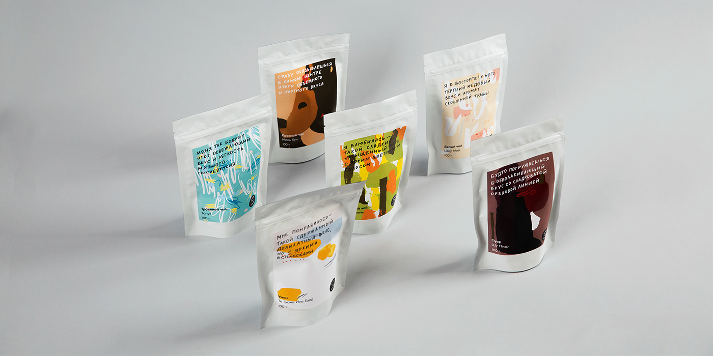
The designers have reworked them in such a way that abstract shapes and colour palette corresponded to a specific taste. Based on the consumers’ feedback, we created a copyright that describes the feeling of tea. The consumers also helped us design the packaging. They suggested the arrangement of all elements and information, so the packaging would be as convenient as possible for them. As a result, the packaging literally speaks the consumer’s language. It is simple and straightforward. The Cup in cup products communicate a unique style both visually and meaningfully. Now consumers know exactly what to expect when purchasing tea in shops.
Дизайнеры переработали их таким образом, чтобы абстрактные формы и цветовая палитра соответствовали конкретному вкусу. А на основе слов потребителей создали копирайт, который описывает ощущения от чая. Ещё потребители помогли нам спроектировать упаковку. Они предложили расположение всех элементов и информации так, чтобы упаковка стала максимально удобной для них самих. В результате получились упаковки, которые буквально говорят на языке потребителя.
Они простые и понятные. Продукция Cup in cup получила уникальную стилистику как визуально,
так и на уровне смысла. Теперь потребитель точно знает, чего ожидать, когда берёт чай с полки.