

INNOVATION FACTORY *
MOSCOW INTERNATIONAL FORUM OF INNOVATION DEVELOPMENT / 2012
____2012
► TASK AND MESSAGE FOR DESIGN:
Constructive, technological and generative style of design language. A strong, bright and at the same time a simple concept would be the way. ))
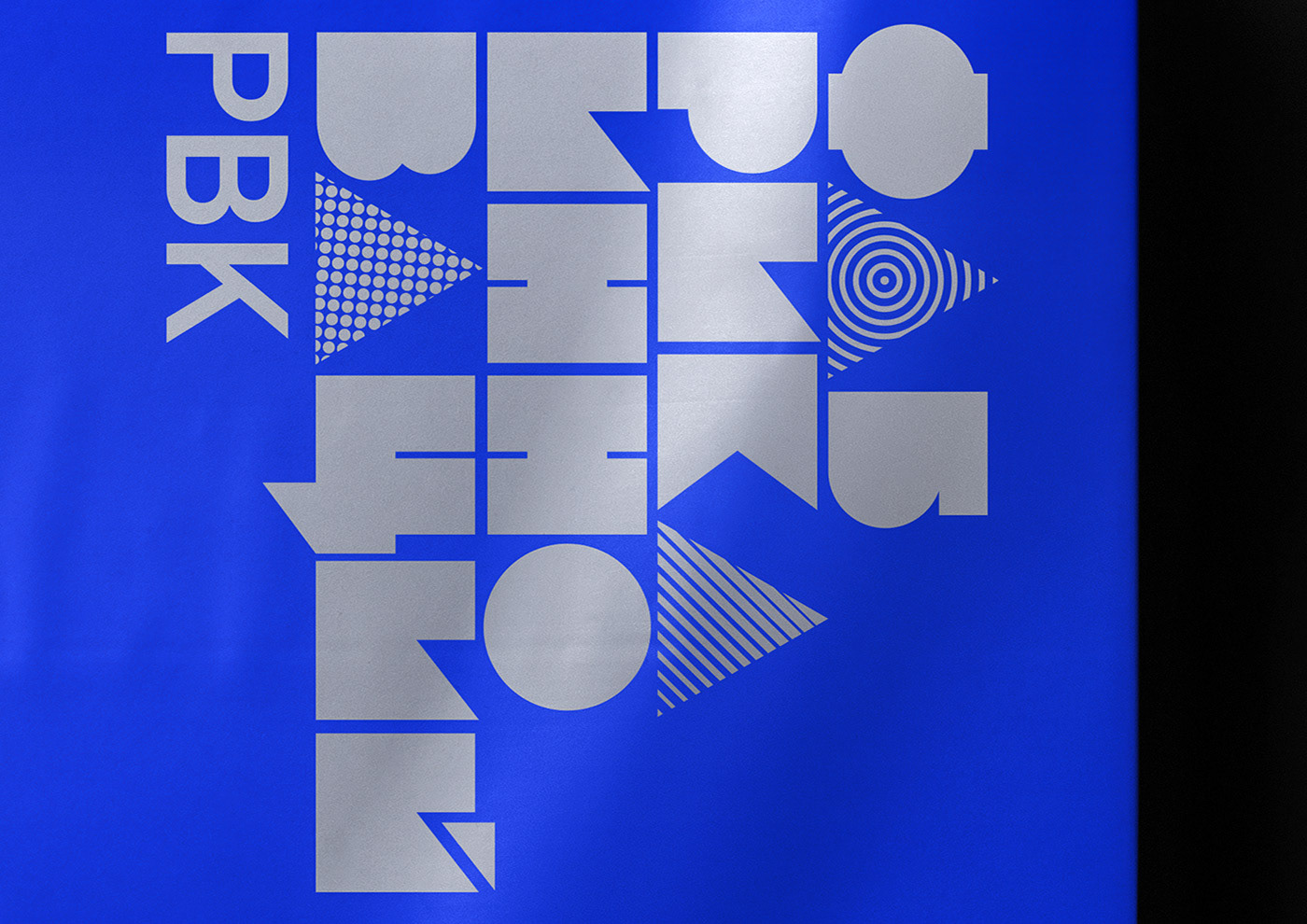
► MY CONCEPT & SOLUTION:
I was inspired by modern solutions in the design of the facades of modern architecture, as an associative illustration of the word Innovation Factory mean. GEOMETRIC patterns - at that time in 2012, this is still a modern approach for graphic design solution.
► GENERAL APPROACH TO CREATING MAIN LOGO AND PATTERN - PATCHES:
The base metric was taken from the original client logo - the entire geometric ratio successfully formed the basis of the graphic style grid and became a flexible modular system with a bright distinctive design for further replication on various media.


► EVENT LOGO CONSTRUCTION:
The basis of the logo - is the LOT font. Further, I added the Cyrillic part and, thus, made the logo universal in writing and assembly for all possible situations. I also saved the original RVC font style from the company logo, as a reference to the client brand.


► FONTS / EF DIN MITTEL CY:
ALL TYPOGRAPHY BASED ON THE DIN FAMILY FROM THE ELSNER+FLAKE COMPANY.
Bold type, used in special cases, as well as for ordinary headers. For text blocks, Notes on margins, or additional annotation, regular and medium style combinations should be used.


► Info and Navigation :
As simple as possible THE modular system, convenient for mounting on walls and cubes assembled on tubes and pillars if necessary.


THANKS FOR WATCHING


