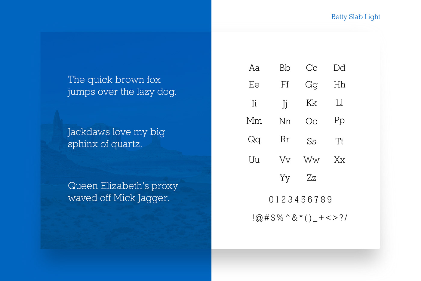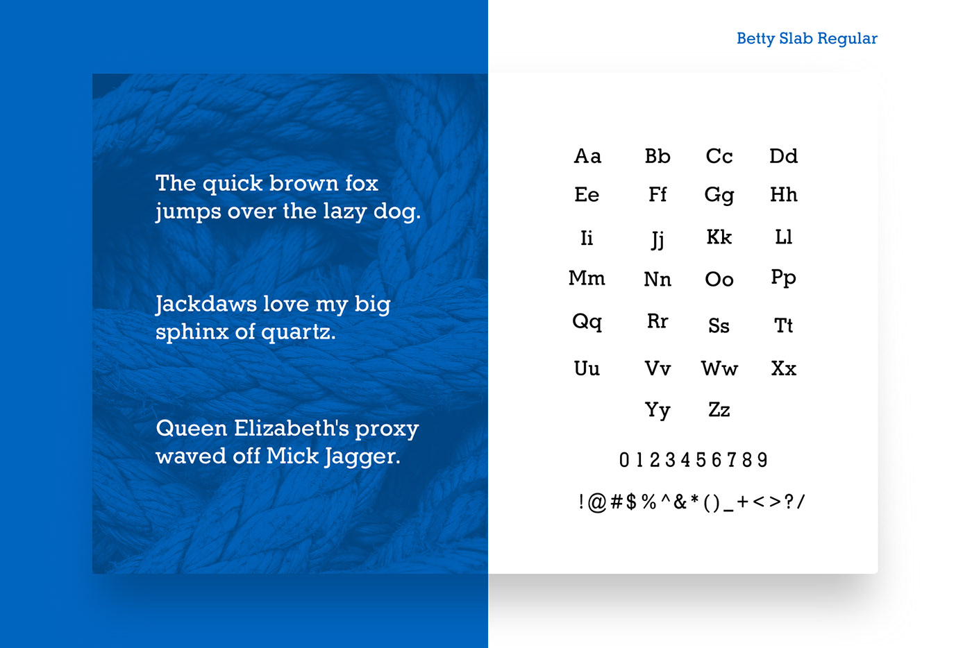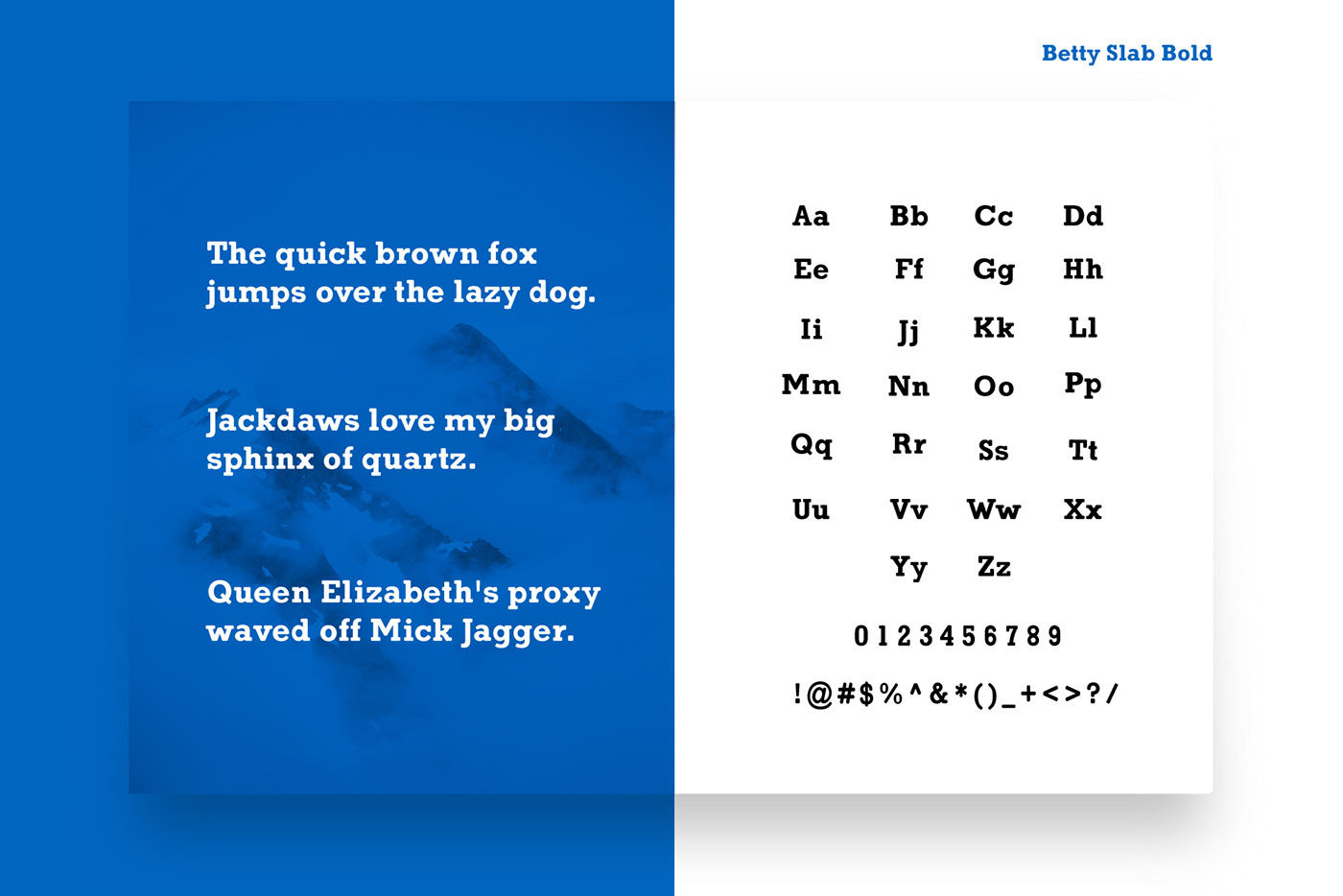
Betty Slab started out of a personal competition. Which is better Memphis or Rockwell? I’ve always flip flopped between the two as my favorite slab serif. Inevitably though, I’d find elements that I didn’t like that would drive me back to the other. I’ve tried damn near every slab since and always came back to these two. After years for indecision, I finally decided to make the slab serif that I always wanted to use. Something with a much softer, crafted touch… but still a strong slab. Hopefully you’ll find it useful as well.
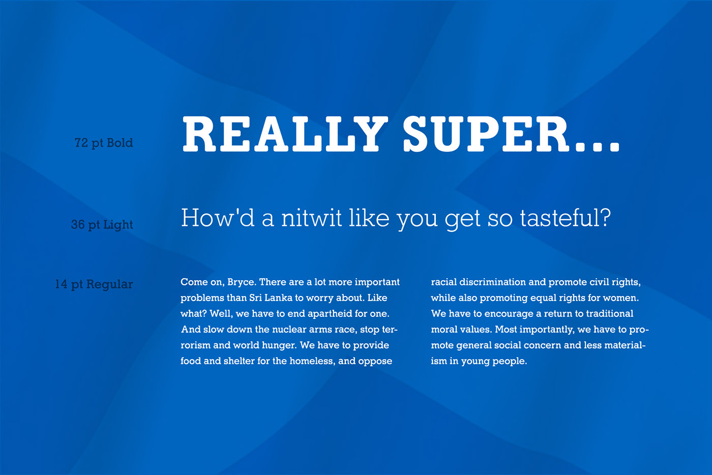

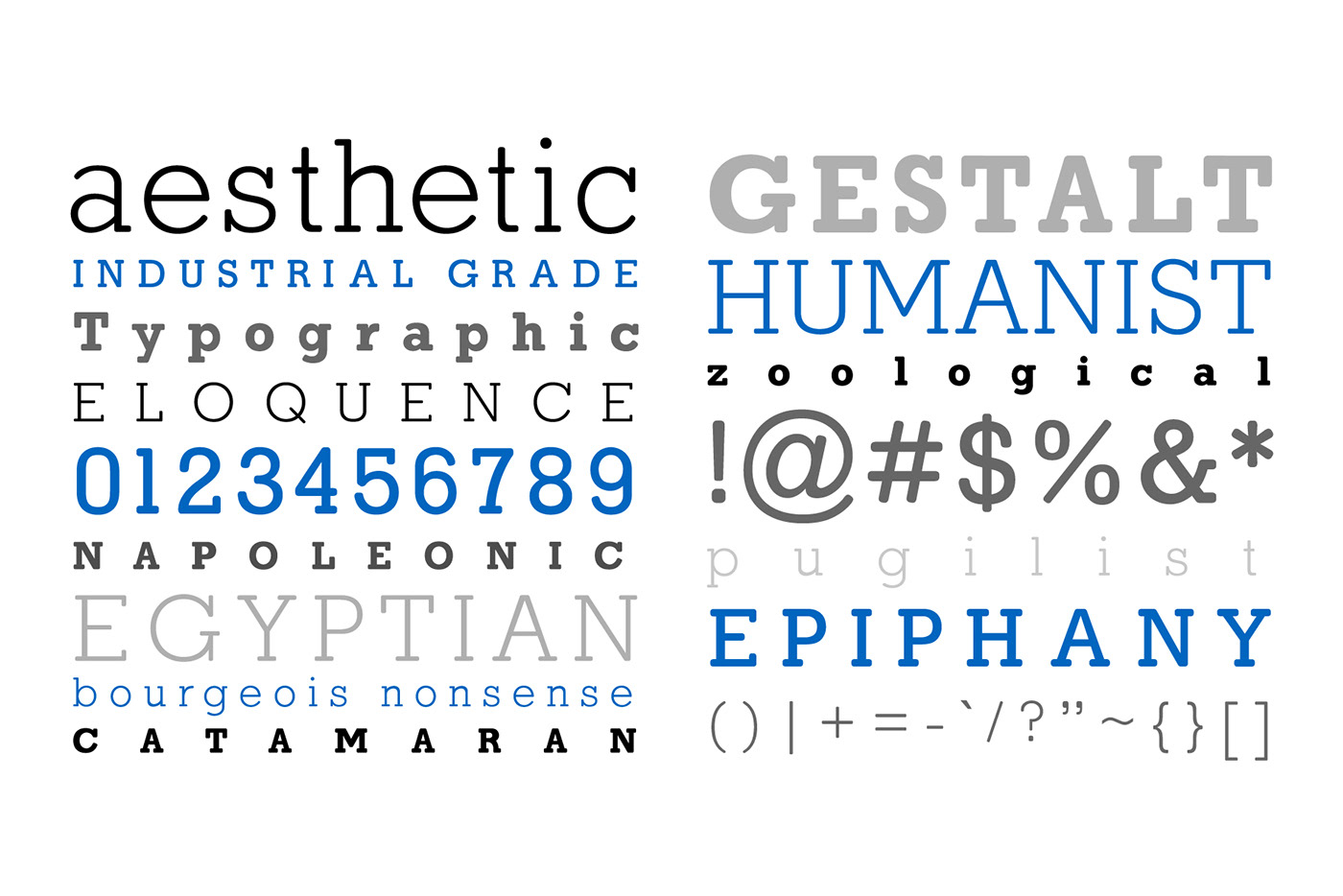
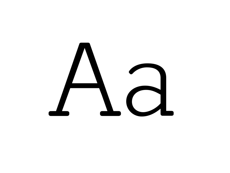
Aside from the Fibonacci terminal curves on the slabs, the Ks and Rs bring in some rounded leg elements that add some flavor to the family. G bars and Q tails differ from the standard Slab fare. In addition, crossbars are removed from the capital A apex and the W vertex. The punctuation also has a nice feel with the subtle curved accents.
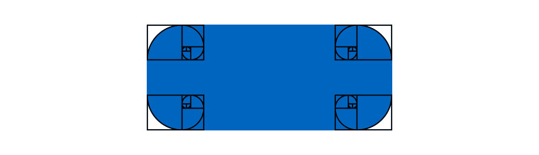
With the slab terminal lengths being on the shorter side, a geometric rounding would make them appear even shorter. The solution was found by using the “8th” Fibonacci curve (0, 1, 1, 2, 3, 5, 8,… ) to elongate curves of the slabs. This treatment creates a great organic elongation of the letterforms while maintaining the strength that a slab serif carries. Also, Illuminati…