
We prepared posters for international science conference. For the topic of social work education and situation of social workers, we have chosen and developed neutral simple style of illustrations. This clean look allowed us to create some variation and enhance understanding and reception of point made in research text of a poster.
Main topic there was education in social work especially developed to help children.
Concept and composition

Poster composition
Illustrations

Definition of social work

Social worker and his tasks
Social work education in context of help for children

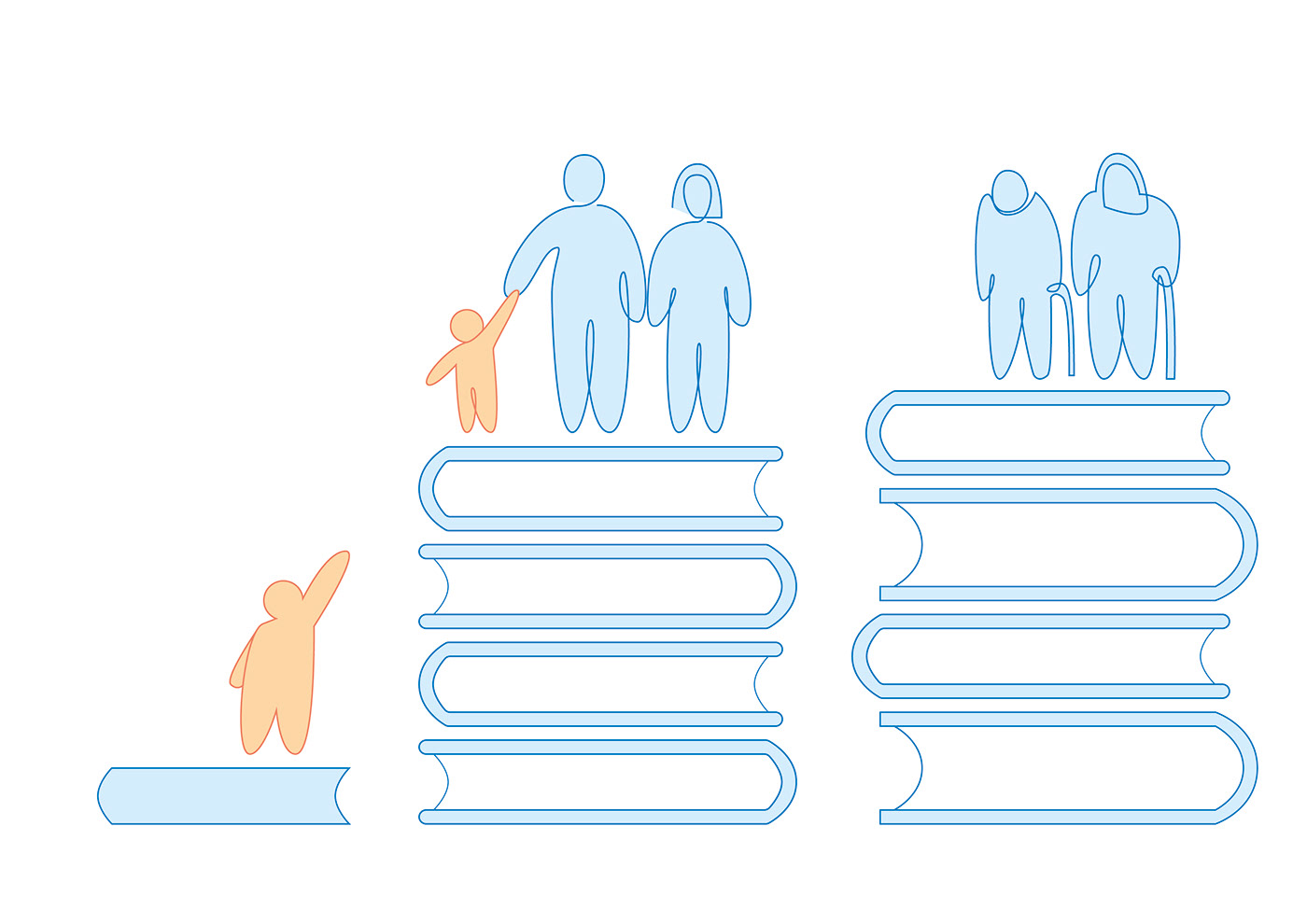
Social worker helping children

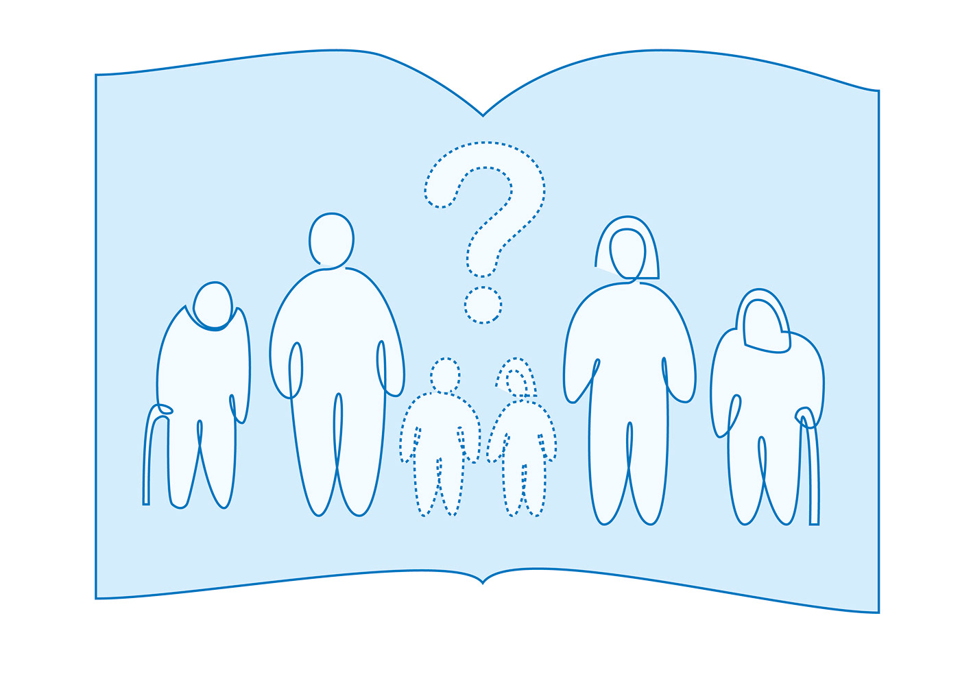
Children looking up to adults
Gap in social education in help considered for children

Law regulations in terms of social work education
Typography choices
We have chosen two typefaces to clearly make the point of a poster.
First one is Avenir Next, humanist typeface, designed by one of most known and respected designers – Adrian Frutiger. Applied to headers and title. Keeps neutral, warm feeling across the poster.
Second choice is Minion Pro. Default font delivered with InDesign, very versatile, with classic touch. Based on renaissance calligraphy (antiqua and italic) backs up humanist values which stand behind whole idea of the poster.
Two type-faces work together well, not only by values they origin from, but also with consistency in their design.
Both give neutral and warm feel, wich we decided to encompass in this design.
Thank you for your time and attention!


